There's a particular kind of late winter morning, gray light coming through the window, everything outside still brown and flat, when white wall art is the only thing that makes a room feel like it's not waiting for spring to fix it. I noticed this properly in a rental with white walls, white trim and a landlord who'd clearly never heard of accent colors, and a framed white on white piece was the first thing that made the living room look intentional instead of just unfinished.
It doesn't want company from anything else trying to be quiet. Put it near a gallery wall full of busy prints or next to anything with heavy color and it just disappears, or worse, looks like you ran out of art and hung a placeholder. It also struggles in a room that's already mostly white, walls, trim, sofa, the works, because then there's no edge for it to sit against and it reads as nothing rather than as calm. Where it genuinely falls short is in a room that needs a focal point, over a fireplace, at the end of a long hallway, anywhere your eye is supposed to land and stop. White on white rarely stops an eye, it just softens a corner, and if you need drama you'll be disappointed every time you walk past it. For sizing, measure the wall space, not the piece in isolation. A single small frame on a big blank wall looks like an afterthought, roughly sixty to seventy five percent of the furniture width below it is the rule I actually use, so over a six foot sofa you want something closer to four feet across, whether that's one large piece or a tight grouping. The mistake I see constantly, mine included, is hanging it too high because you're thinking about the frame and not the sightline, center of the art should sit around eye level for someone standing, not an architectural afterthought up near the ceiling. As for wear, the paper or canvas holds up fine out of direct sun, but put it on a wall that gets afternoon light for a few years and you'll watch the white shift to a faint yellow, uneven too, darker where the frame shadow falls. A textured piece, plaster, raised paint, actual relief work, ages better than a flat print because the texture keeps catching light differently as the color shifts slightly, so it reads as intentional rather than faded. Dust it like you would a lamp shade, a soft brush or the dust attachment on a vacuum, and keep it off any wall that gets direct sun for more than a couple hours a day if you want it looking the same in five years as it does now.
 Aisha's pickWhite Gallery Wall Art for When the Old Ones Give Up
 Aisha's pickWhite Wall Art Sets for Filling an Awkward Gap

 Aisha's pickWhite Landscape Wall Art That Does What It Should

 Aisha's pickWhite Wall Pictures That Get Better With Age

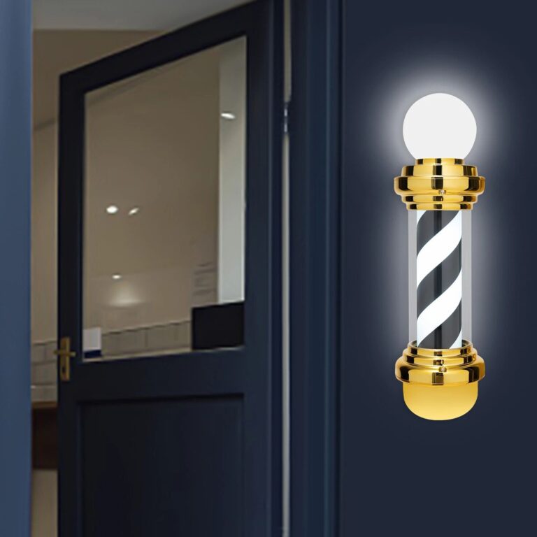 Aisha's pickWhite LED Signs for Filling an Awkward Gap

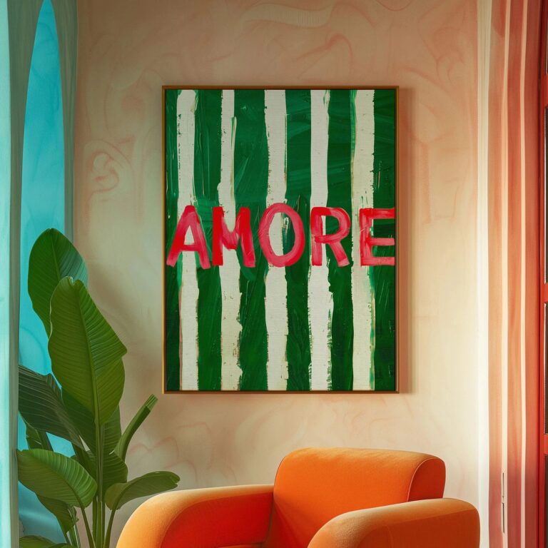 Aisha's pickWhite Wall Posters That Catch the Eye Without Taking Over

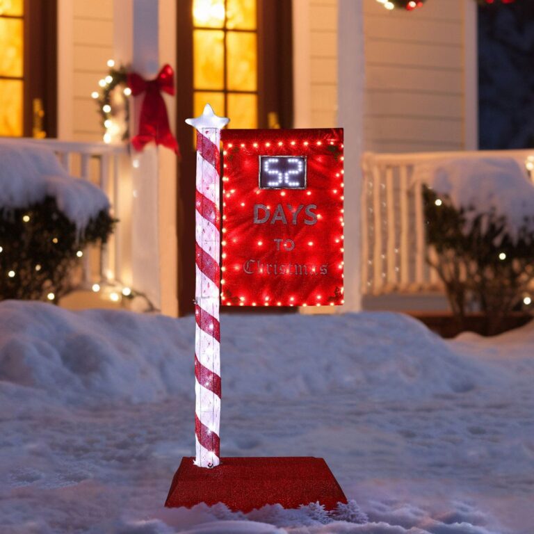 Aisha's pickWhite Metal Signs for Rooms That Feel a Bit Bare

 Aisha's pickWhite Wall Stickers With a Story to Them

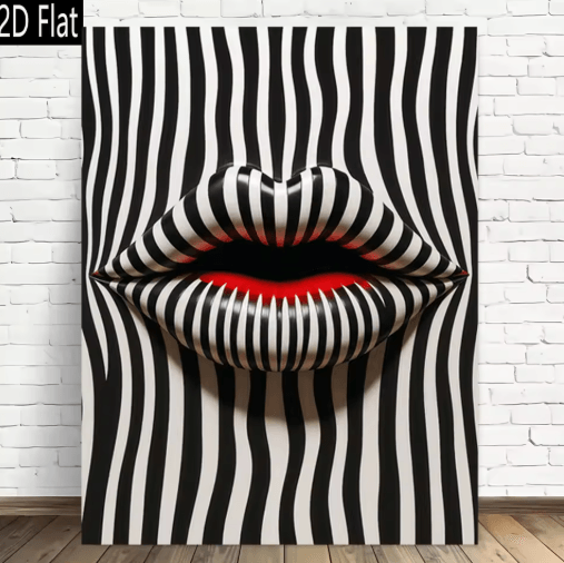 Aisha's pickWhite Minimalist Art Prints That Start ConversationsAlso worth a lookPrintsThe thing nobody tells you about a print is that it changes with the light, and you won't…See the collections →
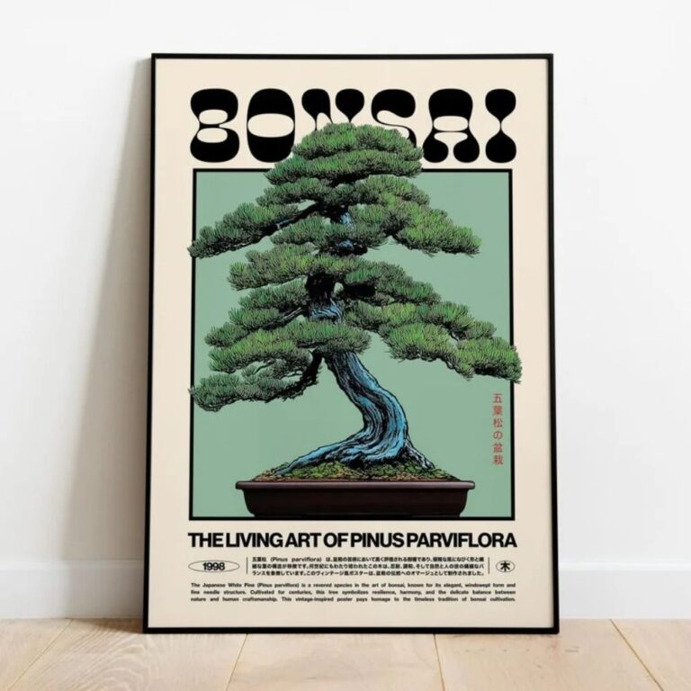
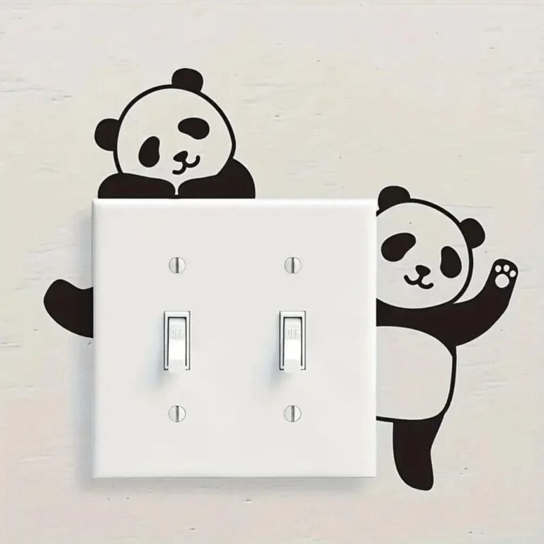 Aisha's pickWhite Wall Stickers for Rooms That Feel a Bit Bare
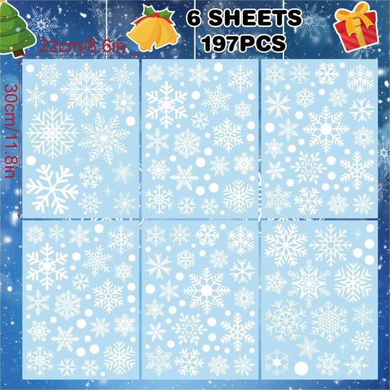
 Aisha's pickWhite Abstract Wall Art With a Bit More About It
 Aisha's pickWhite Minimalist Posters With a Story to Them

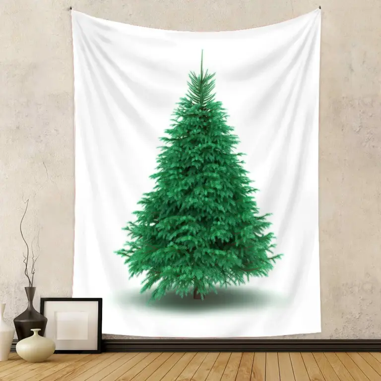
 Aisha's pickWhite Wall Tapestries That Don’t Look Mass Produced
 Aisha's pickWhite Art Prints for Rooms That Feel a Bit Bare

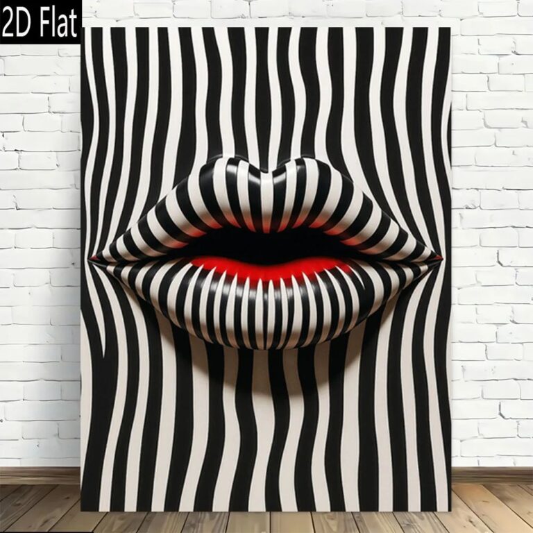 Aisha's pickWhite Minimalist Wall Art Pulled From Dozens of Stores
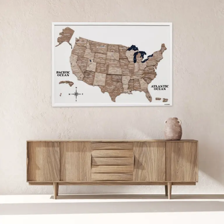
 Aisha's pickWhite Wood Wall Art That Doesn’t Cost a Fortune
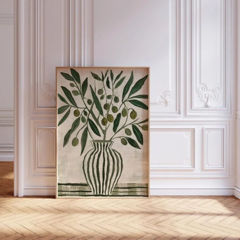
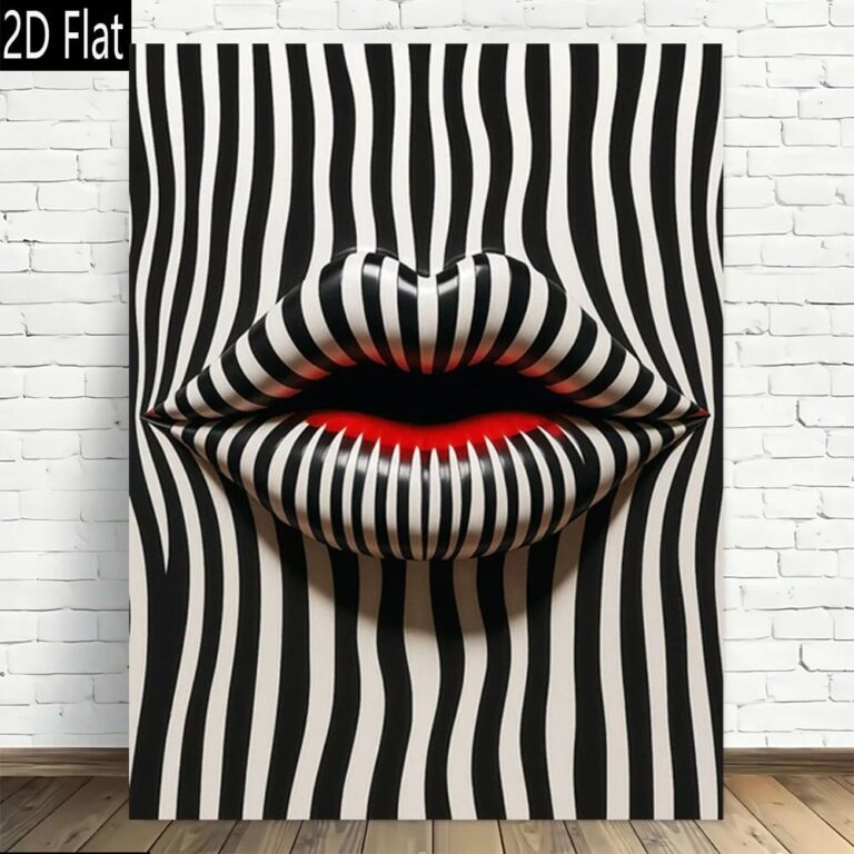 Aisha's pickWhite Canvas Art at Every Price Point

 Aisha's pickWhite Pictures We’d Make Room ForAlso worth a lookModern Wall ArtFor years I figured modern wall art meant one big canvas, something abstract and gray, hung dead center…See the collections →

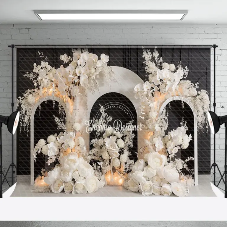 Aisha's pickWhite Wooden Wall Art Picked From the Stores We Trust
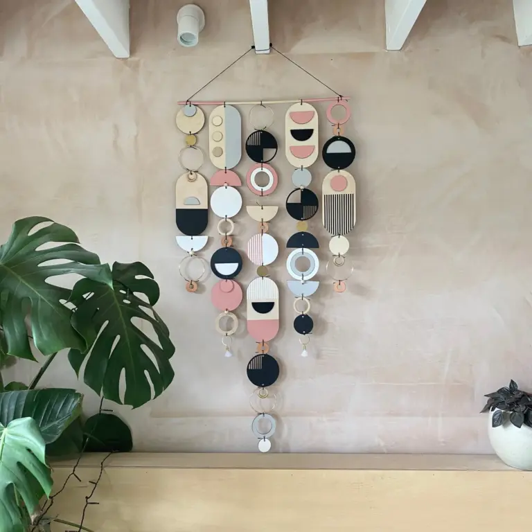
 Aisha's pickWhite Canvas Paintings That Start Conversations

 Aisha's pickWhite Posters From Brands You Know and a Few You Won’t

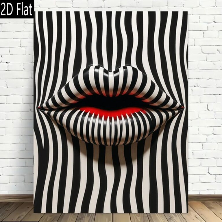 Aisha's pickWhite Canvas Prints Picked From the Stores We Trust

 Aisha's pickWhite Prints for Filling an Awkward Gap
 Aisha's pickWhite Canvas Wall Art Worth Your Money
 Aisha's pickWhite Print Sets for Blank Walls and Empty Shelves
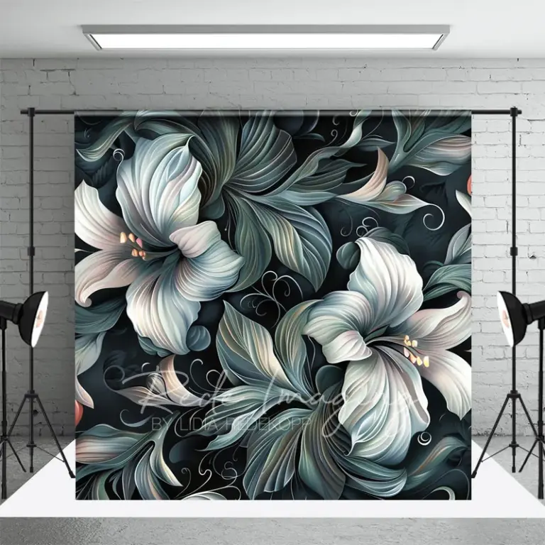 Aisha's pickWhite Floral Wall Art With a Bit More About It

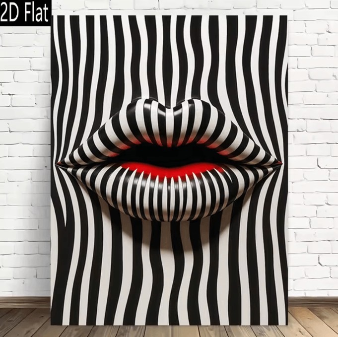 Aisha's pickWhite Retro Wall Art for When the Old Ones Give UpAlso worth a lookPaintingsThe one thing worth knowing before you hang a single painting is that scale matters more than subject.See the collections →
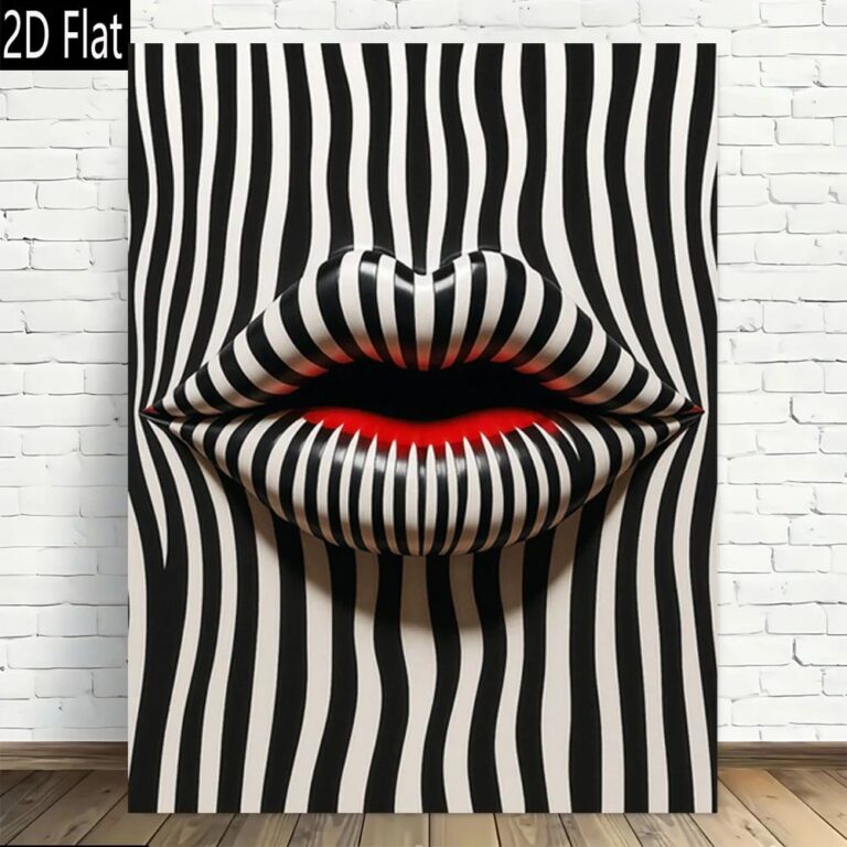
 Aisha's pickWhite Flower Wall Art That Doesn’t Cost a Fortune

 Aisha's pickWhite Tapestries We’d Make Room For
 Aisha's pickWhere to Start With White Framed Art
 Aisha's pickThe White Tree Wall Art Worth Your Cash
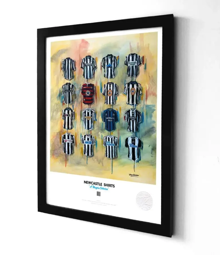 Aisha's pickWhite Framed Prints We’d Make Room For