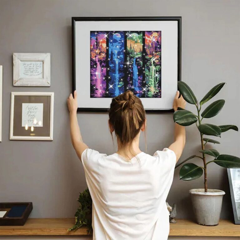
The one thing worth knowing before you hang a single painting is that scale matters more than subject. A small painting on a big wall doesn't look charming, it looks lost, like a postage stamp on a barn door. Measure the wall first, then go looking for the art, not the other way around.
If you own nothing yet, start with one larger piece over the place you actually sit, the sofa or the bed, rather than a cluster of little ones scattered everywhere. A single painting that fills most of the width above a sofa does more for a room than five small ones hung with great care and a level. You can build out to a grouping later once you know how you like to live with color on the wall, but the first purchase should be the one that anchors the room when you walk in tired and just want it to feel finished.
What separates a painting that holds up from one that starts looking sad after a year usually comes down to what's underneath the paint. A canvas stretched tight over a real wood frame, with corners that don't wobble when you knock on them, will stay flat for years. Cheaper ones use thin frames that warp with humidity, and you'll notice the canvas start to sag in the middle like a trampoline nobody wants to jump on anymore. Run a hand along the edge, it should feel solid, not hollow and papery. The paint itself should have some texture to it if it's meant to look like a real brushstroke, not a flat printed sheen that looks fine from across the room and a little sad up close. Touch matters here, a painting with actual texture catches the light differently throughout the day, which is half of why it feels alive instead of decorative.
On color, the ones that are easiest to live with over time are the ones with a muted, slightly dusty palette, warm neutrals, soft blues, faded greens, rather than anything bright and saturated that matches a cushion you'll eventually replace. Abstract paintings in tones close to your wall color blend in and let other things in the room do the talking, while a painting with one strong contrasting color becomes the thing everyone's eye goes to first, which is worth deciding on purpose rather than by accident. Black and white or sepia toned pieces are nearly impossible to get wrong, they sit quietly in almost any room without demanding you redecorate around them.
The real mistake is buying art to match a cushion or a rug instead of buying something you'd still want on the wall after you've replaced that cushion twice.

 Aisha's pickCanvas Paintings with Frame at Every Price Point
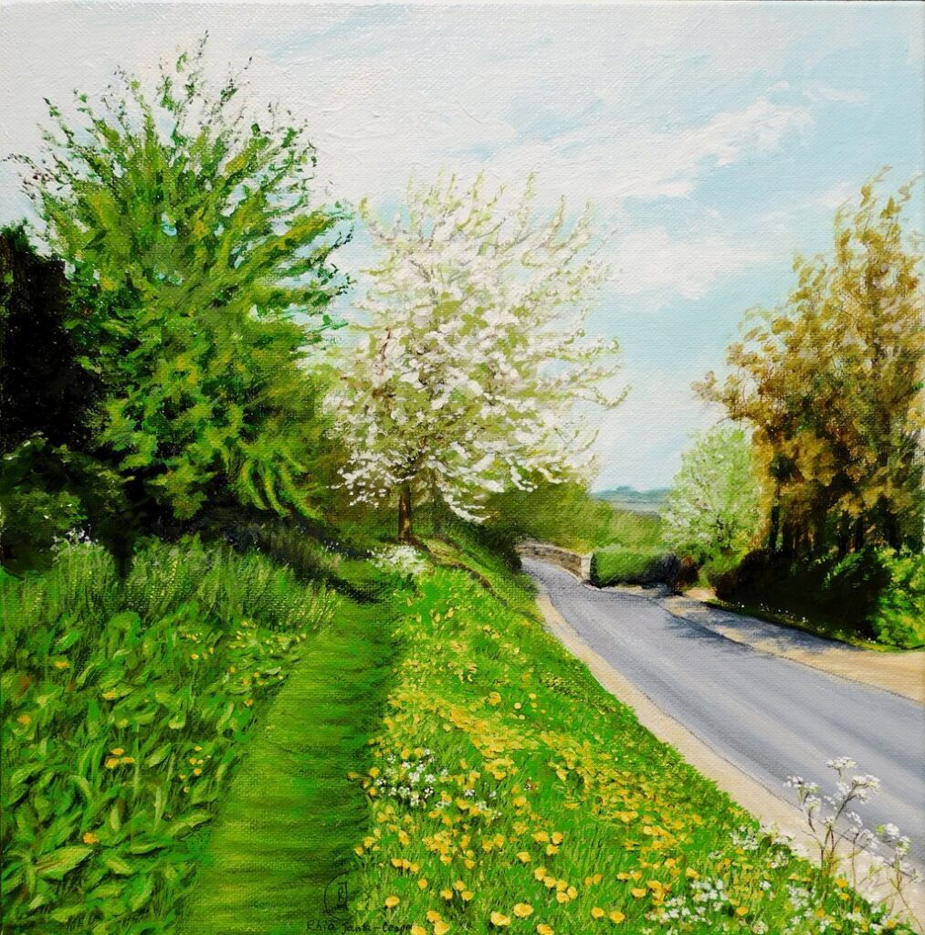
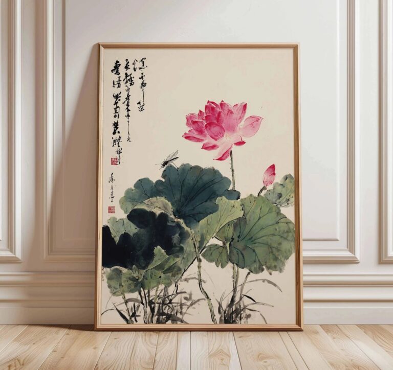 Aisha's pickYellow Canvas Paintings With a Bit More About Them

 Aisha's pickTree Acrylic Paintings We’d Make Room For

 Aisha's pickFloral Canvas Paintings That Don’t Need Babying

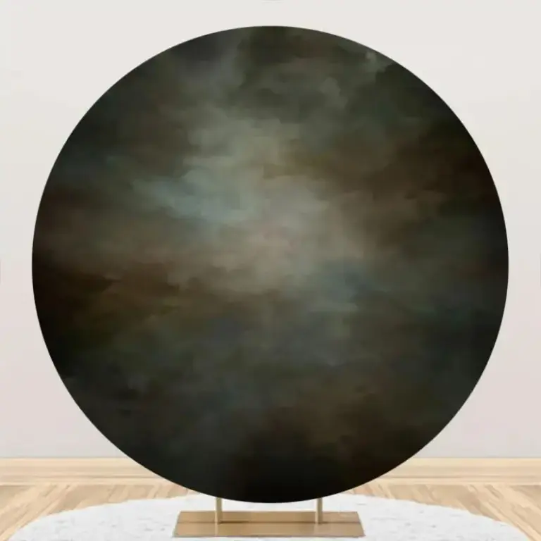 Aisha's pickThe Abstract Acrylic Paintings Worth Your Cash
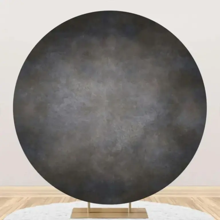
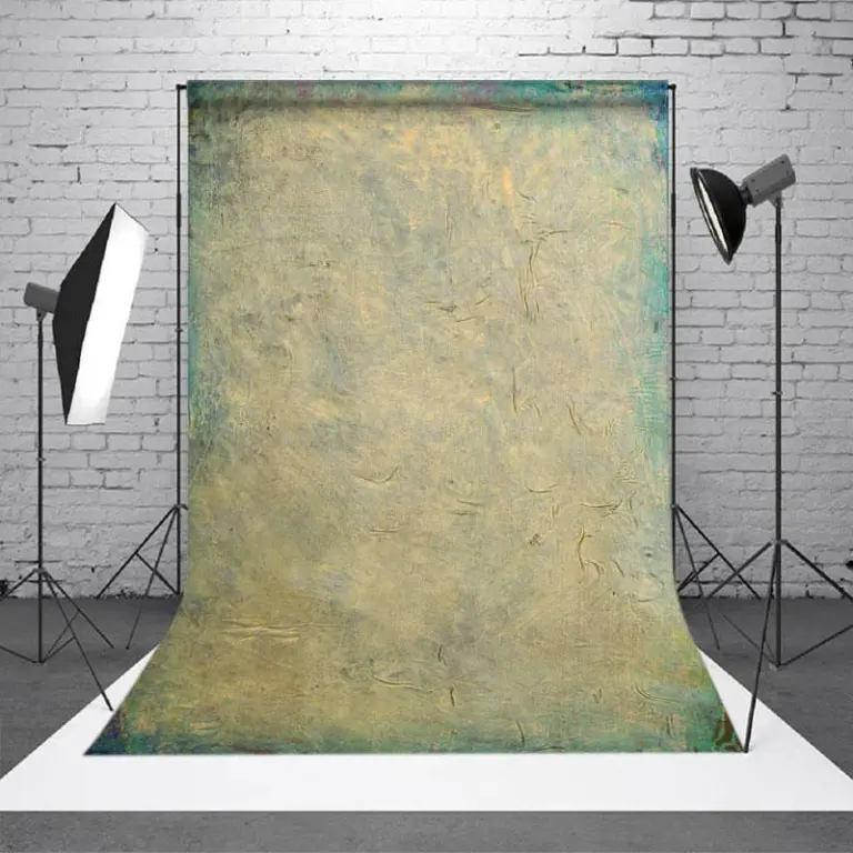 Aisha's pickVintage Oil Paintings That Make Rented Places Feel Like Home
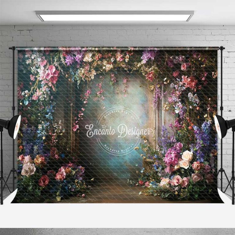
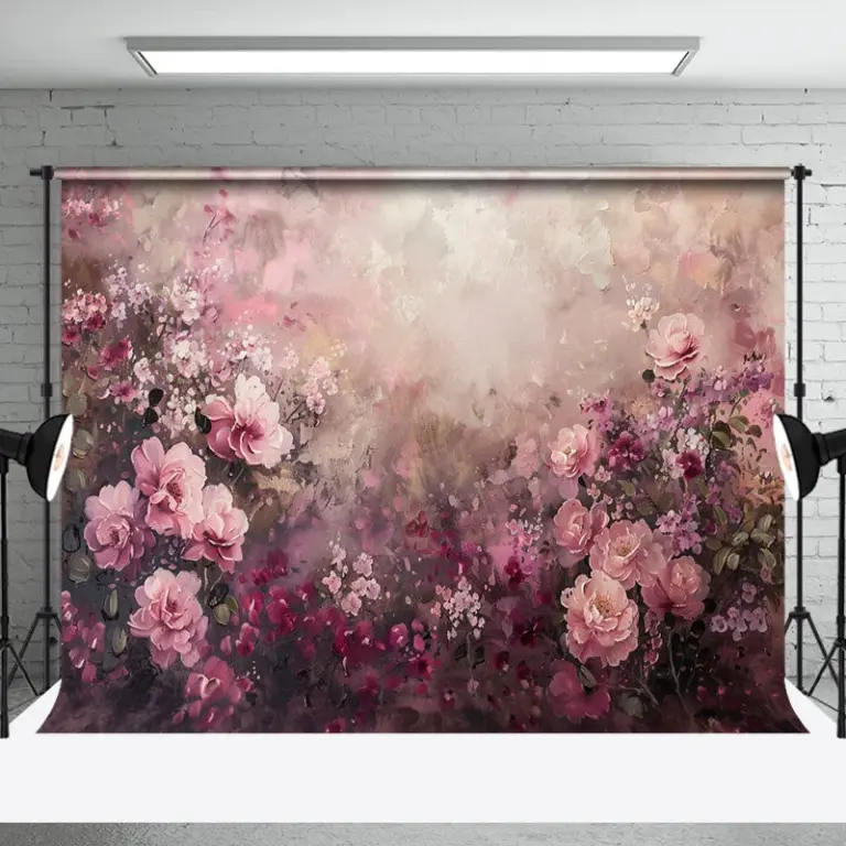 Aisha's pickFlower Canvas Paintings We’d Make Room For

 Aisha's pickGood Abstract Oil Paintings That Don’t Cost a Fortune
 Aisha's pickWatercolor Paintings That Give a Room Some PersonalityAlso worth a lookCanvas PaintingsThe moment that sold me on canvas was standing in the hallway with a cup of coffee, half…See the collections →
 Aisha's pickForest Canvas Paintings That Make a Room Feel Finished
 Aisha's pickAcrylic Paintings for Blank Walls and Empty Shelves

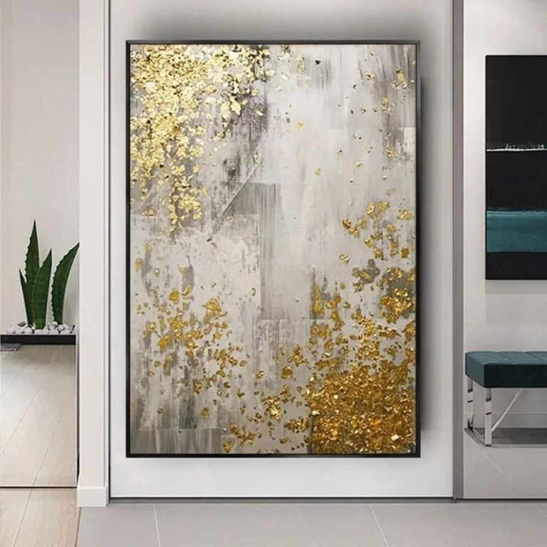 Aisha's pickGold Canvas Paintings for Filling an Awkward Gap

 Aisha's pickFloral Oil Paintings With a Story to Them
 Aisha's pickGreen Canvas Paintings We Keep Coming Back To
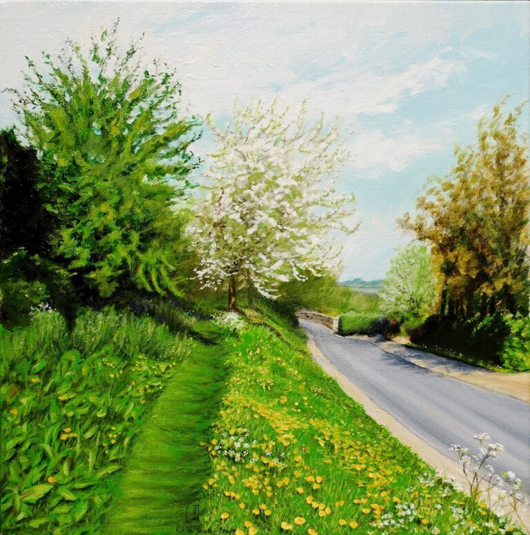
 Aisha's pickFlower Acrylic Paintings for Making a House Feel Like Yours

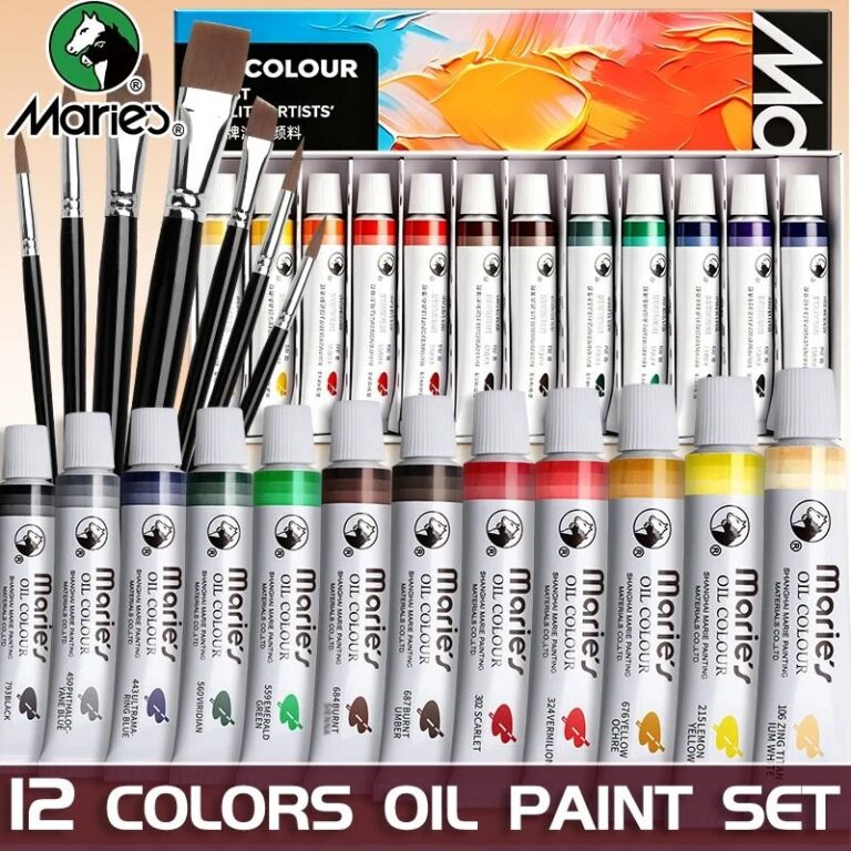 Aisha's pickLandscape Canvas Paintings That Make Great Housewarming Gifts

 Aisha's pickFlower Oil Paintings With a Story to Them

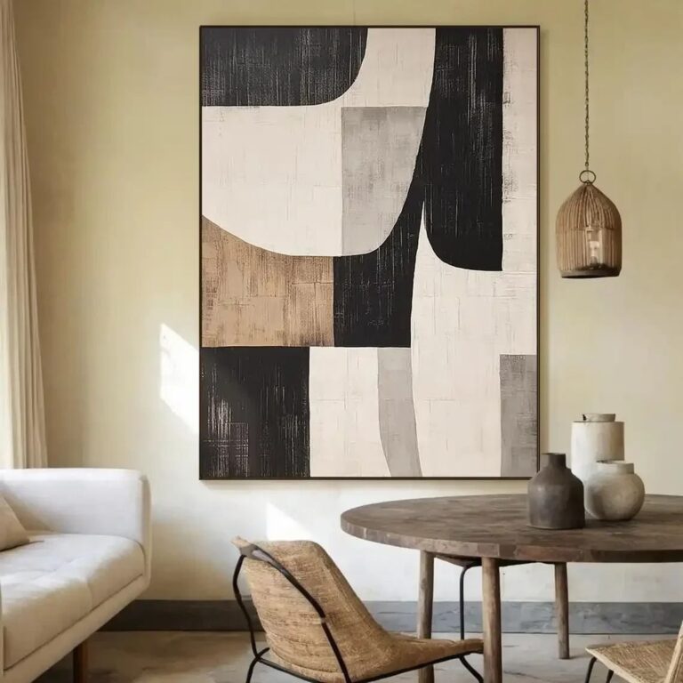 Aisha's pickLarge Canvas Paintings That Start ConversationsAlso worth a lookPrintsThe thing nobody tells you about a print is that it changes with the light, and you won't…See the collections →
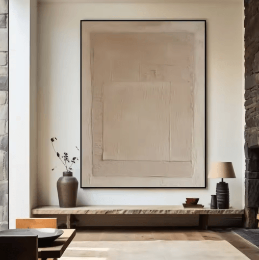
 Aisha's pickLandscape Acrylic Paintings With a Story to Them
 Aisha's pickMedium Canvas Paintings You Won’t Regret Buying

 Aisha's pickLarge Acrylic Paintings That Visitors Always Ask About
 Aisha's pickAbstract Canvas Paintings for Rooms That Feel a Bit Bare
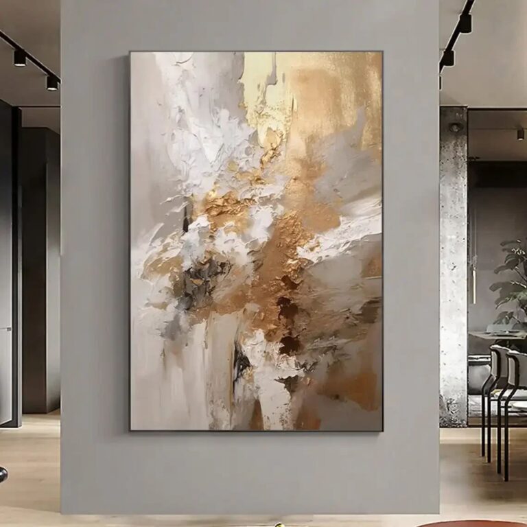
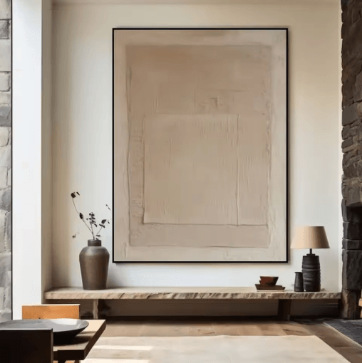 Aisha's pickModern Art Canvas Paintings for Filling an Awkward Gap

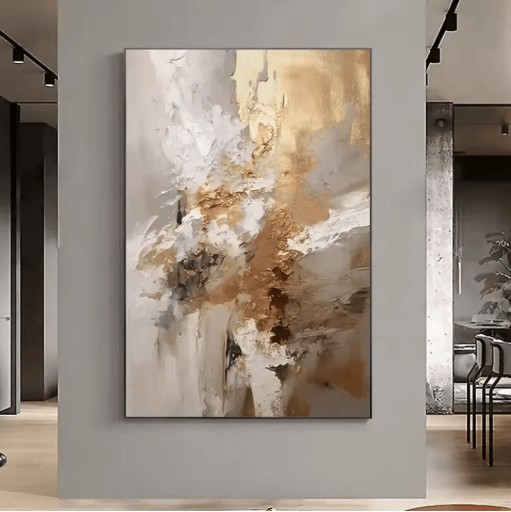 Aisha's pickLarge Oil Paintings That Feel Personal, Not Store Bought

 Aisha's pickBeach Canvas Paintings for Blank Walls and Empty Shelves
 Aisha's pickPortrait Canvas Paintings for Filling an Awkward Gap
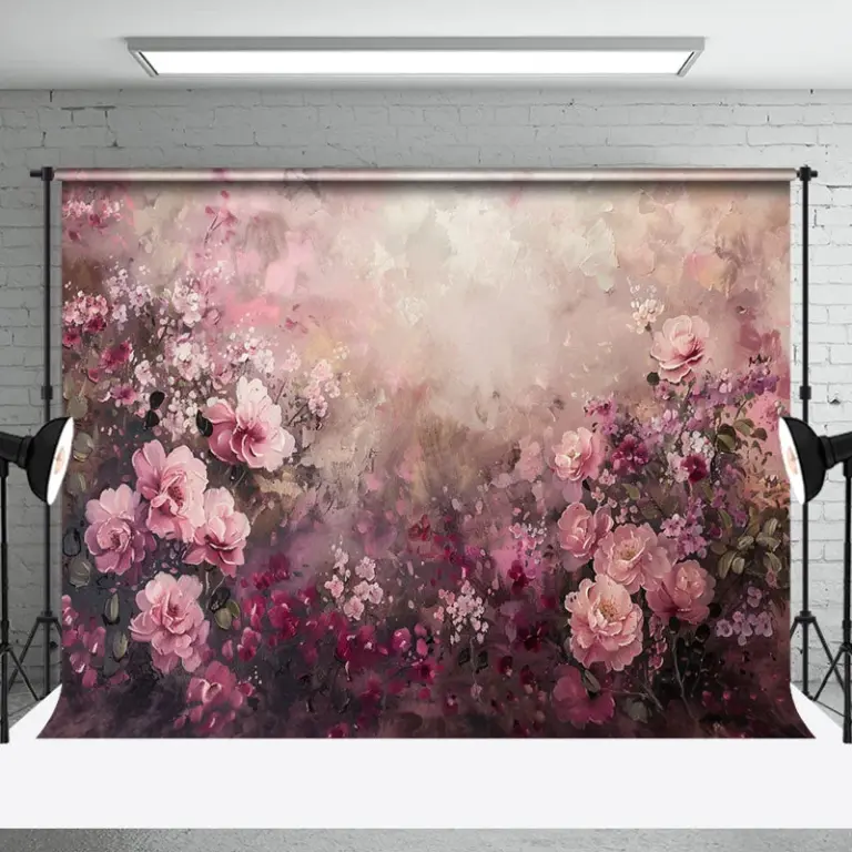
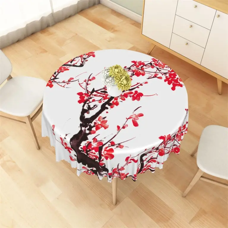 Aisha's pickOil Paintings From Stores Big and SmallAlso worth a lookModern Wall ArtFor years I figured modern wall art meant one big canvas, something abstract and gray, hung dead center…See the collections →
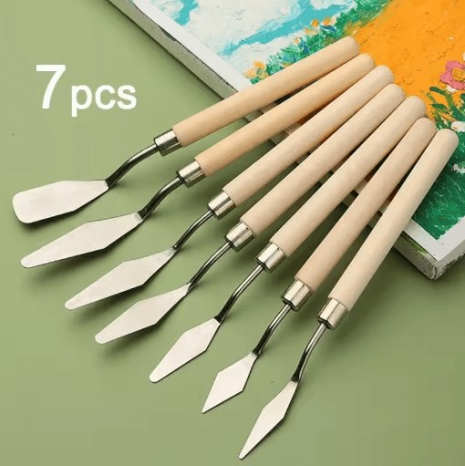
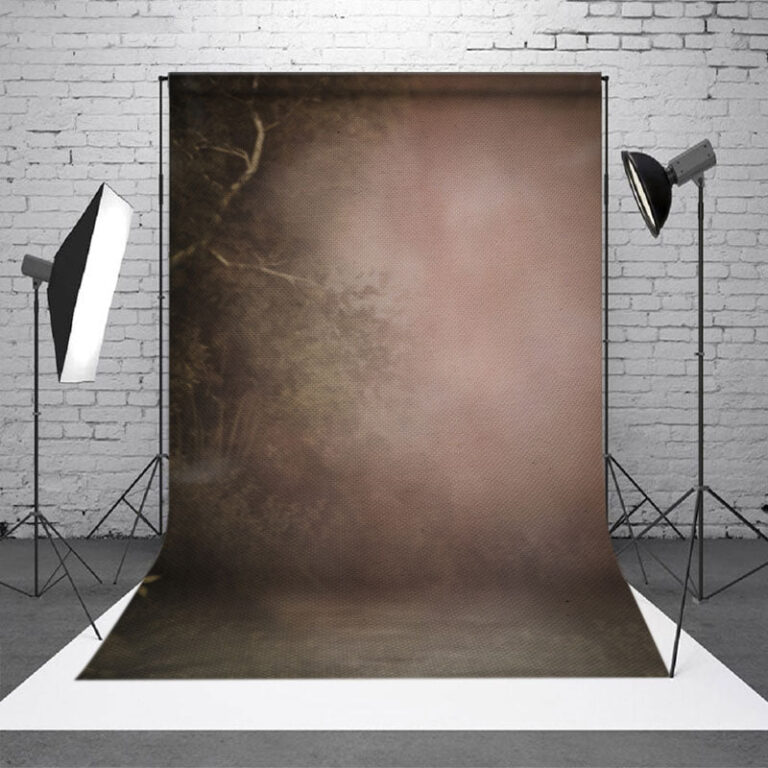 Aisha's pickBlack Canvas Paintings That Catch the Eye Without Taking Over
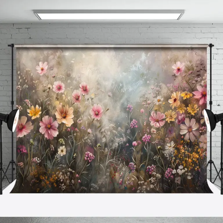
 Aisha's pickRed Canvas Paintings That Feel Personal, Not Store Bought

 Aisha's pickPortrait Acrylic Paintings That Won’t Date in a Year

 Aisha's pickBlue Canvas Paintings With a Story to Them

 Aisha's pickThe Small Canvas Paintings Worth Your Cash

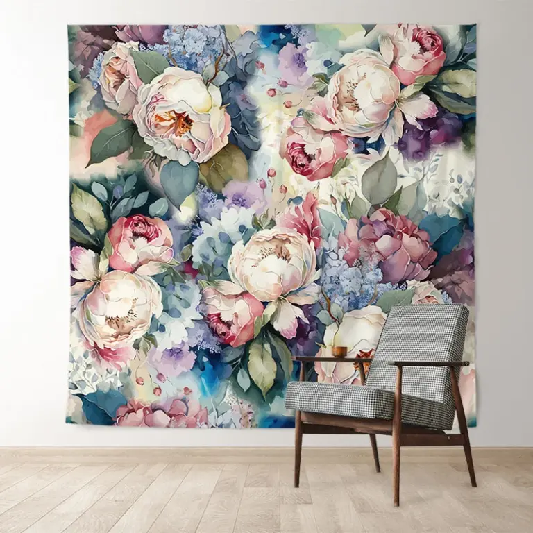 Aisha's pickPortrait Oil Paintings That Look Good Up Close
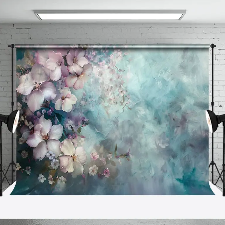
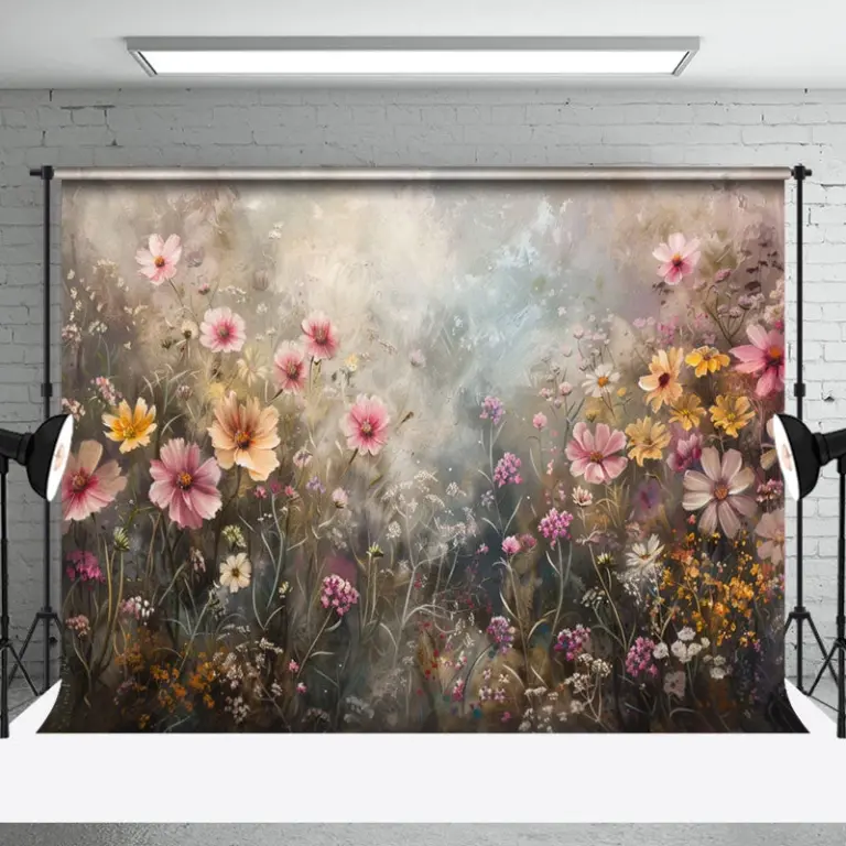 Aisha's pickCanvas Paintings for Rooms That Feel a Bit Bare

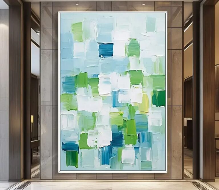 Aisha's pickSpace Canvas Paintings That Give a Room Some Personality