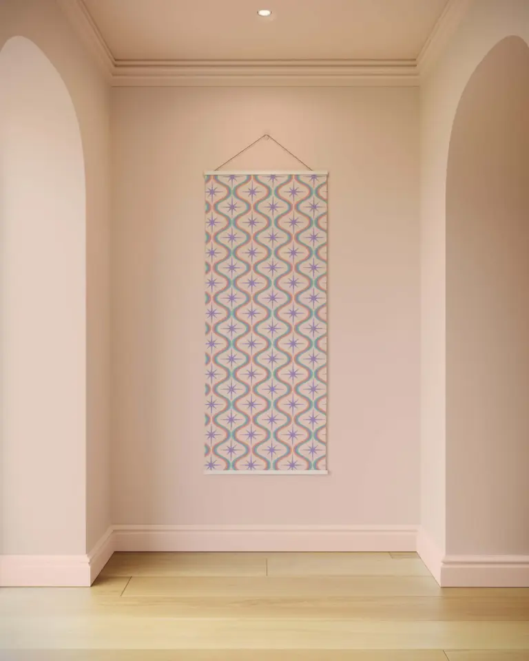
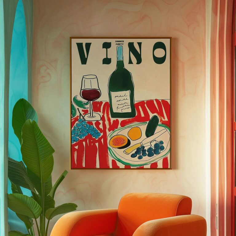
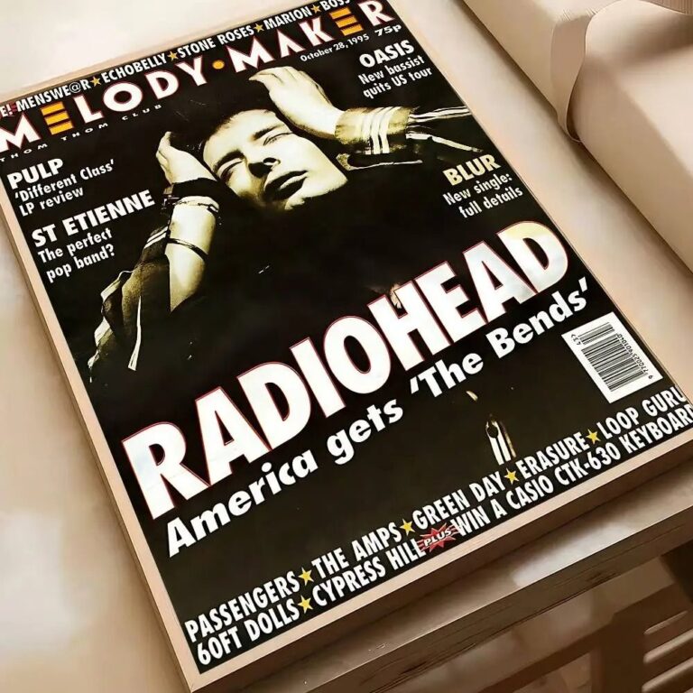
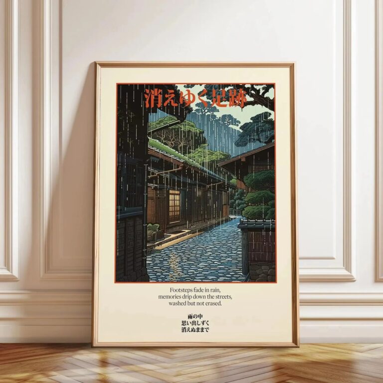
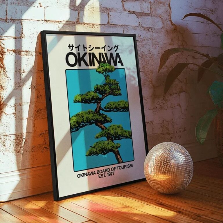
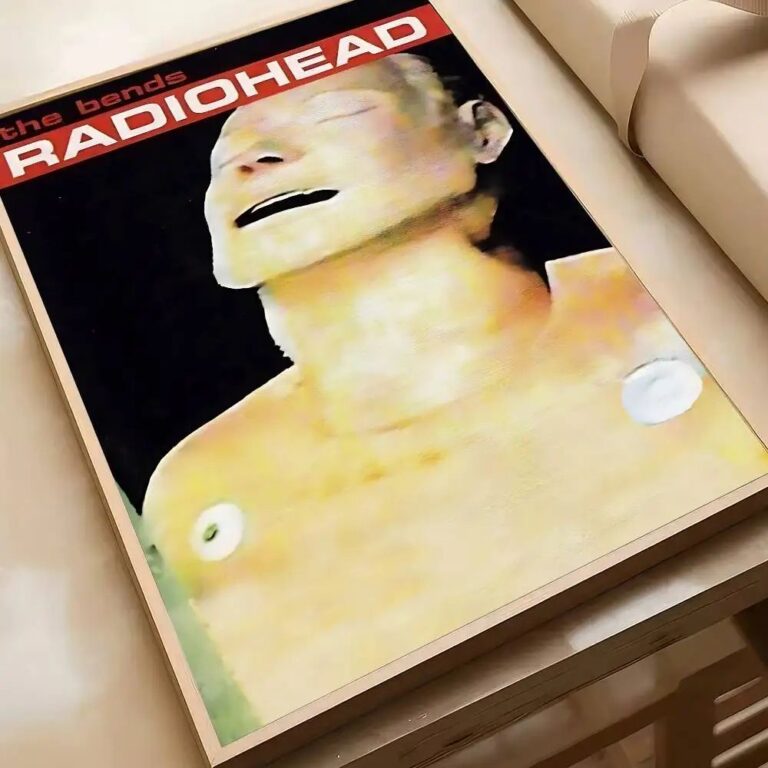
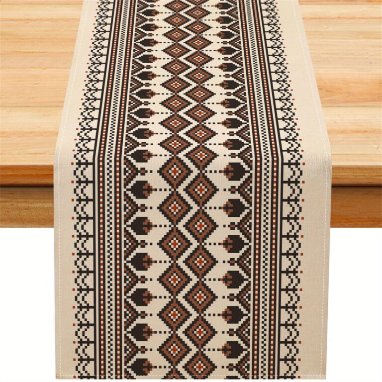
The mistake is hanging one big retro print and expecting it to carry the whole wall by itself, the way it looked in whatever photo made you buy it. Retro art almost always wants company or at least a frame and mat that give it some breathing room, because on its own against a plain wall it can read more like a dorm room leftover than something you chose on purpose.
Where it struggles is next to anything else busy or bright in the same sightline, heavy floral curtains, a patterned rug with its own strong color story, another piece of wall art with a totally different era or palette. Retro prints usually have a few dominant colors and a graphic, flat quality, and they need some calm around them to actually land. If you have none yet, start with a single print in a mustard, burnt orange, or avocado tone, something that reads clearly as its decade without trying to cover every era at once, in a simple frame rather than anything ornate, so the print does the talking and the frame just holds it steady. A heavier frame with real weight to it, wood or a solid metal, also hangs straighter over time and doesn't bow or warp the way thin plastic ones do after a few years on the wall.
It suits rooms where you already have some personality going, a kitchen with open shelving and mismatched mugs, a den with a secondhand couch, a stairwell that could use a reason to look up. It works best in homes that lean a little worn in and lived in already, rented apartments included, because retro art doesn't ask you to repaint or commit to anything structural, it just leans into what's already there. It reads well year round too, no real season attached to it, though I find it earns its spot most in rooms you spend time in during the colder months, since you end up looking at the walls more when you're inside more.
Where it falls short is in spaces that are trying to feel sleek or hushed, a bedroom meant for actual rest, a bathroom going for spa and quiet, anywhere you want the eye to slow down rather than catch on something loud. It can also fight with a very modern, minimal kitchen or living room where everything else is clean lines and neutral tone, the print will just look like it wandered in from another house.
I'd put the first one in a hallway or stairwell, somewhere you pass through rather than sit and stare, so it gets noticed without having to hold up the whole room on its own.
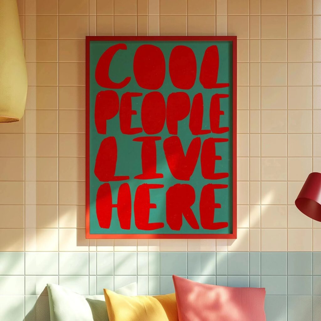 Aisha's pickGreen Retro Wall Art You’ll Live With Happily for Years
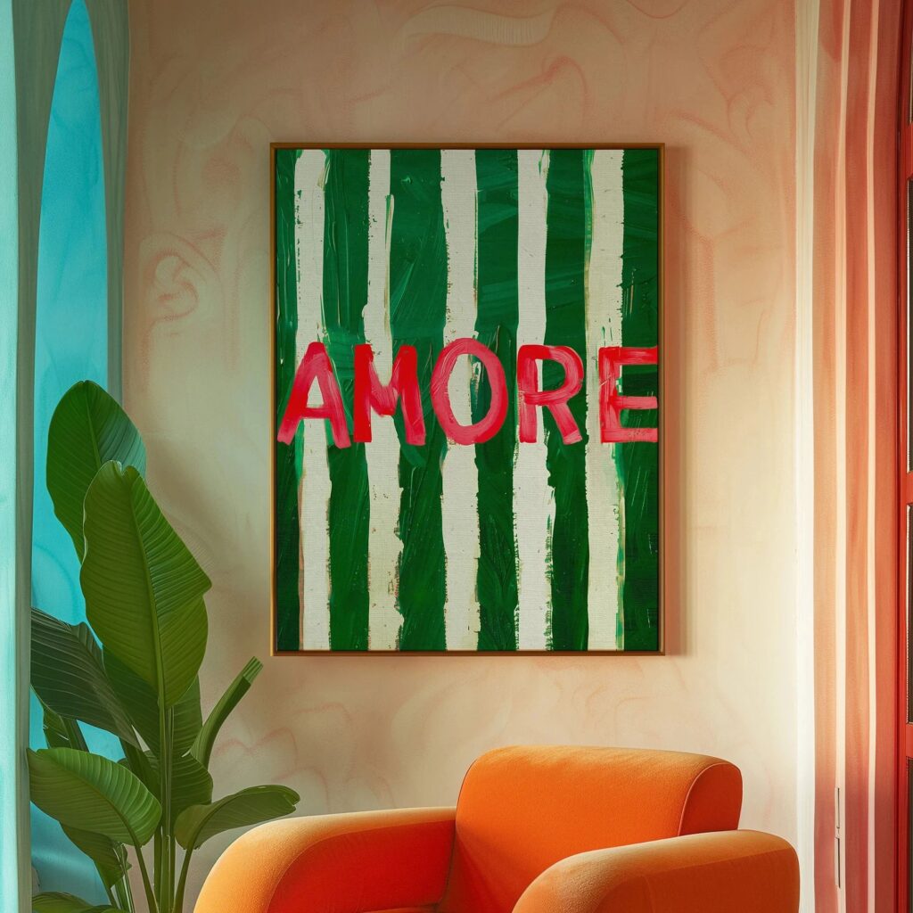
 Aisha's pickRetro Wall Art at Every Price Point
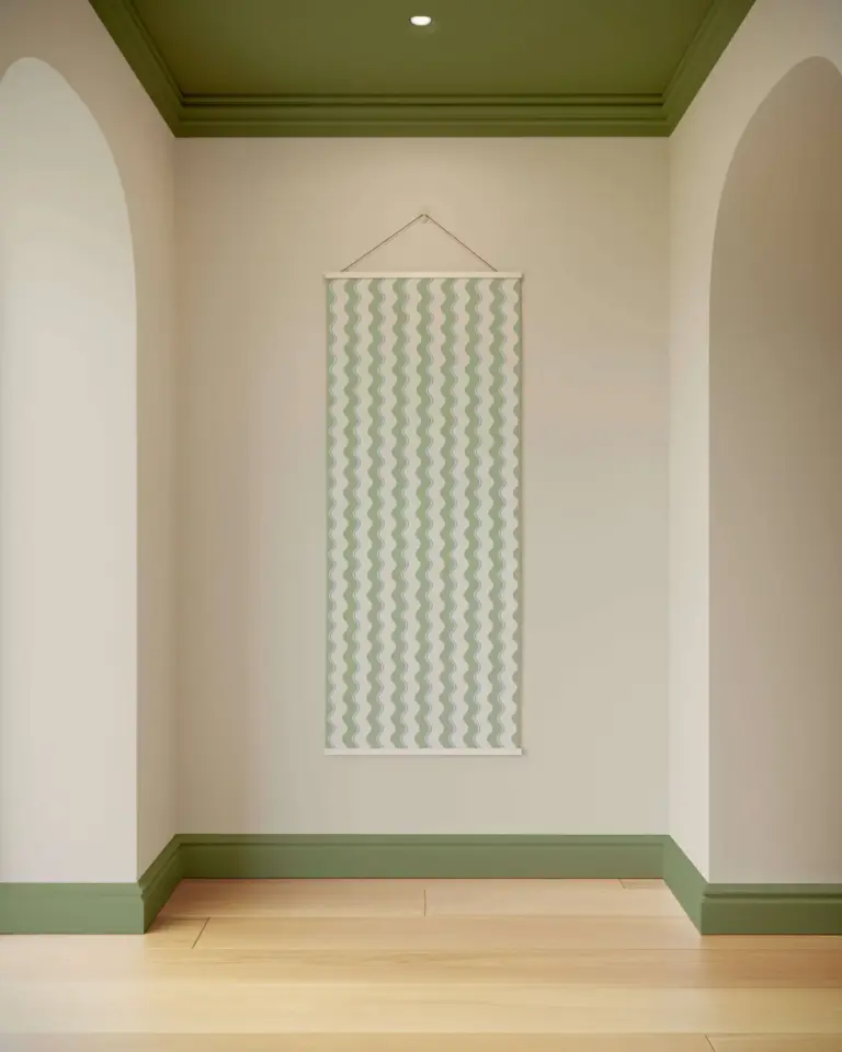
 Aisha's pickLarge Retro Wall Art That Looks the Part
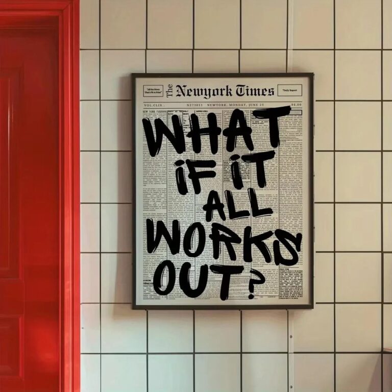
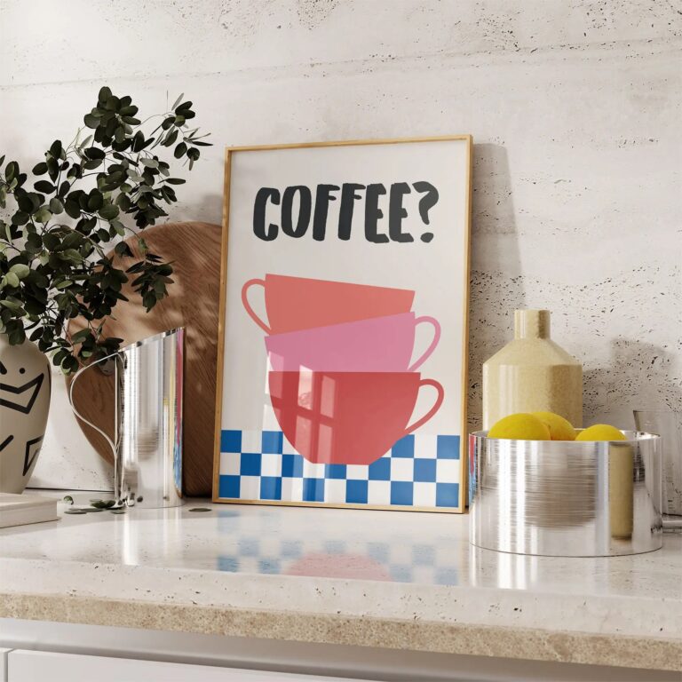 Aisha's pickRetro Wall Art for Bedroom That Earns Its Place
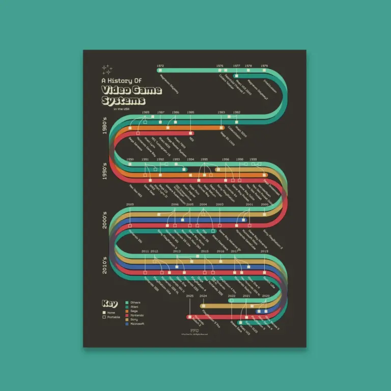
 Aisha's pickPink Retro Wall Art That Doesn’t Cost a Fortune
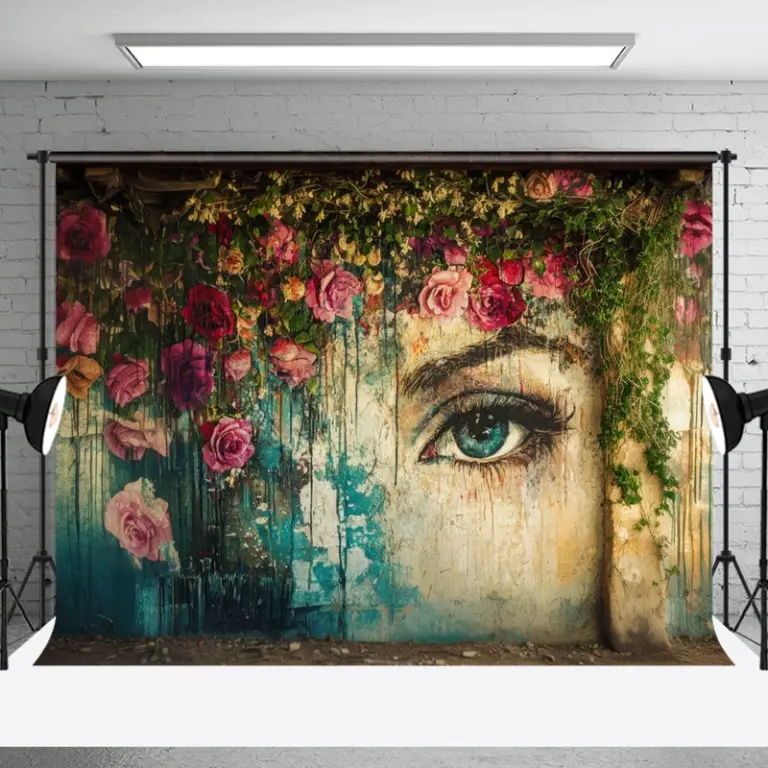
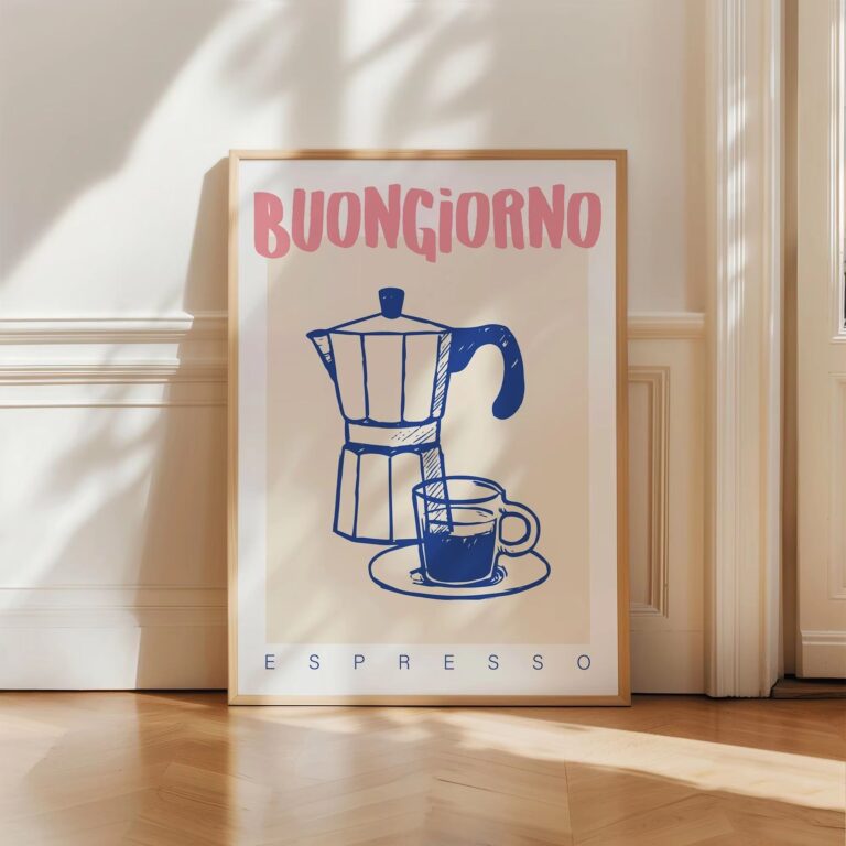 Aisha's pickThe Retro Wall Art for Living Room Worth Your Cash

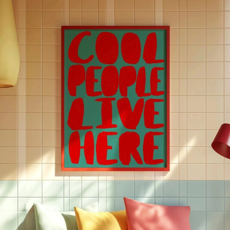 Aisha's pickRetro Art Prints That Give a Room Some Personality
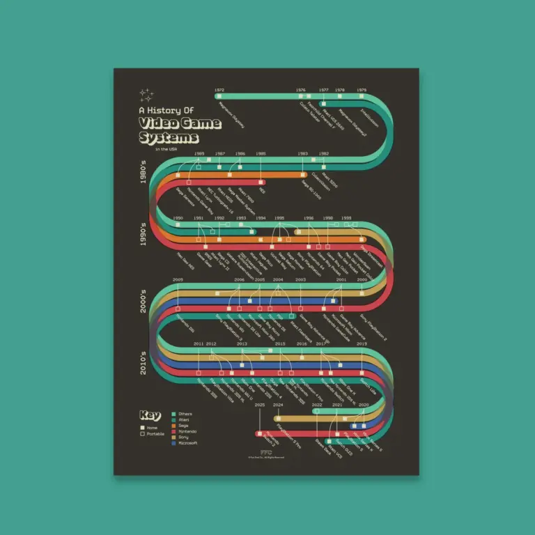
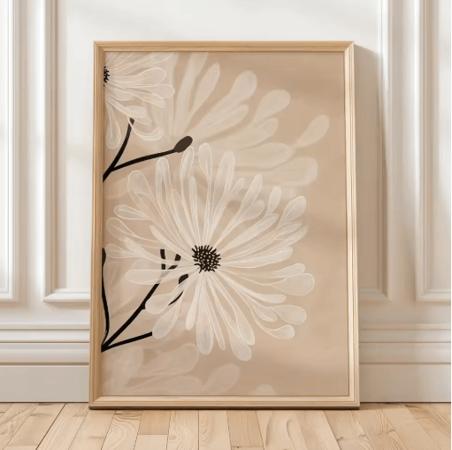 Aisha's pickRetro Wall Art for Office Picked by People Who Care Too Much
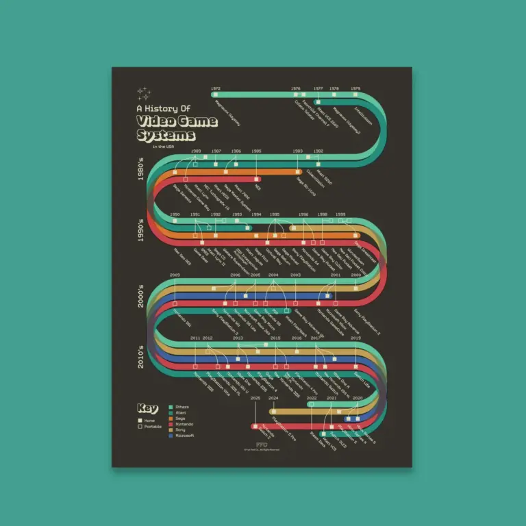
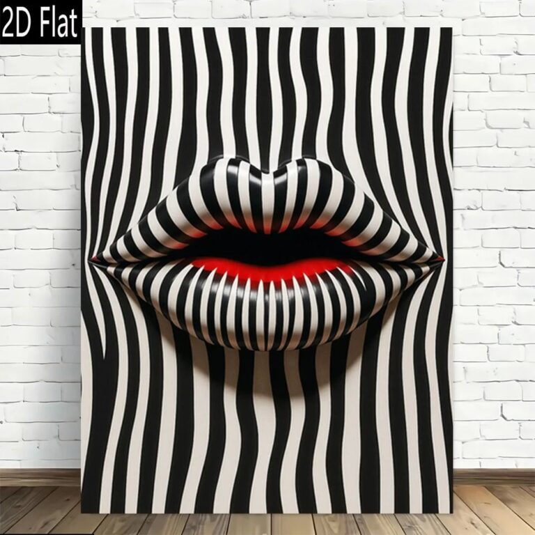 Aisha's pickRetro Art Prints for Bedroom That Don’t Shout About ItAlso worth a lookPrintsThe thing nobody tells you about a print is that it changes with the light, and you won't…See the collections →
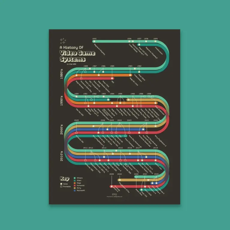
 Aisha's pickOur Shortlist of Retro Wall Art Sets
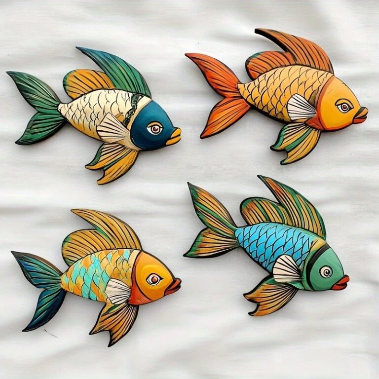
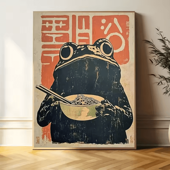 Aisha's pickRetro Art Prints for Living Room That Feel Personal, Not Store Bought
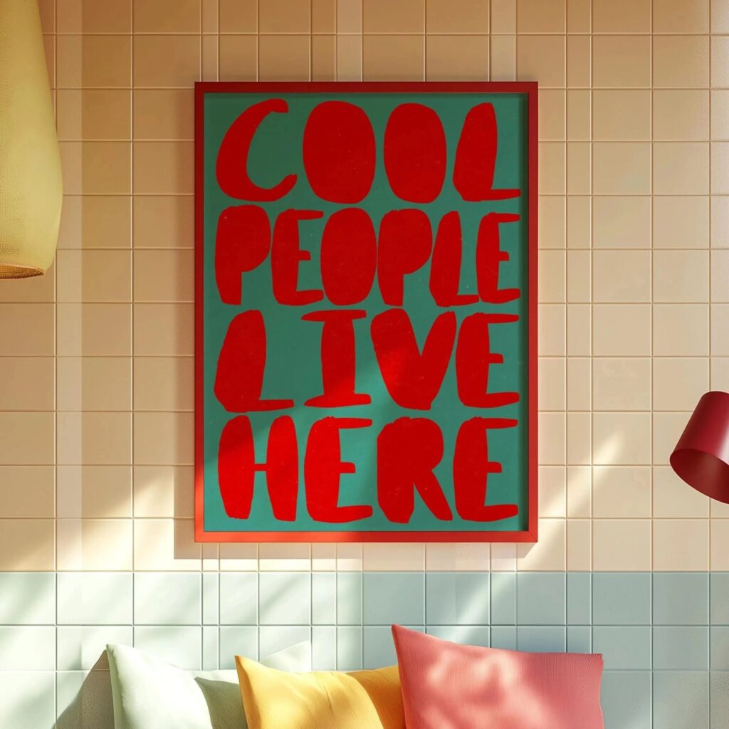
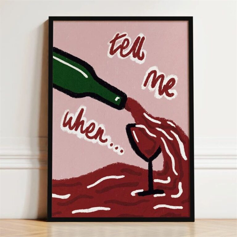 Aisha's pickRetro Wall Posters That Look Like They Cost More
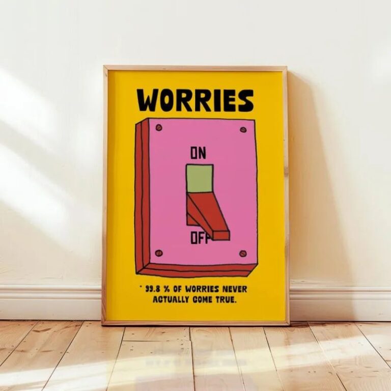
 Aisha's pickRetro Pictures for Rooms That Feel a Bit Bare

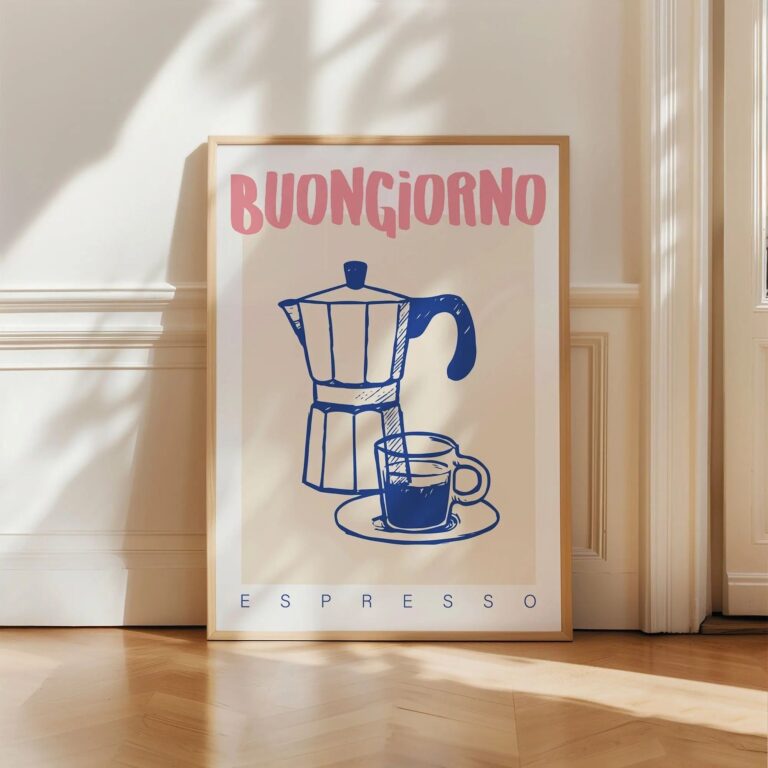 Aisha's pickSpace Retro Posters That Won’t Date in a Year
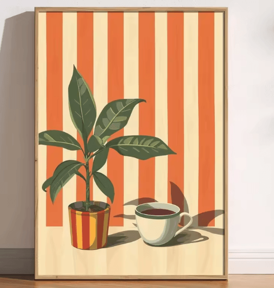
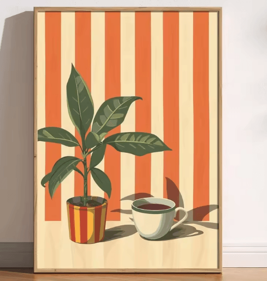 Aisha's pickRetro Posters We’d Make Room For

 Aisha's pickWhite Retro Wall Art for When the Old Ones Give Up
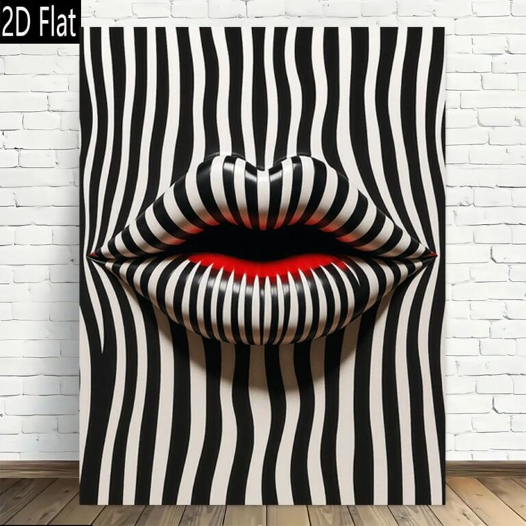
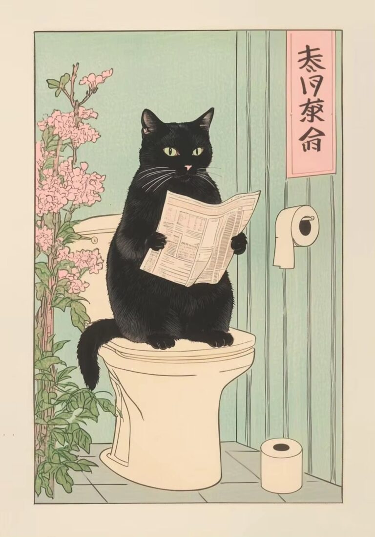 Aisha's pickRetro Posters for Bathroom That Stand Up to Steam

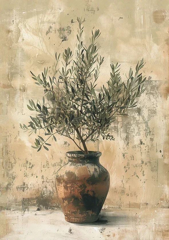 Aisha's pickRetro Posters for Bedroom That Make Great Housewarming GiftsAlso worth a lookModern Wall ArtFor years I figured modern wall art meant one big canvas, something abstract and gray, hung dead center…See the collections →
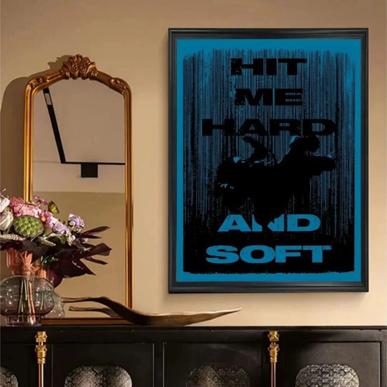
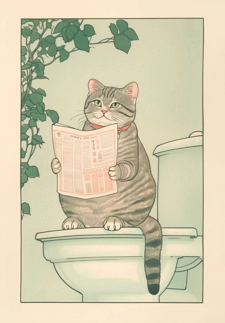 Aisha's pickRetro Posters for Living Room That Start Conversations

 Aisha's pickRetro Posters for Office That Make a Room Feel Finished

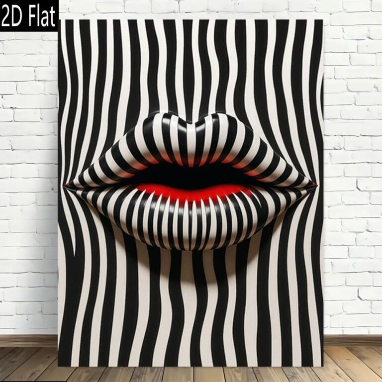 Aisha's pickRetro Prints for Filling an Awkward Gap
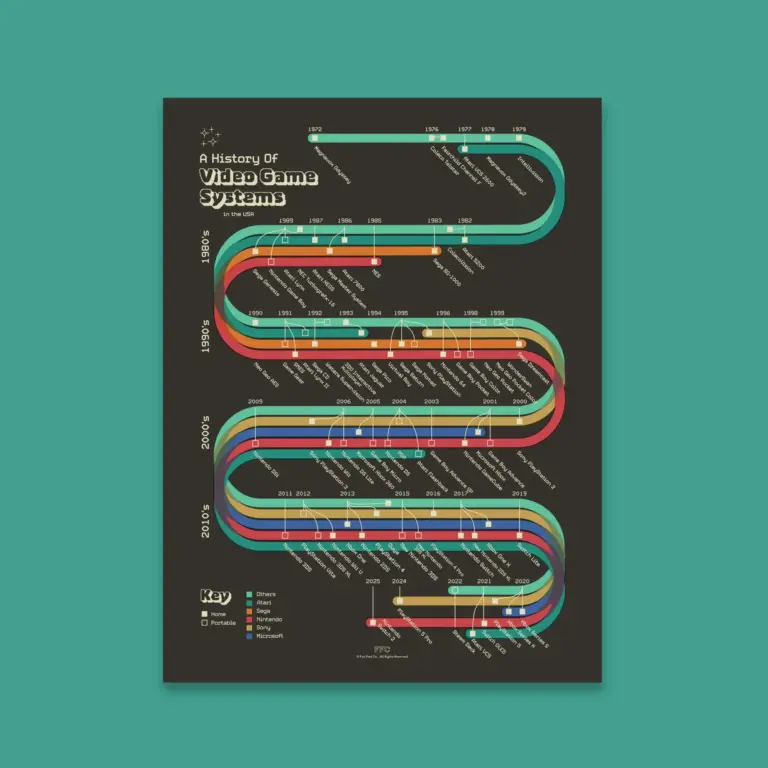
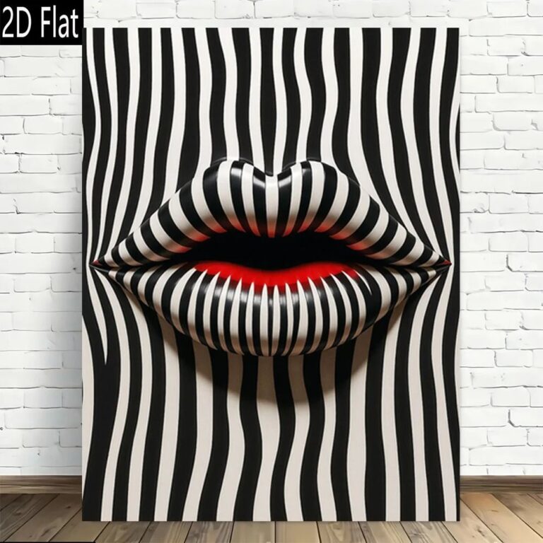 Aisha's pickBlack Retro Wall Art That Earns Its Place

 Aisha's pickRetro Print Sets That Catch the Eye Without Taking Over
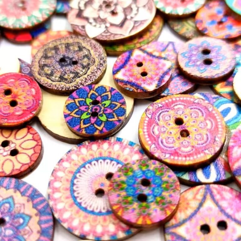
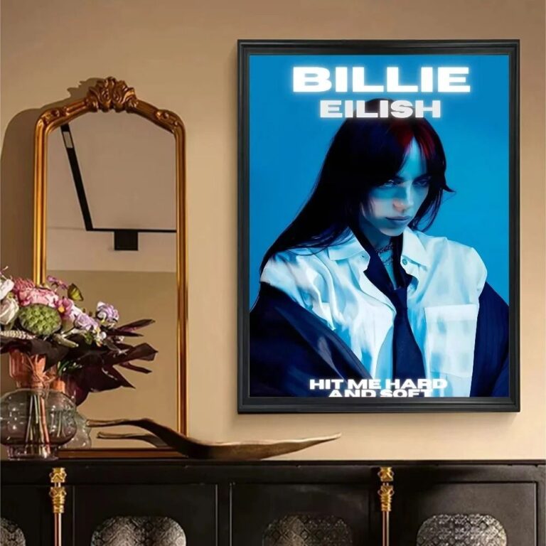 Aisha's pickBlue Retro Wall Art That Earns Its Place