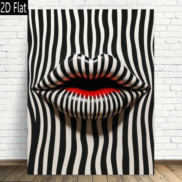
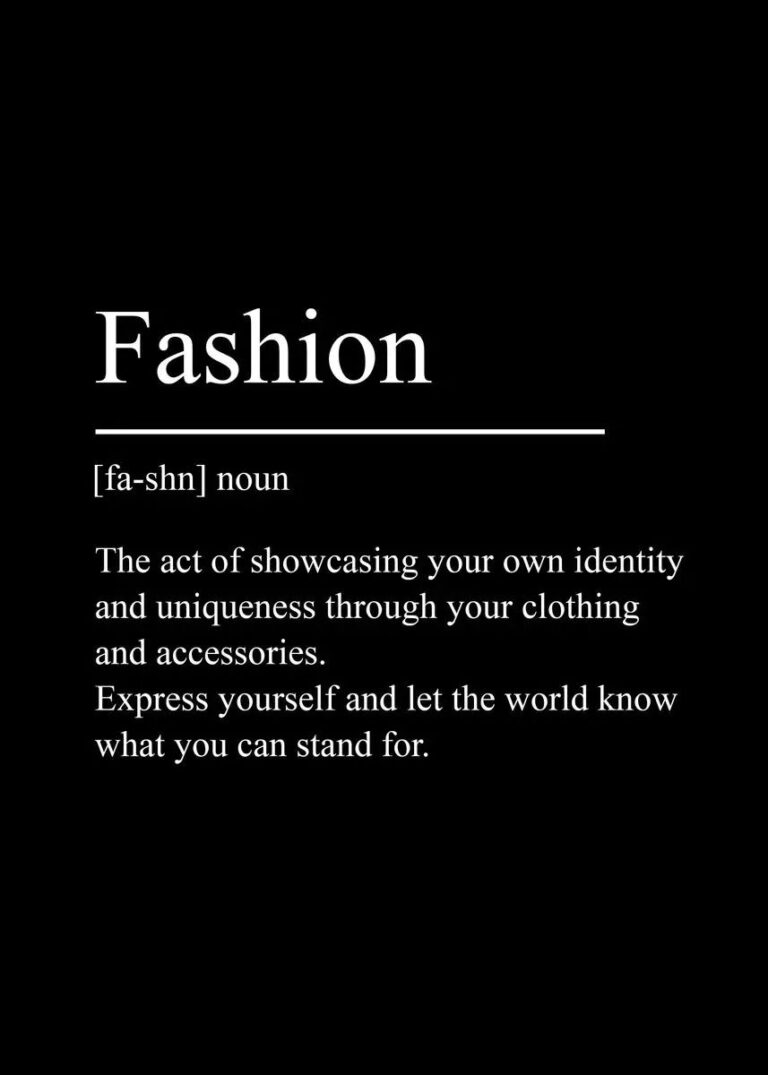
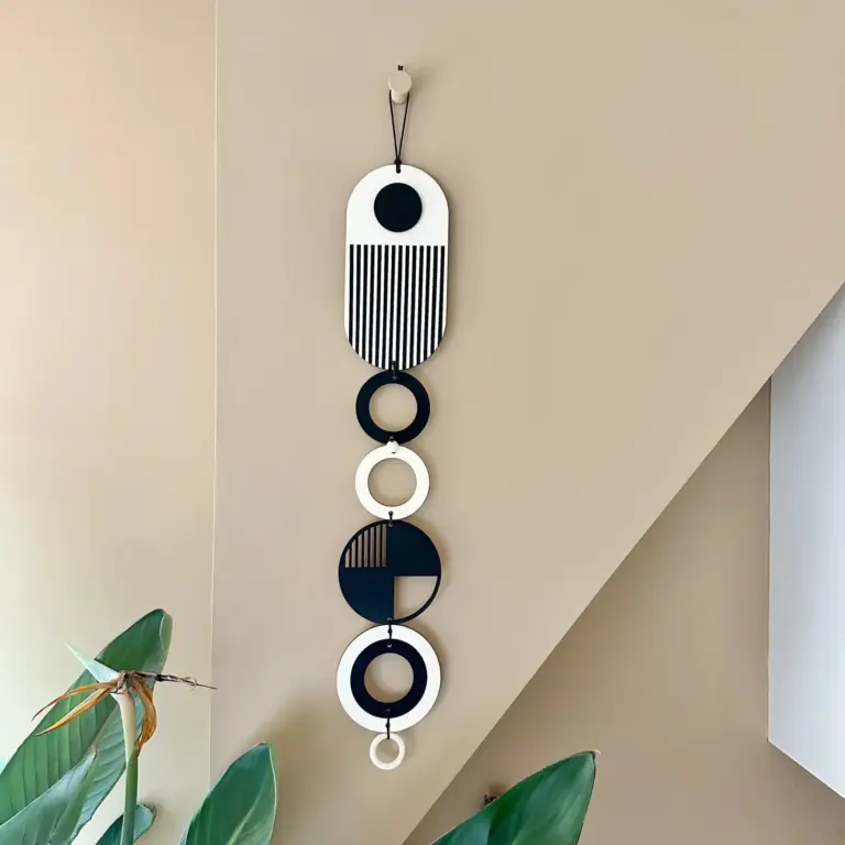
Minimalist wall art used to mean one thing: a single black and white line drawing of a woman's face, hung slightly too high, in every rental apartment photo from about 2019 onward. That's loosened up a lot, and for the better. Now it covers abstract color blocking, simple shapes, quiet line work, pieces that actually have some personality instead of just looking like a placeholder for personality. You can still buy the generic version, but you don't have to.
It struggles next to anything else loud. A heavily patterned rug, a busy gallery wall, ornate furniture with lots of carved detail, all of that will fight a minimalist piece for attention and the piece will lose, because its whole job is restraint. It also looks a little sad on its own in a huge, blank expanse of wall with nothing else around it, like it got left there by accident. It wants either a clean, fairly calm room to anchor, or a small supporting role next to other simple things.
Sizing is where most people get it wrong, and I include myself, because I once hung a print barely bigger than a sheet of paper above a queen bed and it looked like a stamp. The general rule is to fill about two thirds of the wall space you're working with, or if it's going over furniture, two thirds to three quarters of that furniture's width. Measure the actual wall, not the vibe of the wall. Hold up a piece of butcher paper cut to size and live with it taped up for a day before you commit to hanging.
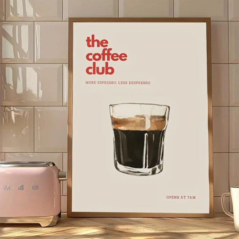
Quality shows up fast once you look closely. Check the frame corners for tight, flush joints, not a visible gap or a smear of glue. Run a finger along the edge, a good one feels solid, not like thin molding wrapped around nothing. If it's canvas, the canvas should be taut with no give when you press it, and the print itself should look crisp up close, not slightly blurry or pixelated, which happens with cheap scaled up images. Paper should feel like actual stock, not printer paper in a frame.
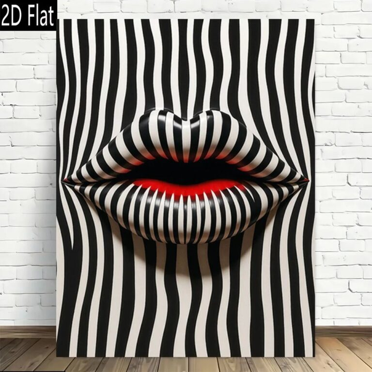
Where it's the wrong choice is anywhere that already has a strong visual identity, a room full of vintage finds, bold wallpaper, a collection of mismatched frames you love. Forcing minimalist art into that just looks like it wandered in from another apartment. It also won't fix a room that has nothing else going on, it needs company, not a solo assignment.
I'd put the first piece in the living room, somewhere people actually sit and look at it.
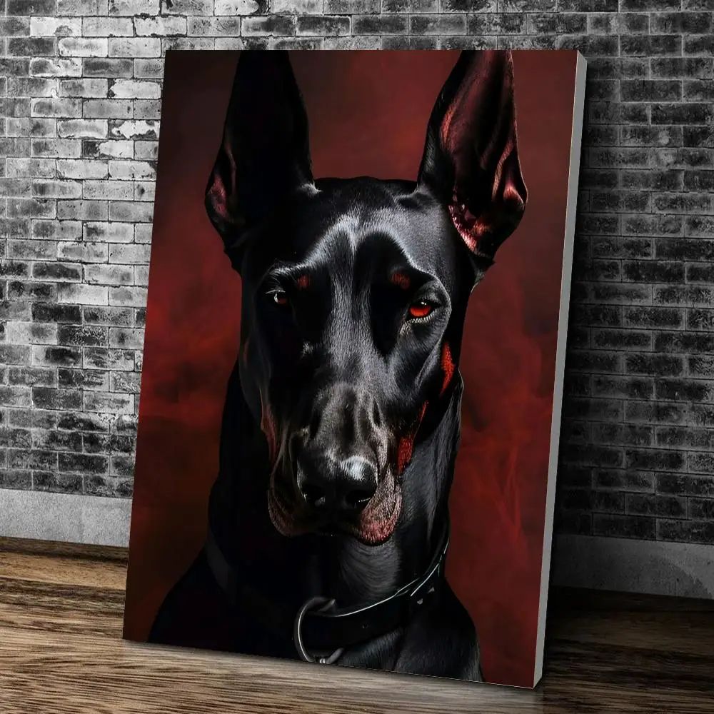 Aisha's pickMinimalist Posters for Bedroom That Feel Personal, Not Store Bought
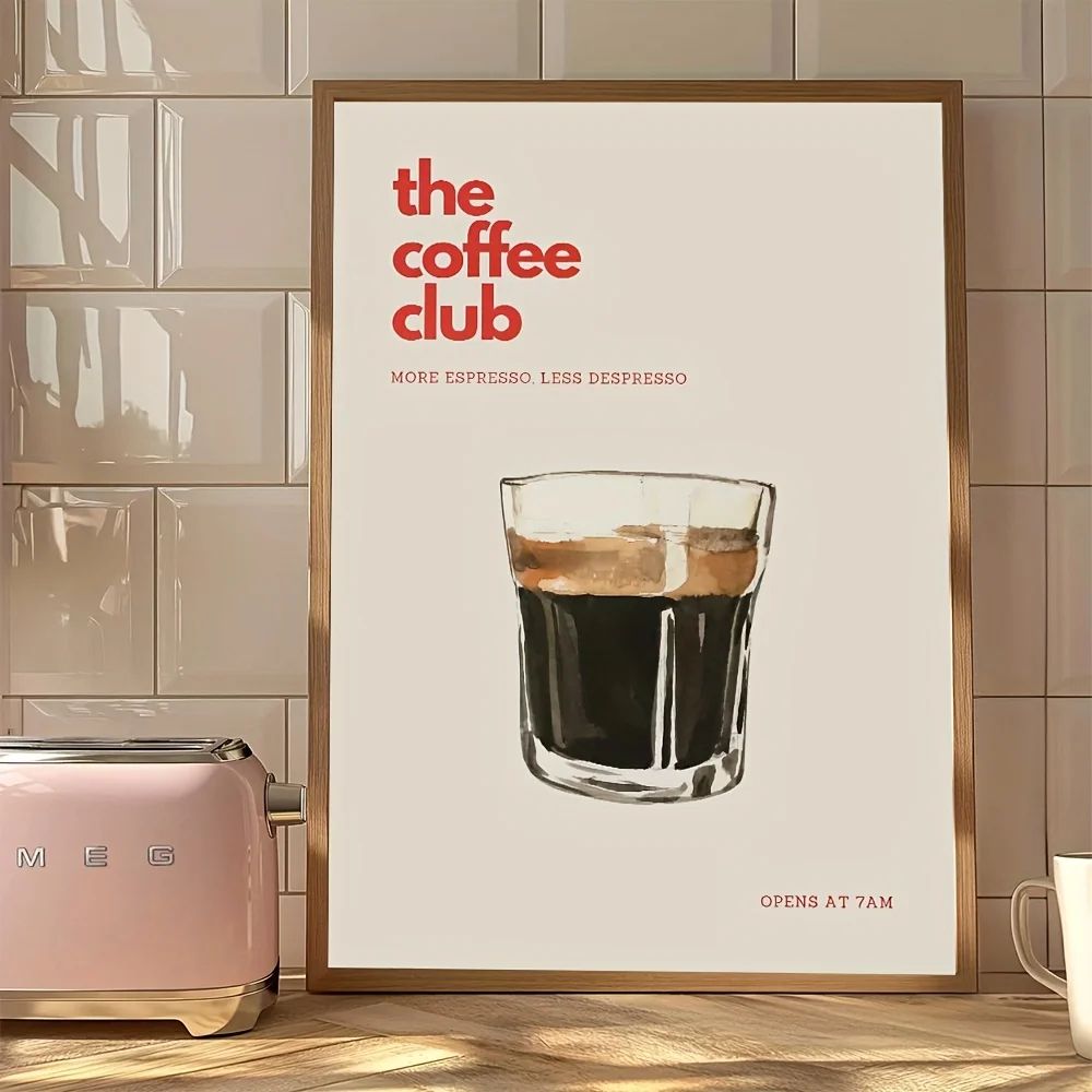
 Aisha's pickSimple Minimalist Posters for Living Room Done Well
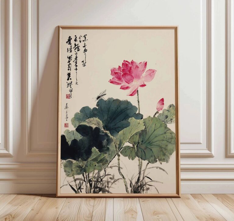
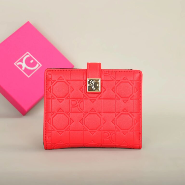 Aisha's pickMinimalist Prints We’d Make Room For

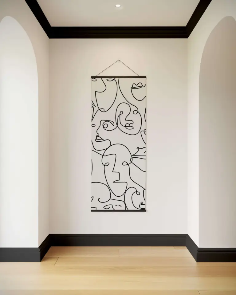 Aisha's pickGood Minimalist Wall Art Without the Big Price Tag
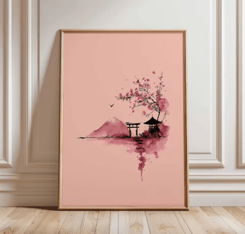
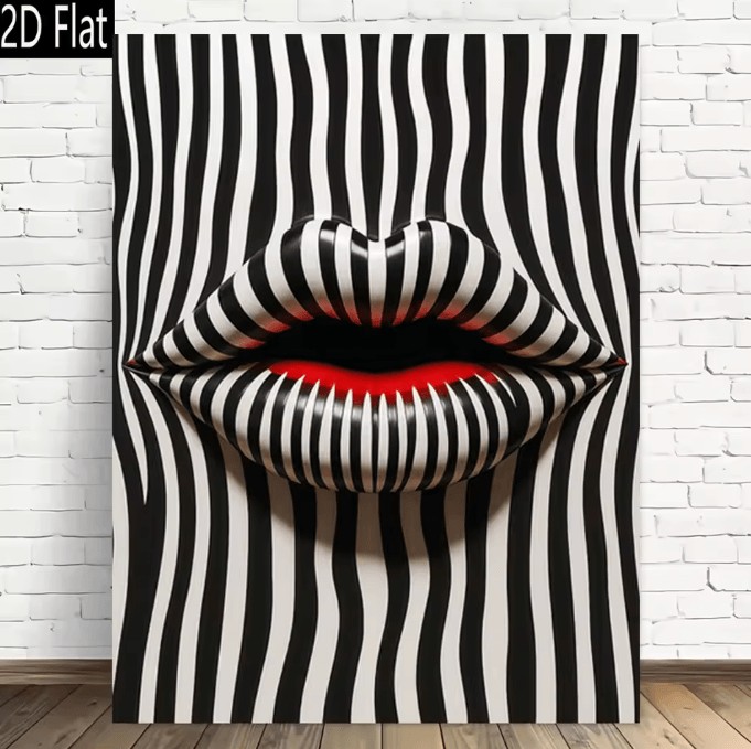 Aisha's pickOur Shortlist of Minimalist Wall Art for Bedroom
 Aisha's pickGood Black Minimalist Art Prints That Don’t Cost a Fortune
 Aisha's pickMinimalist Wall Art for Living Room Worth Your Money
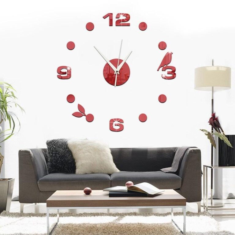
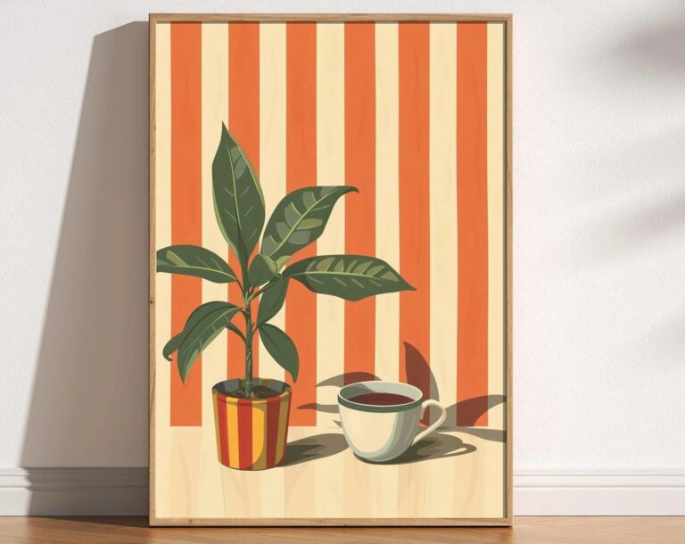 Aisha's pickBlack Minimalist Posters Pulled From Dozens of Stores
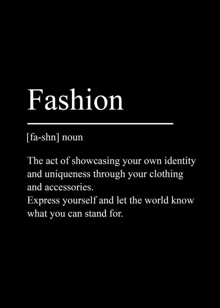
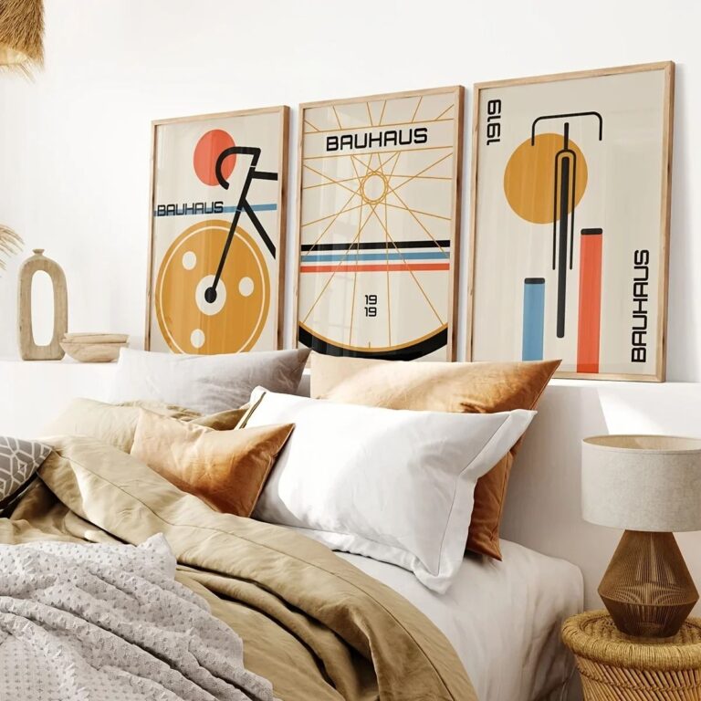 Aisha's pickMinimalist Wall Art for Office That Does What It ShouldAlso worth a lookPrintsThe thing nobody tells you about a print is that it changes with the light, and you won't…See the collections →
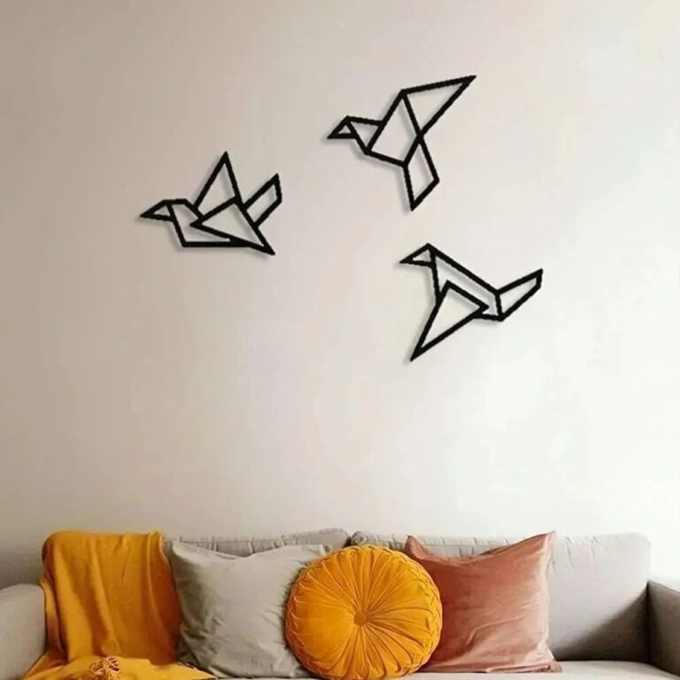
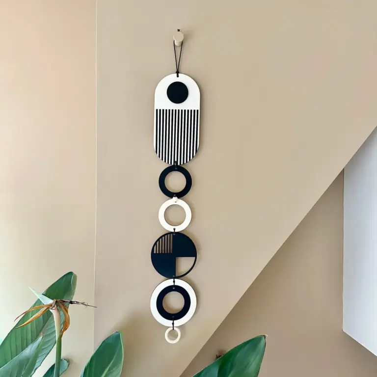 Aisha's pickBlack Minimalist Wall Art That Doesn’t Cost a Fortune

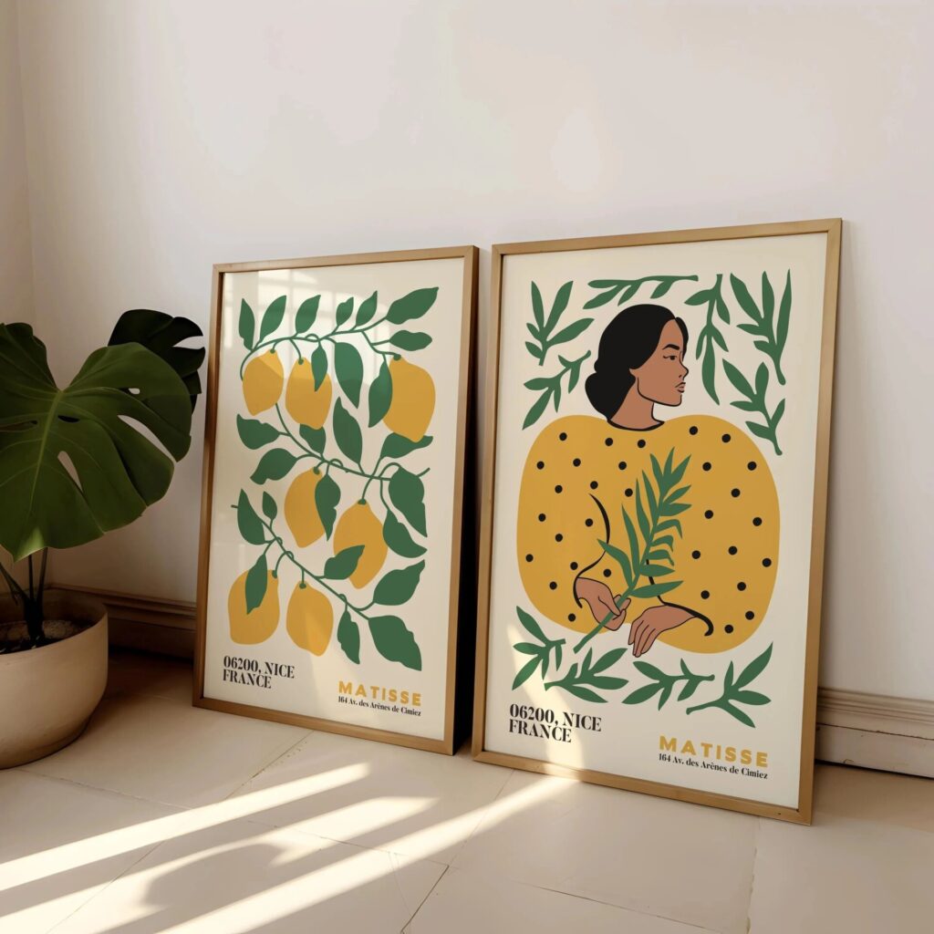 Aisha's pickMinimalist Wall Art Sets From Stores Big and Small
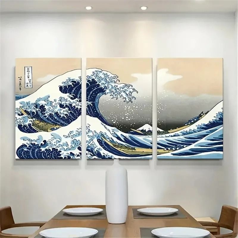
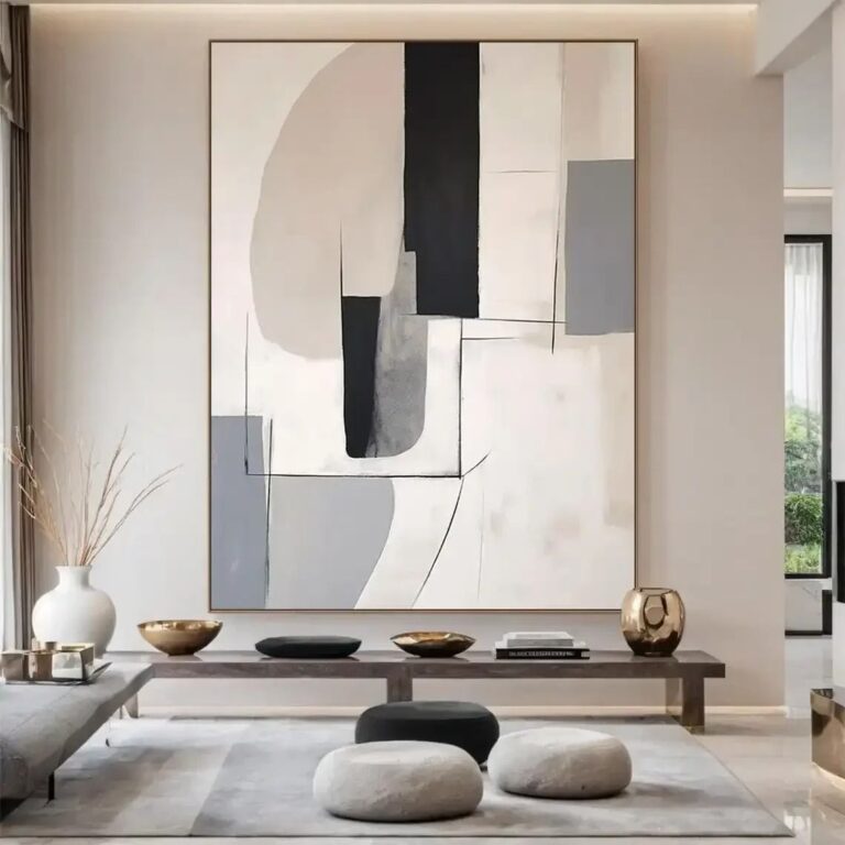 Aisha's pickLarge Minimalist Wall Art From Brands You Know and a Few You Won’t
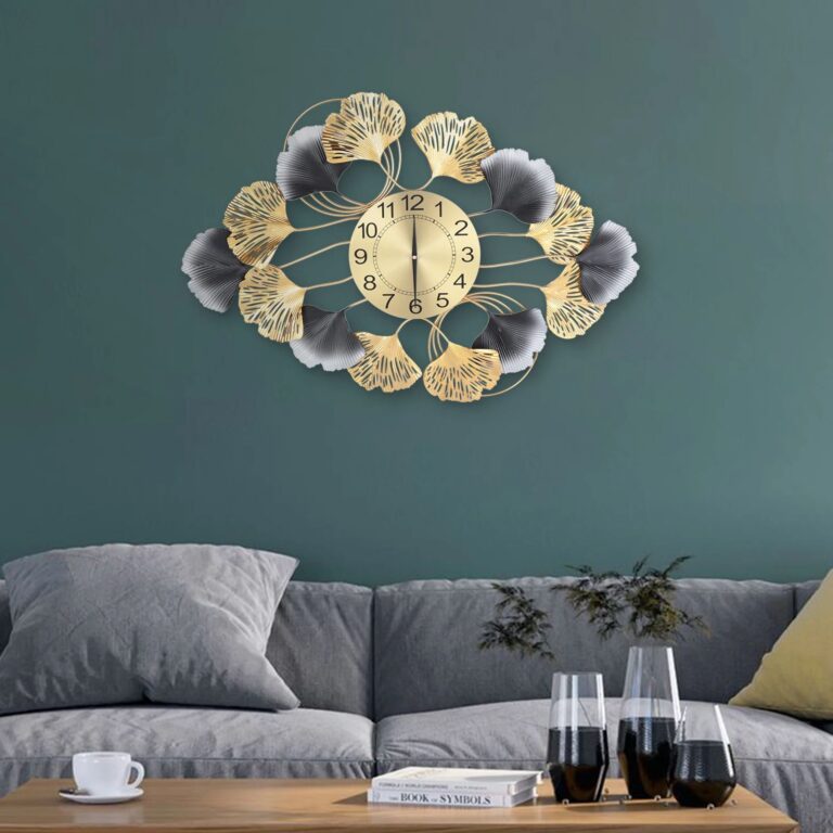
 Aisha's pickMinimalist Wall Pictures for Rooms That Feel a Bit Bare
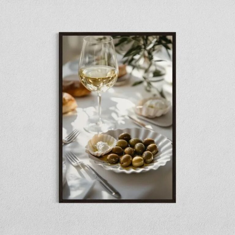 Aisha's pickMinimalist Art Prints With Some Character
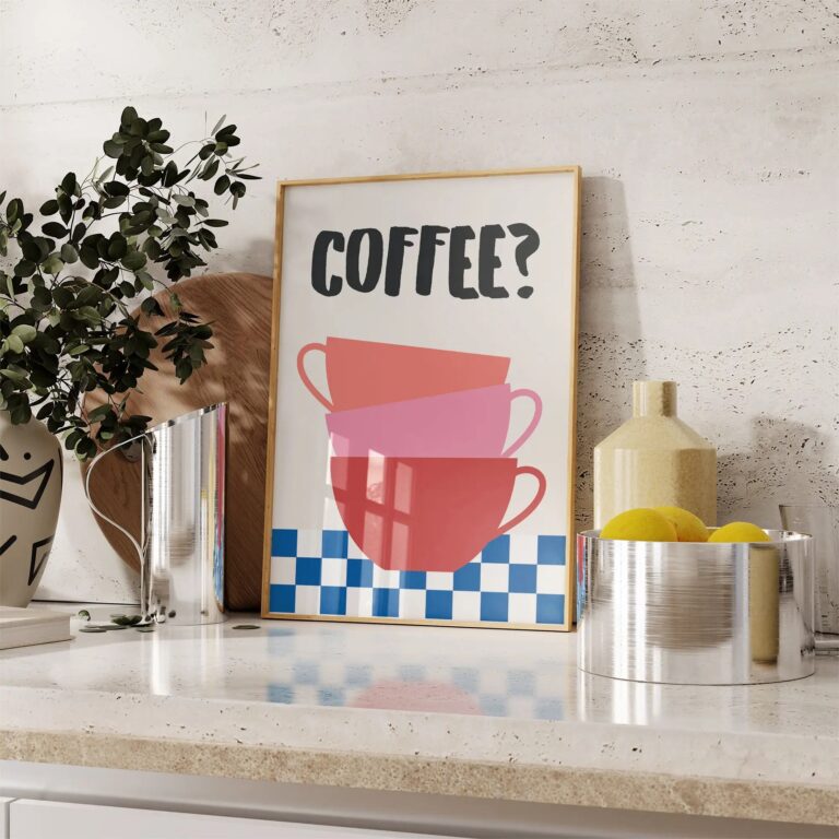
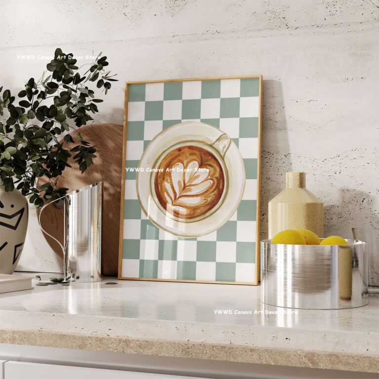 Aisha's pickMinimalist Wall Posters That Don’t Need Babying
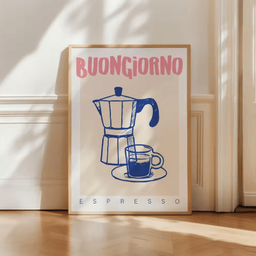
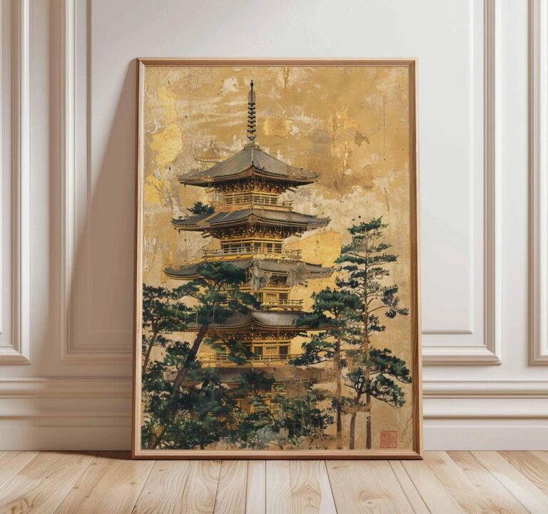 Aisha's pickMinimalist Art Prints for Bedroom That Catch the Eye Without Taking Over
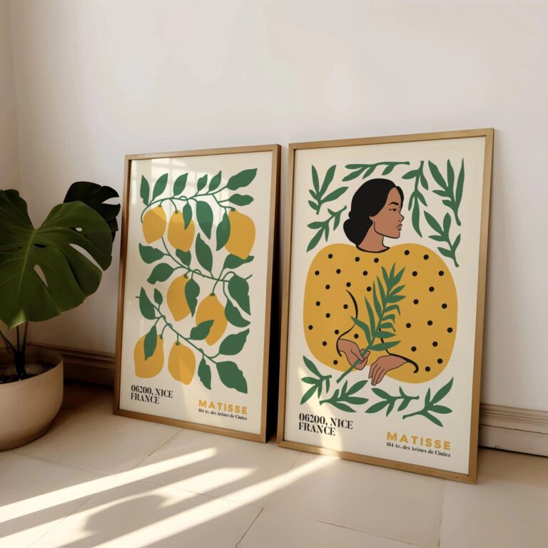
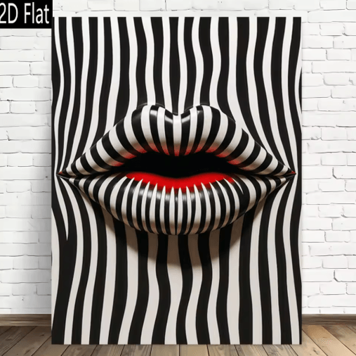 Aisha's pickWhite Minimalist Art Prints That Start Conversations
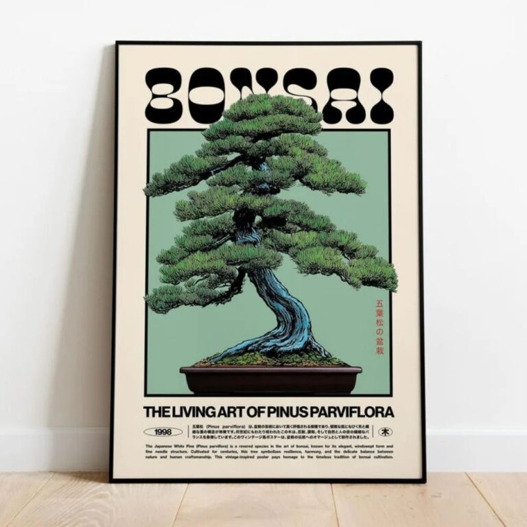
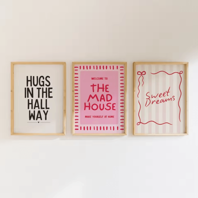 Aisha's pickDecent Minimalist Art Prints for Living Room Without the HassleAlso worth a lookModern Wall ArtFor years I figured modern wall art meant one big canvas, something abstract and gray, hung dead center…See the collections →
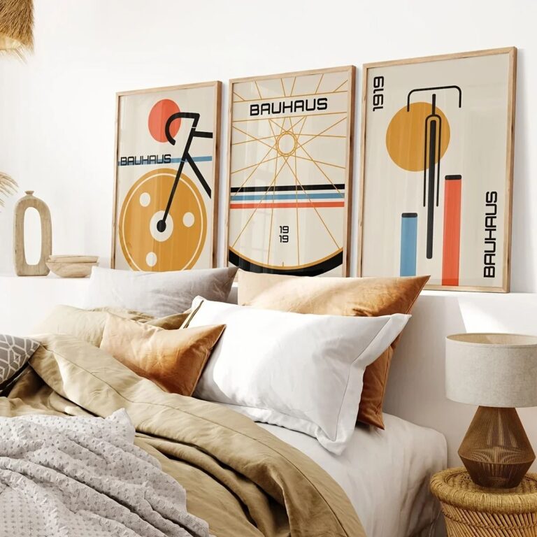
 Aisha's pickWhite Minimalist Posters With a Story to Them
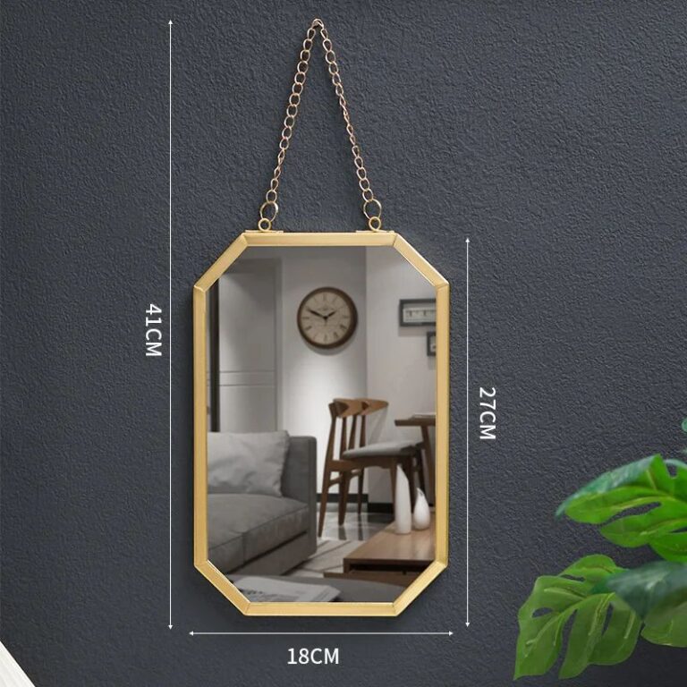 Aisha's pickMinimalist Framed Art That Holds Up
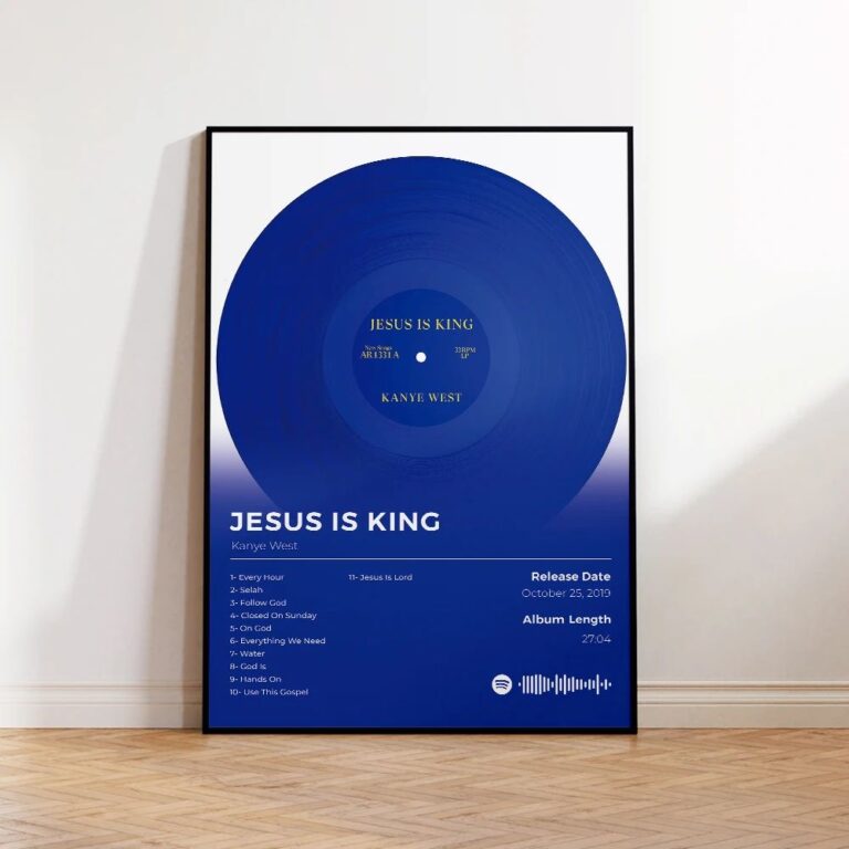
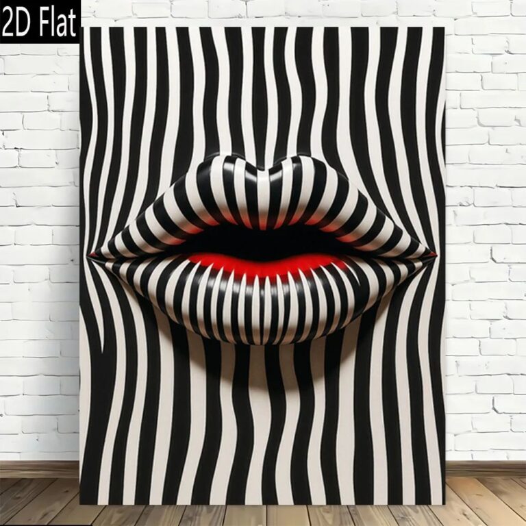 Aisha's pickWhite Minimalist Wall Art Pulled From Dozens of Stores
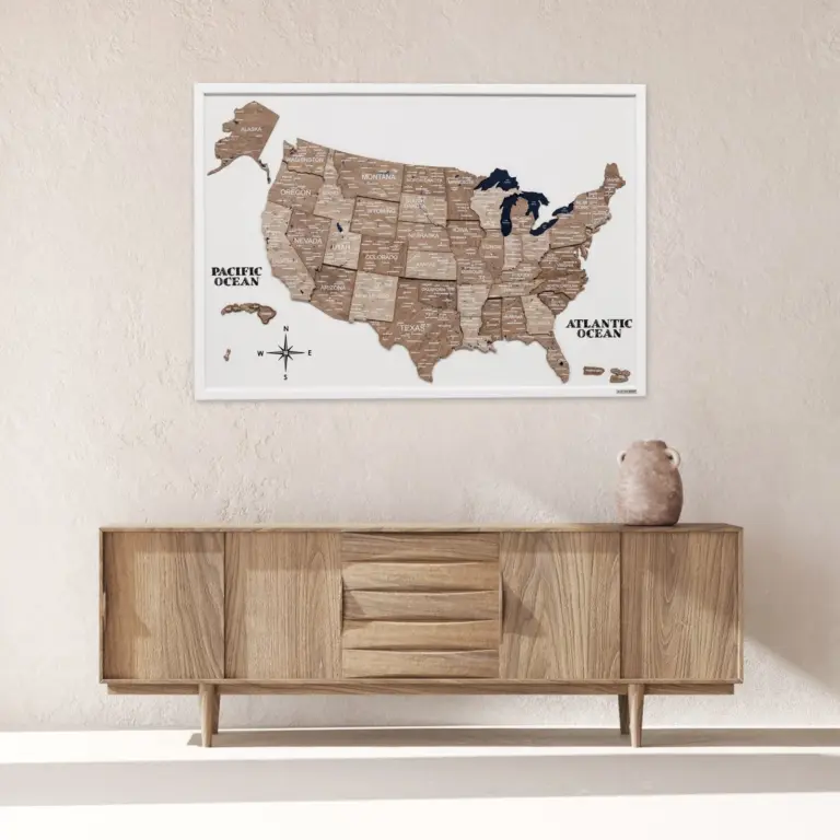
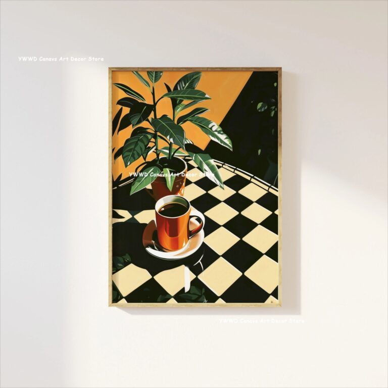 Aisha's pickMinimalist Photography Prints That Look Better in Real Life