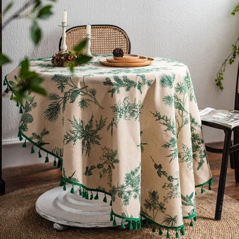
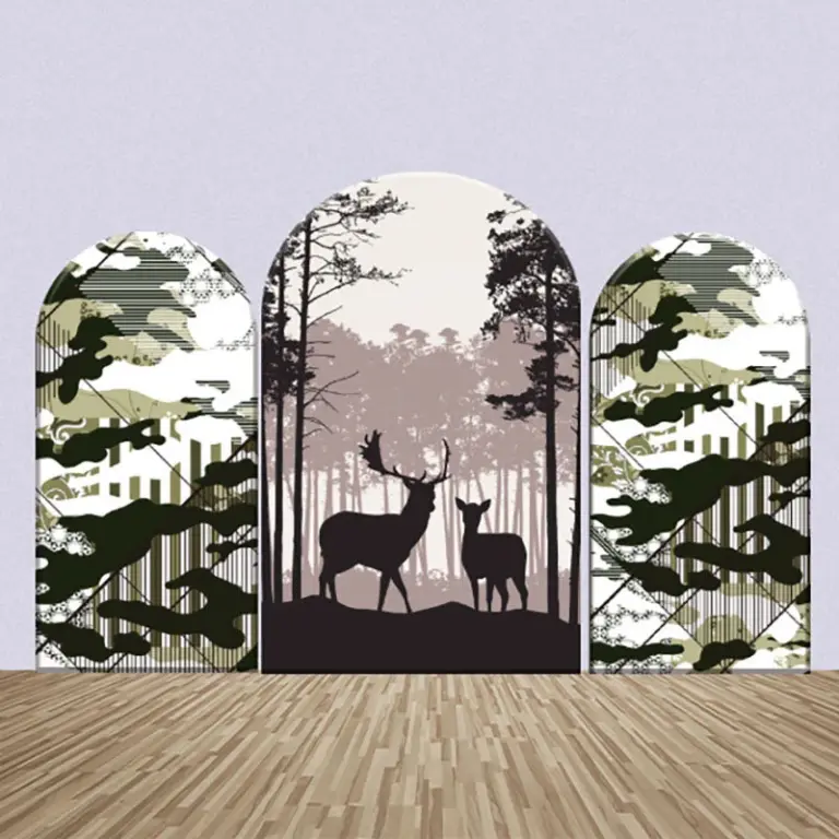
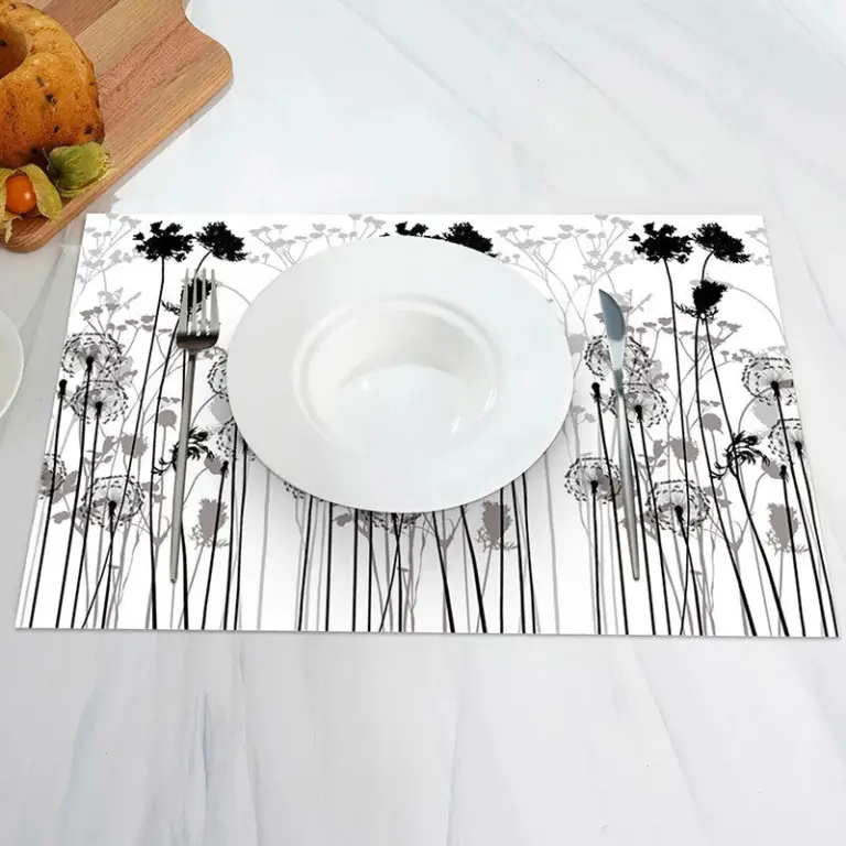
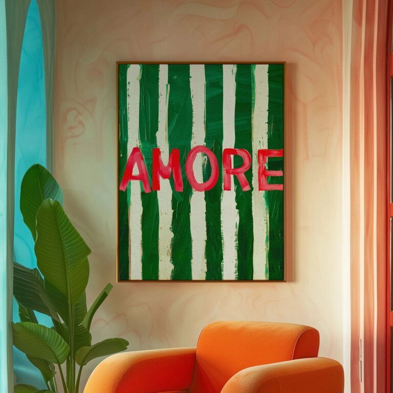
The first thing I look at is whether the green reads as a color or as a shape. Some prints are so detailed, so busy with leaves and stems, that from across the room all you register is a dark blob on the wall. The good ones hold their color even at a distance, so you can glance over from the kitchen and know exactly what you're looking at without squinting.
If you own zero pieces of green wall art right now, start with something botanical but simple, a single leaf form or a loose, abstract wash rather than a detailed print of an entire fern. Detailed botanical prints are lovely but they ask a lot of a wall that's otherwise bare, and they can tip into looking like a doctor's office poster if the frame is wrong. One confident shape gives you the color without the clutter, and it's easier to build around later if you decide you want a second or third piece.
Green works almost everywhere, which is rare for a color, but it earns its keep hardest in rooms that get decent natural light during the day and go a bit moody at night, a living room with a west facing window, a bedroom that catches morning sun. In a north facing room with weak light all day, a deep forest green print can go flat and almost black by four in the afternoon, so I'd lean toward a lighter, warmer green in a room like that. It also suits homes that already lean toward wood tones and plants, since it doesn't fight with either, it just sits in the same family.
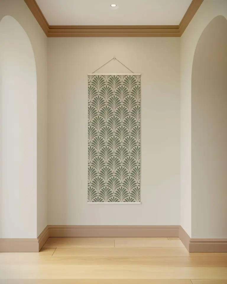
For finishes and shades, the ones I find easiest to live with long term are the muted, almost grayed out greens, sage, olive, a dusty eucalyptus tone, rather than anything bright or kelly green. Bright green art is a lot of personality to commit a whole wall to, and I say that as someone who bought a bright green abstract print convinced it would look bold and instead it looked like it was arguing with the sofa for two years before I moved it to a hallway, where it finally behaves. Matte finishes age better than glossy ones too, since glossy paper shows every bit of glare the second the sun hits it in the afternoon.
The one mistake I'd steer you away from is matching the green in the print exactly to a green somewhere else in the room, a cushion, a throw, a lampshade. It looks accidental and try hard at the same time, like you ran out of one fabric and had to improvise. Let the print's green be its own thing and let the rest of the room be a few shades off.
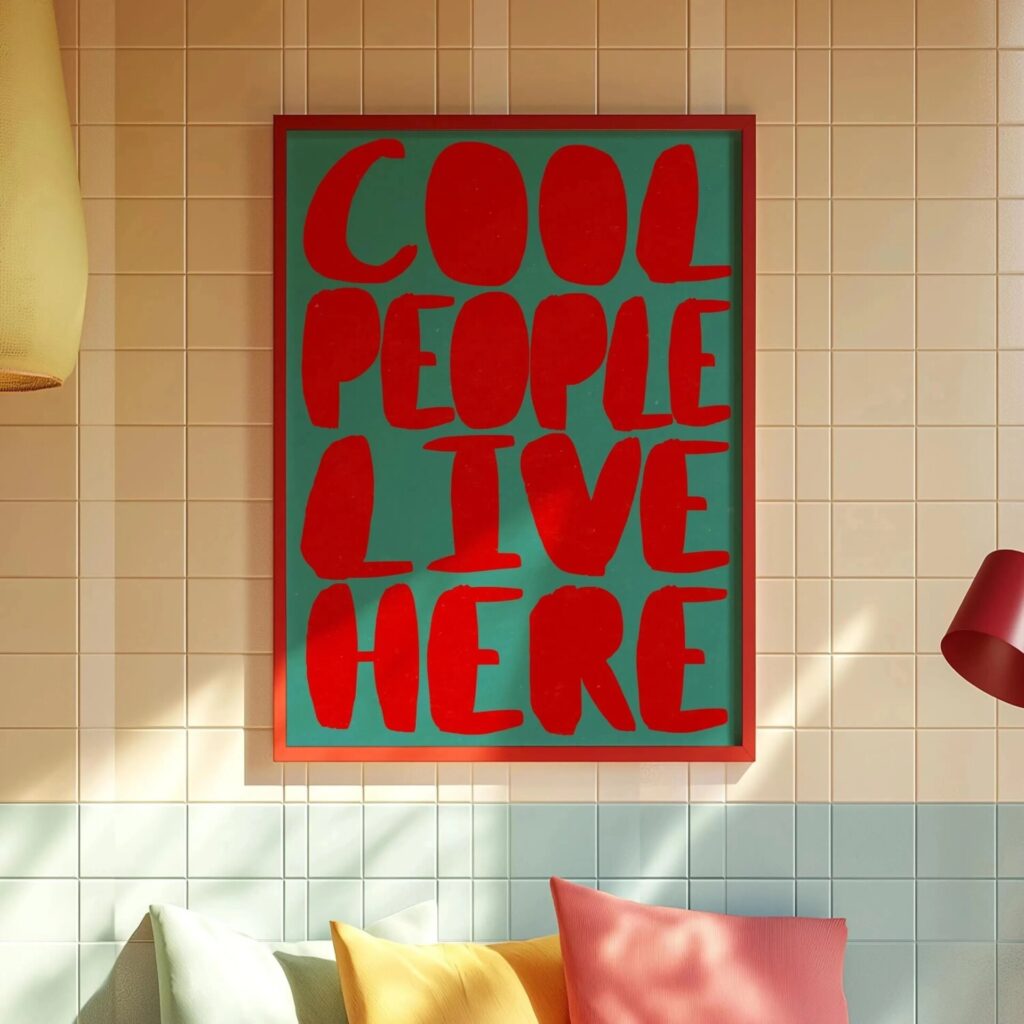 Aisha's pickGreen Retro Wall Art You’ll Live With Happily for Years
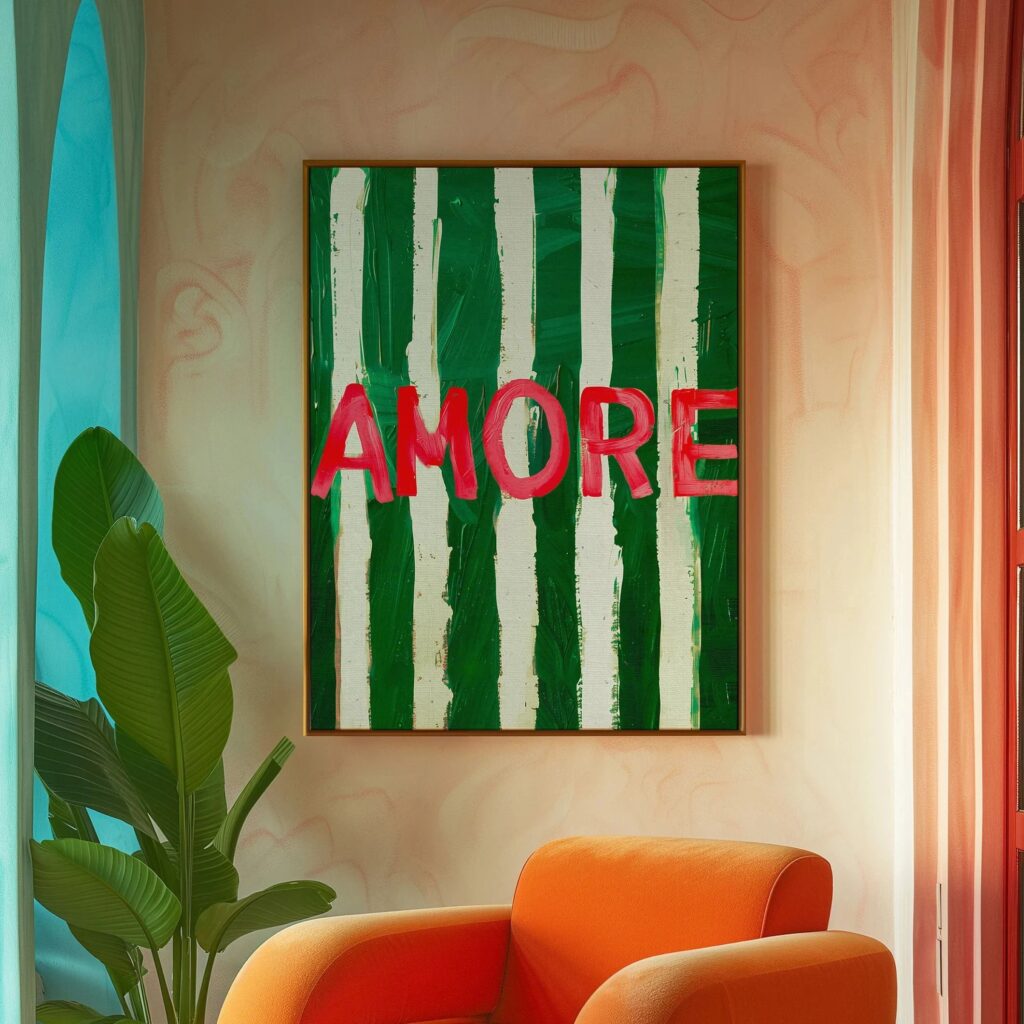
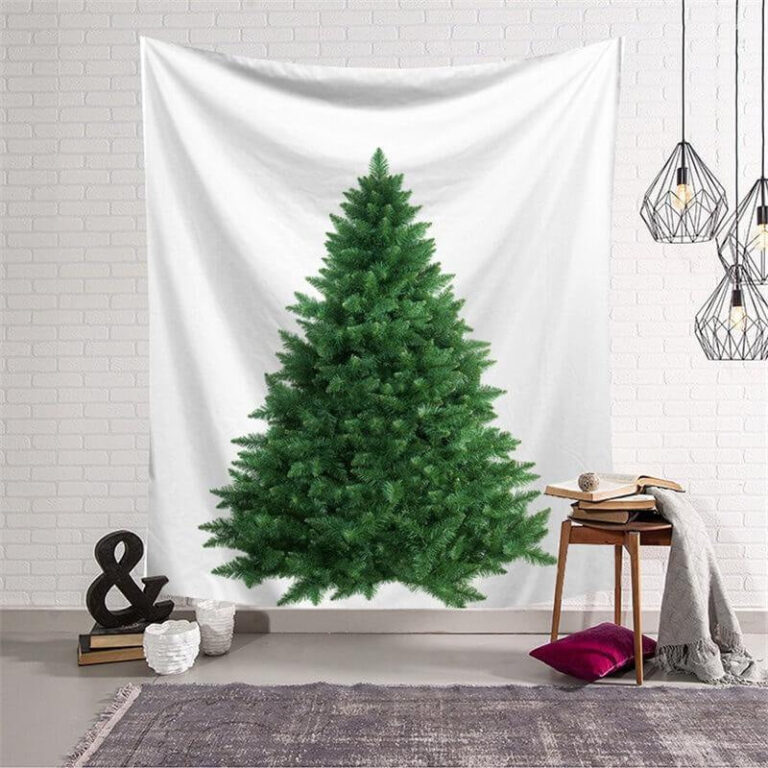 Aisha's pickNo Fuss Green 3D Wall Art
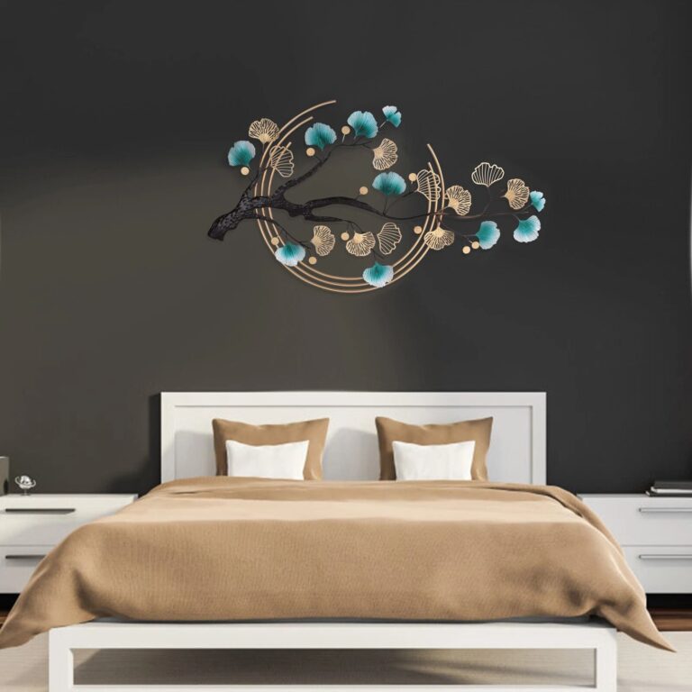
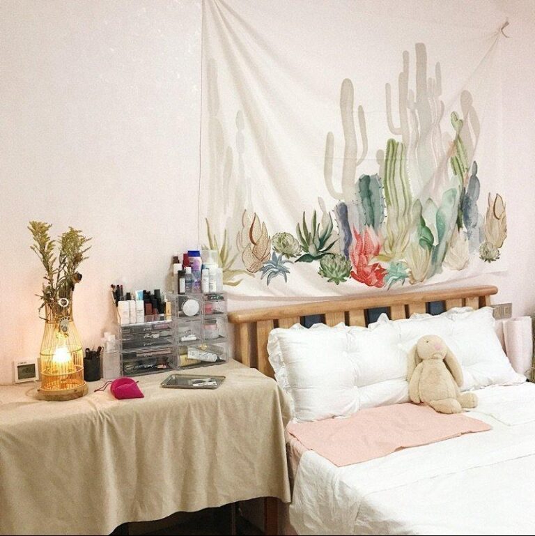
 Aisha's pickGreen Tapestries We Keep Coming Back To
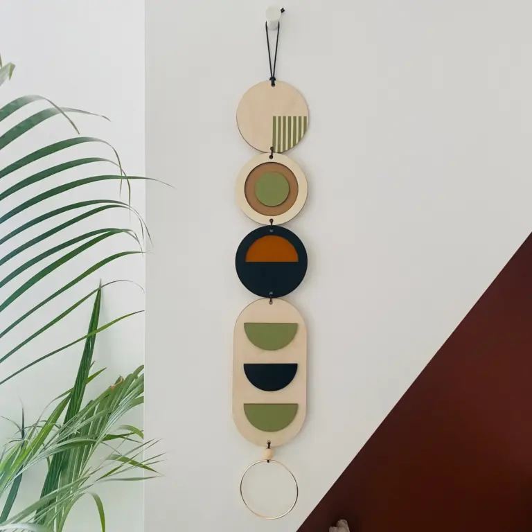
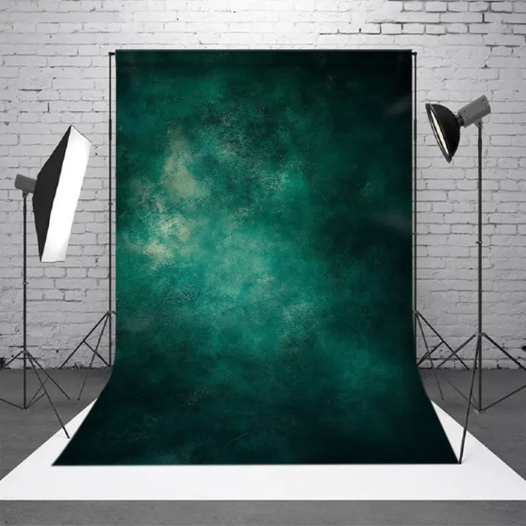 Aisha's pickGreen Abstract Wall Art That Looks the Part
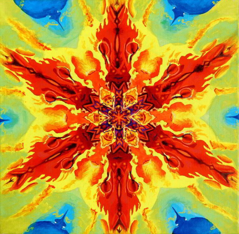
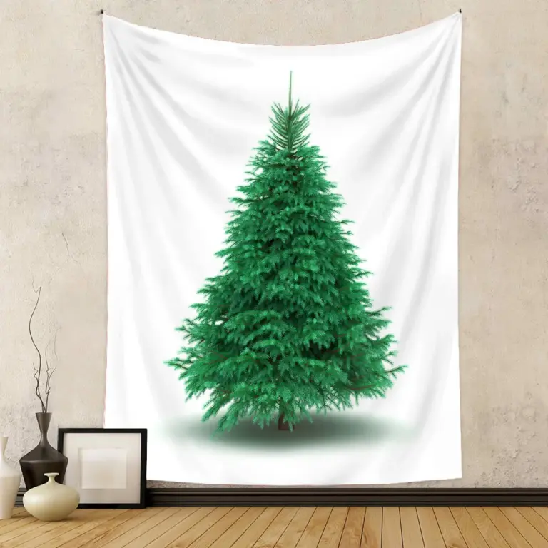 Aisha's pickGreen Tree Wall Art Picked by People Who Care Too Much
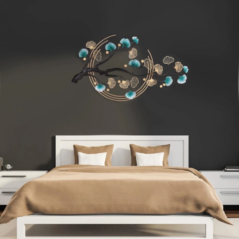
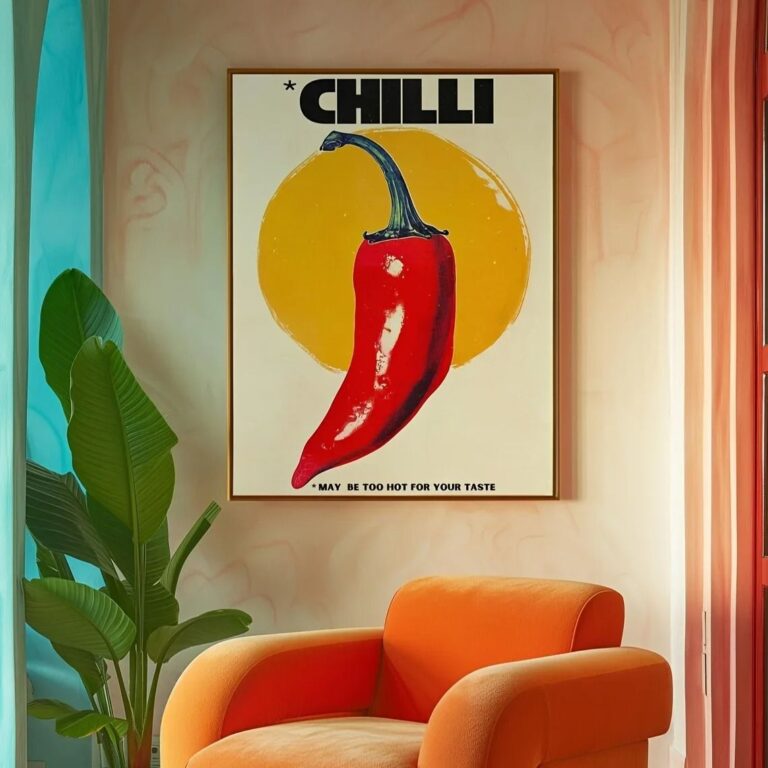 Aisha's pickGreen Art Prints That Start Conversations
 Aisha's pickGreen Vintage Wall Art From Brands You Know and a Few You Won’t
 Aisha's pickGreen Canvas Art From Brands You Know and a Few You Won’t

 Aisha's pickGreen Wall Art for When the Old Ones Give UpAlso worth a lookPrintsThe thing nobody tells you about a print is that it changes with the light, and you won't…See the collections →
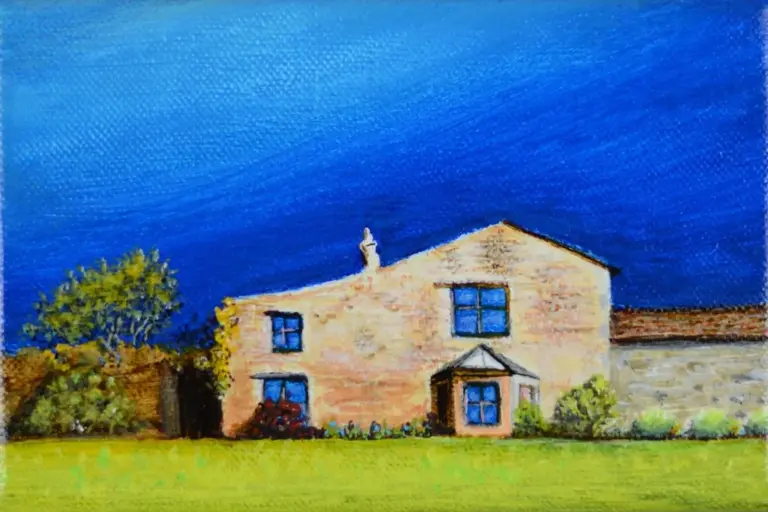 Aisha's pickGreen Canvas Paintings We Keep Coming Back To
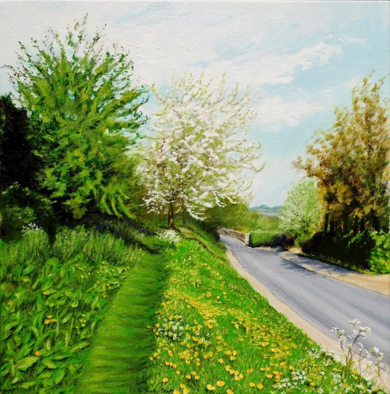
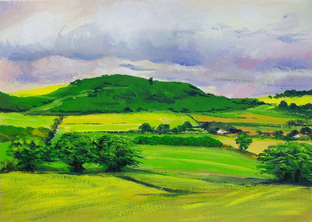 Aisha's pickGreen Wall Art Sets That Make Great Housewarming Gifts
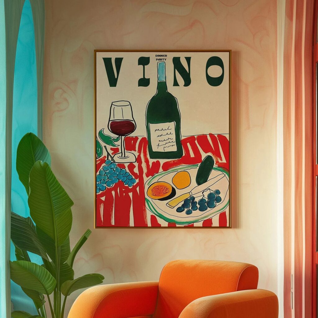
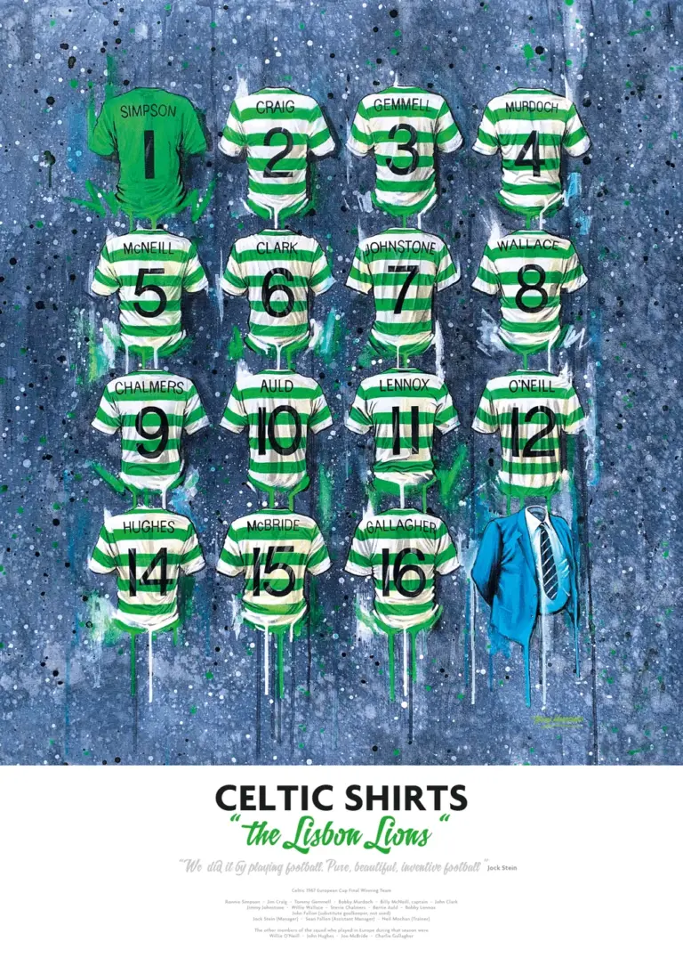 Aisha's pickGreen Canvas Prints We’d Buy Again
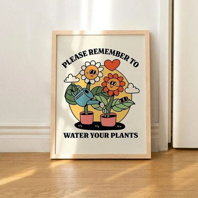
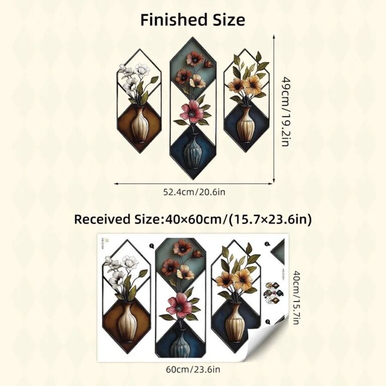 Aisha's pickGreen Wall Murals From Stores Big and Small
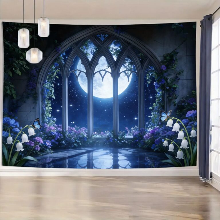
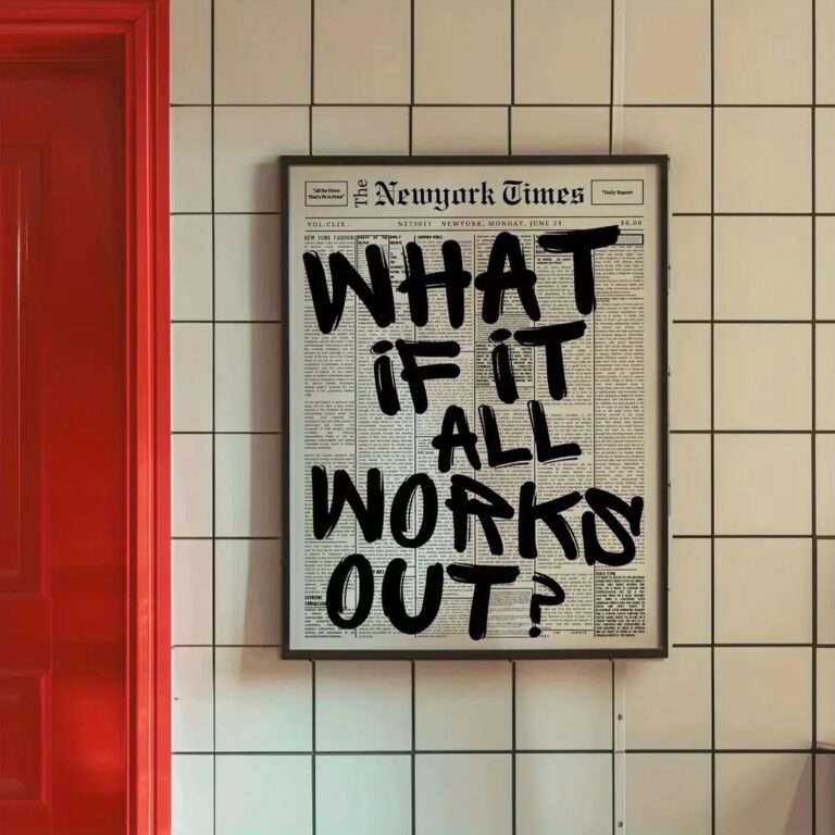 Aisha's pickDecent Green Canvas Wall Art Without the Hassle
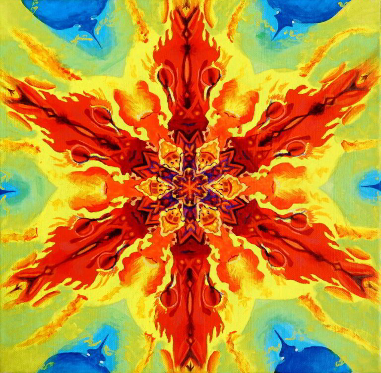
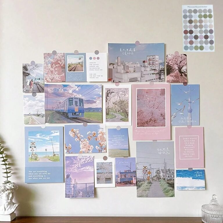 Aisha's pickGreen Wall Posters That Catch the Eye Without Taking Over
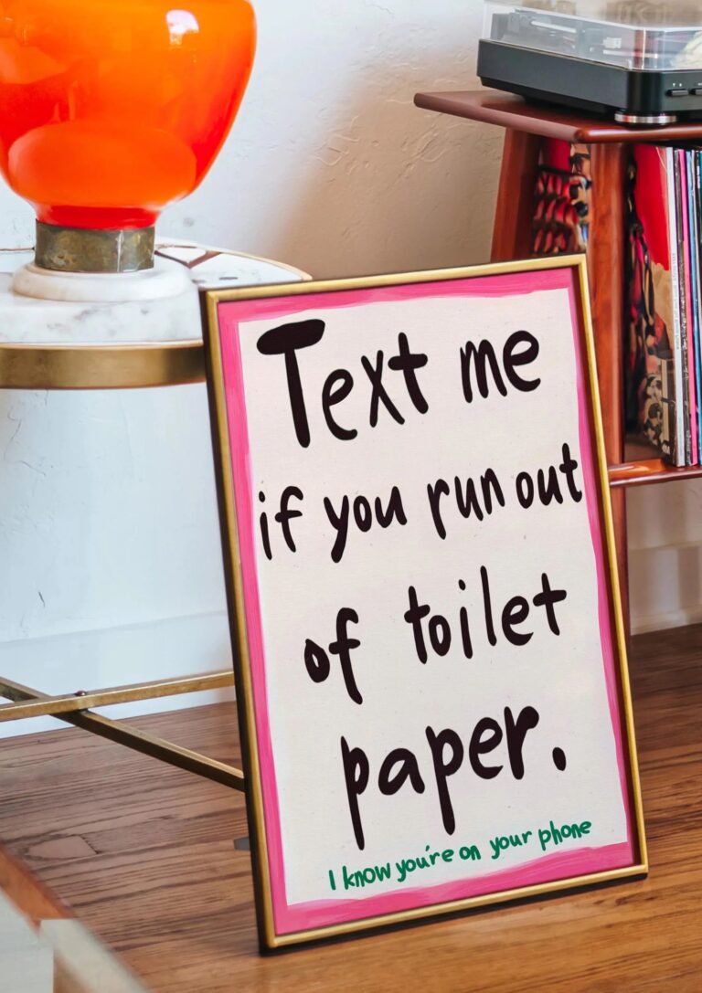
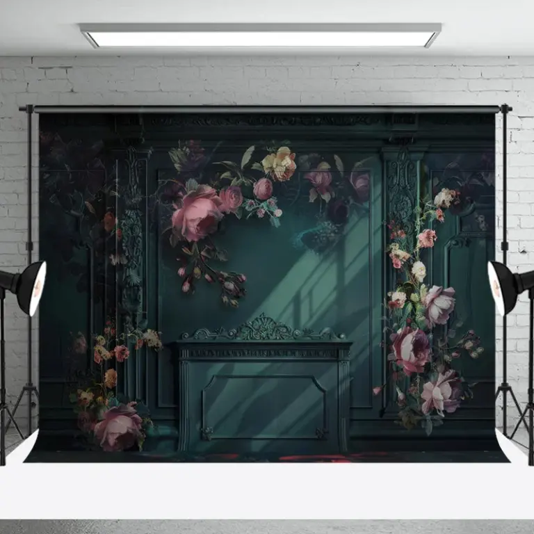 Aisha's pickGreen Floral Wall Art That Doesn’t Cost a Fortune
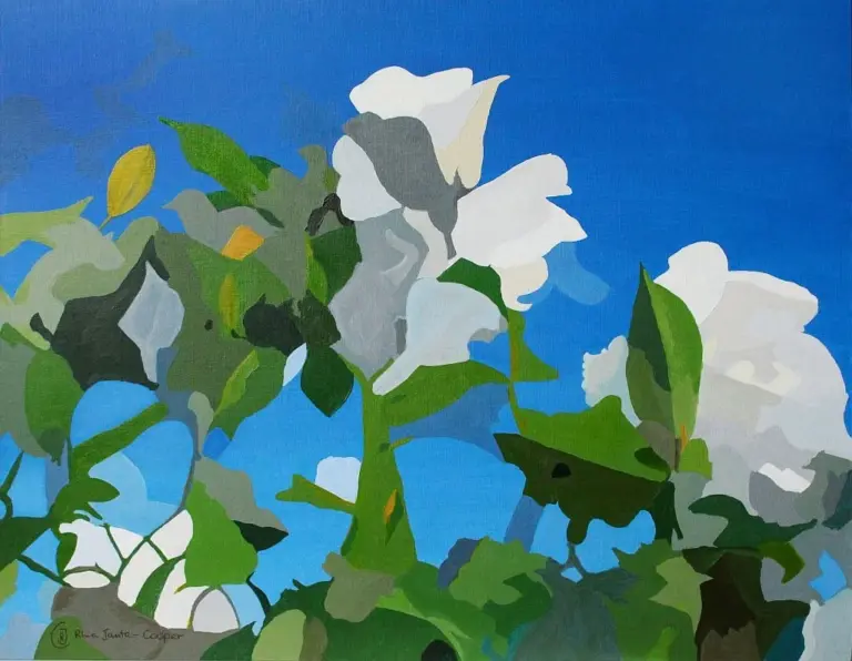
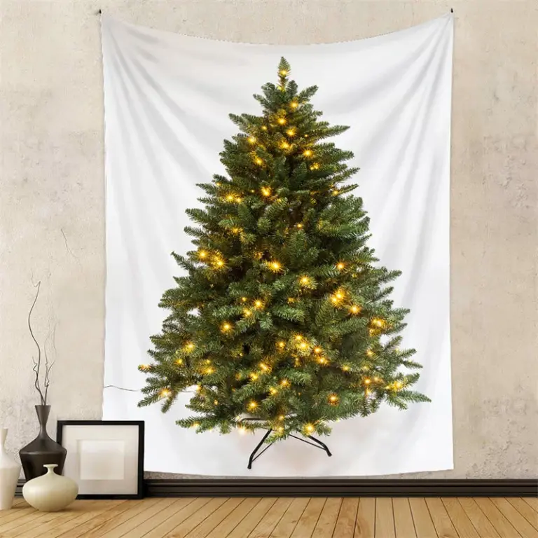 Aisha's pickGreen Wall Tapestries for Filling an Awkward Gap
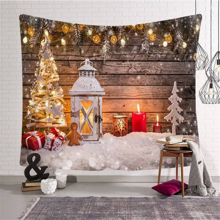
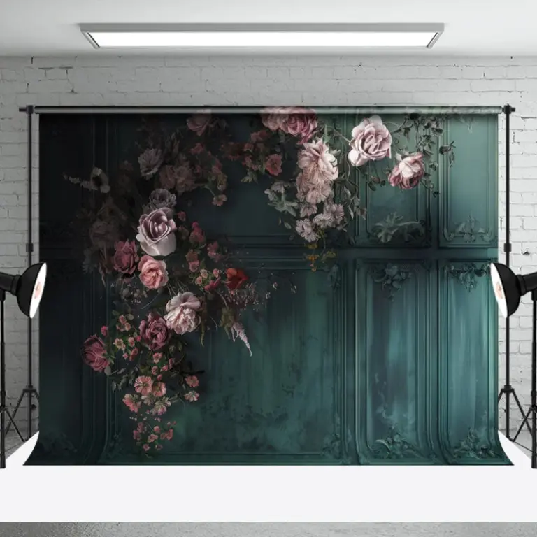 Aisha's pickGood Green Flower Wall Art Without the Big Price TagAlso worth a lookModern Wall ArtFor years I figured modern wall art meant one big canvas, something abstract and gray, hung dead center…See the collections →
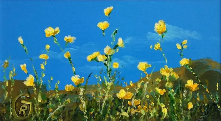
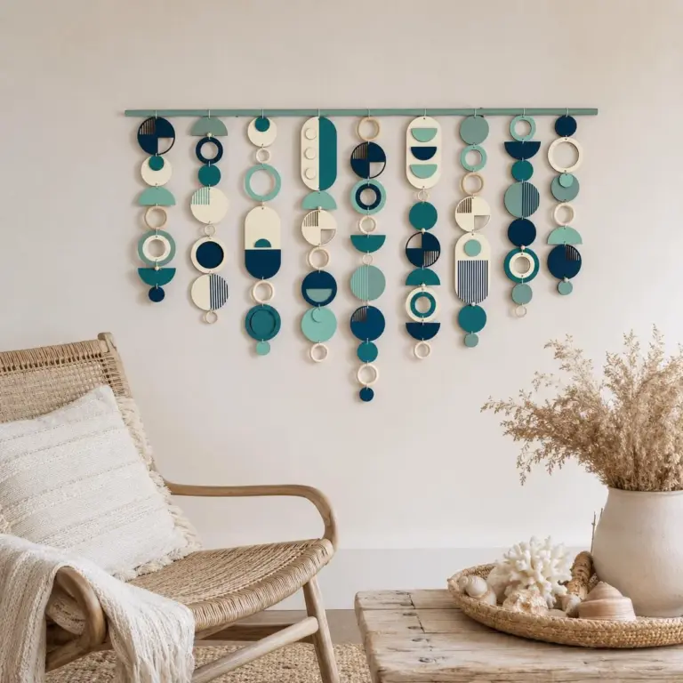 Aisha's pickGreen Wood Wall Art Worth Your Money
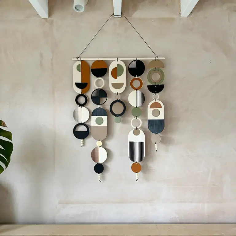
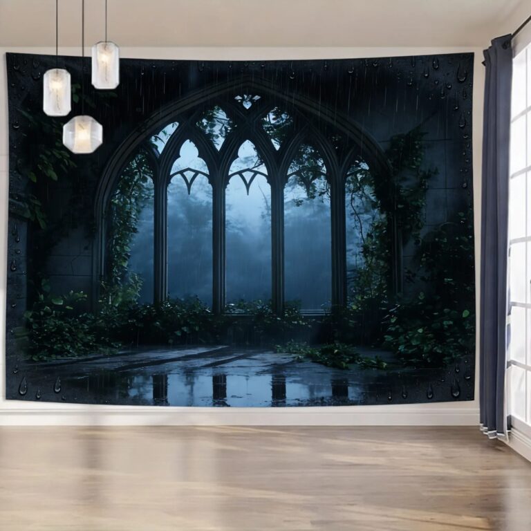 Aisha's pickGreen Landscape Wall Art Worth Your Money
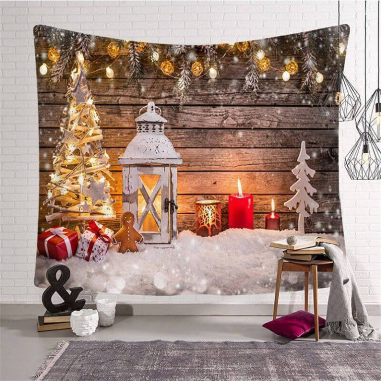
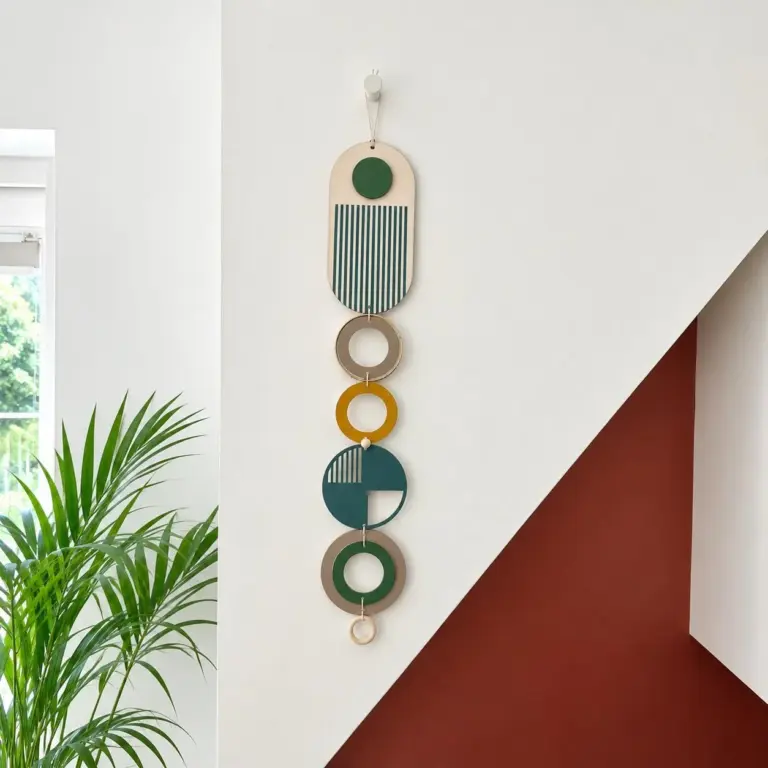 Aisha's pickThe Green Wooden Wall Art Worth Your Cash
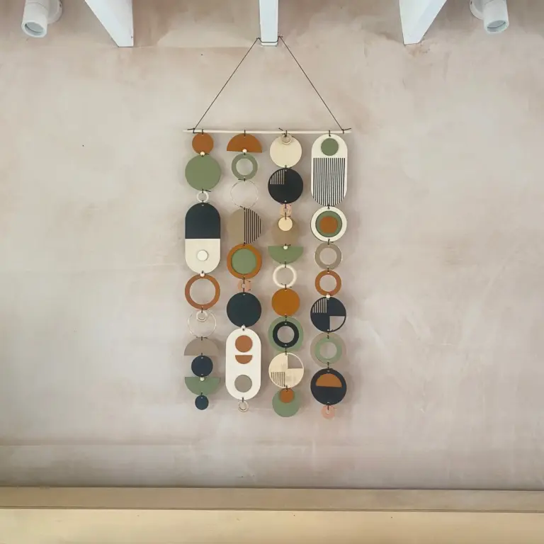
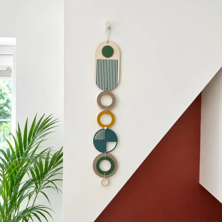 Aisha's pickGreen Metal Wall Art That Holds Up
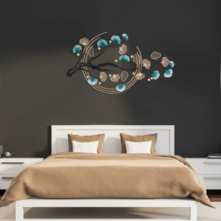
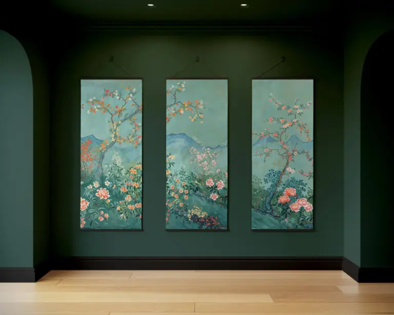 Aisha's pickTeal Wall Art Hunted Down So You Don’t Have To
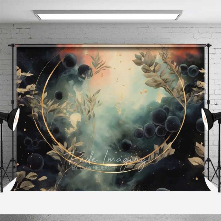
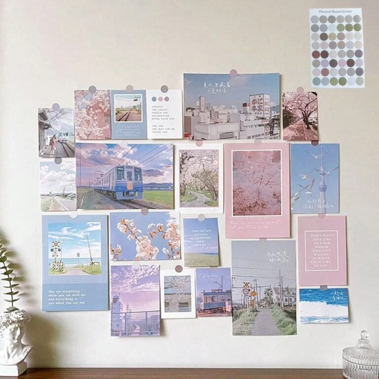 Aisha's pickGreen Pictures for Filling an Awkward Gap