Will flower art make a room look like your grandmother's dining room, the one with the lace tablecloth nobody was allowed to eat on? It can, but only if you pick the fussy, overly literal kind. A good botanical print, a loose watercolor, a close up photograph of a single bloom with a lot of empty space around it, reads as calm and current, not chintzy. The flowers aren't the problem. The wrong flowers are.
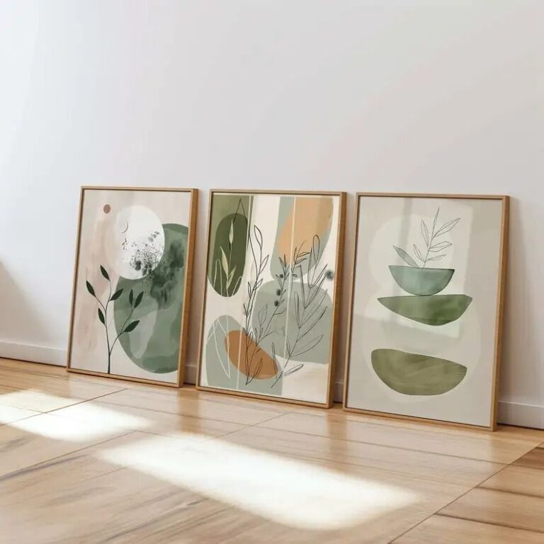
Scale is where most people get this wrong, and I say that having once hung a nine by twelve inch print of a poppy above a queen size bed, where it looked like a stamp someone forgot to remove. For a single piece over a sofa or bed, you want something that covers roughly two thirds of the furniture's width, which usually means bigger than you think, somewhere in the thirty to forty inch range if it's the only thing on that wall. If you're doing a grouping instead, measure the actual wall space first, lay the frames out on the floor in that footprint with painter's tape marking the edges, and only then start deciding which bloom goes where. Hang the center of the arrangement at roughly eye level, around fifty seven inches from the floor, not from the top of the furniture below it, which is the mistake that makes everything look like it's floating up near the ceiling for no reason.
This kind of art suits bedrooms, bathrooms, entryways and dining rooms more than it suits a home office or a kids' playroom, where it tends to read as an afterthought rather than a choice. It works well in rented apartments precisely because it's easy to swap and rarely offends a landlord, and it has a natural home in spring and summer light, though a moody, darker floral can carry a room straight through winter without feeling out of season. Where it falls apart is in a room that's already busy with pattern, a heavily tiled bathroom, a wallpapered hallway, anywhere with a lot going on. Flower art needs a bit of visual quiet around it to look intentional rather than crowded.
The cheap version, printed flat on thin paper behind glass with a plastic frame, fades within a year of any direct sun and looks it. A better one, archival ink on proper paper, in a frame with some actual weight to it, holds its color for years and feels like it belongs on the wall rather than leaning against it. I'd spend the extra money on the frame before I'd spend it on a bigger print. Find the one that makes you want to walk past it slowly, and give it room to actually breathe.
 Aisha's pickFlower Posters for Blank Walls and Empty Shelves

 Aisha's pickFlower Prints That Make Great Housewarming Gifts

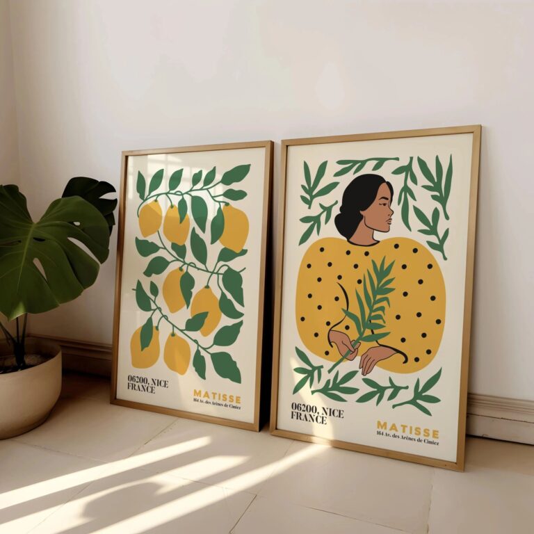 Aisha's pickFlower Print Sets That Give a Room Some Personality
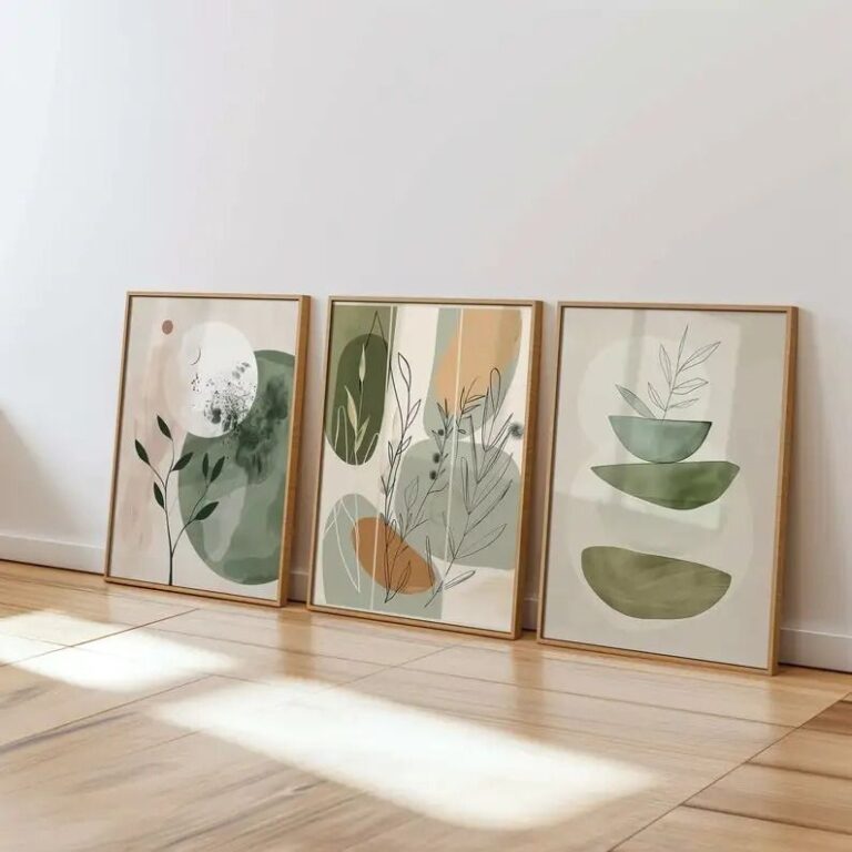
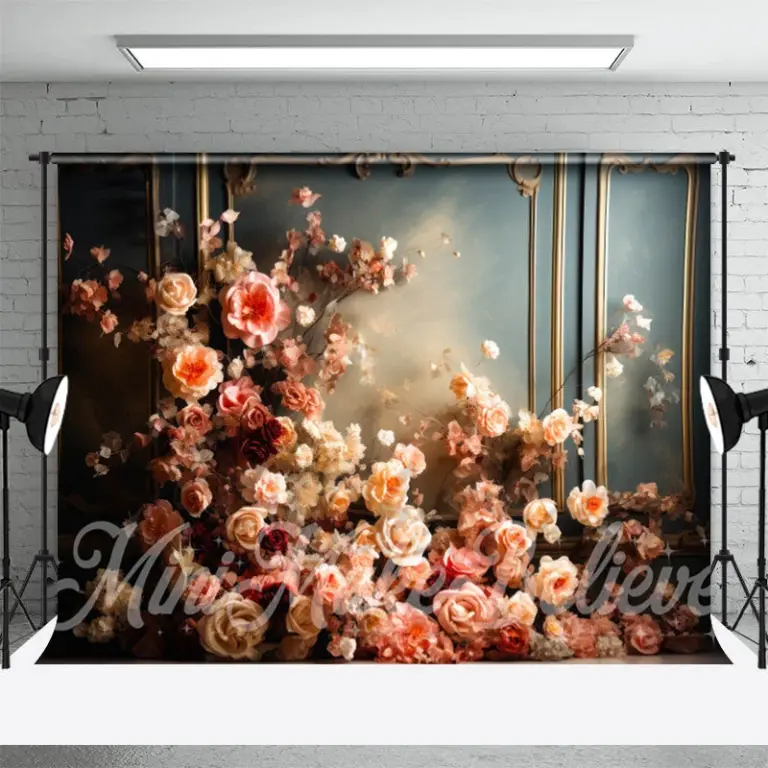 Aisha's pickFlower Wall Art That Holds Up
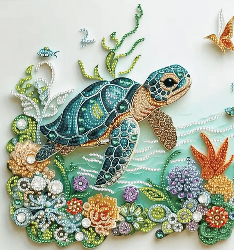
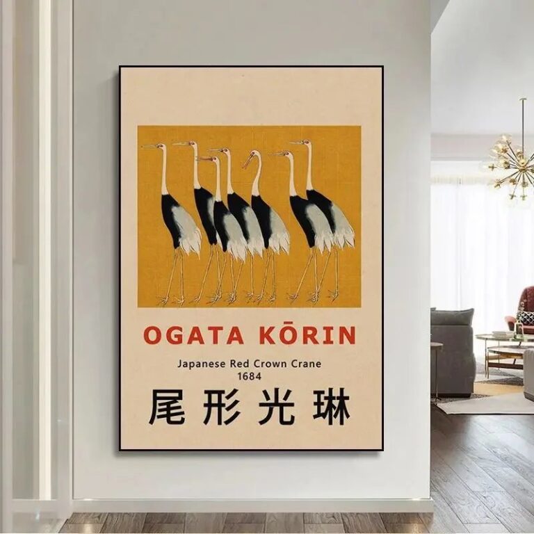 Aisha's pickFlower Wall Art for Bedroom Worth Your Money
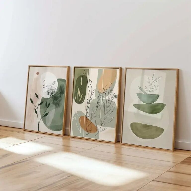
 Aisha's pickBlack Flower Wall Art That Earns Its Place
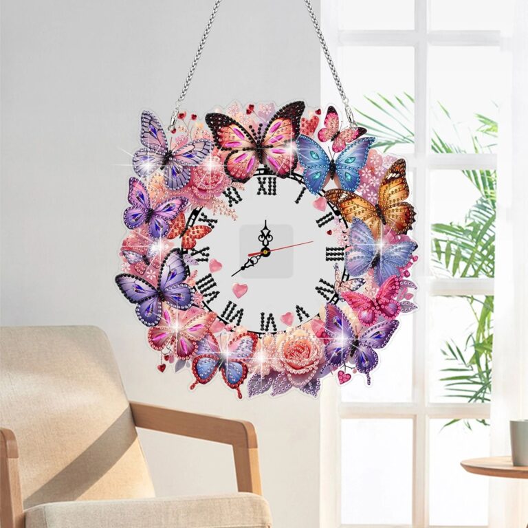 Aisha's pickFlower Wall Art for Living Room Pulled From Dozens of Stores
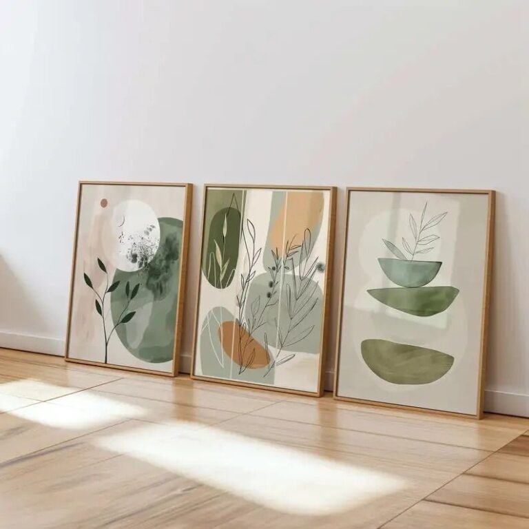
 Aisha's pickBlue Flower Wall Art We Keep Buying
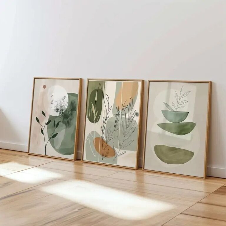 Aisha's pickThe Flower Wall Art for Office Worth Your CashAlso worth a lookPrintsThe thing nobody tells you about a print is that it changes with the light, and you won't…See the collections →
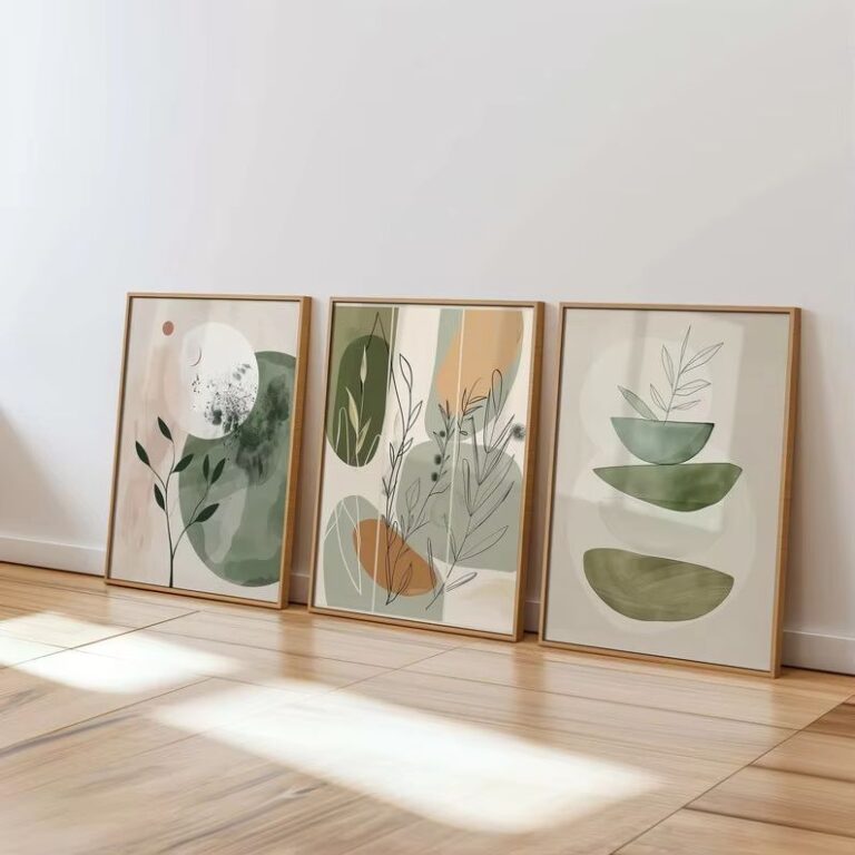
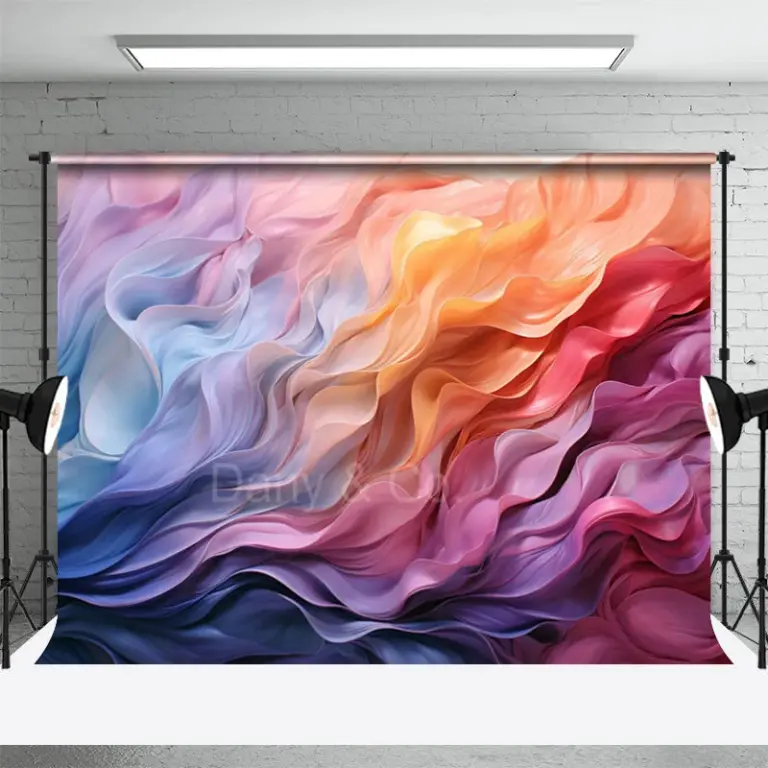 Aisha's pickFlower 3D Wall Art With a Bit More About It
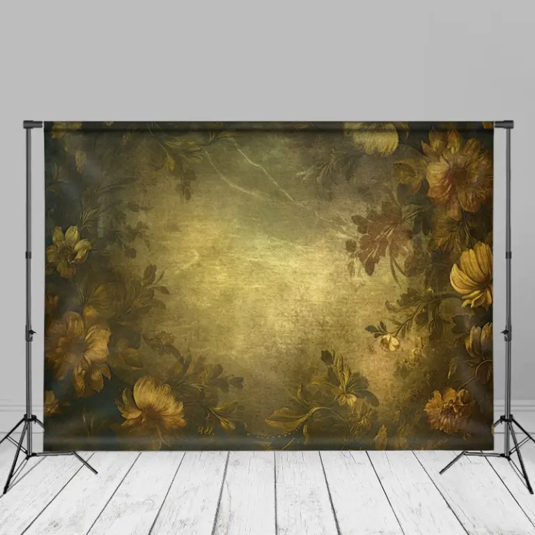
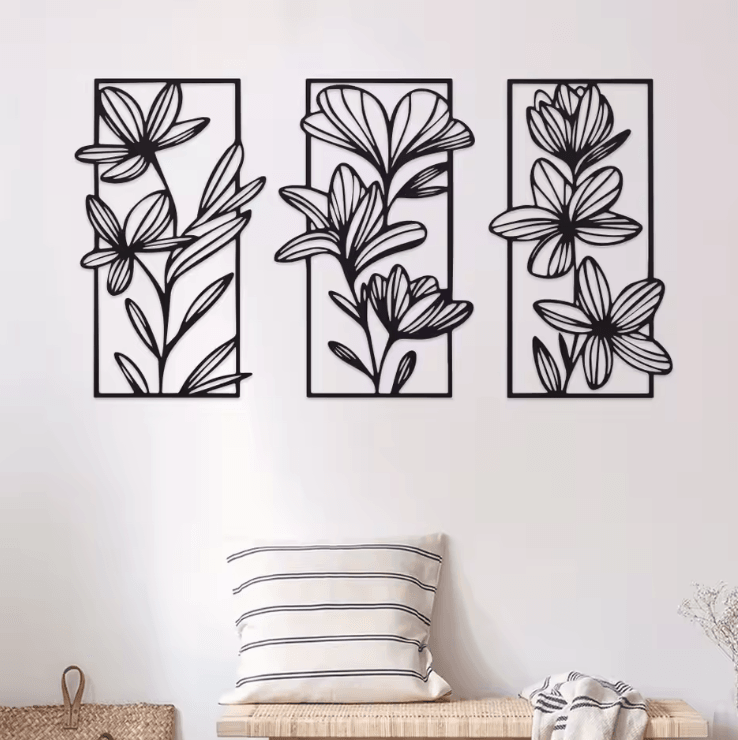 Aisha's pickGood Flower Wall Art Sets That Don’t Cost a Fortune
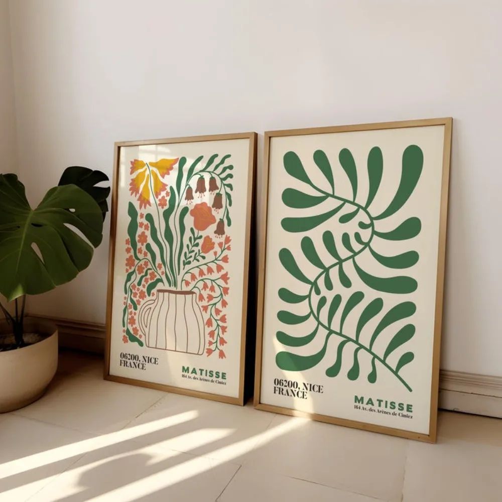
 Aisha's pickFlower Acrylic Paintings for Making a House Feel Like Yours
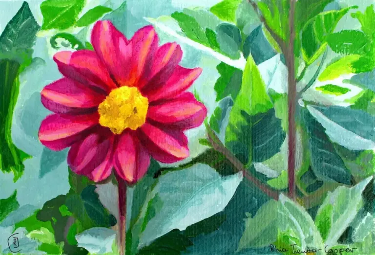
 Aisha's pickFlower Wall Posters That Catch the Eye Without Taking Over
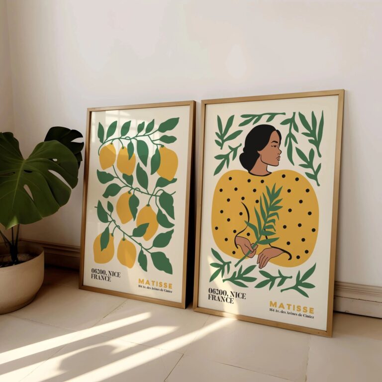 Aisha's pickFlower Art Prints for Rooms That Feel a Bit Bare
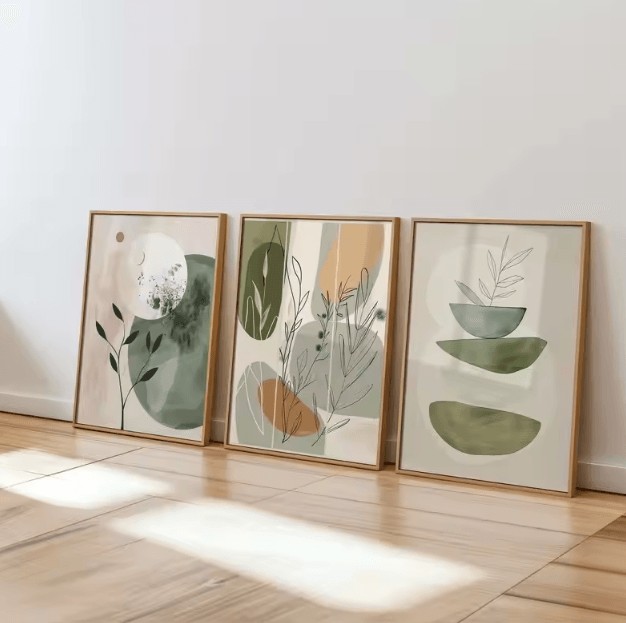
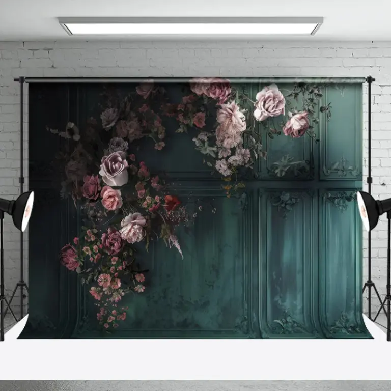 Aisha's pickGood Green Flower Wall Art Without the Big Price Tag

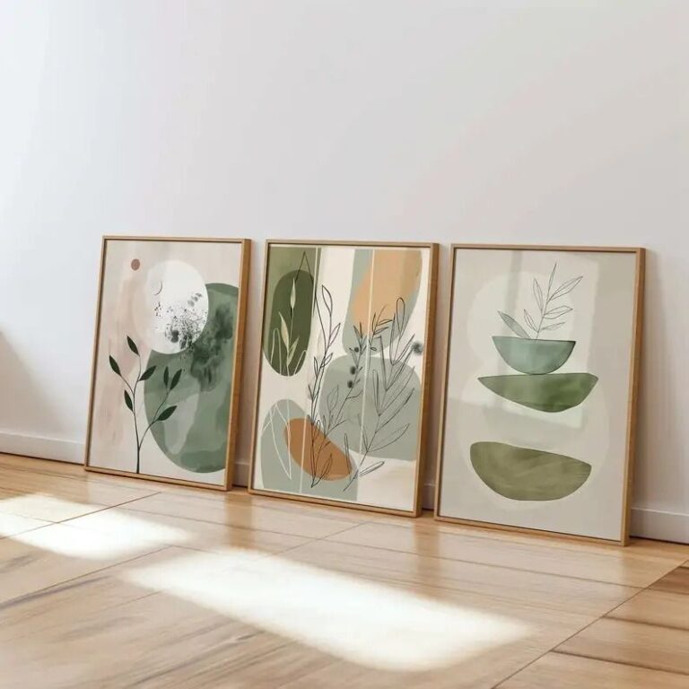 Aisha's pickFlower Art Prints for Living Room That Make Rented Places Feel Like Home
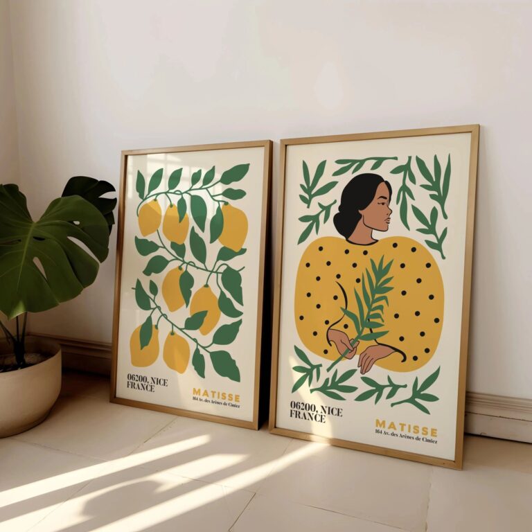
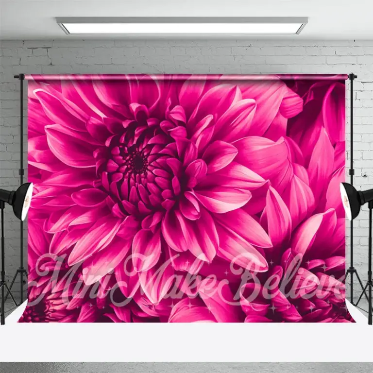 Aisha's pickLarge Flower Wall Art That Holds Up
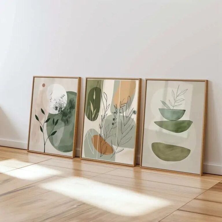
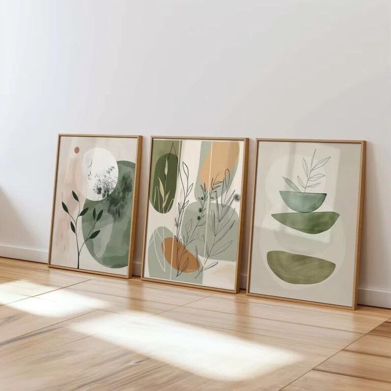 Aisha's pickFlower Canvas Art That Does What It ShouldAlso worth a lookModern Wall ArtFor years I figured modern wall art meant one big canvas, something abstract and gray, hung dead center…See the collections →
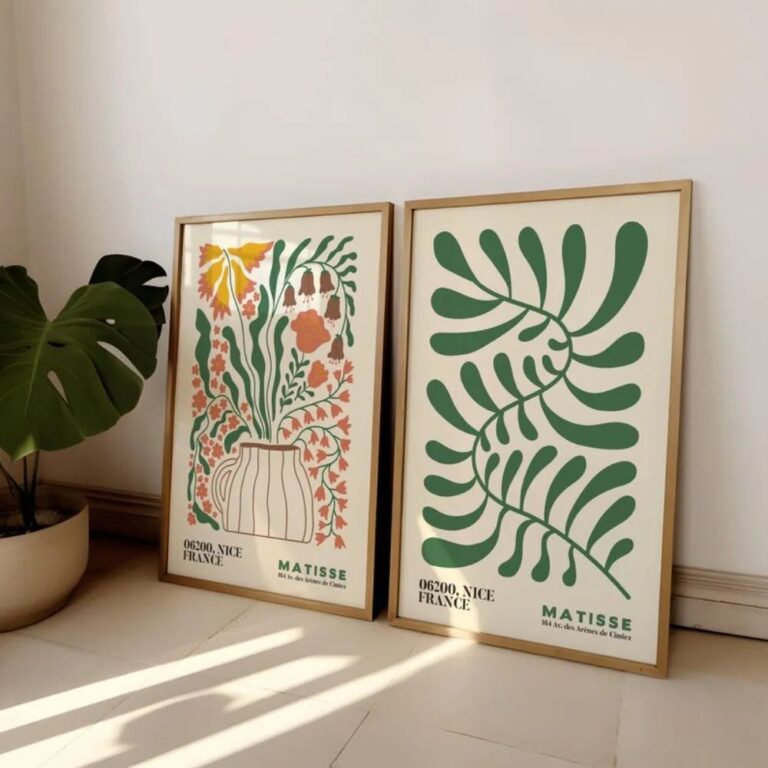
 Aisha's pickThe Pink Flower Wall Art Worth Your Cash
 Aisha's pickFlower Canvas Paintings We’d Make Room For
 Aisha's pickWhite Flower Wall Art That Doesn’t Cost a Fortune

 Aisha's pickFlower Gallery Wall Art That Looks the Part