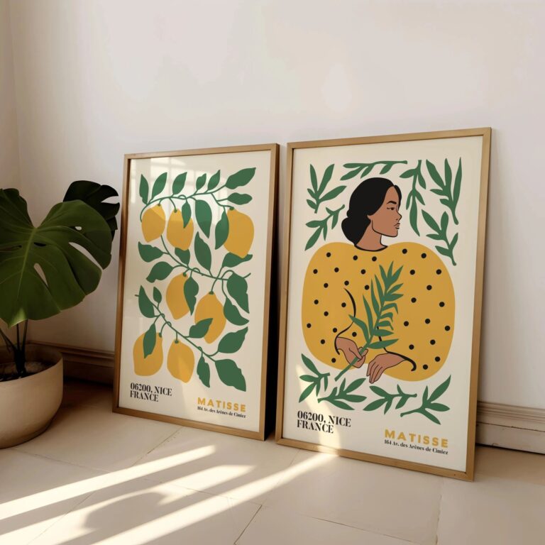
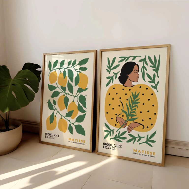
The first thing I do with any floral print is check the color against actual daylight, not the lighting in whatever room I'm standing in when I buy it. A print that looks soft and warm under a shop's bulbs can turn sickly the second you get it home and the afternoon sun hits it. I learned this with a peony print that looked dusty pink in the store and turned bright coral in my hallway by three in the afternoon. It still hangs there. I just stopped looking at it around lunchtime.
Floral art has real limits, and I think people skip over them because flowers feel like a safe, uncontroversial choice. They are not neutral. A big, busy floral can fight with a room that already has patterned rugs, patterned curtains, or a grandmother's china collection on display. It can also read as fussy in a space that is otherwise clean and modern, like it wandered in from a different house. If your walls are already doing a lot of work, a floral print is one more voice in a conversation that is already loud enough.
Where it earns its spot is in rooms that could use some softness without needing a full redecorate. Bedrooms, especially ones that get morning light, feel calmer with a floral over the headboard, something with muted tones rather than anything too graphic. Bathrooms work too, oddly enough, since the humidity doesn't bother a good print the way it bothers wallpaper. I'd avoid north facing rooms that stay gray most of the day, since cooler colored florals can make that dimness feel even flatter. Warmer tones hold up better there.
The difference between a print that lasts and one that looks cheap in a year comes down to the paper and the frame, not the image itself. A thin, glossy print will yellow and ripple if it gets any humidity or direct light at all, which rules out most kitchens and a lot of bathrooms unless it is properly sealed behind glass. Look for a heavier matte paper, a frame with an actual rebate instead of a flimsy plastic clip back, and corners that are mitered clean, not just butted together and glued. Run a finger along the frame edge. If it catches or feels rough, that is a print that was made to be shipped, not lived with.
The one mistake I keep seeing, because I made it myself, is buying the print before measuring the wall. A floral that looked generous and full on a screen can shrink down to something apologetic and small once it is up, surrounded by too much blank wall on either side. Measure first. Buy the print to fit the space, not the other way around.
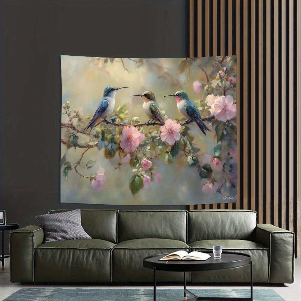 Aisha's pickFloral Wall Art for Bedroom That Earns Its Place
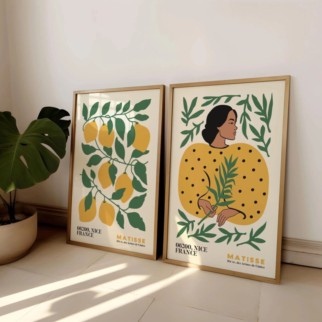
 Aisha's pickBlack Floral Wall Art That Does What It Should
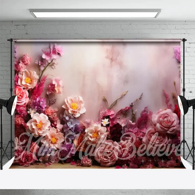
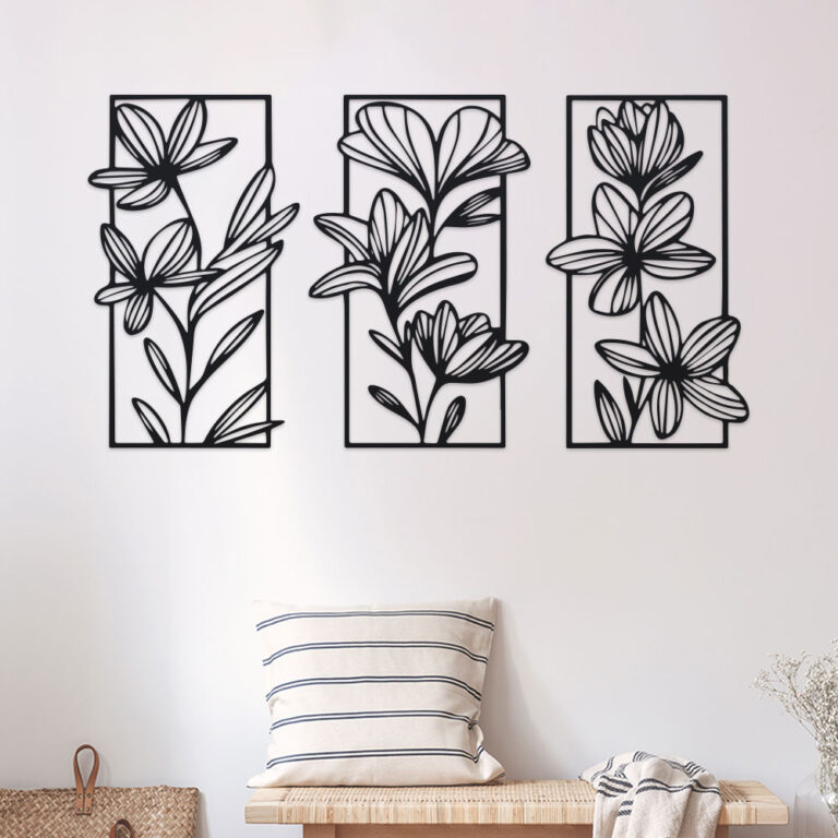 Aisha's pickFloral Wall Art for Living Room We Keep Buying
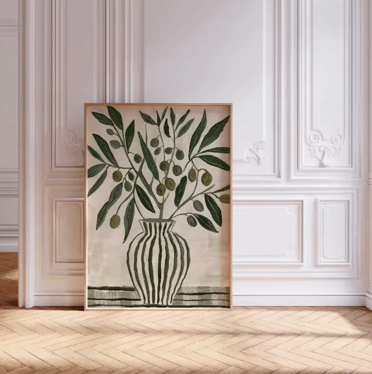
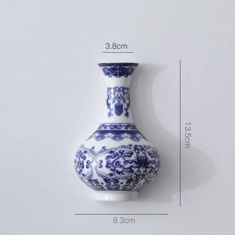 Aisha's pickGood Blue Floral Wall Art Without the Big Price Tag

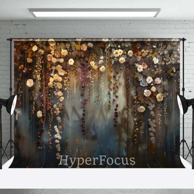 Aisha's pickDecent Floral Wall Art for Office Without the Hassle
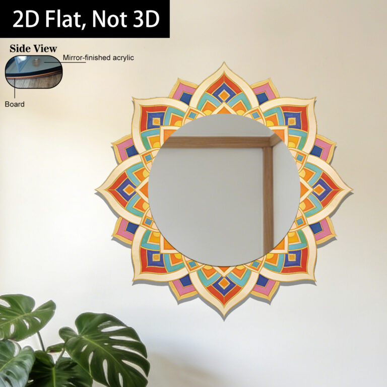
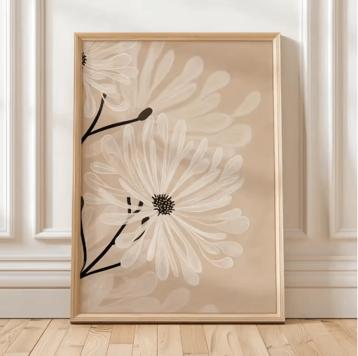 Aisha's pickFloral Art Prints You Won’t Want to Hide Away
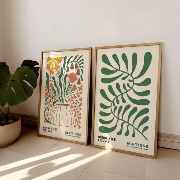
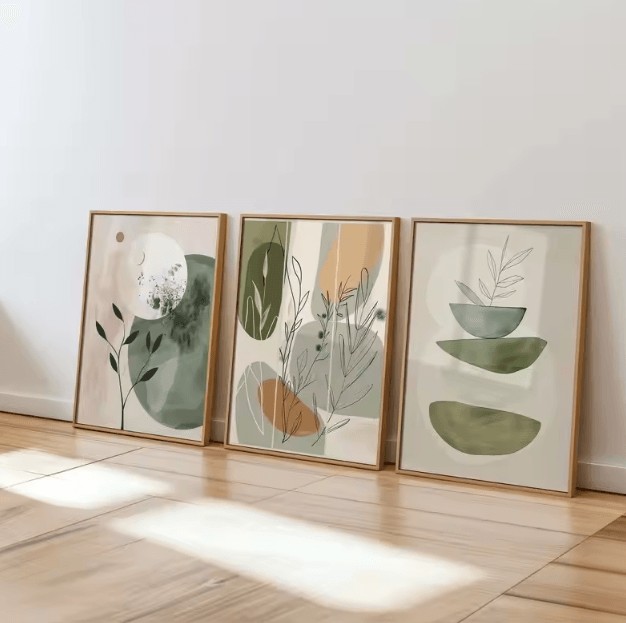 Aisha's pickFloral Wall Art Sets That Look Good Up Close
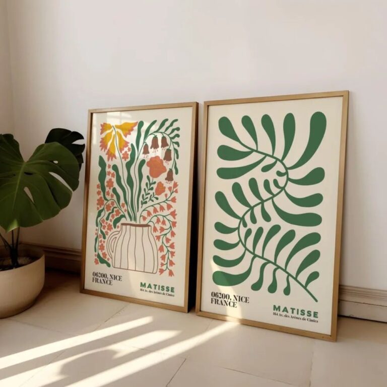
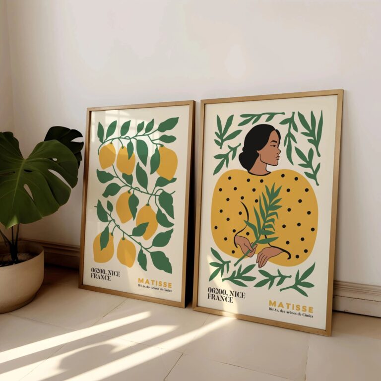 Aisha's pickFloral Art Prints for Living Room We’d Buy Again
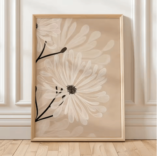
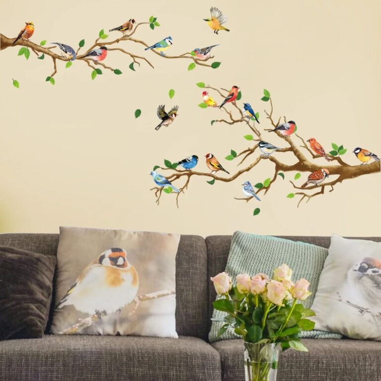 Aisha's pickFloral Wall Murals That Catch the Eye Without Taking OverAlso worth a lookPrintsThe thing nobody tells you about a print is that it changes with the light, and you won't…See the collections →
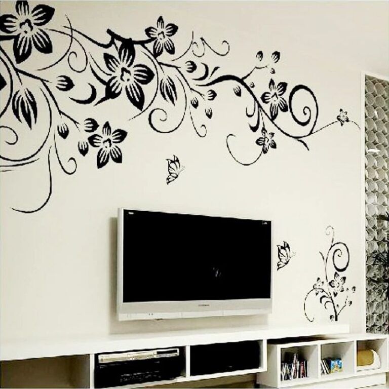
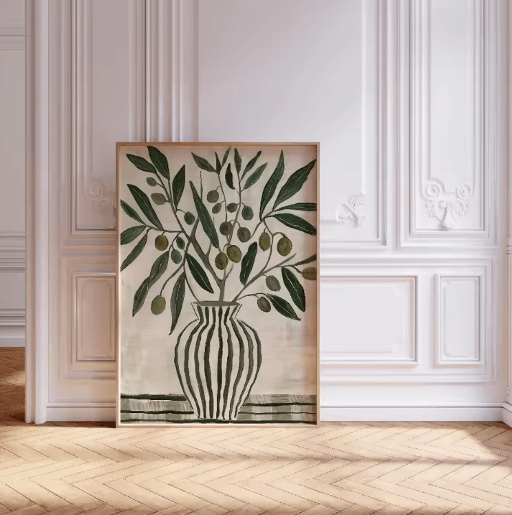 Aisha's pickFloral Canvas Art Worth Your Money
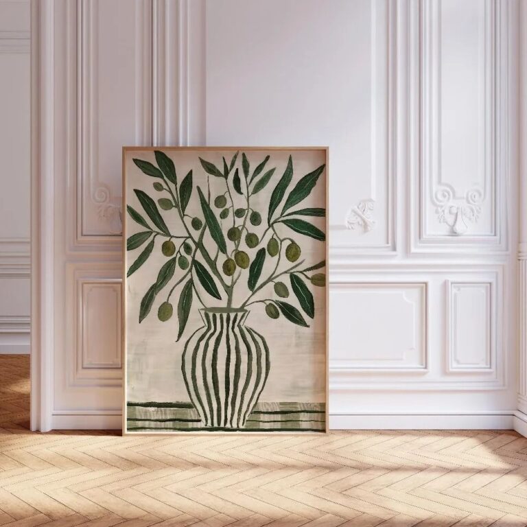
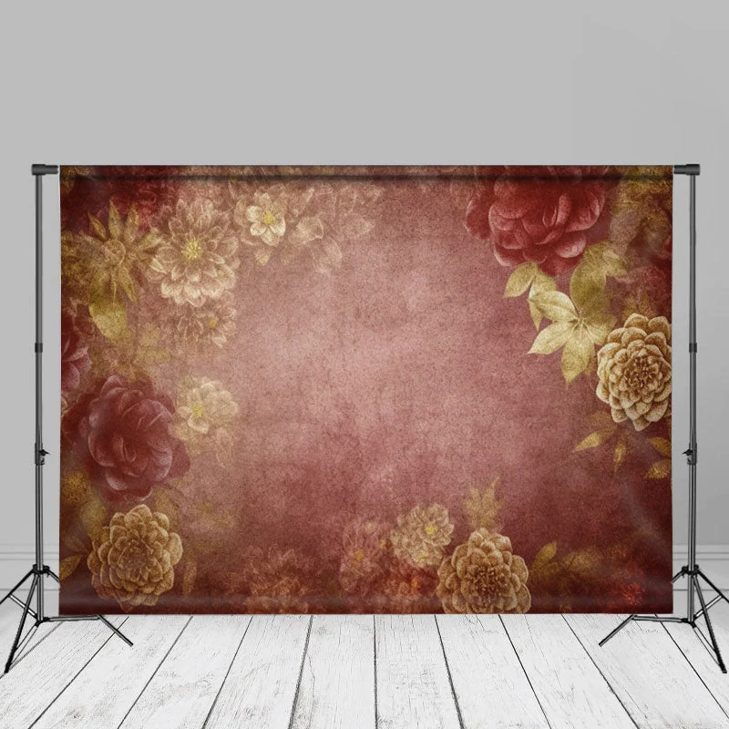 Aisha's pickGold Floral Wall Art Worth Your Money
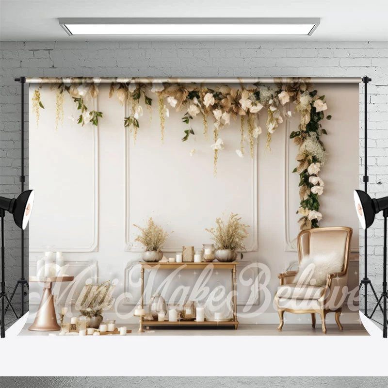
 Aisha's pickFloral Canvas Paintings That Don’t Need Babying

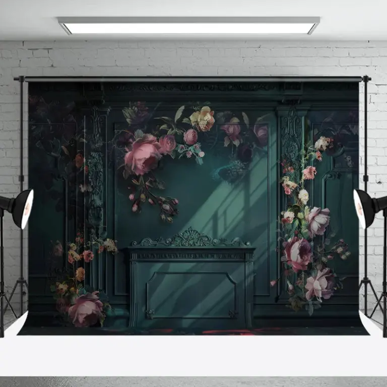 Aisha's pickGreen Floral Wall Art That Doesn’t Cost a Fortune

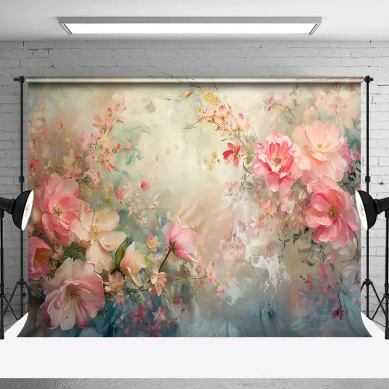 Aisha's pickFloral Oil Paintings With a Story to Them
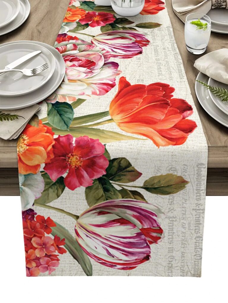
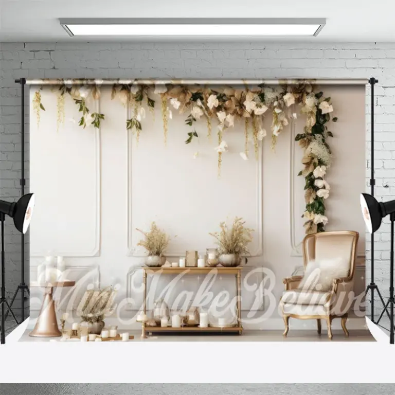 Aisha's pickGood Pink Floral Wall Art Without the Big Price Tag
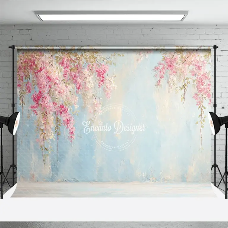
 Aisha's pickFloral Photography Prints That Start Conversations

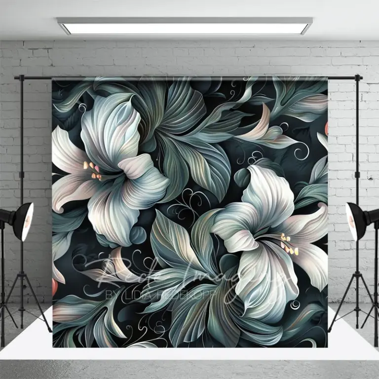 Aisha's pickWhite Floral Wall Art With a Bit More About It

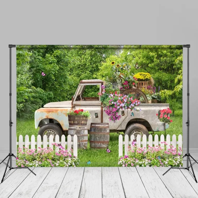 Aisha's pickFloral Pictures You Won’t Regret BuyingAlso worth a lookModern Wall ArtFor years I figured modern wall art meant one big canvas, something abstract and gray, hung dead center…See the collections →
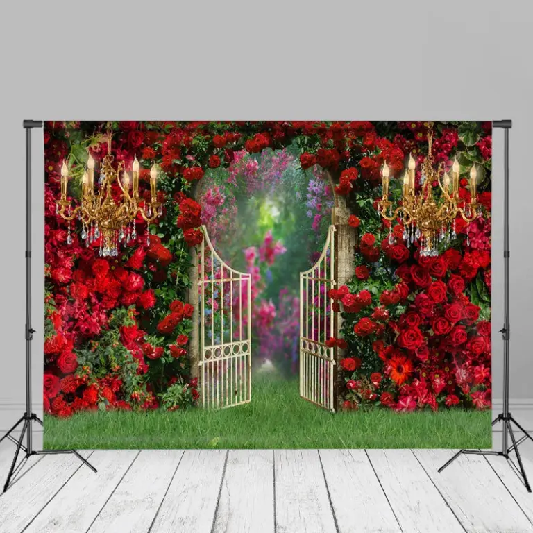
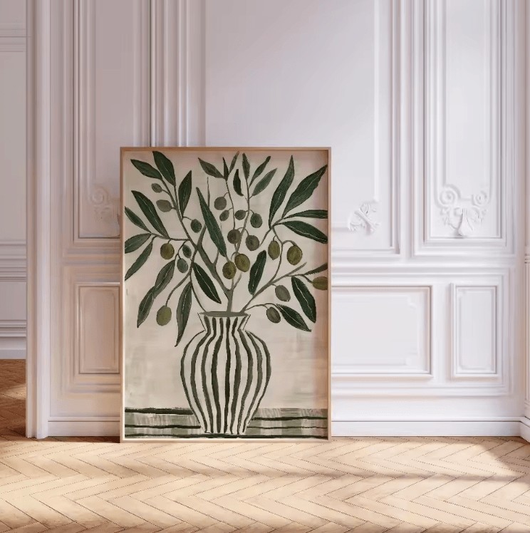 Aisha's pickFloral Posters Picked by People Who Care Too Much
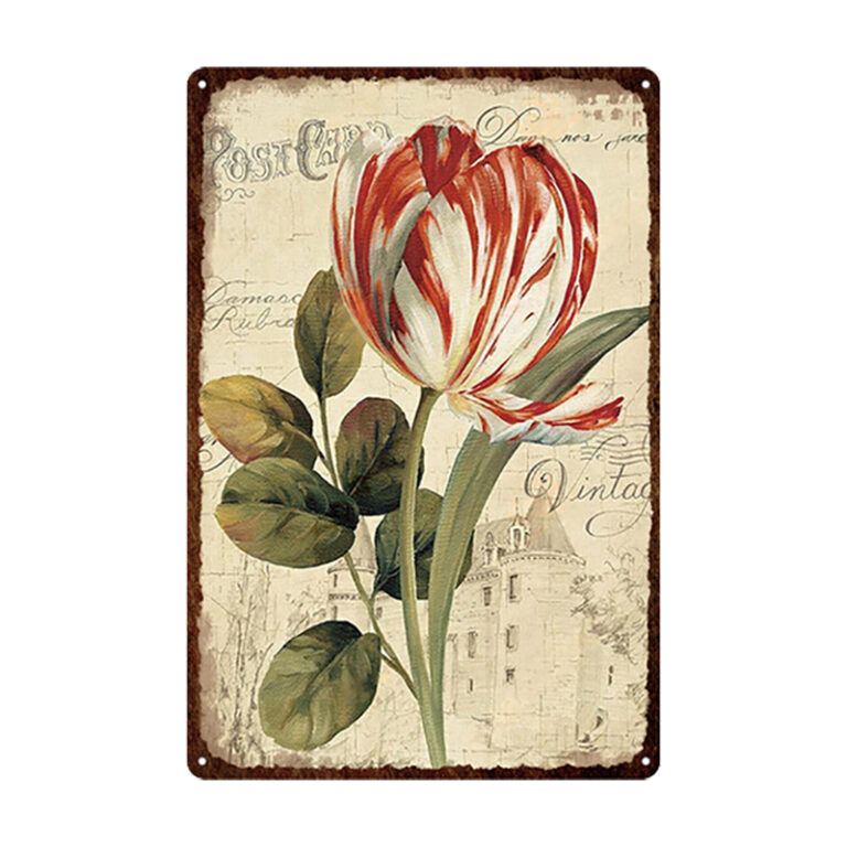
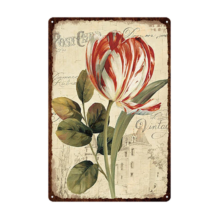 Aisha's pickGood Floral Posters for Living Room That Don’t Cost a Fortune
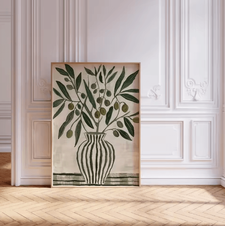
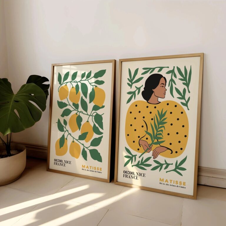 Aisha's pickFloral Prints We Keep Coming Back To
 Aisha's pickFloral Print Sets That Give a Room Some Personality