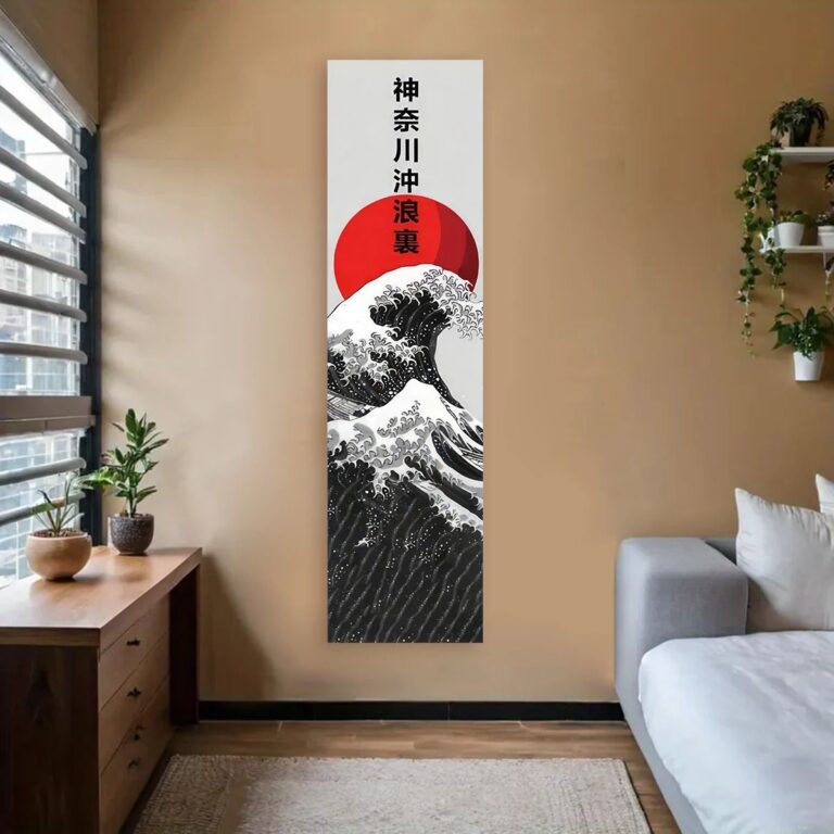
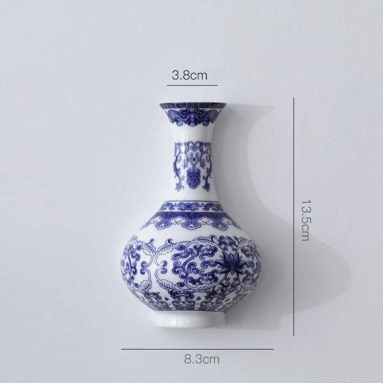
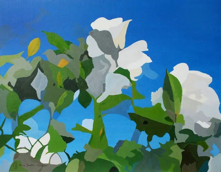
The question I get most is whether blue art will make a room feel cold, and the answer is almost never, because the blue that works on walls is rarely the blue people are scared of. A deep navy or ink toned piece reads warmer than you'd expect once it's framed and hung, closer to a good pair of denim jeans than a swimming pool. The blue to avoid, in my experience, is anything flat and bright, the shade that looks like a printer default. It sits on a wall like it's apologizing for being there.
For living with it day to day, the easiest shades are the ones with some gray or green mixed in, a slate blue, a teal that leans more pine than turquoise, an indigo that's almost black until the light hits it. Those read as neutral as any beige, but with actual depth, so they hold up next to wood tones, brass, even a busy patterned rug without a fight. A pure cobalt or electric blue is gorgeous, I won't pretend otherwise, but it wants a room that's already calm around it. Put it with white walls and simple furniture and it looks intentional. Put it in a room with five other loud things going on and it starts looking like an accident.
Blue art is forgiving about where it lives. Bedrooms take to it easily, since the deeper shades do something calming that most paint colors try and fail to do. It works well in a home office too, oddly, because it reads as serious without being boring. Where it struggles a little is in a kitchen with a lot of warm wood and yellow light, where it can look slightly out of place unless there's some other blue or metal nearby to connect it to the room. Seasonally it holds its own all year, which is more than I can say for anything orange or seasonal green.
If someone has no blue art at all and wants to start somewhere, I'd start with one piece in that gray leaning navy, nothing abstract or confusing, something with a clear subject or a clean block of color. It plays well with almost anything already on the walls, and it doesn't ask the rest of the room to change to suit it. Once that piece is up and it's clearly working, adding a second, bolder blue gets a lot less scary.
A single good piece in the right blue tends to quietly outlast whatever trend convinced you to buy it in the first place.
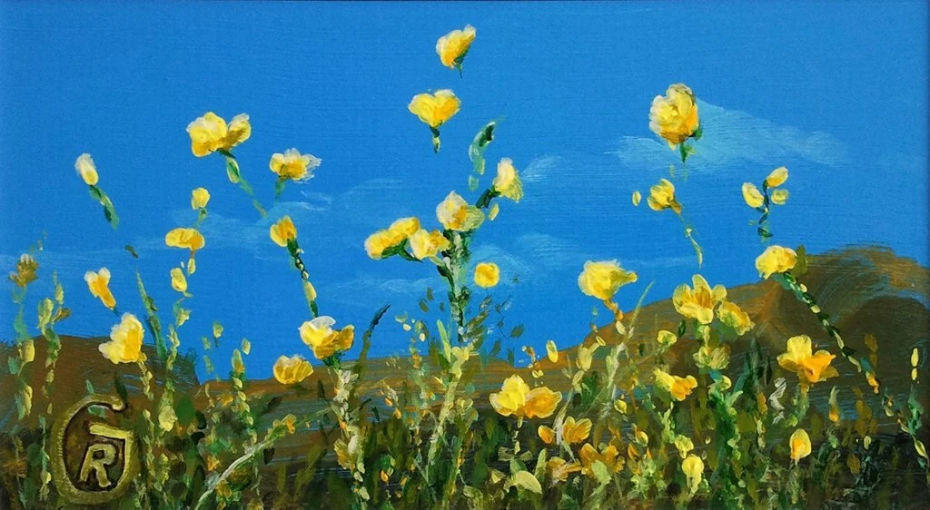 Aisha's pickBlue Flower Wall Art We Keep Buying
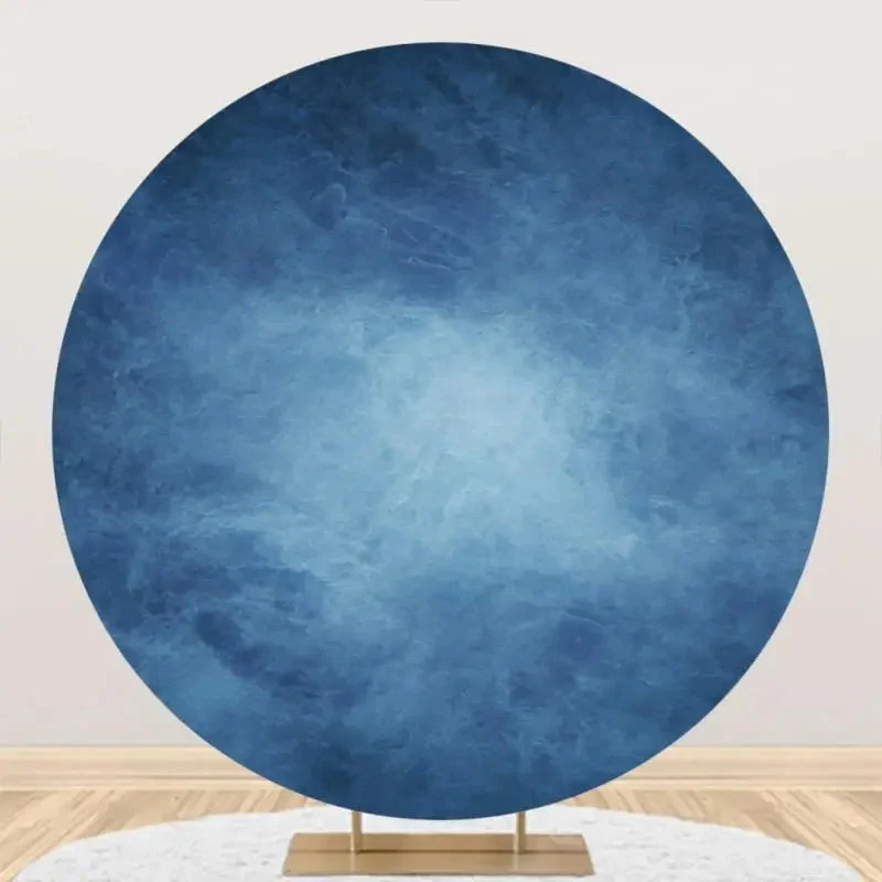
 Aisha's pickBlue Metal Wall Art Hunted Down So You Don’t Have To
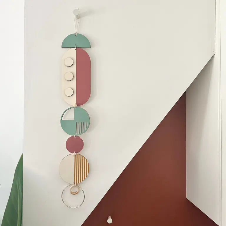
 Aisha's pickBlue Pictures With a Story to Them
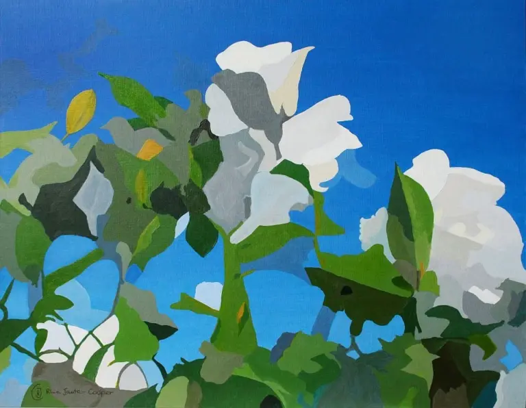
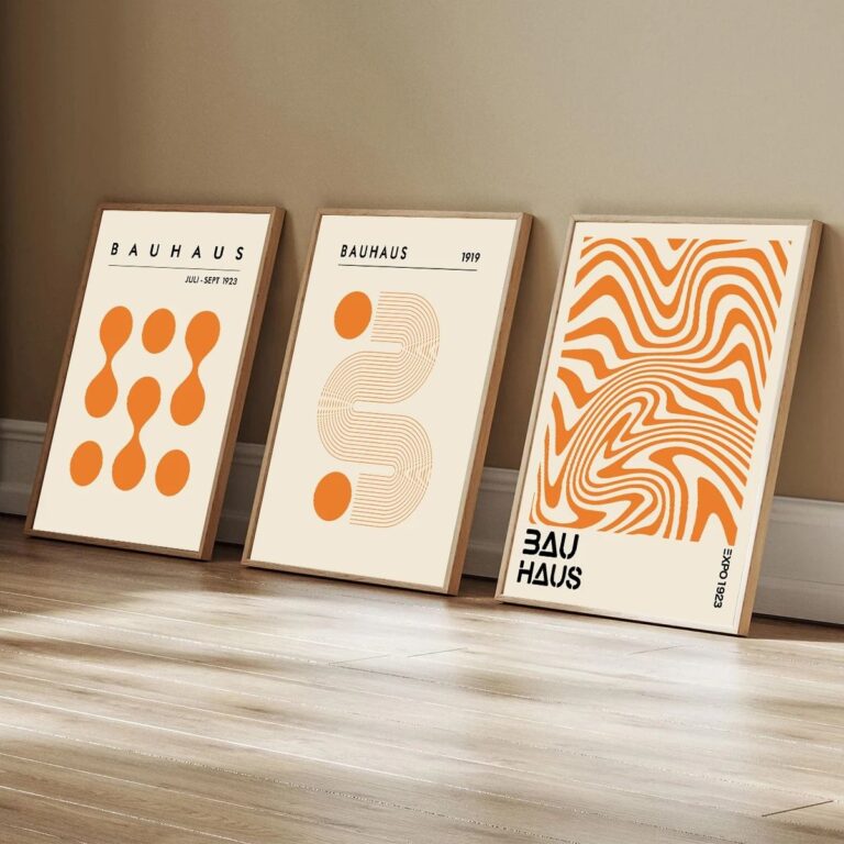 Aisha's pickBlue Posters We’d Make Room For

 Aisha's pickBlue Prints That Give a Room Some Personality
 Aisha's pickBlue Print Sets That Visitors Always Ask About
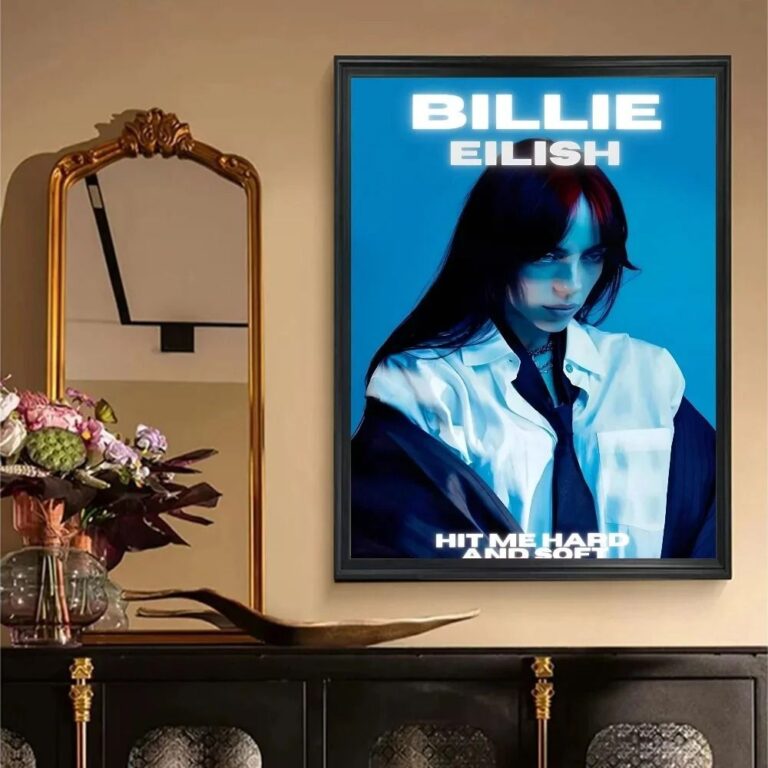 Aisha's pickBlue Retro Wall Art That Earns Its Place
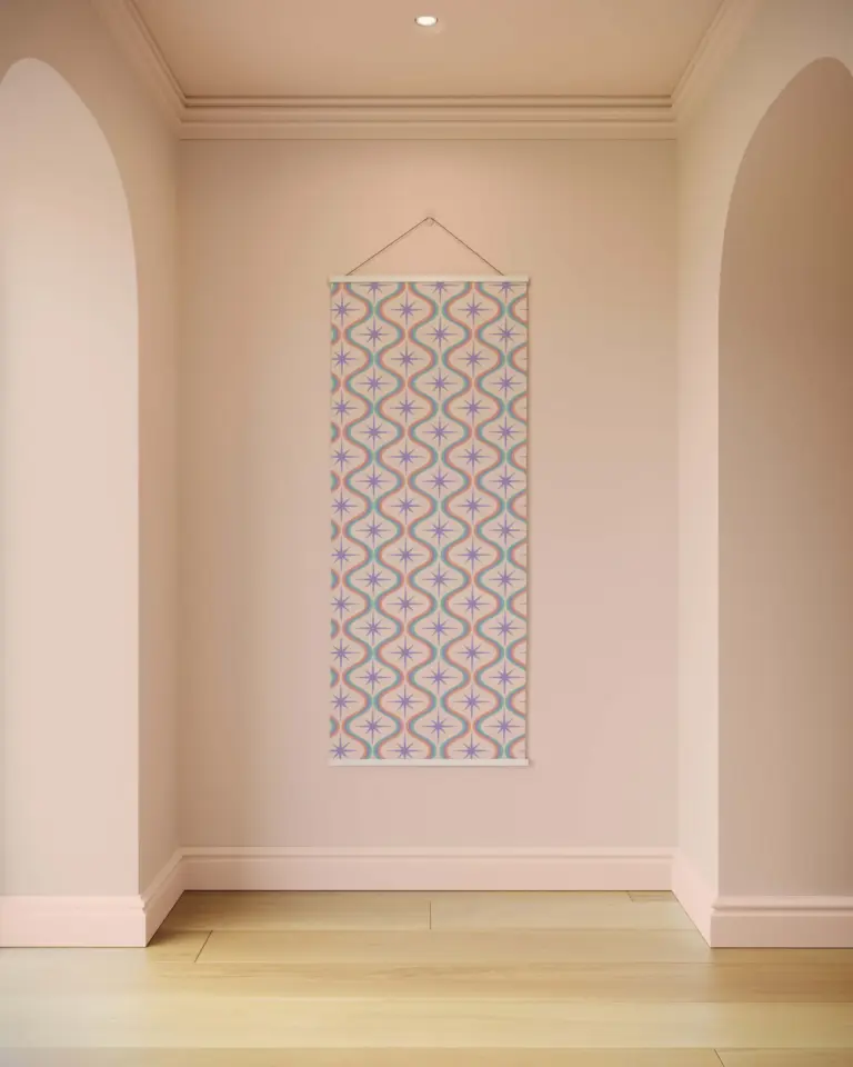
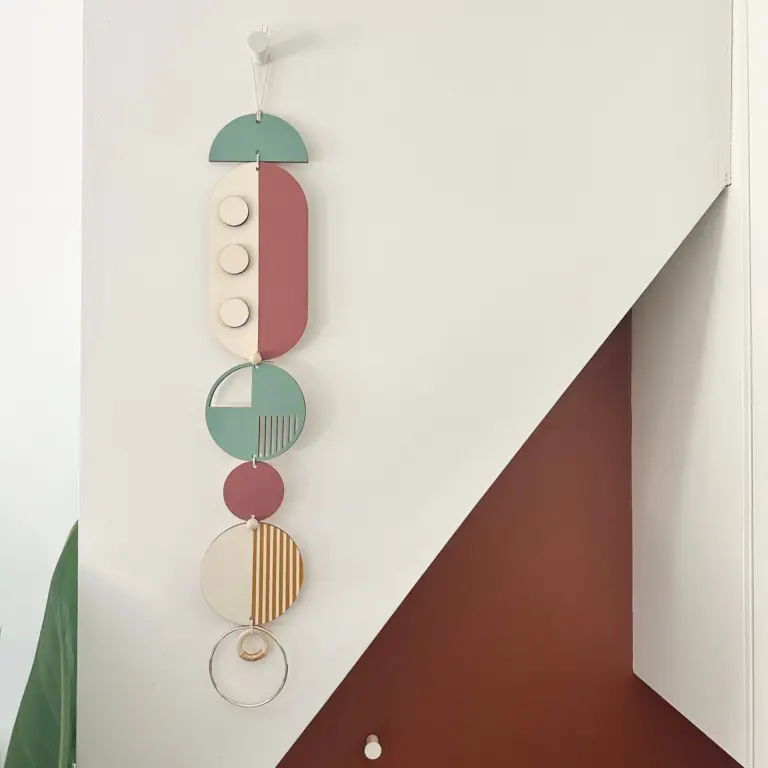 Aisha's pickBlue Tapestries That Make a Shelf Look Styled
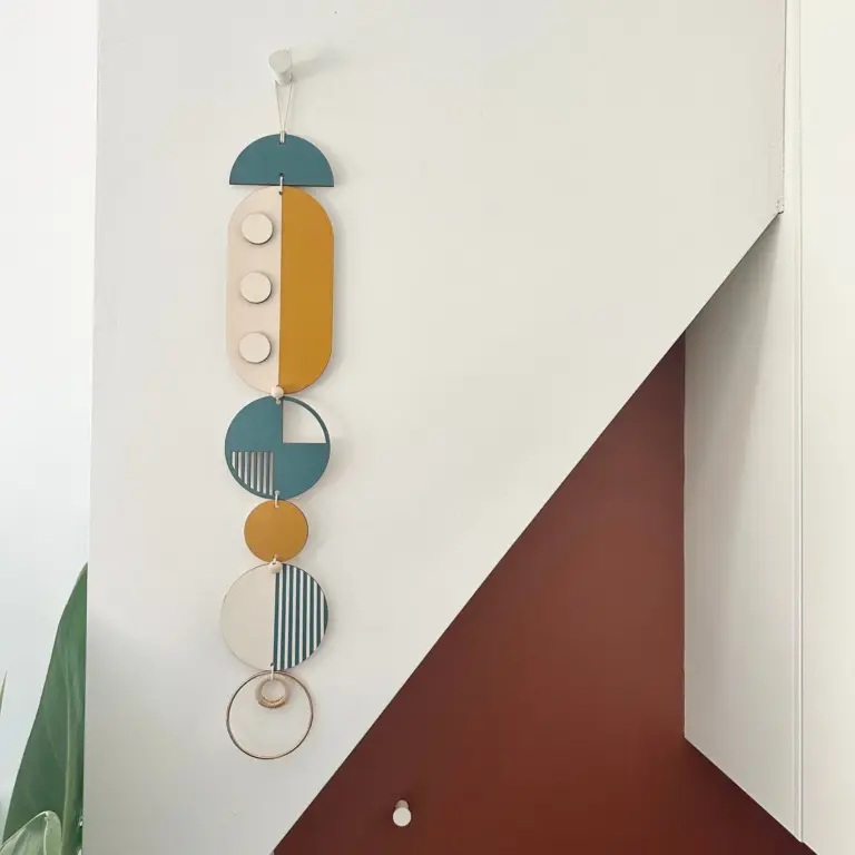
 Aisha's pickBlue Vintage Wall Art We Keep BuyingAlso worth a lookPrintsThe thing nobody tells you about a print is that it changes with the light, and you won't…See the collections →

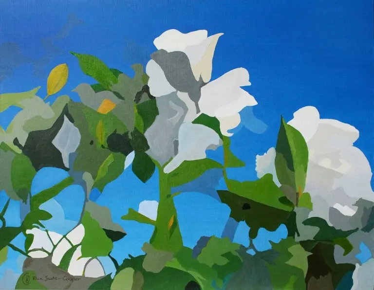 Aisha's pickBlue Abstract Wall Art That Earns Its Place
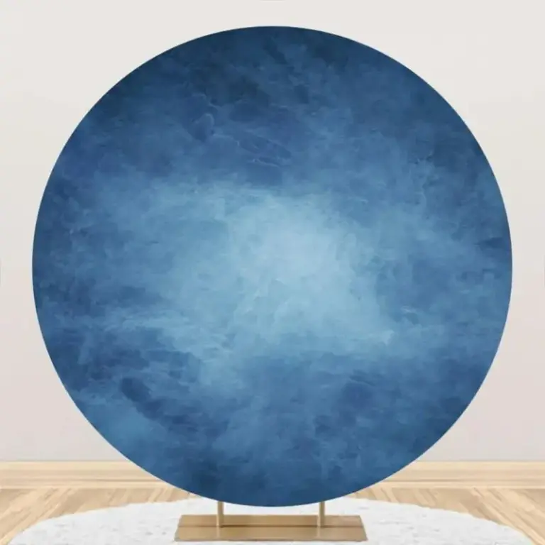
 Aisha's pickBlue Wall Art With Some Character
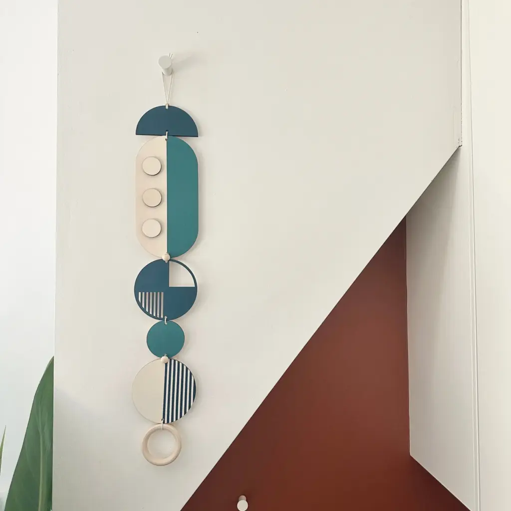
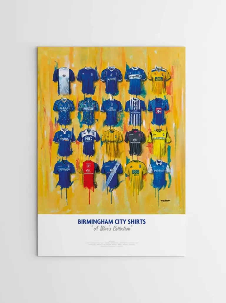 Aisha's pickBlue Art Prints We Keep Coming Back To
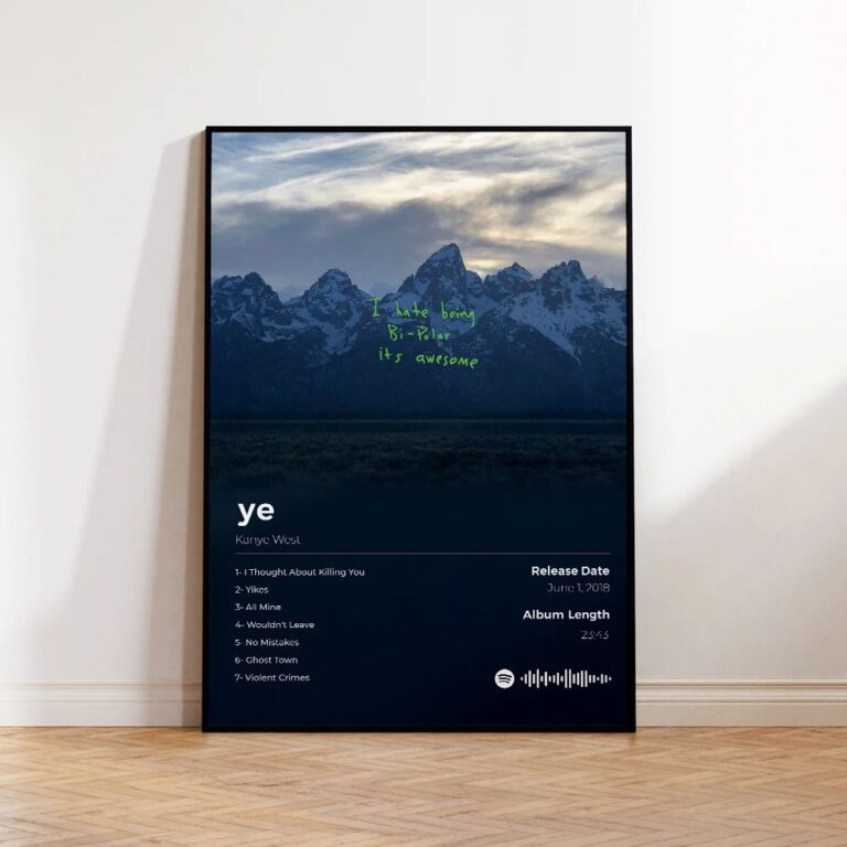
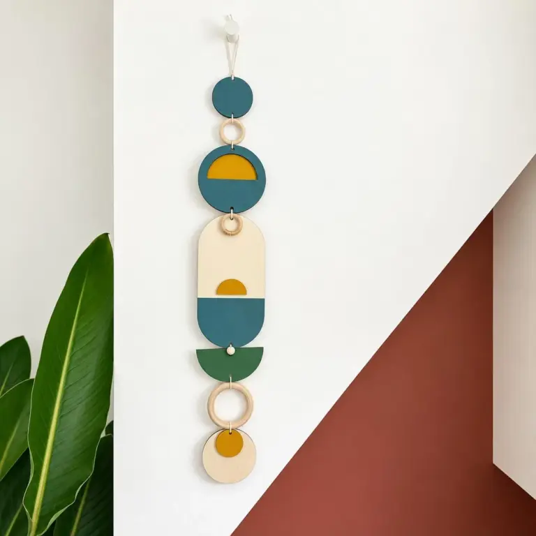 Aisha's pickBlue Wall Tapestries That Don’t Look Mass Produced
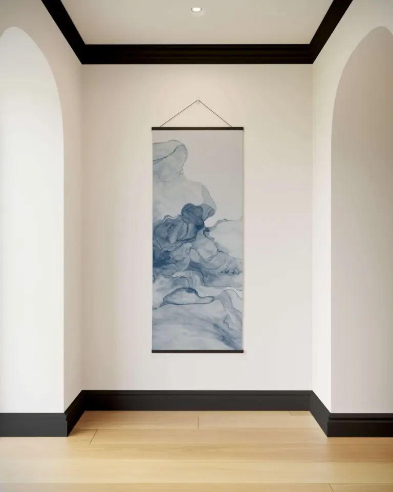
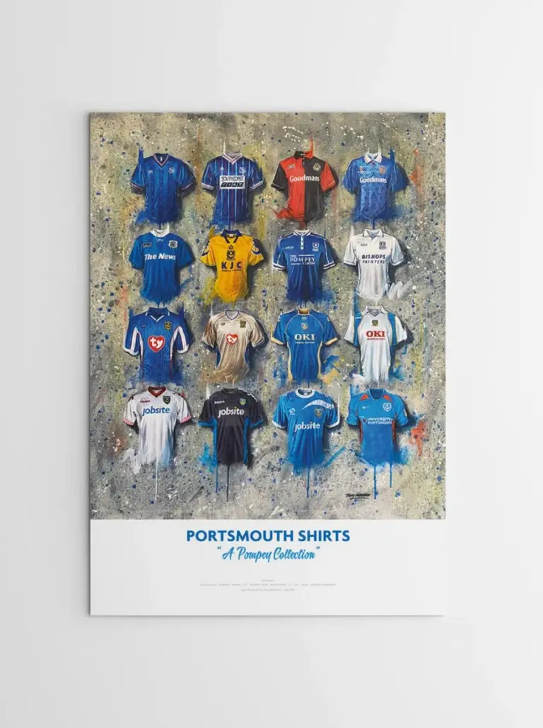 Aisha's pickBlue Canvas Art Picked by People Who Care Too Much
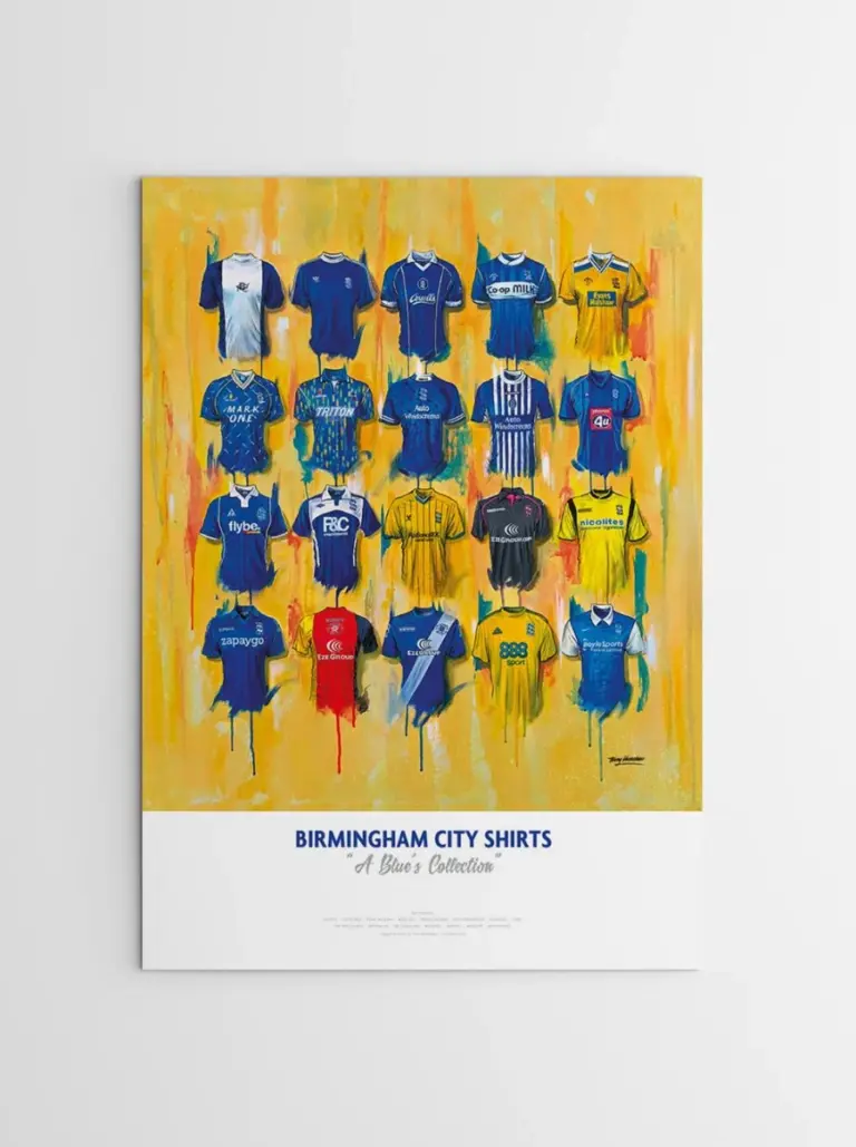
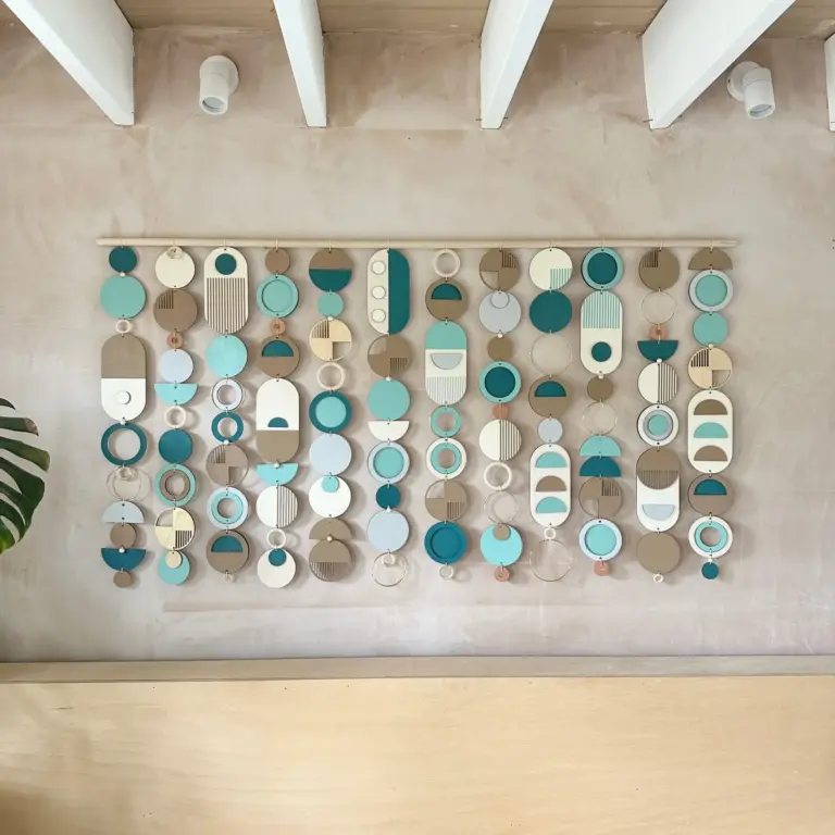 Aisha's pickBlue Wood Wall Art at Every Price Point
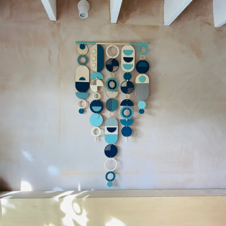
 Aisha's pickBlue Canvas Paintings With a Story to Them

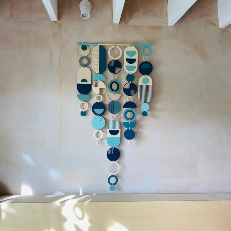 Aisha's pickGood Blue Wooden Wall Art Without the Big Price Tag
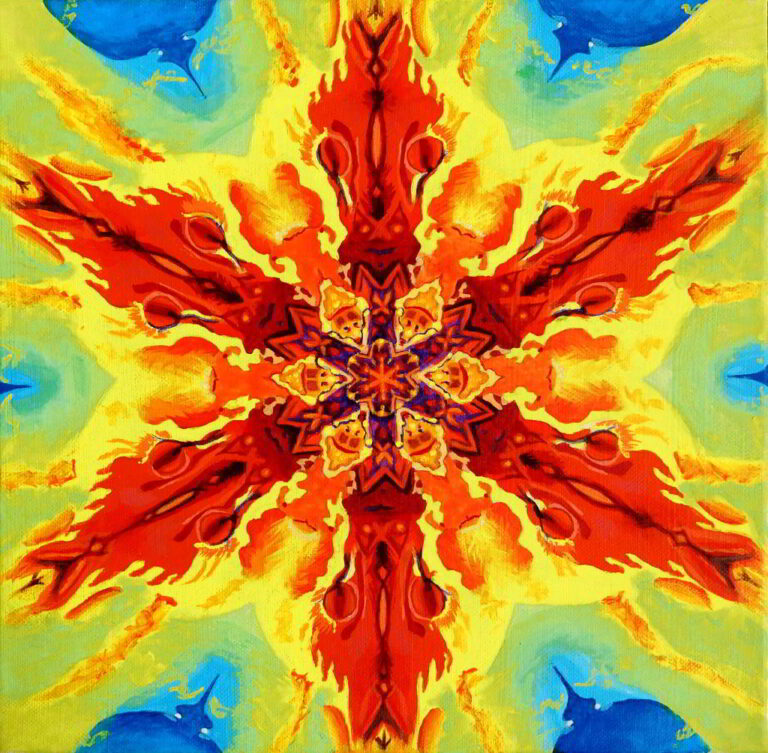
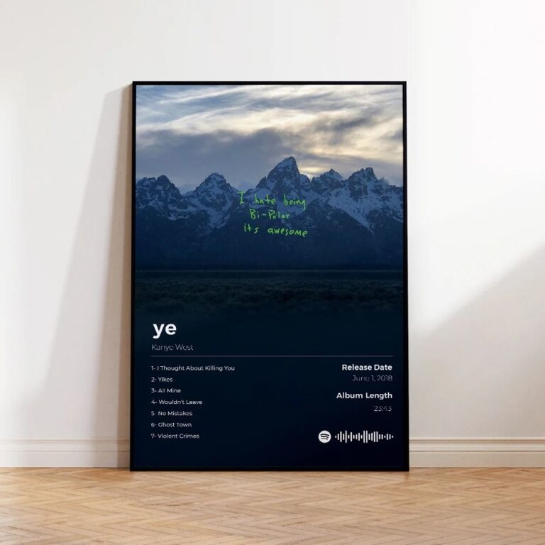 Aisha's pickSimple Blue Canvas Prints Done WellAlso worth a lookModern Wall ArtFor years I figured modern wall art meant one big canvas, something abstract and gray, hung dead center…See the collections →
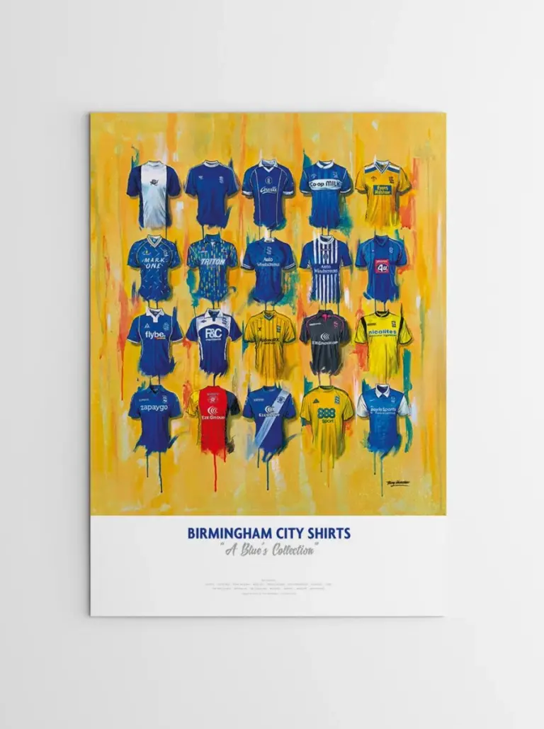
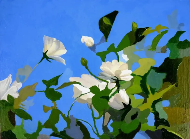 Aisha's pickBlue Canvas Wall Art Worth Knowing About