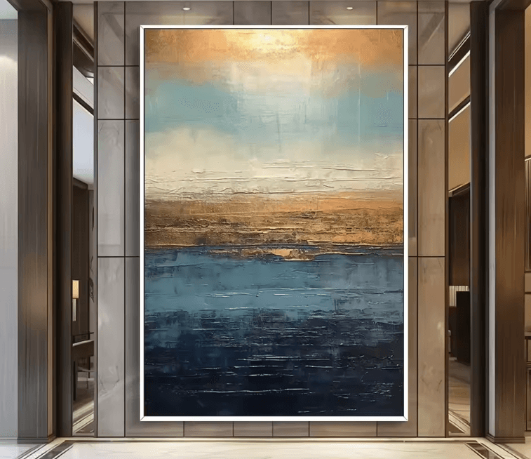
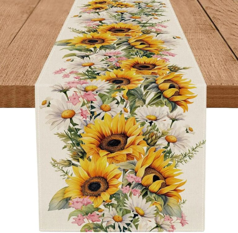
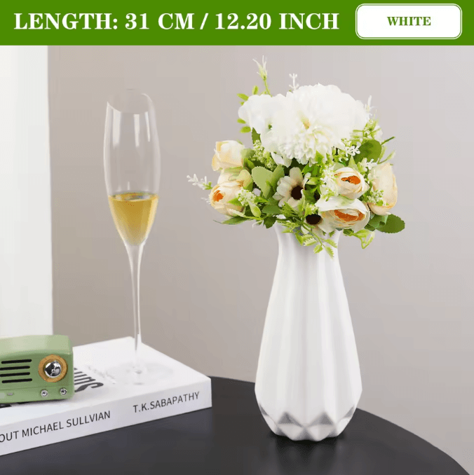
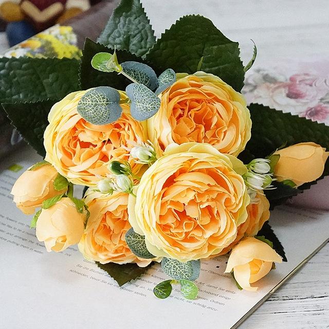
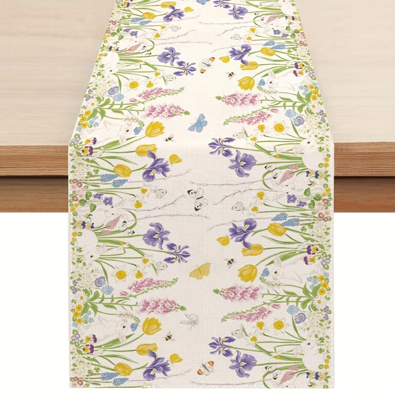
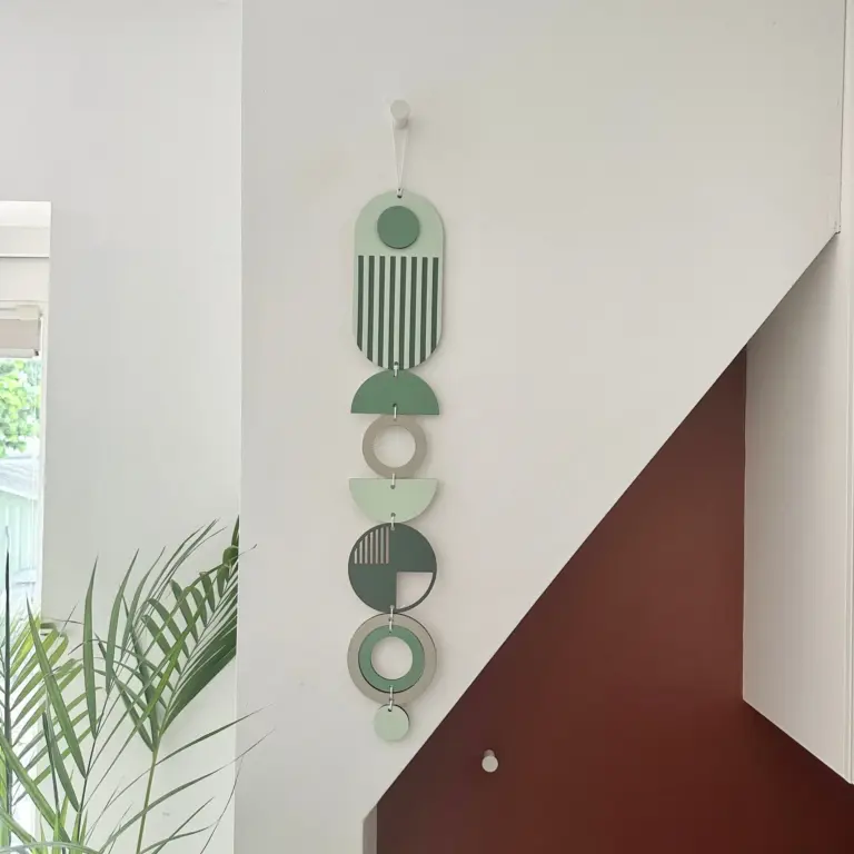
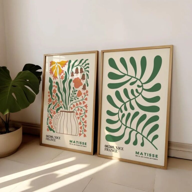
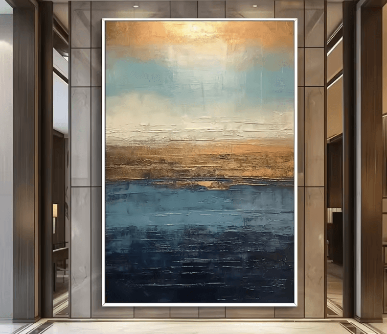
The mistake is treating printed decor like it's the finishing touch, when it's usually the first thing your eye hits when you walk in. People buy one big graphic print, hang it dead center over the couch, and wonder why the room suddenly feels like a waiting area. A print isn't a neutral background element. It's the loudest thing in most rooms it enters, so it has to earn that spot, not just fill it.
Where it struggles is anywhere already busy. A patterned rug, patterned curtains, and a bold print on the wall all fighting for attention is how you end up with a room nobody can relax in, including you. Printed decor wants calm surroundings to push against, a plain wall, simple furniture, so give it room to actually read as a piece instead of one more pattern in a pile of patterns. On quality, the difference shows up fast once you've lived with a few. A well made print uses real paper or canvas with some weight to it, ink that doesn't look flat or washed out under a lamp at night, and a frame or mount that's actually square, because a slightly warped frame on a wall you see every day will bother you more than it should. The cheap version fades in a sunny spot within a year, the paper cockles if there's any humidity at all, and the colors looked richer on the screen than they do on your wall, which is a very specific kind of letdown. As for where it's the wrong call, skip it in a room that already has a strong focal point, like a fireplace or a big window with a view, because the print will either lose that fight or win it and ruin the view's moment. It's also not the answer if you're trying to make a small room feel calm and larger, since a big graphic print can shrink a space just by being loud in it. For finishes that are easy to live with long term, black and white photography ages better than almost anything trendy, botanical line drawings hold up in a hallway or bathroom without getting tired, and a muted single color print, the kind that reads almost like a tone on tone piece from across the room, gives you the personality without the commitment of a huge splashy graphic you might regret in two years.
Keep prints out of direct sun if you want the color to survive past the first summer.
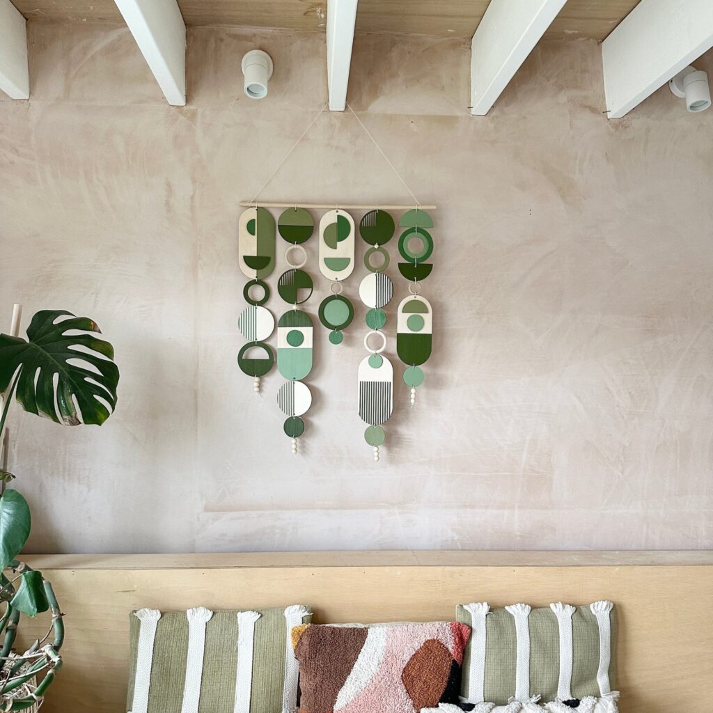
 Aisha's pickGeometric Boho Decor With a Bit More About It
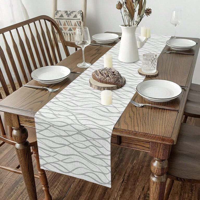
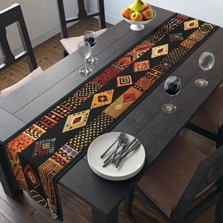 Aisha's pickGeometric Dining Table Decor You’ll Live With Happily for Years
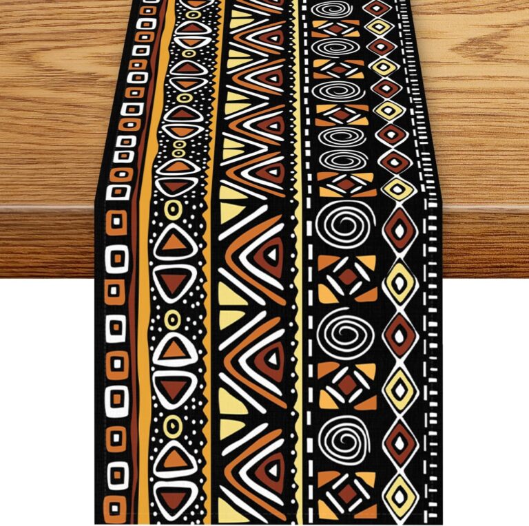
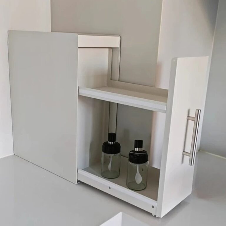 Aisha's pickGeometric Home Accessories That Make a Shelf Look Styled
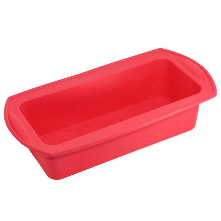
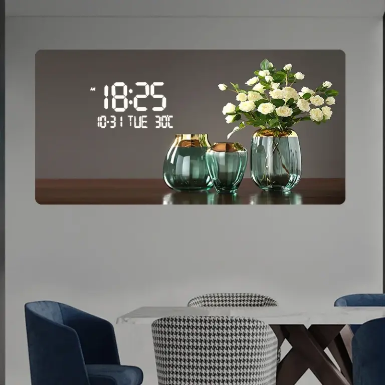 Aisha's pickGeometric Home Decor That Holds Up

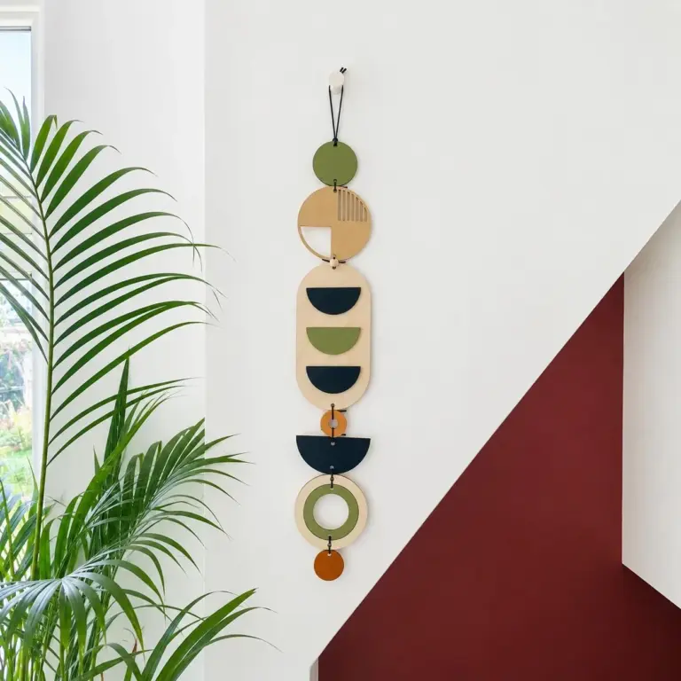 Aisha's pickGeometric Living Room Decor for Movie Nights and Slow Sundays

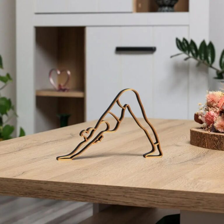 Aisha's pickShopping for Abstract Bedroom Decor? Start Here
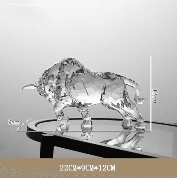
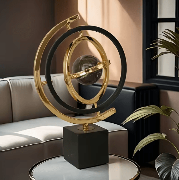
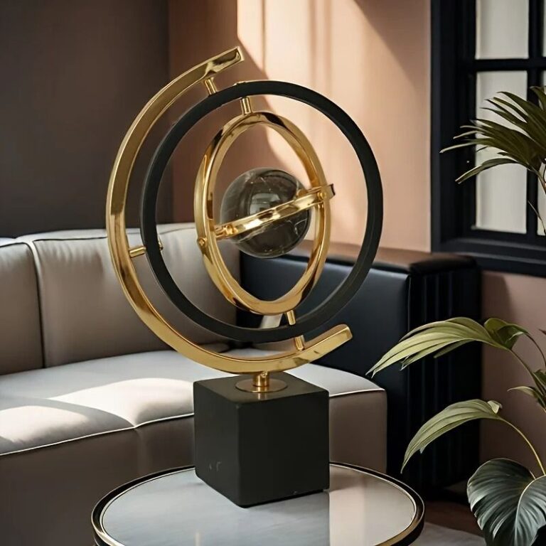 Aisha's pickDecent Geometric Sculptures Without the Hassle
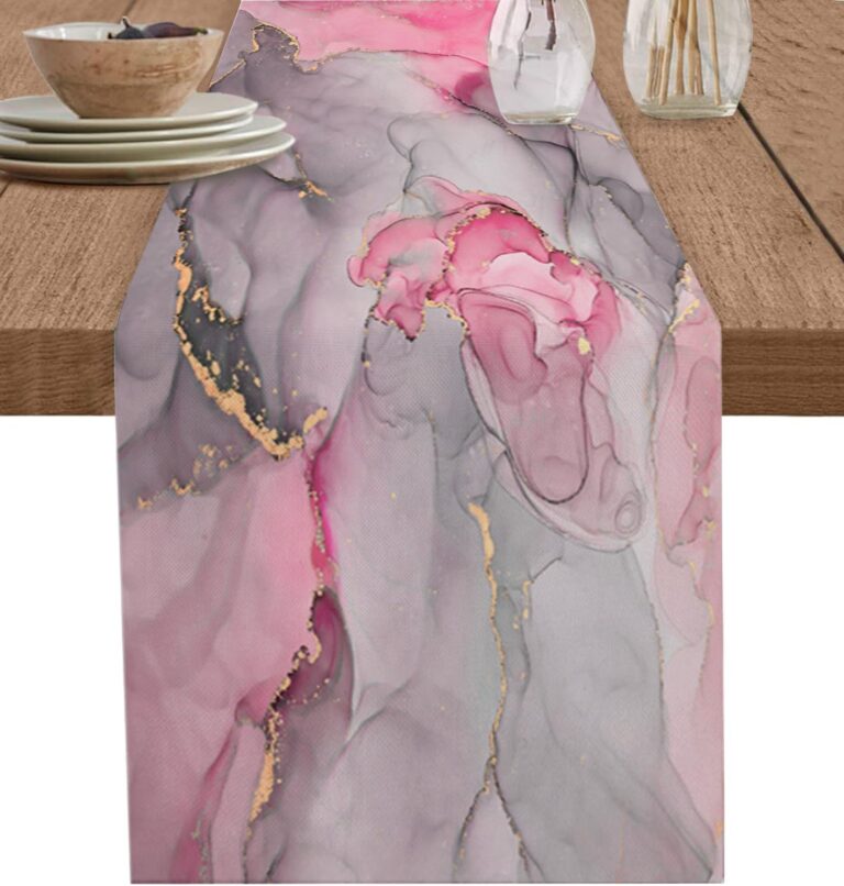 Aisha's pickAbstract Dining Table Decor From Stores Big and Small
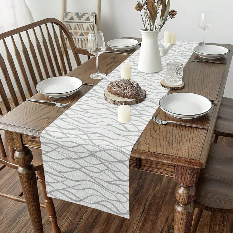
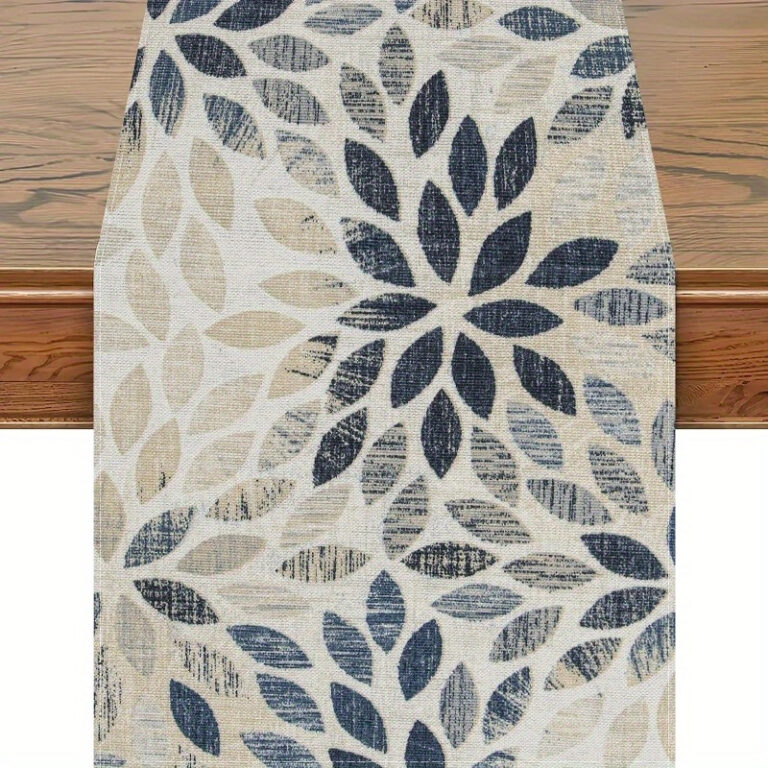 Aisha's pickGood Geometric Table Decor Without the Big Price TagAlso worth a lookDecorDecor is the stuff that doesn't do anything useful at all, and that's exactly the point of it.See the collections →
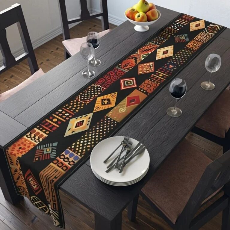
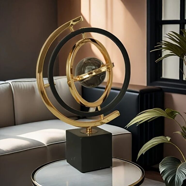 Aisha's pickAbstract Home Decor That Doesn’t Cost a Fortune
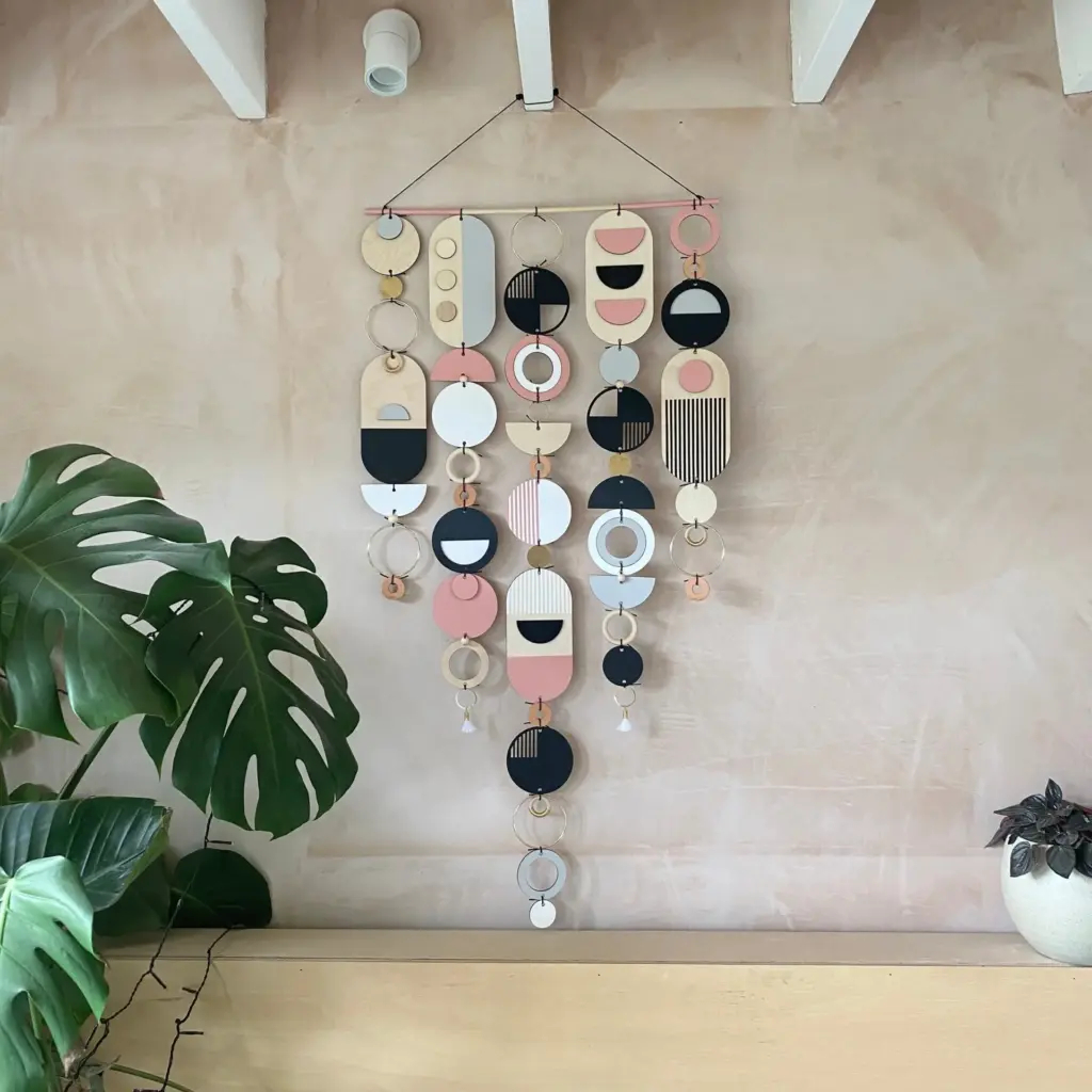
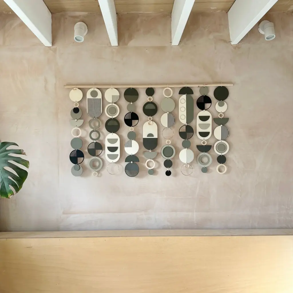 Aisha's pickGeometric Wall Decor From Brands You Know and a Few You Won’t
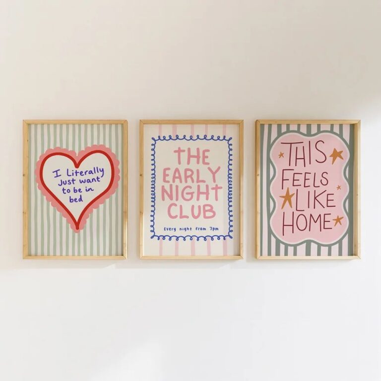 Aisha's pickAbstract Living Room Decor at Every Price Point
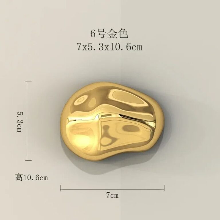
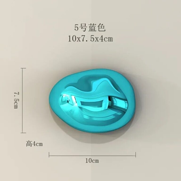 Aisha's pickAbstract Ornaments We’d Make Room For

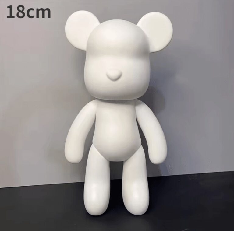 Aisha's pickAbstract Sculptures That Make a Room Feel Finished

 Aisha's pickOur Shortlist of Abstract Table Decor
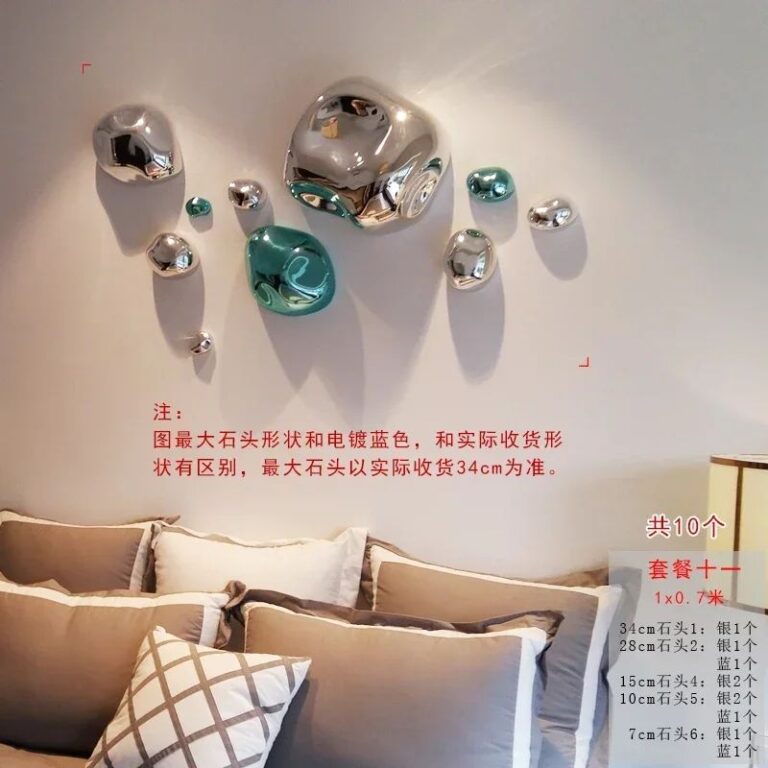 Aisha's pickGood Abstract Wall Decor Without the Big Price TagAlso worth a lookModern DecorYou know the moment. You've finally got the boring stuff sorted, the sofa's in, the curtains hang right,…See the collections →