Beige outdoor furniture is the quiet workhorse of a porch or patio, and I say that as a compliment, because most of what you put outside has to answer to weather, light and whatever else is already sitting out there, and beige just gets on with it. It does not compete with the house, the plants, or the four other things you already own that you never meant to match.
The shades that wear well outside tend toward the warmer end, sandy, oatmeal, a touch of gray mixed in rather than pink, because a cool, flat beige can look washed out and a little sad under bright sun, almost chalky by midsummer. A woven resin wicker in a warm tan, or a cushion in a heavier canvas with some texture to it, holds its color far longer than a smooth, pale fabric that shows every water spot and bit of pollen. Where it struggles is against a lot of gray composite decking or cool stone paving, the two tones sit next to each other looking unrelated rather than calm, and against anything already busy, bright cushions, patterned umbrellas, a riot of potted flowers, it tends to disappear rather than ground the space the way you want it to.
The difference between a piece that still looks decent after three summers and one that turns chalky and sad by its second is almost always in what you cannot see at first glance. Look at how the frame is joined, welded aluminum holds up far better outside than anything screwed together through thin tubing, because screws work loose with heat and cold and start to rattle. Check whether the cushion covers zip off for washing or whether you are stuck scrubbing fabric in place forever, and press a thumb into the foam, the cheap stuff flattens into a pancake by the following spring while a denser foam with a quick dry design keeps its shape and drains instead of holding water like a sponge. A beige finish on cheap resin also tends to yellow unevenly in strong sun, while a better pigment ages more gracefully, fading a shade or two all over rather than blotching.
Where it is the wrong call is a small, shaded porch that already reads a bit dim, beige there can make the whole setup look underfurnished rather than restful, and you are often better off with something darker that reads as intentional. It is also not the piece to reach for if you want the furniture itself to be the reason people notice the space, because that was never really the job it was built for.

 Aisha's pickNatural Outdoor Furniture Sets That Look Better in Real Life

 Aisha's pickNatural Outdoor Patio Sets That Survive Kids and Pets
 Aisha's pickGood Natural Patio Furniture Without the Big Price Tag
 Aisha's pickSimple Natural Patio Sets Done Well
 Aisha's pickNatural Round Patio Sets That Stand Up to the Weather
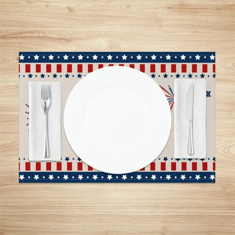 Aisha's pickWhere to Start With Beige Outdoor Sets
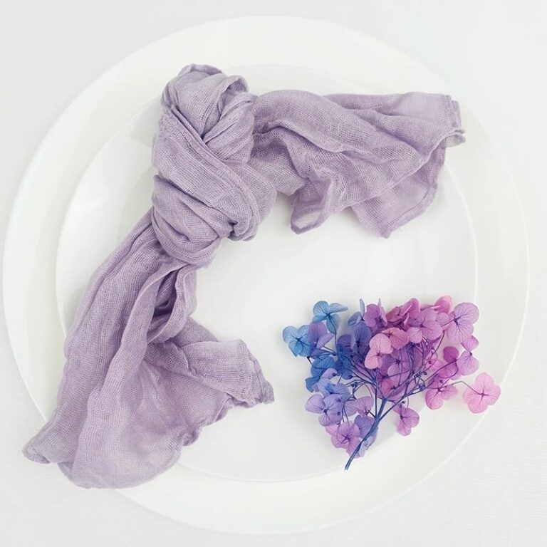
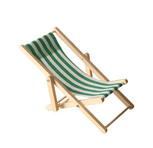 Aisha's pickSmall Natural Outdoor Furniture We Keep Buying
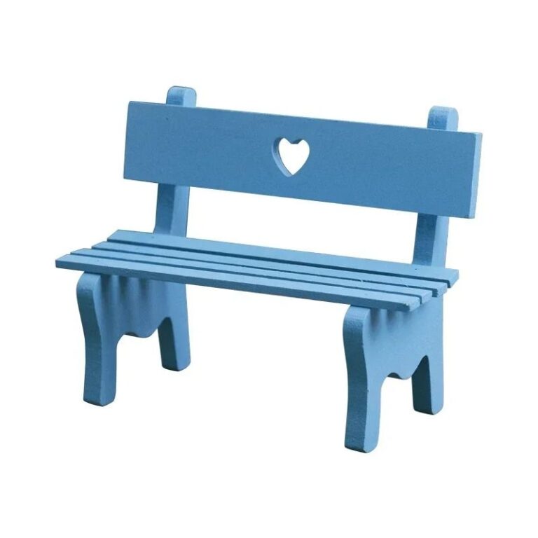
 Aisha's pickNatural Outdoor Furniture That Holds Up
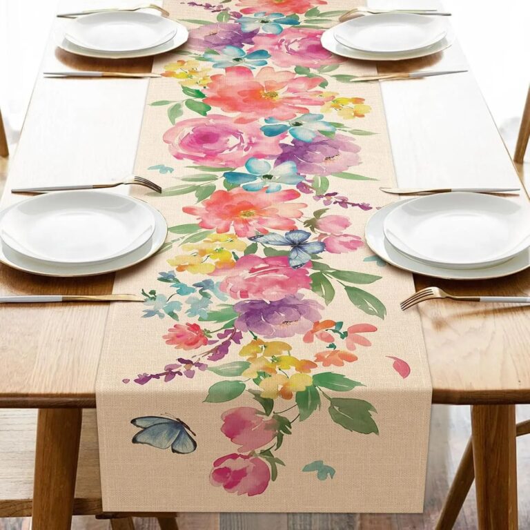
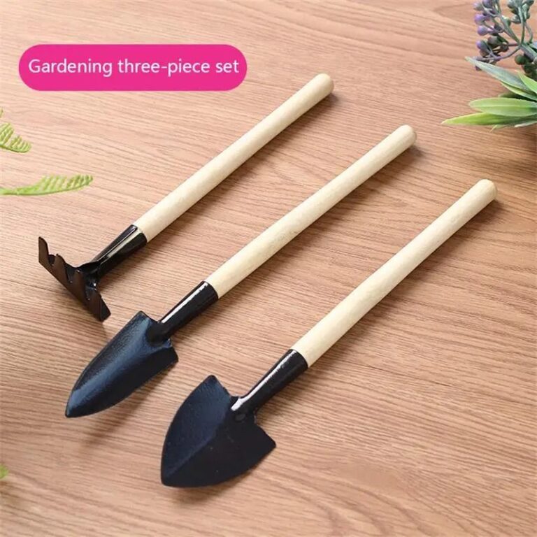 Aisha's pickSmall Natural Patio Sets That Do the Job RightAlso worth a lookDining Outdoor SetsThe thing nobody tells you is to measure your door frames before you measure the patio.See the collections →

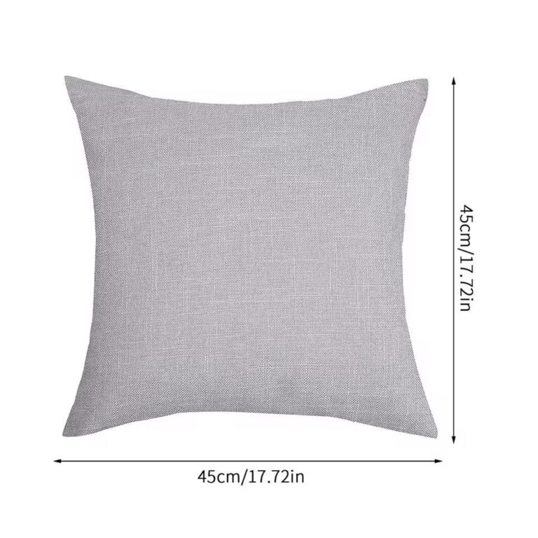 Aisha's pickNatural Outdoor Furniture Covers for Barbecues and Lazy Weekends
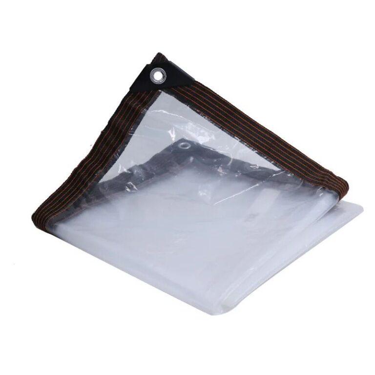
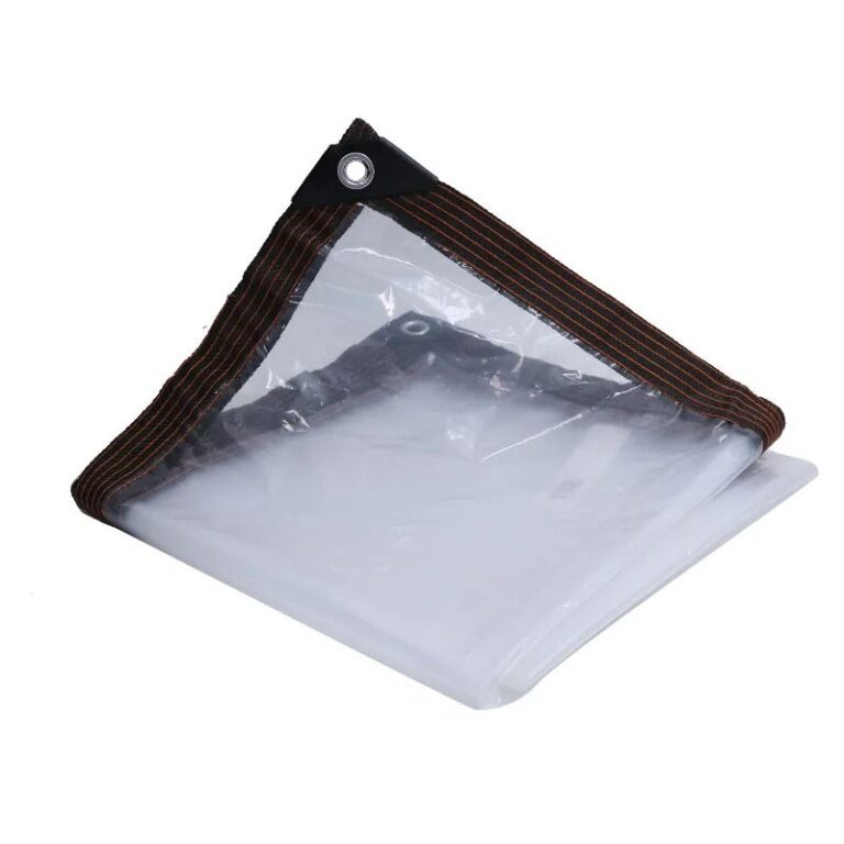 Aisha's pickNatural Outdoor Furniture Covers That Stand Up to the Weather
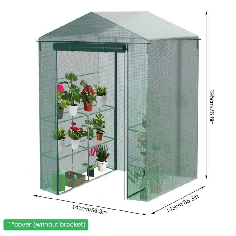
 Aisha's pickNatural Outdoor Furniture Sets Without the Silly Price Tag
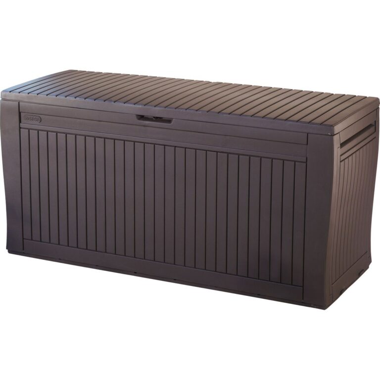 Aisha's pickNatural Outdoor Furniture with Storage Worth Your Money
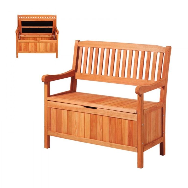
 Aisha's pickNatural Outdoor Sets for Barbecues and Lazy Weekends
 Aisha's pickWhere to Start With Natural Metal Outdoor Furniture
 Aisha's pickNatural Outdoor Dining Sets We Keep Coming Back To