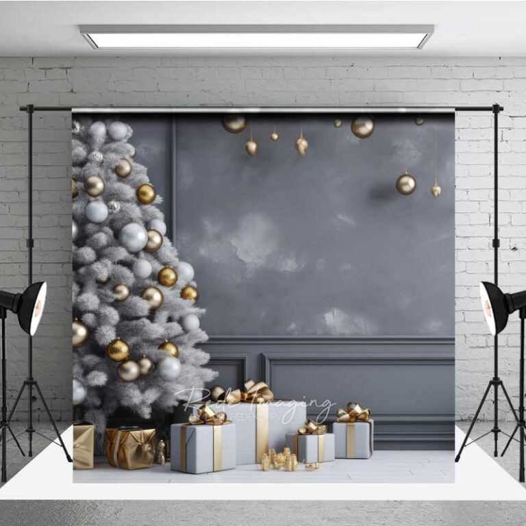
Stand in front of the white decorations table and ask yourself one question before anything else: does your tree already lean warm, with gold lights and wooden ornaments, or does it lean cool, with silver and icy blue. White sits happily with both, which is the whole appeal, but it will look washed out and a little sad against anything stark white already in the room, like a white mantel or a pale wall with no texture behind it. You need some contrast somewhere or the whole corner disappears into itself.
Where it goes wrong is when a room is already working hard to look like a winter catalog, all white walls, white furniture, white everything, and then you add white decorations on top and the effect is less festive and more operating theater. I made that mistake in my old apartment with white ceramic ornaments on a white shelf and genuinely could not see them from the couch. Where it goes right is almost anywhere with some warmth underneath it to push against, a wood floor, a brick wall, a worn leather chair, dark green garland, even just a beige rug. White decorations read as snow and candlelight when there is something for the eye to land on first. They also do something nice with low winter light, catching whatever lamp or string lights you have going in the late afternoon in a way colored ornaments just absorb.
As for wearing well, most white finishes are either matte ceramic, painted wood, or that slightly glittered felt look, and each ages differently. Ceramic chips if it gets knocked off a shelf, so keep anything breakable away from a mantel edge if you have a cat with main character energy, which mine does. Painted wood yellows a touch over the years under direct sun, nothing dramatic, just something to know before you store it facing a window. Felt and fabric pieces collect dust fastest, so a quick once over with a soft brush before you put them away in January saves you from unwrapping something gray next December.
On sizing, measure your mantel or shelf before you buy anything in bulk, because white ornaments in particular look like nothing in a photo and then arrive the size of a grapefruit. Leave gaps. A crowded line of white decorations loses definition and just reads as clutter, where three or four well spaced ones look deliberate.
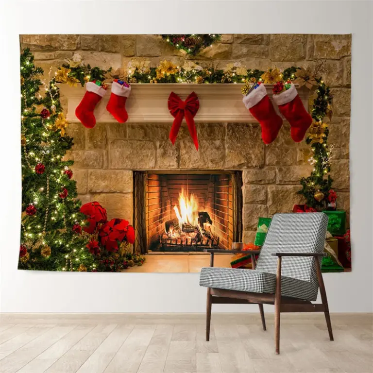
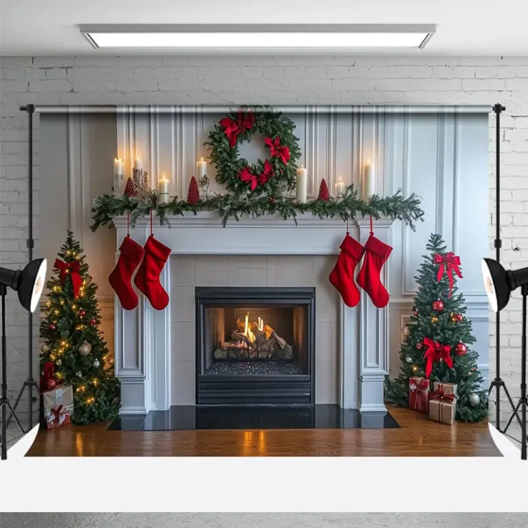
First place I would put them is the mantel, where the firelight does half the work for you.

 Aisha's pickWhite Christmas Tree Stars From Brands You Know and a Few You Won’t
 Aisha's pickLarge White Christmas Decorations We Dig Out Every Year
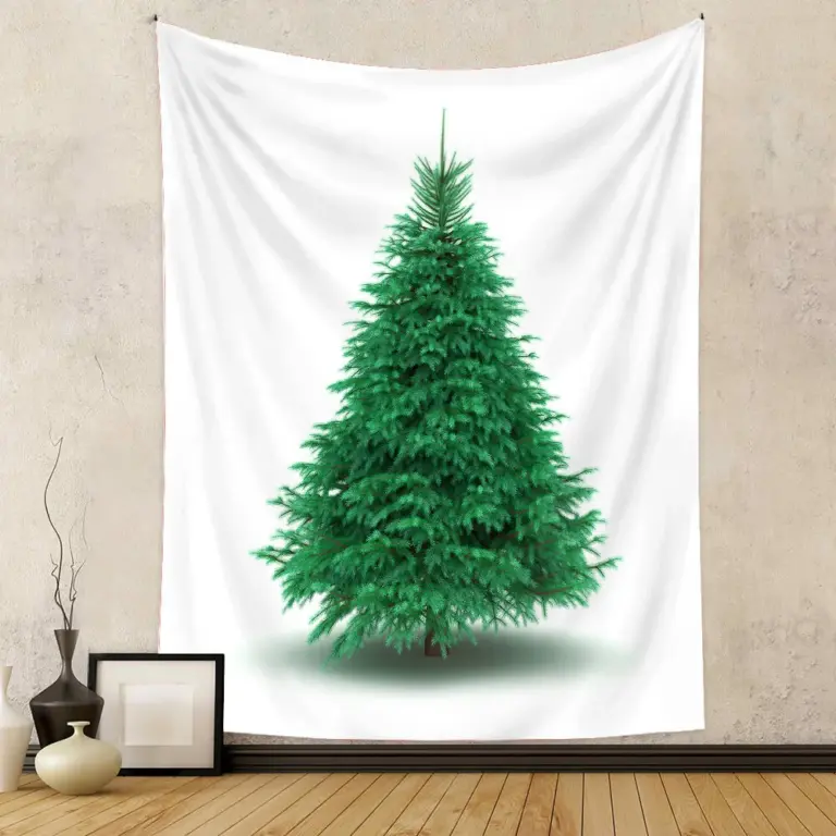
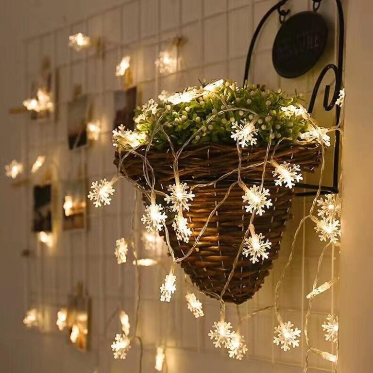 Aisha's pickGood White Christmas Wall Decor Without the Big Price Tag
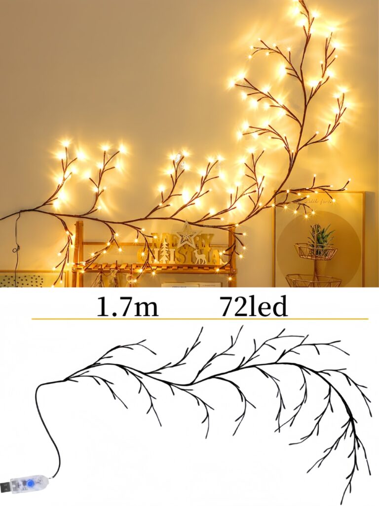
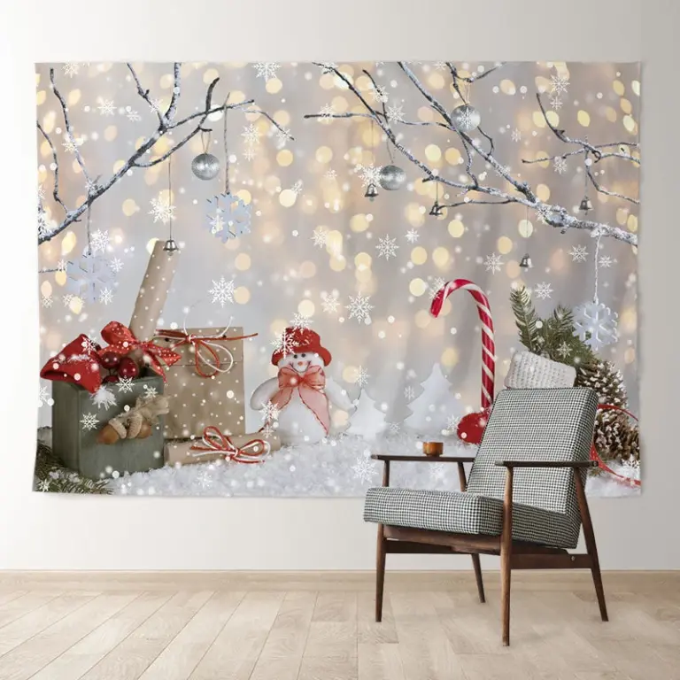 Aisha's pickWhite Christmas Baubles That Survive Being Packed Away

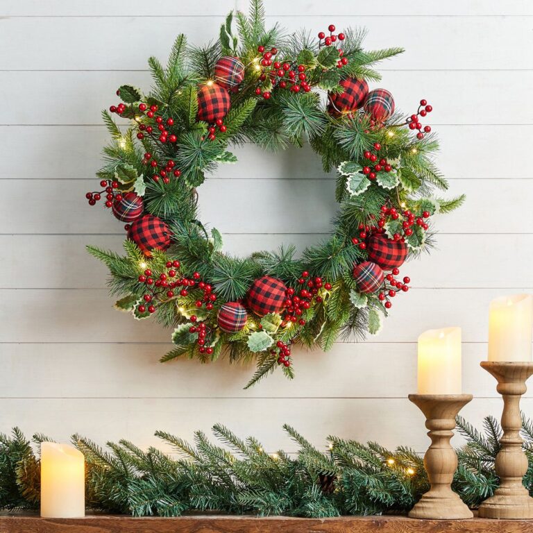 Aisha's pickWhite Christmas Wreaths That Look Better in Real Life
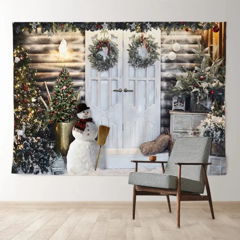
 Aisha's pickWhite Christmas Baubles for the Tree, the Mantel and Beyond
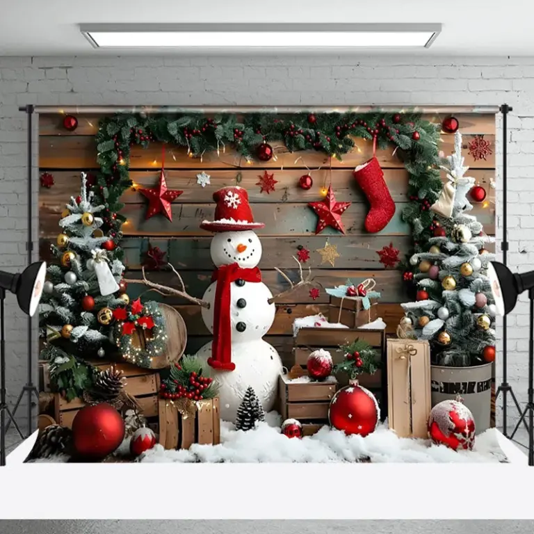
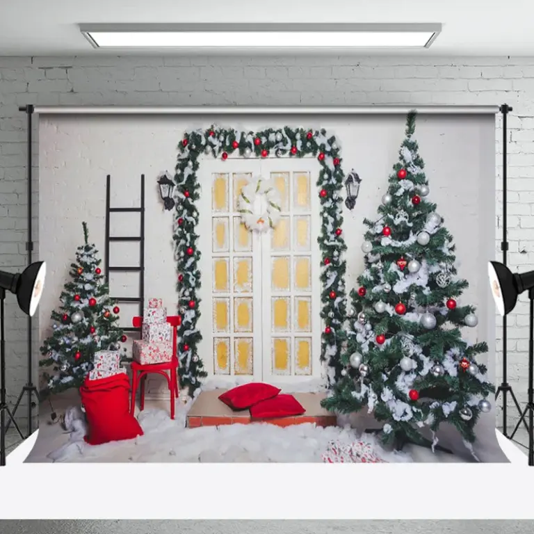 Aisha's pickOur Shortlist of White Christmas Wreaths for Tree
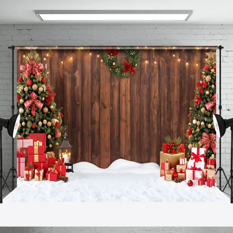
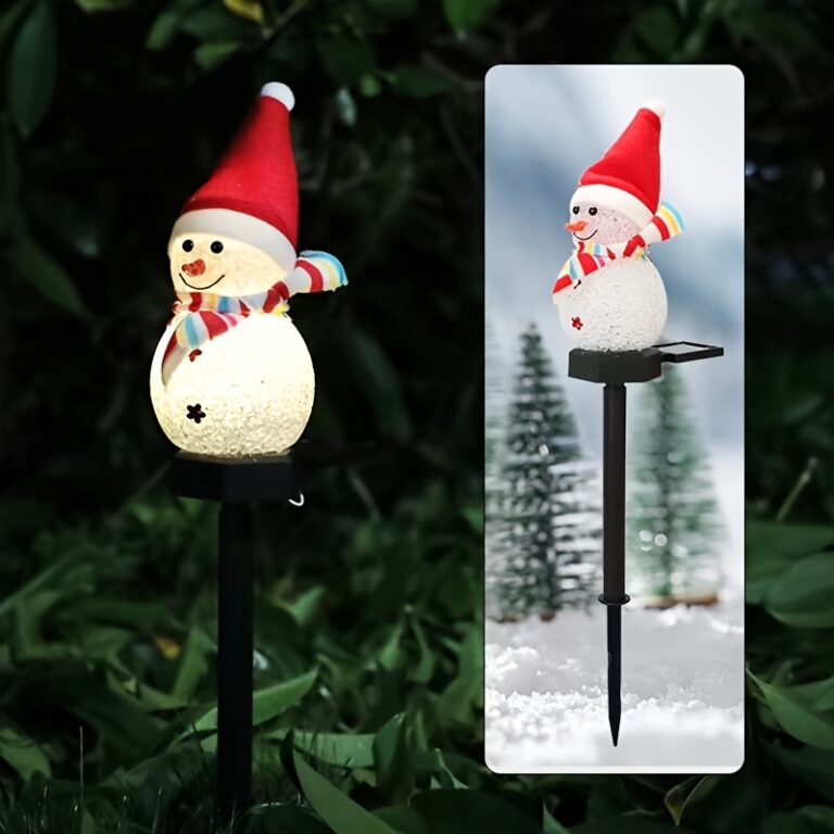 Aisha's pickWhite Christmas Decorations We Dig Out Every Year
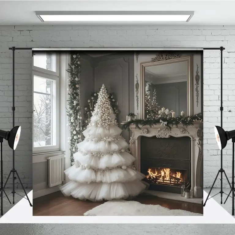
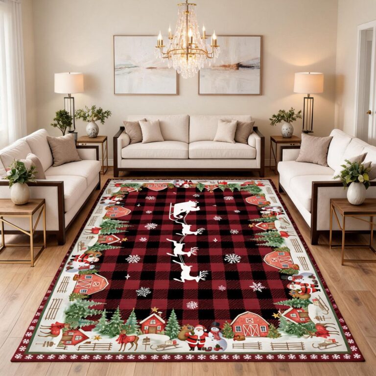 Aisha's pickWhite Glitter Christmas Decorations That Survive Being Packed AwayAlso worth a lookChristmas OrnamentsOrnaments used to mean one box of mismatched glass balls passed down until half of them were bald…See the collections →
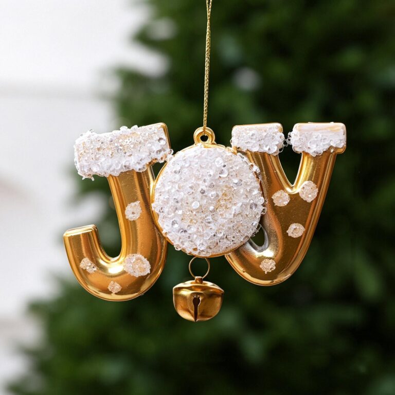
 Aisha's pickWhite Christmas Decorations That Come Out Every December
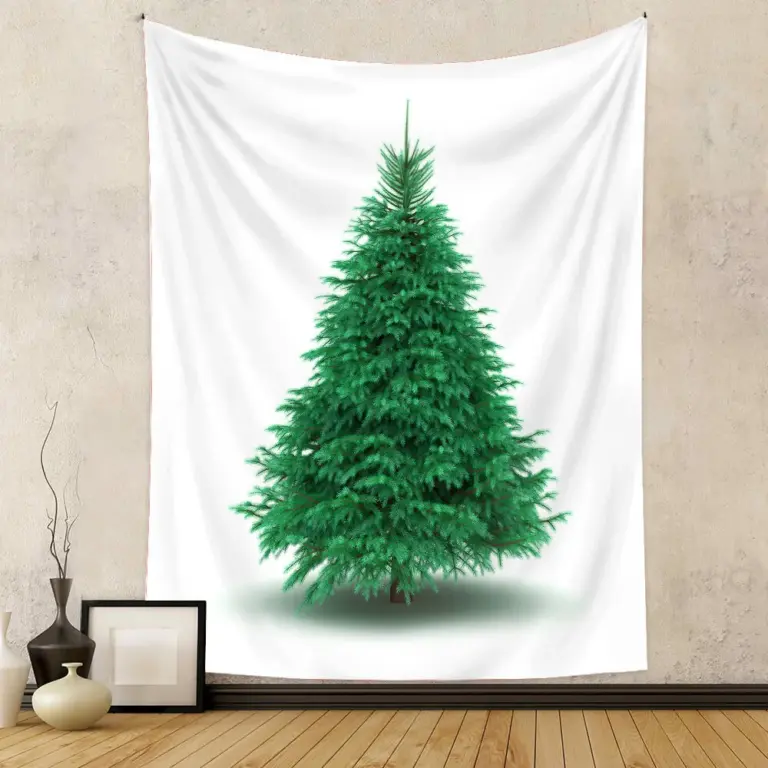
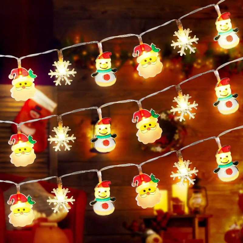 Aisha's pickWhite LED Christmas Decorations You’ll Keep for Years

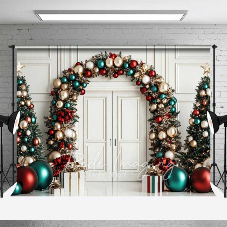 Aisha's pickGood White Christmas Decorations for Tree That Don’t Cost a Fortune

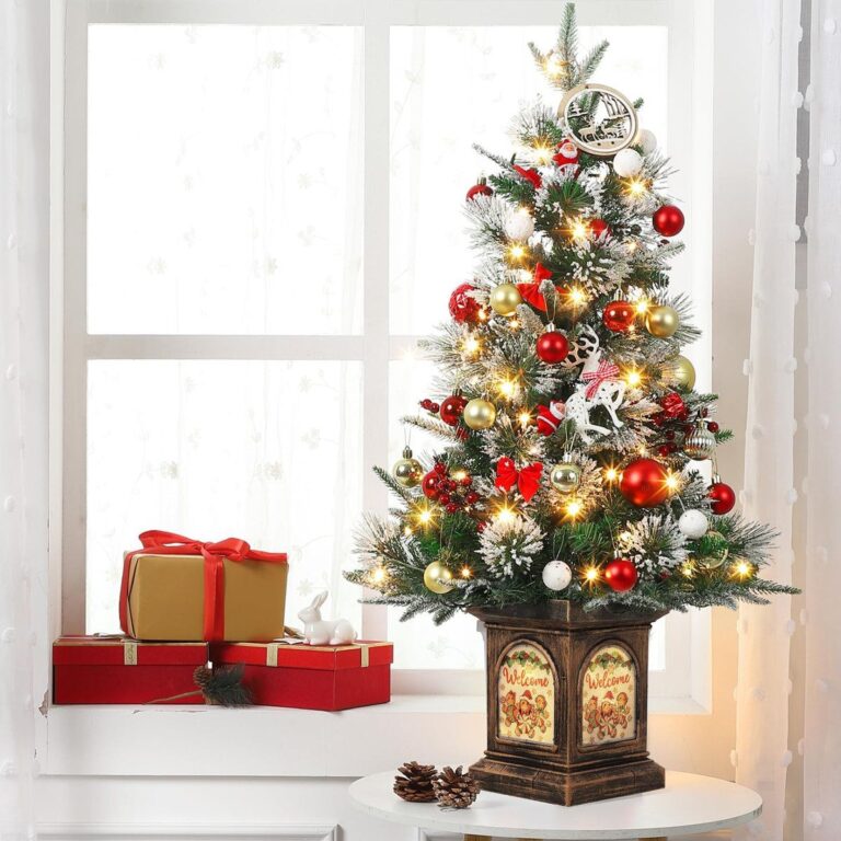 Aisha's pickWhite Pre Lit Christmas Decorations That Make the House Feel Festive
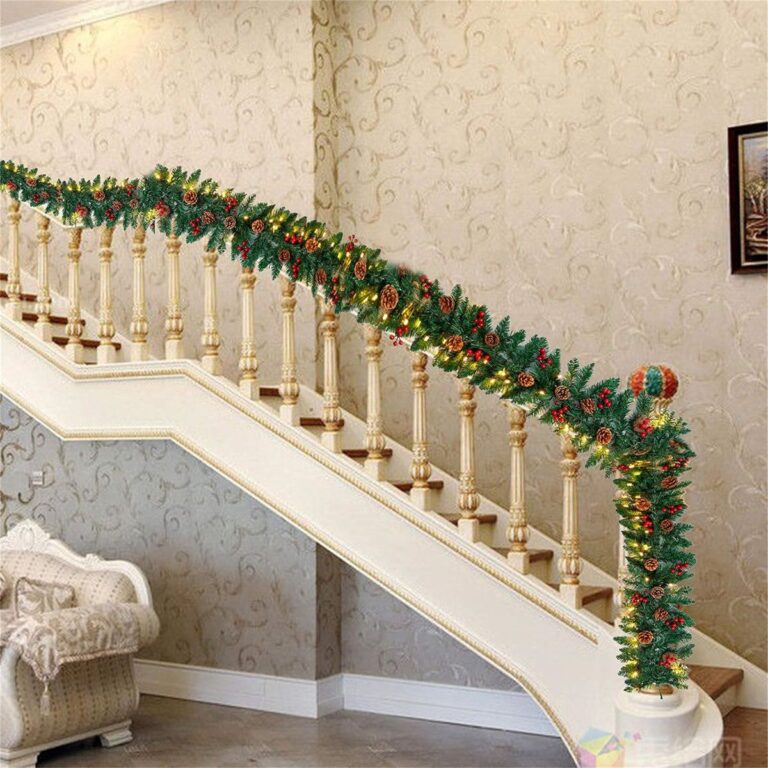
 Aisha's pickWhite Christmas Decorations with Lights You Won’t Regret Buying
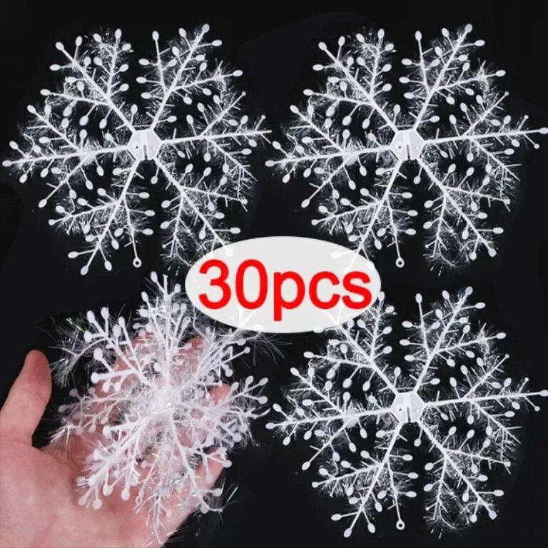
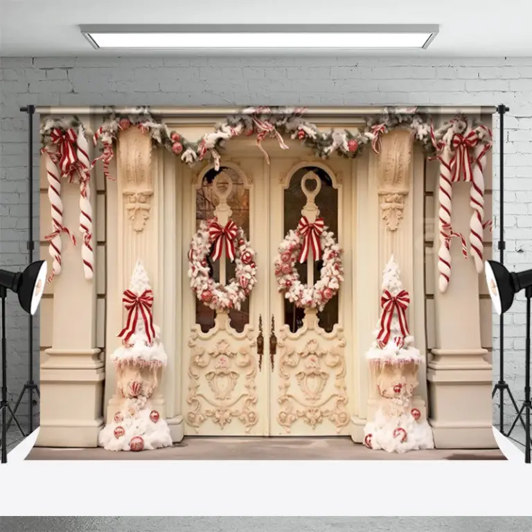 Aisha's pickWhite Christmas Door Wreaths for People Who Know What They Like
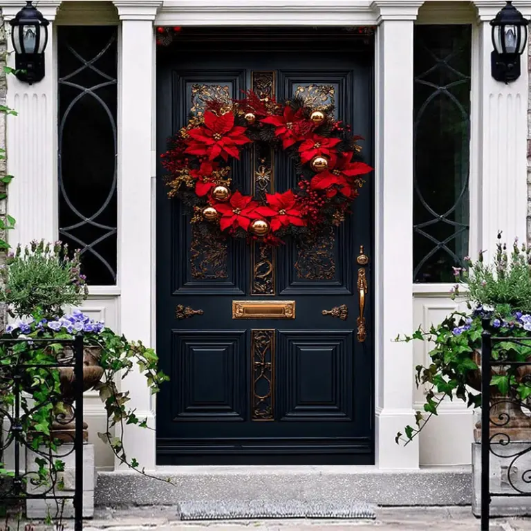
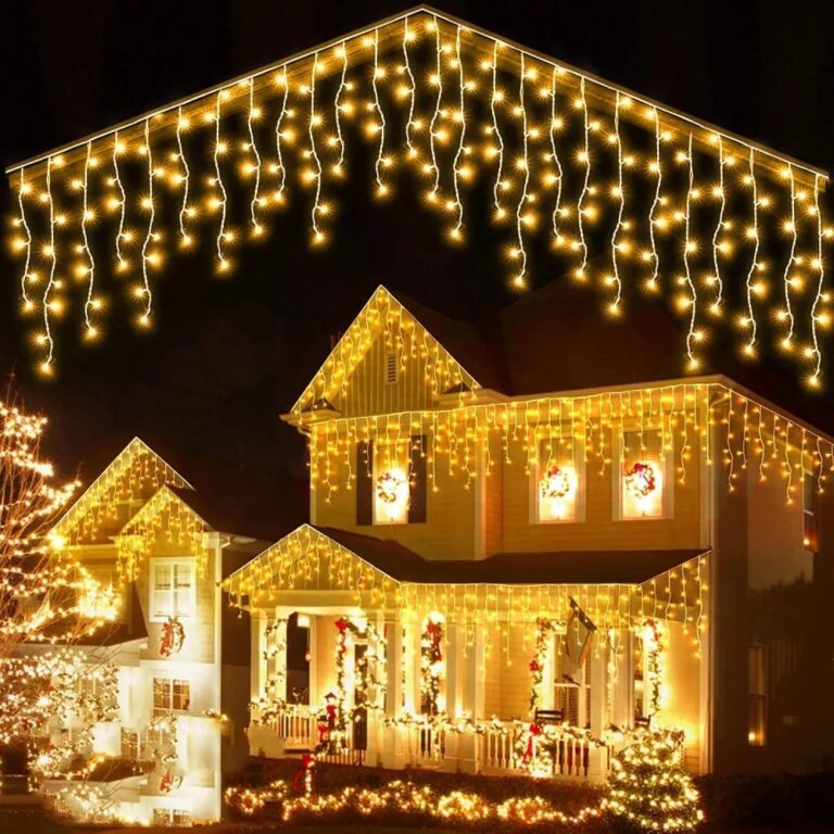 Aisha's pickWhite Christmas Garlands for Making a House Feel Like Yours
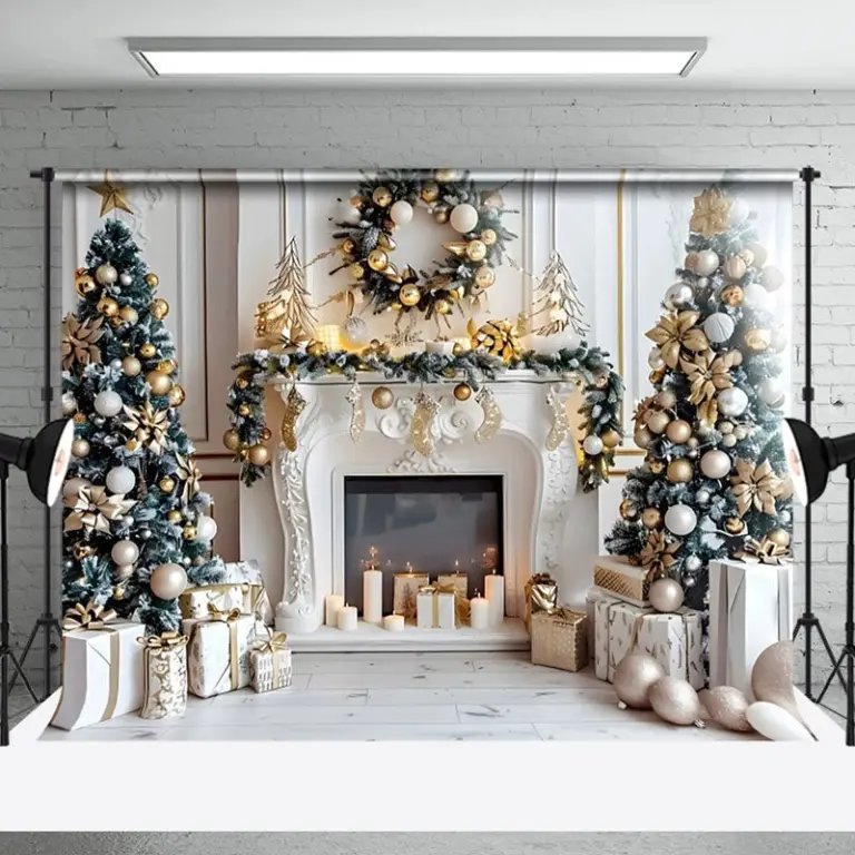
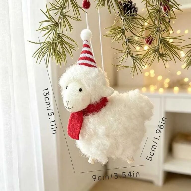 Aisha's pickWhite Christmas Hanging Decorations With a Bit More About Them
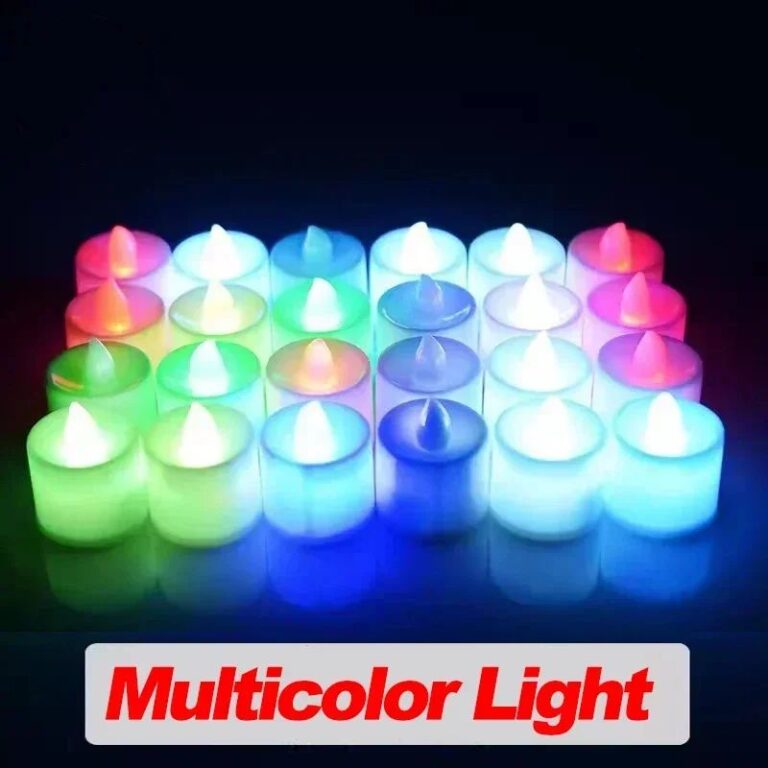 Aisha's pickWhite Christmas Light Up Decorations That Visitors Always Ask AboutAlso worth a lookChristmas WreathsThe afternoon it gets dark by five and someone finally turns the porch light on, that's when a…See the collections →
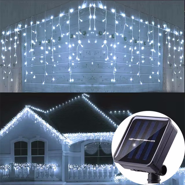
 Aisha's pickWhite Christmas Ornaments You Won’t Want to Hide Away
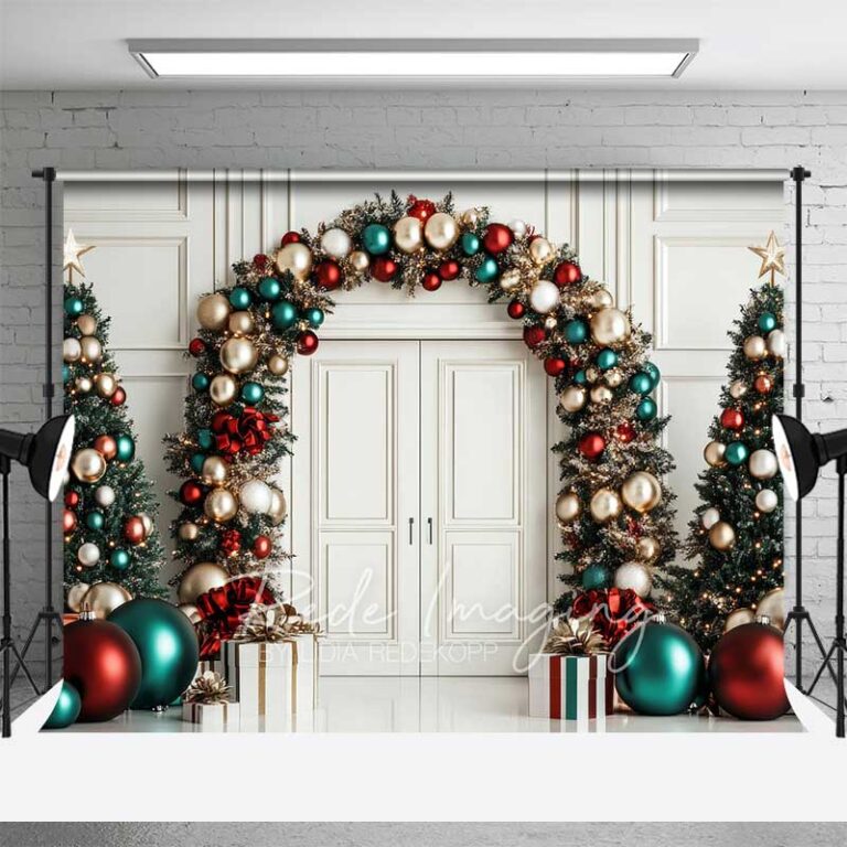
 Aisha's pickWhite Christmas Ornaments That Make a Room Feel Finished