My colleague Ron walked into my living room in October, looked at the sofa, looked at me, and said, “Did you rob a Sizzler.” Which is unkind, and also not entirely wrong, because I had just bought a bright red leather three seater off a clearance listing without thinking through what happens to a room once you introduce something that reflects light like that. Leather does something fabric never does. It catches the lamp, it catches the window, it catches the overhead light I still haven’t gotten around to replacing with something less like an interrogation room, and it throws all of that back at you. Red leather does this louder than any other color leather I’ve owned, because red already wants attention and shine just hands it a microphone.
I’d had a brown leather chair for years before this sofa arrived, inherited from my grandmother, matte with age and completely unbothered by anything I put near it. You could throw an orange pillow on that chair and it would just sit there being fine. The red sofa is not fine with anything.
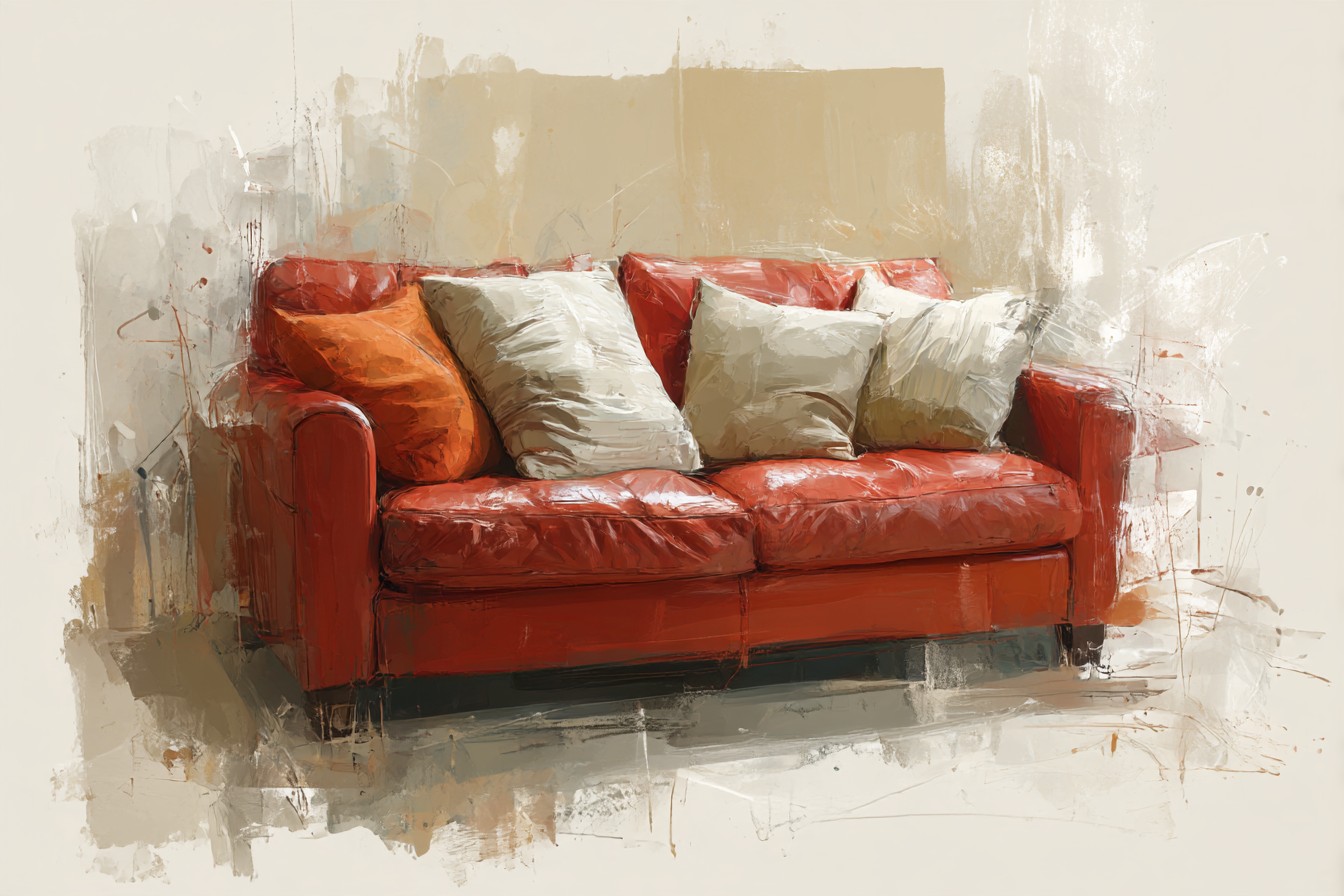
I found this out the slow way, pillow by pillow, most of them wrong, one particularly wrong ivory boucle number that made the whole setup look like it was auditioning for a furniture showroom nobody’s allowed to actually live in. My house is a hundred and thirty year old triple decker in Providence with gaps under the baseboards you could lose a pencil in, and everything in it has to earn its place by being useful, not just photogenic, so a pillow that only works from one angle in daylight was never going to survive here.
What I’ve learned, mostly by getting it wrong first, is that the shine changes the math completely. A matte fabric sofa forgives a lot of pillow decisions because the base surface isn’t doing anything itself, it’s just sitting there being a backdrop. Leather, especially red leather, is already a decision, so the pillows have to either calm it down, deepen it, or contrast it hard enough to look intentional rather than like you ran out of ideas halfway through. This isn’t a formal styling exercise, it’s more like negotiating with a piece of furniture that has a personality and isn’t shy about it. Here’s what’s actually worked, what’s actually failed, and what I’d tell you before you make the same ivory boucle mistake I did.
[Red Leather Sofa Pillows]
The Neutral, Matte Fabric Route
This is where most people land first, and for good reason, though I want to be specific about why it works rather than just saying neutrals are safe, because safe isn’t really the point. The point is texture contrast. A flat cotton or linen pillow in oatmeal, warm cream, or a soft stone color absorbs light instead of bouncing it, which means it sits next to the shine of the leather instead of competing with it. I have a pair of linen pillows in a color the label called “wheat” that has done more to calm this sofa down than anything else I’ve tried, because the weave has enough texture to read as matte from across the room, not just up close.
Where this goes wrong is when people reach for anything with a subtle sheen thinking it’ll blend, a satin blend cream pillow, a silky poly weave. Don’t. I did this with a set from a big box store that looked fine in the packaging and looked like two smaller, confused versions of the sofa once they were on it, all fighting for the same light. If you’re going neutral, go properly matte. Boucle works here too, though mine picked up cat hair like it was being paid for it, which is a genuine consideration if you’ve got a cat who considers the sofa neutral territory. Chunky knit throws in the same tonal family do the same calming job without quite as much upkeep, which is the version I’d actually recommend to anyone who isn’t prepared to lint roll a pillow twice a week.
[Neutral Fabric Pillows]
Going Dark and Deep Instead
The opposite approach, and the one I resisted for about a year because I assumed dark pillows against red leather would look like a hotel bar circa 2009, is deep tones, navy, forest green, a near black charcoal. This actually works better than I expected, and it works because it stops trying to soften the red and instead treats it as a rich color that deserves an equally rich partner, not a buffer.
A forest green velvet pillow I bought on a whim from a shop that’s since closed down has become the one piece in this room I’d replace immediately if something happened to it. It doesn’t fight the shine of the leather, it sort of matches its intensity while going a completely different direction with it, so the whole combination reads as deliberate rather than accidental. Navy does something similar but cooler, more like the red is a warm evening and the navy is the night arriving. What I wouldn’t do is put two dark, high sheen pillows together, a velvet and a satin in the same dark family, because then you’ve got three shiny surfaces in one seating area throwing light at each other and it starts to feel like sitting inside a jewelry box. One shine source per grouping. That’s the actual rule I’ve settled on after getting it backward more than once.
[Deep Tone Pillows]
The Mustard and Ochre Argument
I didn’t believe this would work until a former student’s mother, who does upholstery work on the side, mentioned in passing that warm yellows sit better against red than most people assume, because they share an undertone instead of clashing against one. I went home skeptical and tried it anyway with a mustard cotton pillow I’d been using in my classroom reading corner, of all places, and she was right, though I’m not going to pretend I understood the color theory behind it before I saw it in person.
You Might Also Like

Ochre and ripe mustard tones against red leather create something that feels autumnal rather than aggressive, which is a genuinely useful trick if you’re worried the red plus a bold accent is going to tip into looking like a fire truck had a baby with a couch. The trick is keeping the fabric matte again, a rough weave cotton or a slightly nubby linen blend, because a shiny mustard satin brings back the same problem as the cream satin disaster from earlier, too much reflective surface having an argument with itself. I’ve got two of these now in a natural dyed cotton that’s slightly uneven in color from pillow to pillow, which I initially thought was a manufacturing flaw and now consider the entire appeal.
[Mustard And Ochre Pillows]
Textured Fabrics That Do the Actual Work
This is less about color and more about surface, and it’s probably the section I feel most strongly about, because texture is doing at least half the job that color usually gets credit for. Chunky knits, boucle, raw linen, even a slightly rough wool blend, all of these interrupt the smoothness of the leather in a way that flat, tightly woven fabric just doesn’t. Put a flat cotton pillow next to leather and you’ve got two smooth surfaces sitting there being smooth at each other. Put a properly textured knit next to it and suddenly there’s a conversation happening, one surface reflecting, one surface absorbing and catching shadow in its own weave.
I learned this by accident with a boucle pillow in a dull sage color that I almost returned because I thought the color was wrong for the room. The color wasn’t wrong. The texture was doing so much of the visual work that I could have put it in almost any muted color and it would have worked, because it was breaking up the shine rather than trying to match or contrast it tonally. If you take one thing from this whole piece, and skip everything else about specific colors, it’s this: texture is doing more for you against leather than color choice ever will. A flat pillow in the “perfect” color will still look slightly off. A textured pillow in an approximate color will look right.
[Textured Fabric Pillows]
Pattern, Used Carefully
I avoided pattern near this sofa for the better part of two years, convinced that red leather plus any kind of print would tip the whole room into looking like it was decorated by committee, three separate committees, none of whom spoke to each other. I was mostly right to be cautious, but not entirely, because small scale, low contrast pattern does actually work, it’s the bold graphic stuff that causes the trouble.
A narrow stripe in cream and a muted terracotta, small enough that it reads as texture from across the room rather than pattern, has been sitting on this sofa for about eight months now without me once thinking it looked busy. What doesn’t work, and I say this from direct experience with a geometric print pillow that lasted exactly one dinner party before I moved it to a chair nobody sits in, is anything with sharp contrast or a large repeat.

It turns the sofa into the loudest thing in the room, and the sofa is already fairly loud on its own, it doesn’t need backup. If you want pattern, keep the scale small and keep at least one color in the pattern matching something already in the room, the floor, a rug, anything, so it feels tethered rather than dropped in from somewhere else entirely.
[Patterned Pillows]
Final Thoughts
If you’d told me two years ago I’d end up with strong, specific opinions about pillow texture versus pillow color, I’d have assumed you were talking about someone else’s life, but here we are. The actual short version, if you want it without all the trial and error I went through to get here, is that shine changes the rules. Matte neutrals calm it down, deep tones match its intensity without competing, mustard and ochre lean into the warmth already there, texture does more work than color ever will on its own, and pattern needs to stay small and quiet or it turns the whole arrangement into a shouting match.
None of this is about finding the one correct answer, because there isn’t one, there’s just what actually holds up once you’ve lived with it through a few seasons and a few dinner parties and at least one pillow you regret buying. Mine’s the ivory boucle, sitting in a closet now, too nice to throw out and too wrong for that sofa to ever bring back. Ron still brings up the Sizzler comment occasionally, which I’ve stopped taking personally, mostly because he’s not wrong that the sofa demands a reaction. It’s supposed to. That’s rather the point of buying a red leather sofa in the first place, and the pillows are just there to make sure the reaction is the good kind.