
I have exactly eleven pillows on my couch right now, and four of them are mustard. I counted because my wife asked why the couch looks like it’s “auditioning for a furniture catalog” and I genuinely didn’t have an answer beyond “I like the color and I keep buying it.” That’s not a flex, that’s a confession. Mustard is the one shade I never planned to build a whole design personality around, and yet here we are, four pillows deep, with a fifth sitting in a cart on my phone that I keep almost buying at eleven at night.
Here’s the thing about mustard nobody tells you when you bring the first one home. On its own, sitting next to the wrong colors, it can look less like a warm, confident, “I have a point of view” choice and more like something left over from a 1974 kitchen. I learned that the hard way with a mustard and lime green combo I put together during a Pinterest fueled fever dream two years ago that made our living room look like a bad avocado. My wife walked in, looked at it for a solid five seconds, and said nothing, which from her is basically a scathing review.
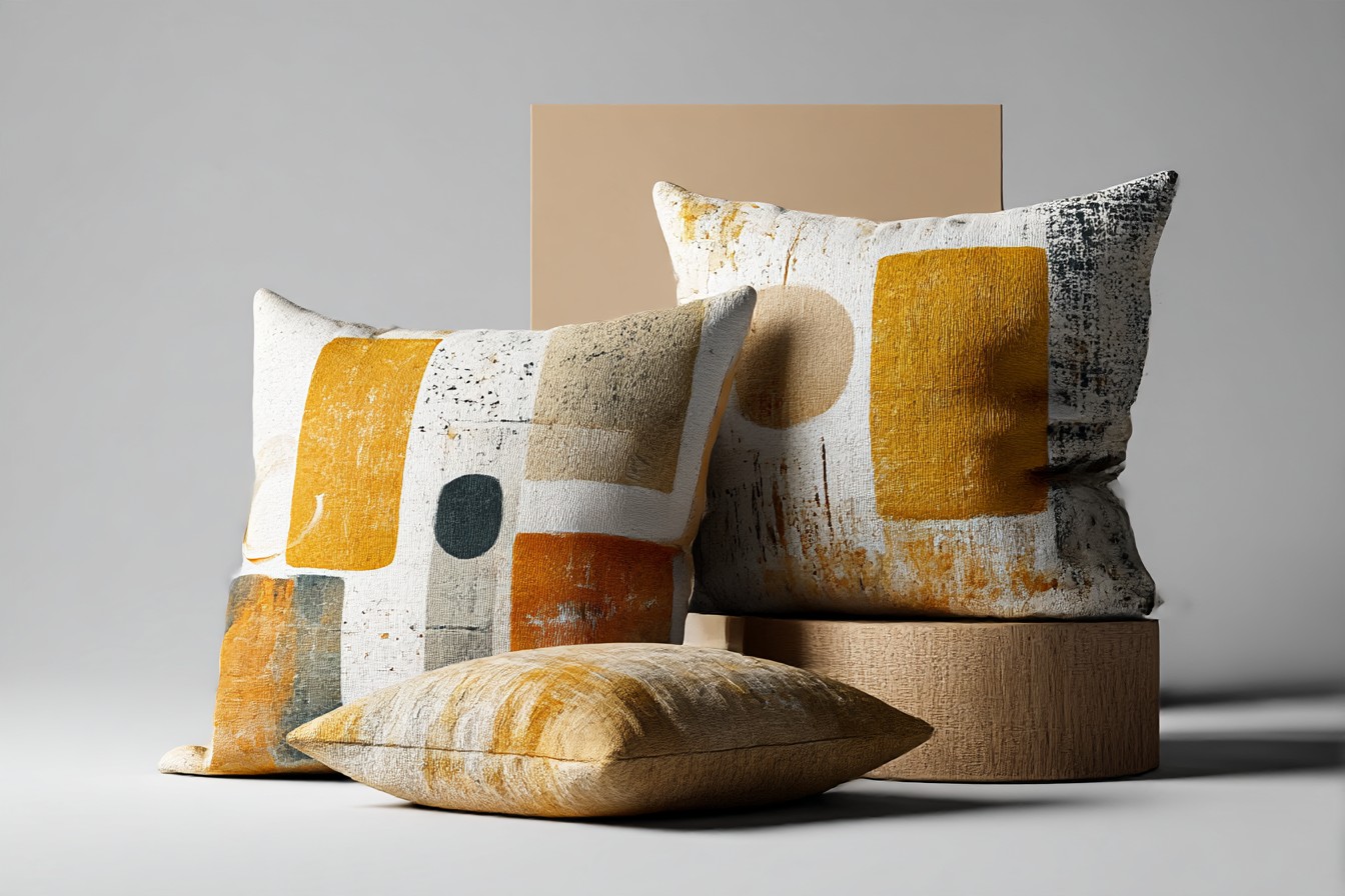
I swapped the lime pillows out within the week.
What I’ve figured out since, through a lot of trial, error, and one truly regrettable throw blanket, is that mustard is completely dependent on its company. Pair it right and it reads rich, autumnal, like something you’d see in a nice cabin. Pair it wrong and it reads like a dated diner booth. The color itself hasn’t changed. Everything around it has to do the work.
So this is me walking through what’s actually held up in my house, on my actual couch, survived by actual kids, rather than what looks nice in a photo with nobody sitting on it. Because that’s the other thing about mustard specifically, it shows everything. Crumbs, dog hair, a sippy cup incident I’ll get to later. It’s a color that demands you think about what’s next to it and what’s about to be spilled on it, often in that order.
[Mustard Pillows]
Mustard and Deep Navy, the Pairing That Never Lets You Down
This is the one I’d tell a friend to start with if they were nervous about mustard, because it is close to impossible to mess up. Navy and mustard sit on opposite ends of the color wheel in a way that just works, the kind of contrast that looks intentional even on days when nothing else about my living room is. I’ve got a navy linen sofa, mustard pillows on top, and it’s the one combination in my house that’s survived every redecorating mood swing I’ve had in three years, which for me is basically a world record.
It also happens to be the most forgiving combination when things go wrong, and things go wrong constantly in a house with a five year old and a two year old. My oldest spilled an entire cup of grape juice directly onto a mustard pillow sitting against the navy cushion back in March, and I remember standing there bracing for a disaster, because grape juice against mustard sounds like it should be catastrophic. It came out. Cold water, a little dish soap, and it came out completely, and the navy next to it hid the panic entirely for the ten minutes I needed to deal with it.
Where this pairing gets interesting is in the details you add around it. A little rust colored throw, a brass lamp, maybe a leather ottoman with some age on it, and suddenly navy and mustard stop looking like a safe choice and start looking like a deliberate one. I added a worn leather pouf to this exact setup last fall and my brother in law, who has strong opinions about everything and rarely compliments anything I own, actually asked where I got it. That doesn’t happen often in my house.
[Navy Pairings]
Charcoal Gray, the Color That Makes Mustard Behave
If navy is the bold pairing, charcoal is the responsible older sibling that makes everything calmer. I went through a phase where every pillow in my house had some kind of pattern or color statement happening, and my living room genuinely gave me a headache by the end of it. Charcoal fixed that. Not by fighting mustard for attention, but by just quietly grounding it.
I’ve got a charcoal gray sectional now, the kind of practical, slightly boring purchase I made specifically because I have kids, and mustard pillows on it look properly intentional instead of loud. It’s the difference between a room that feels warm and a room that feels like it’s shouting at you. My friend Marcus, who has genuinely tasteful furniture and no children to destroy it, told me once that charcoal is the color equivalent of a good pair of jeans, it goes with almost anything and it never looks wrong. I’ve thought about that comment more than I probably should.
The real test came when my youngest decided the charcoal sectional made an excellent trampoline, mustard pillows and all, for about four minutes straight while I was dealing with dinner. Cushions went flying, one landed in the dog’s water bowl, and somehow nothing was damaged, nothing was stained, and charcoal hid the general chaos of that entire afternoon in a way a lighter color never would have. It held up. He was furious it didn’t collapse under him. Best possible review I could ask for.
Charcoal also does something clever with mustard’s warmth, it cools it down just enough that the color doesn’t feel like it’s trying too hard, which matters if your house, like mine, already has a lot going on visually just from the sheer volume of kid stuff lying around.
[Charcoal Pairings]
Terracotta and Rust, for When You’re Ready to Commit
I’ll admit something upfront here, I went a little overboard with this one. Terracotta and mustard together is genuinely one of my favorite combinations, warm on warm, like a fall day distilled into fabric, but I bought four terracotta accent pieces in the space of six weeks last October and my wife started referring to our living room as “the pumpkin patch,” which, fair.
The reason this pairing works so well is that mustard and terracotta are close enough in tone that they never fight, but different enough that you still get depth. It’s not a contrast pairing like navy, it’s more of a harmony pairing, everything sits in the same warm family and the room feels cohesive without feeling matchy. I put a rust colored throw over the back of the couch with mustard pillows in front of it and honestly it’s the coziest corner of my entire house, the one spot where I actually want to sit down with coffee before the kids wake up and chaos resumes.
You Might Also Like

The risk with this combination is exactly what happened to me, it’s easy to go too far and end up in genuinely autumnal overload, where your living room looks like it’s permanently decorated for a harvest festival that ended three months ago. I had to pull two of the terracotta pieces out entirely to let the mustard breathe. Lesson learned. A little rust goes a long way, one throw, maybe one accent chair, not an entire room’s worth.
Where it survived real testing, a rust colored pillow next to a mustard one took a full crayon incident from my oldest, some kind of orange scribble that matched almost too well, and wiped off with a damp cloth because I’d finally learned to only buy pillow covers I could actually machine wash. That’s not a design tip, that’s a parenting tip disguised as one.
[Terracotta Pairings]
Sage Green, the Unexpected One That Actually Works
I resisted this combination for a long time because sage green felt like a color other people used, the kind of shade that shows up in home stores next to eucalyptus bunches and candles that smell like nothing in particular. I didn’t think it belonged anywhere near mustard, which I associated with warmth, not with anything botanical or muted.
Then my mother in law gave us a sage green throw blanket for Christmas two years ago, the kind of gift you accept graciously and plan to quietly rehome, and I threw it over the couch next to a mustard pillow while cleaning up one evening, mostly to get it out of the way. It looked better than almost anything I’d deliberately planned. Sage pulls something earthy and grounded out of mustard that navy and charcoal don’t touch, it’s a softer combination, less about contrast and more about the two colors coming from the same general outdoor palette, like a walk through actual mustard fields would look, if I’ve ever actually seen one, which I haven’t, but you get the idea.
This pairing had its real test during a genuinely unfortunate afternoon when my youngest got hold of a green marker and decided the throw blanket needed “more sage,” his words, roughly, since he can’t say much yet, but the intent was clear from the scribbles. It came out with a magic eraser and a lot of muttering under my breath. The pillow next to it survived untouched purely by luck, since he ran out of steam before he got to it.
Sage and mustard together work best in small doses, I’ve found, one pillow, one throw, not an entire sofa’s worth, because too much sage pulls the whole look toward something more spa like than lived in, and my house is not, under any circumstances, spa like.
[Sage Green Pairings]
Cream and Ivory, the Safe Choice That Isn’t Actually Safe
I used to think cream was the risk free option, the color you reach for when you don’t want to think too hard. Cream pillows next to mustard look genuinely beautiful, soft, warm, almost editorial, the kind of combination that makes a room feel finished without trying too hard. Then I actually lived with a cream pillow in a house with two kids and a dog for about three weeks and learned that “safe” was the wrong word entirely.
Cream shows everything. Every bit of dirt, every dog hair, every mysterious sticky handprint that appears despite you swearing nobody touched anything. I put a cream colored pillow next to two mustard ones on the reading chair in our living room, thinking it would look calm and elevated, and within nine days it had a faint grayish smudge on one corner that I still can’t identify the origin of. Nine days. That’s not a typo.
That said, I haven’t given up on it, because the look really is worth something when it’s clean, and I’ve gotten smarter about it. Removable, washable covers only, no exceptions, and I keep the cream pillow up higher on the chair where smaller hands don’t reach as easily. It’s held up fine since I made that adjustment, actually, and the contrast against mustard is still the softest, most put together look I’ve managed in this entire house.
If you’re going to do cream next to mustard, treat it like you would a white couch with kids around, not impossible, just something you manage on purpose rather than something you set and forget. The payoff, when it’s clean, is genuinely the nicest combination on this whole list, which is exactly why it stings every time it isn’t.
[Cream Pairings]
Final Thoughts
If you’d asked me three years ago whether I’d end up with strong, specific opinions about what goes next to a mustard pillow, I’d have laughed. It’s a pillow. But living with this color, actually living with it, through juice spills and marker incidents and one deeply misguided lime green phase, has taught me it’s less about the mustard itself and more about what you’re willing to put it up against.
Navy gives you the safest bold move.
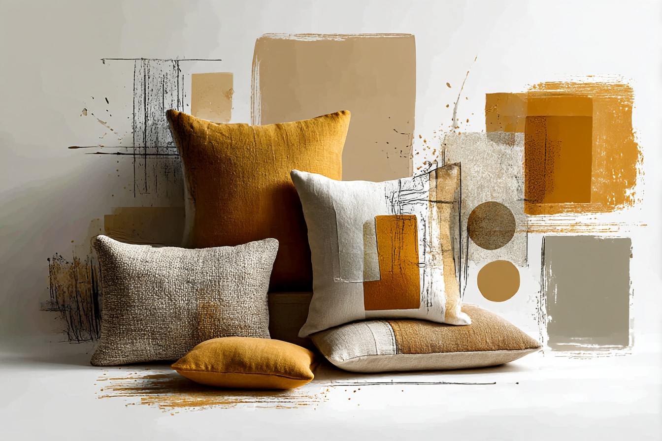
Charcoal calms it down when the rest of your house is already loud enough. Terracotta commits you to a whole warm mood, in moderation. Sage sneaks in from a direction you don’t expect. Cream rewards you if you’re willing to actually manage it instead of just hoping for the best.
None of these are wrong. They just ask different things of you and your actual house, not the version of it in photos. Mine’s got crumbs under the couch right now and a mustard pillow with a faint juice ghost on one corner that only I can see. It still looks good. That’s really the whole test.

[…] All velvet, all corduroy, all the same weight, and it flattens out again. Mixing a slouchy linen mustard pillow with a stiffer rust velvet one gives the whole arrangement somewhere to go visually, instead of […]
[…] out the fabric makes all the difference. A flat, slightly matte cotton mustard pillow can look dated fast. A textured ochre in a heavier weave, something with a bit of visible thread […]