My mom stood in my bathroom doorway, took one look at the tile job I’d just finished grouting myself, and said, “It’s very… hospital.” Not mean, exactly. She followed it with “in a nice way,” which is the kind of thing you say when it is not, actually, in a nice way. I’d spent a full Saturday on my knees with a rubber float doing this light gray tile, feeling proud of myself, and my own mother compared it to a place you go to get a hip replaced.
Here’s the thing though. She wasn’t wrong about the risk. Light gray tile, done wrong, reads cold. Clinical.
Like someone photocopied a spa and forgot to add the spa part. I’d seen it happen in my coworker Danielle’s building, she’d redone her bathroom the same summer I did mine, same tile guy even, and hers came out looking like a place you’d wait for a blood test. Same tile. Completely different feeling. The difference wasn’t the tile at all. It was everything around it, the towels, the paint, the faucet, the vanity color, all the stuff she’d left neutral because “gray goes with everything” and then wondered why the whole room had the personality of a filing cabinet.
I did not want a filing cabinet. I wanted a bathroom that looked like an actual person lived there and occasionally enjoyed a bath. So I spent an embarrassing number of weekends and one full Friday lunch break scrolling color forums, plus my usual Saturday morning at the thrift store on the corner near me, the one with the guy who restocks Fridays and definitely remembers me at this point, probably not fondly. And what I found out is that light gray tile isn’t the neutral trap everyone treats it like. It’s more like a blank canvas that’s already got an opinion, cool undertone, quiet, and it needs you to bring the warmth or the contrast, because it will not bring it for you.
This is the ledger entry I keep coming back to when people ask me what actually goes with light gray tile. Not one answer. Five, really, depending what part of the room you’re solving for. Towels first, because that’s the cheapest fix and the one people skip.
[Light Gray Bathroom Tile]
Towels That Stop the Room Looking Like a Waiting Room
I want to be clear, I owned exactly one set of towels for two years before I fixed this, and they were the white ones that came free with a bath mat bundle, which tells you everything about how much thought I’d put into it. White towels with light gray tile is fine. It’s also nothing. It’s the towel equivalent of shrugging.
What actually worked, and I say this having bought four different towel sets in six months chasing it, was a burnt terracotta pair from a shop that was closing down, marked to nine dollars each, which I did the math on and worked out to about a dollar sixty a month if they last me the two years towels usually last me, which is genuinely a great rate for something that makes the whole room look considered. The warm rust against the cool gray does something the white never did. It gives the tile a job. Mustard does the same thing, so does a deep sage, anything with actual pigment and warmth in it. What doesn’t work, learned this one the hard way at a different thrift trip, is pale blue. Pale blue towels on light gray tile is just more gray wearing a costume. My mom would’ve had a field day, “hospital, but the towels match now.”
[Towels]
Wall Paint, or the Argument I Have With Myself Every Time
I repainted my bathroom wall twice in eighteen months, which is not a brag, it’s a confession, and the second time cost me a Saturday and forty one dollars in paint I probably could’ve avoided if I’d just committed the first time.
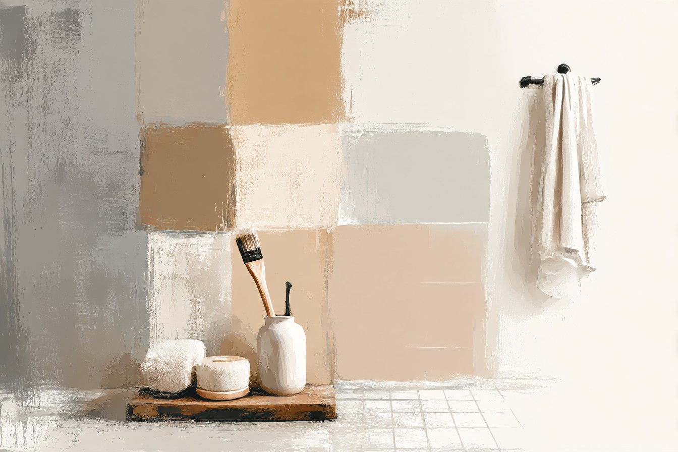
Round one was a warm white, the kind with a barely there yellow undertone, and it was fine, safe, boring in a way that matched nothing about how I actually feel about my own bathroom. Round two I went for a warm greige, more brown than gray, and that’s the one that stuck, because it acknowledges the tile without competing with it or disappearing into it. If you want to go bolder, and I have thought about this more than a reasonable adult should, a deep hunter green or a soft blush both play well against light gray, because they’re either warm enough or saturated enough to give the cool tile something to react against. What I’d avoid, based on Danielle’s bathroom which I keep bringing up because it’s still the clearest example I’ve got, is another cool gray on the walls. Two cool grays in one small room just amplifies the clinical thing. You end up back at the hospital hallway, just with better lighting.
[Wall Paint]
You Might Also Like

Fixtures and Hardware, Where the Real Money Argument Lives
This is the section where my mom’s “one trash bag away from a documentary” comment about my hall closet becomes relevant, because I nearly didn’t tell you about this purchase out of embarrassment. I swapped my chrome faucet for a brushed brass one, secondhand, off a listing from someone renovating a whole house who was basically giving away perfectly good hardware because it “didn’t match their vision.” Twenty two dollars. Faucet’s been in for fourteen months now, still tight at the joint, no green tinge, nothing chipping, which works out to about a dollar fifty a month and I did that math three times because the first answer felt too good to be real.
Brass against light gray tile is warm without being loud, and it reads intentional in a way chrome just doesn’t, chrome tends to melt into the cool tone and disappear, which is exactly the invisible, personality-free thing you’re trying to avoid. Matte black is the other strong option, more dramatic, more contrast, works especially well if your vanity’s on the darker side too. What I wouldn’t do, and I did this in my first apartment and regretted it within a year, is nickel. It’s not quite warm, not quite cool, it just sort of sits there being indecisive, which is a strange thing to say about a faucet but here we are.
[Fixtures]
The Vanity Is Where People Chicken Out
Everyone commits to bold tile, bold towels even, and then buys the safest possible vanity because it feels like the expensive, permanent decision. I get it. I chickened out too, first time round, bought a plain white vanity because it felt like the responsible choice, and it just sat there doing nothing, matching nothing, adding nothing.
The one I have now came from an estate sale two towns over, a navy blue vanity with brass hardware already on it, which felt like fate or at least a very good coincidence, sixty five dollars, and I priced a comparable new one online afterward just to torment myself, it would’ve been over four hundred. That’s the buy that makes my whole year’s ledger look good, one line item basically covering three other regrets. Navy against light gray tile has enough depth to stop the room going flat. Hunter green does the same. Even a warm wood tone vanity, something with visible grain, works better than plain white, because it introduces texture the tile doesn’t have on its own. If you take one thing from this section, don’t play it safe on the vanity just because it’s the biggest single item in the room. That’s exactly why it’s worth getting right.
[Vanity]
The Small Stuff That Finishes the Argument
Bath mats, shower curtains, the little tray you put your soap on, none of it feels like it matters until you look at photos of the finished room and realize the small stuff is doing half the work. I bought a mustard bath mat on a whim, four dollars, faded thrift store find, didn’t even wash it before I put it down which I don’t recommend, and it ended up being the thing that ties the terracotta towels and the brass faucet together without me planning that at all. Sometimes you get lucky.
A plant helps too, something with actual green in it, not the sad plastic kind, because live green against cool gray tile does something warm gray paint alone can’t. And art, even one small framed thing, breaks up what would otherwise be a wall of tile and painted wall doing nothing interesting together.

The rule across all of it is the same one from the towels section: light gray tile wants warmth or it wants contrast, and it will take either one gladly, it just won’t generate its own.
[Accessories]
Final Thoughts
If I’m totaling up the ledger on this whole project, and I always am, the wins were the secondhand faucet and that navy vanity, both of them proof that the color decision and the money decision aren’t actually separate arguments, they’re the same one. The losses were the two rounds of wall paint and that first sad set of white towels that did nothing for two full years while I didn’t notice.
What I’d tell anyone standing in a bathroom with light gray tile, worried it’s going to read cold no matter what they do, is that the tile was never the problem. It’s patient. It’ll take terracotta, mustard, brass, navy, sage, whatever warmth or contrast you actually commit to, it just won’t offer any of that itself. Pair it with more cool neutrals and yes, you’ll end up with something that looks like it should have a vending machine in the hallway outside. Pair it with one warm, deliberate choice, even just the towels, and the whole room shifts. Mine did. My mom hasn’t said the hospital line again, though I suspect that’s less about the color scheme and more about her having moved on to criticizing the state of my hall closet instead, which, fair, honestly, that one’s still a documentary waiting to happen.