
Everyone told me teal was the color you regret. My sister in law painted a whole accent wall that exact shade in 2014, this sort of swimming pool teal, and it lasted about eighteen months before she was back to white because she said it made the living room look like a dentist’s waiting room after five o’clock. I filed that away as gospel. Teal pillows, teal anything, was a phase color, a color you’d be apologizing for by the following winter, the interior design equivalent of a perm.
Then I found four teal velvet pillows at an estate sale two towns over, the kind of sale where the whole house smells like a candle that’s been burning since the Reagan administration, and I bought them because they were three dollars each and I am constitutionally unable to leave a three dollar pillow behind. They sat in a bag in the hall closet for about four months while I built up the nerve to actually put them anywhere, because I still had the dentist’s office thing rattling around in my head.
What changed my mind was, honestly, my own living room, which is the least glamorous origin story I can offer you. I have a sofa that’s a sort of tired oatmeal color because I bought it during a phase where I thought I wanted a “neutral foundation,” and every single thing I’d tried on it for two years looked like it belonged in a hospital waiting room, which is a different waiting room than the dentist one but equally bad.

I threw the teal pillows on there mostly out of impatience, expecting them to look wrong, and they didn’t. They looked like the room had been missing something specific and I’d finally found it. My sister in law’s mistake, I eventually worked out, wasn’t the color. It was that she’d made the whole wall do it. A wall has to live with you every single day in every light. A pillow you can throw across the room when you’re tired of it, or move to a chair, and it costs you nothing to be wrong about it.
What I actually learned, testing this across two rooms and one very confused reading chair, is that teal isn’t difficult, it’s just particular about company. Get the color next to it right and the pillow looks expensive. Get it wrong and yes, dentist’s office, every time. So here’s what I’ve actually put next to it, on furniture I actually own, in a house that has opinions about everything.
[Teal Pillows]
Mustard and Ochre, for a Couch That Needs an Argument
The oatmeal sofa I mentioned, the one I bought during my neutral foundation era, is exactly the kind of piece that benefits from a fight. Teal alone made it interesting. Teal with a mustard pillow thrown in, one of those deep ochre yellows rather than anything closer to lemon, made it look like I’d actually thought about it, which, to be fair, I eventually had, after several months of not thinking about it at all.
Mustard and teal is not a subtle pairing and I don’t think it’s trying to be. It’s the color combination of a really good vintage rug, the kind you see in a photo and assume costs four figures until you look closer and it’s actually just old and a little worn in a way that reads as intentional. Putting that same energy on a couch through pillows costs considerably less than the rug does, which I mention because I did briefly consider the rug and then remembered I have a dog who treats rugs as a personal challenge.
The trick, and I did get this wrong on the first pass, is not letting the mustard go pastel on you. I bought a cushion cover online described as “golden ochre” that arrived looking distinctly like a school bus, and against the teal it looked less like an intentional contrast and more like two toddlers had disagreed about what pillows were for. Once I found a properly deep, almost burnt version of mustard, closer to turmeric than sunflower, the two colors stopped competing and started actually working together, each one making the other look more expensive than it was.
This pairing wants texture doing some of the work too. My mustard pillow is a nubby cotton with almost a basket weave to it, and next to the smoothness of the teal velvet it reads as considered rather than accidental, the difference between a room that looks put together and one that looks like a pillow fight that got out of hand.
[Couch Pillow Colors]
Blush and Dusty Pink, for a Bed That’s Trying Too Hard to Be Neutral
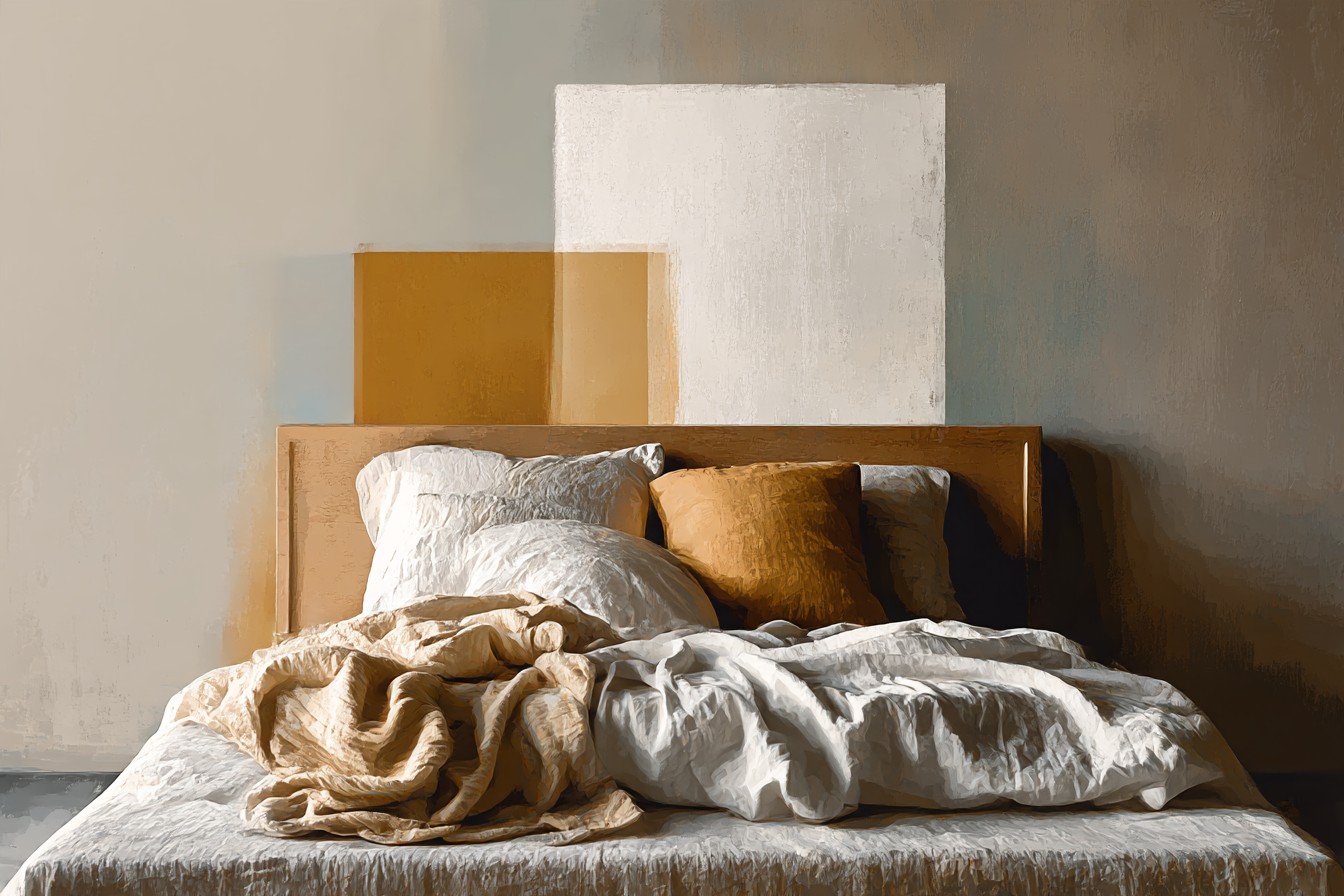
My bedroom is the one room in this house I’ve kept deliberately calm, mostly because it’s also the coldest room in the house and I’ve decided that visual busyness and thermal misery shouldn’t happen in the same space at the same time. White duvet, cream linen sheets, the whole quiet palette. It needed something, though, because quiet had started tipping over into boring, the kind of boring where guests compliment it in the specific way people compliment a room they don’t actually want to spend time in.
Two teal pillows against the white bedding did the heavy lifting I expected. What I didn’t expect was how much better it got once I added a single dusty pink pillow into the mix, a sort of faded rose rather than anything bright or Barbie adjacent. It’s a strange pairing on paper, teal and pink, the kind of thing that sounds like it belongs on a flamingo, but in the muted, almost chalky versions of both colors it reads as genuinely sophisticated rather than novelty. I think it’s because both colors, in their softened forms, share the same slightly dusty, slightly vintage quality, like they’ve both been left out in the sun a little.
This is a pairing that wants restraint, which is not a word I use about myself often. One pink pillow, tucked slightly behind the teal ones rather than front and center, keeps it from tipping into “little girl’s bedroom” territory, which is a real risk with this combination if you’re not careful about proportion. I learned this the hard way with a friend’s guest room, three pink and three teal in equal measure, that ended up looking like a birthday party rather than somewhere an adult sleeps.
[Bed Pillow Colors]
Navy, for the Reading Chair by the Cold Window
I have a reading chair positioned, foolishly, directly beside the one window in this house that lets in a genuinely alarming amount of cold air, condensation and all, the kind of window that has convinced me over several winters that “original features” is real estate speak for “the building is actively working against you.” The chair itself is a deep navy velvet, secondhand, and for a long time I left it exactly as it was because navy on its own already felt like a finished decision.
You Might Also Like

Adding a single teal pillow to it turned out to be one of those pairings that shouldn’t work on paper and completely does in person. Navy and teal are close enough on the color wheel that putting them together risks looking like you ran out of one and grabbed the nearest jar, but the two shades I’ve got, a proper ink navy and a teal with real depth rather than anything bright or aqua, sit together like they were always meant to. It’s a tonal pairing rather than a contrasting one, and tonal pairings on a single chair read as deliberate in a way that’s hard to fake with two colors that are actively fighting each other.
What sold me on it permanently was a specific evening, deep January, the radiator doing absolutely nothing useful against that window, and I was sitting in that chair under a blanket noticing that the navy and teal together looked richer in lamplight than either color managed on its own in daylight. Dark, saturated colors do that. They hold onto lamplight instead of just reflecting it back at you the way pale colors do, which is a small practical point nobody puts in the design magazines but matters enormously if, like me, you spend four months of the year in a room lit mostly by a single forty watt bulb because the overhead fixture in this house has never worked properly and I’ve stopped fighting it.
[Chair Pillow Colors]
Rust and Terracotta, for the Couch in Autumn
I swap pillow covers seasonally, which sounds like the kind of thing only a person with too much closet space and too little else going on would admit to, and it is, but it also means I’ve had the chance to test teal against a genuinely wide range of colors on the exact same sofa without buying anything new, which is the only kind of research I actually trust.
Rust and terracotta against teal is an autumn pairing that shouldn’t feel as warm as it does, given that teal itself reads as a cool color on every color wheel I’ve ever seen printed in a textbook. But something happens when you put a properly warm, almost clay colored terracotta pillow next to a deep teal one. The teal stops reading as cold entirely. It starts reading as the color of water at the end of summer, which is a strange thing to write about a cushion but is genuinely how it looks once the terracotta is doing its job beside it.
This is the pairing I’d reach for on a couch in a room that gets a lot of natural light in the afternoon, because the warmth in the terracotta seems to pull the same warmth forward out of the teal, the two colors meeting somewhere in the middle instead of sitting at opposite ends of the temperature scale. I tried this same combination once in the north facing spare room, which gets almost no direct sun, and it fell completely flat, muddy rather than rich, which taught me that this particular pairing isn’t really about the colors in isolation. It’s about what light is doing to them at three in the afternoon, and if your room doesn’t have that light, you’re better off elsewhere on this list.
[Autumn Pillow Colors]
Cream and Warm Wood Tones, for When You’ve Lost Your Nerve
There’s a version of this whole exercise where you just want the safest possible option, the pillow pairing equivalent of ordering the same thing every time at a restaurant because you know exactly what you’re getting. Cream is that option for teal, and I don’t say that as an insult. Some evenings you don’t want your couch to be an argument, you just want it to look nice while you eat cereal in front of it.
Teal against a proper warm cream, not stark white, not anything with a blue undertone that fights the teal for attention, just does the job every single time. It’s the pairing I recommend to anyone who’s nervous about the whole thing, because it fails so rarely it’s almost boring to write about. The one thing I’d say, having lived with this combination on both a couch and, briefly, a window seat, is that the color temperature of the cream matters more than people think.

A cream that leans even slightly grey makes the teal look flat and a little sad. A cream that leans warm, almost the color of the inside of a croissant if that’s not a ridiculous thing to compare fabric to, makes the teal look properly rich.
Add a wooden element into that same space, an actual wood frame chair nearby, or a side table with some visible grain to it, and the whole thing settles into something that looks considered without looking like you spent a single evening agonizing over it, which, in my case, was a complete lie, because I absolutely did.
[Neutral Pillow Colors]
Final Thoughts
I still think about my sister in law’s teal wall sometimes, mostly because it’s a useful reminder that the wrong amount of a good color is indistinguishable from a bad one. Teal was never actually the problem. An entire wall of it, with no relief and no company, was the problem, and a pillow will never make that particular mistake because a pillow, by its nature, comes with an exit strategy.
What I keep coming back to, having now put teal next to mustard, blush, navy, terracotta, and cream in four different rooms of a house that fights me on almost everything else, is that this is a genuinely easy color to work with once you stop treating it as the main event. It wants a partner. Mustard for an argument, pink for softness, navy for depth, terracotta for warmth, cream for when you’ve had a long week and don’t want to think about it. Pick based on the room you actually have, not the room in the photograph, and it’ll behave.
I bought those estate sale pillows for three dollars each expecting to feel a little foolish about them eventually. I have not felt foolish about them once, which might be the single strongest recommendation I can offer for anything currently in my house.

[…] the moment I realized I’d been treating pillow color like an afterthought instead of the thing that decides whether teal reads as a choice or an […]
[…] gentlest possible contrast. I use these on the ends of the arrangement now, bookending two or three colored pillows in the middle, and it’s the first pillow layout I haven’t wanted to redo within a […]