
I was standing in the doorway of the spare room on a Tuesday afternoon with an armful of flat sheets I hadn’t folded properly in maybe four years, trying to work out where they went, when it hit me that I was looking directly at the reason that room never felt finished. The wardrobe. White, flat fronted, perfectly nice, bought in 2016 to replace the walnut monstrosity that had lived in that spot since my daughter left for college, and it had been sitting there ever since looking like a large, well behaved appliance rather than a piece of furniture anyone had thought about. Not ugly. Never ugly. Just entirely without opinion, the way a fridge doesn’t have an opinion, and a room full of things without opinions ends up feeling like a waiting room.
I want to be fair to white wardrobes here because I think they get unfairly blamed for their own blankness, when really the blankness is the whole point of buying one.

You buy white because you don’t want the wardrobe to be the main character. You want it to disappear into the wall a bit, do its job, hold the sheets and the winter coats and the sweater you swore you’d wear more this year, and not demand anything of you visually. That’s a completely reasonable thing to want. I’ve owned three white wardrobes across three different decades of this house, actually, one flat MDF number from the early nineties that warped the first time it sat near a radiator for a winter, one from around 2004 with those awful fake shaker panels that were supposed to look like real joinery and looked instead like someone had drawn joinery on with a ruler, and the current one, which is the best built of the three and also, structurally, the most boring.
The trouble is that boring, left entirely to its own devices, tips over into flat. And flat is what happens when a white wardrobe is surrounded by nothing that gives it anything to react against. It just sits there being white next to a wall that’s also white, on a floor that’s beige, under a light fixture nobody’s replaced since the house was built, and the whole corner reads like a hallway in a rental listing. I’d like to have a word with the woman who furnished that spare room in 2016 and thought “clean and simple” meant “don’t put anything else in here.” She wasn’t wrong that white wardrobes need restraint around them. She was wrong about how much restraint, which turned out to be considerably less than none.
So here’s what I’ve actually worked out, over three wardrobes and one very patient sister who has strong opinions about corners, about what a plain white wardrobe needs standing near it, sitting under it, or hanging beside it before it stops looking like storage and starts looking like part of a room somebody lives in.
[White Wardrobes]
Warm Wood, Somewhere Close By
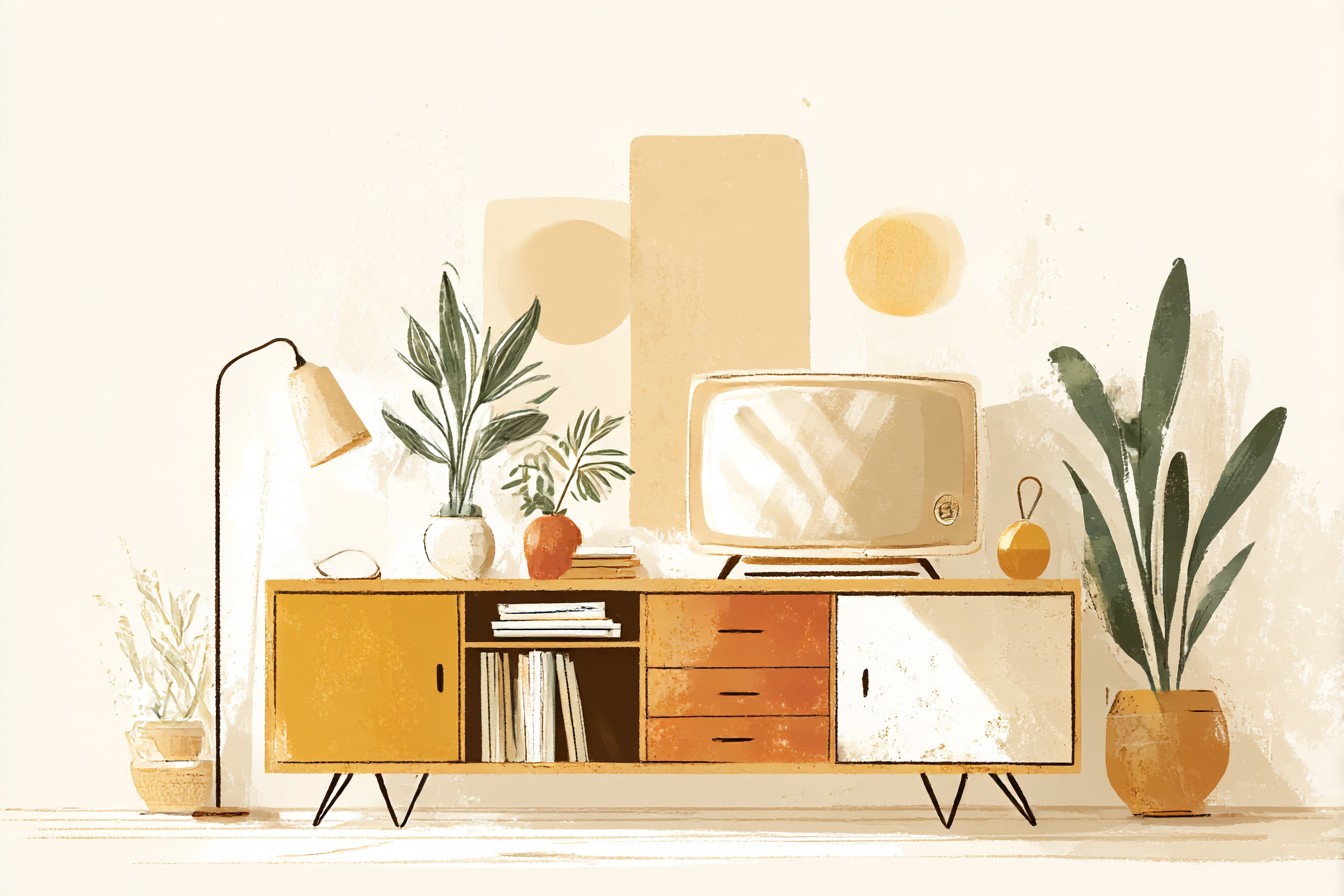
The single fastest fix I found, and I mean fastest, not best necessarily, though it’s also probably the best, was putting something in real wood right next to the wardrobe rather than trying to solve the flatness with more white or more paint. I’ve got an old blanket chest at the foot of ours now, oak, bought secondhand at an estate sale for eighteen dollars because the seller clearly had no idea what it was worth and I wasn’t going to be the one to tell her, and the contrast between that warm honey colored wood and the flat white door panels does more work than anything else in the room.
White wardrobes read as cool, almost clinical if the white has any gray in it at all, and wood is the fastest way to warm that back up without touching the paint. It doesn’t need to be a big piece either. A single cane and wood bench under the window, a woven wood laundry basket tucked beside the wardrobe instead of hidden in a closet somewhere, even just wooden coat hangers visible through a gap in the doors if yours has glass panels, all of it works the same way, giving the eye something with grain and warmth to land on before it slides back to all that smooth white.
My sister’s theory, which I’ve never managed to disprove, is that a room with pure white furniture and no wood in it at all looks like a hospital corridor that got lucky with the light. She said this about my spare room specifically, in 1997, about the old walnut wardrobe’s predecessor, and she was right then too, though the wardrobe in question was actually cream, not white, and I’ve never let her forget that she can’t tell the difference.
[Warm Wood Accents]
Black, in Small, Deliberate Amounts
I resisted black in that room for years because I had convinced myself black anything near white anything was too severe for a bedroom, too much like a magazine spread styled by somebody who’s never actually slept in the space they’re photographing. I was wrong, and I was wrong specifically because I was thinking about black as a large amount rather than a small, precise one.
What actually works is black in details, not surfaces. Wardrobe handles in matte black instead of the brushed nickel mine came with. A single black framed mirror leaning against the wall beside it rather than a white framed one that just disappears into the door panels next to it. A slim black floor lamp in the corner. None of it dominates, all of it defines. White on white on white has no edges, nothing for your eye to use as a stopping point, and black in small doses gives the wardrobe an actual outline instead of letting it blur into the wall behind it.
I did this backwards the first time, incidentally, and put a large black rug directly under the wardrobe thinking bigger would mean better, and the effect was less “defined” and more “someone has installed a wardrobe over a hole.” Small and deliberate. That’s the whole rule. A pull, a frame, a lamp base. Not a floor.
[Black Accents]
One Genuinely Bold Color, Kept Away From the Wardrobe Itself
This is the answer to the question everyone’s actually asking, which is what color goes with a white wardrobe, and my answer, after several wrong attempts, is almost anything, as long as it’s not on the wardrobe and not trying to match it. White wardrobes work as a blank canvas specifically because they don’t compete, so the color should go somewhere else entirely, a wall, a chair, a set of curtains, and let the wardrobe stay the quiet one in the conversation.
You Might Also Like

I went through a phase in the early 2000s of thinking the wardrobe itself needed color, painted the doors a sort of confident forest green over the white laminate without priming it properly first, and within eight months it had chipped at every corner where a hanger or a drawer edge caught it, revealing white underneath in a pattern that looked less “distressed finish” and more “poorly maintained.” Lesson learned. Keep the color off the actual piece.
What I do now is put the color on the wall behind or beside it instead, a deep terracotta on the back wall of the current spare room, which makes the white wardrobe look crisp and intentional rather than absent, the way a white shirt looks sharper against a colored jacket than against a white one. Rust, forest green, a deep navy, even a dusty pink, all of it does the same job, giving the white something to be white against, rather than something to blend into.
[Bold Color Accents]
Texture, Especially on the Floor
If wood solves the warmth problem and black solves the edges problem, texture solves the third one, which is that a flat white door on a flat beige carpet in a flat lit room has nothing rough or soft or interesting anywhere near it, and the eye gets bored fast. A chunky wool rug in a natural undyed color does more for a white wardrobe than another coat of paint ever would.
I put a jute rug down in front of ours a few years back, one of the coarse ones that feels slightly like standing on a doormat, and it changed the whole corner instantly, gave it a kind of textured foundation that made the smooth wardrobe look deliberate by comparison rather than accidental. Woven baskets nearby do similar work, so does a chunky knit throw draped over the blanket chest, so does anything with actual physical texture your hand would notice before your eye does.
What I’d tell anyone starting from scratch is not to put a flat rug under a flat wardrobe on a flat wall and expect the room to have any personality at all, because it won’t, it’ll just be three flat things agreeing with each other quietly. Texture breaks that agreement. It’s the cheapest fix on this whole list too, frankly, a secondhand rug costs less than a lamp and does more.
[Textured Rugs]
A Little Bit of Shine, Used Sparingly
The last piece, and the one I resisted longest because I associate excessive shine with about 2011 and a lot of mirrored furniture that hasn’t aged well, is a small amount of reflective surface somewhere near the wardrobe.

Not mirrored panels on the doors, I’ve seen that done and it’s a nightmare to keep looking clean, fingerprints show up on mirrored wardrobe fronts the way they show up on nothing else in the house. A brass lamp base, a glass topped side table, a single framed print with glass in it catching the window light, that’s the amount I mean.
White wardrobes, especially in a north facing room without much direct sun, can go slightly dead looking without a bit of shine somewhere to catch what light there is and throw it back. I noticed this properly the winter we moved the wardrobe to the wall opposite the window instead of beside it, the room got noticeably duller, and it wasn’t until I put an old brass candlestick on top of the chest across from it that the corner came back to life at all.
I’d have laughed at anyone who told me in 1998 that a single brass candlestick from a thrift store would do more for a room than the entire wardrobe, but here we are, and I stand by it now.
[Shine and Metallics]
Final Thoughts
None of this is complicated, which I think is exactly why it gets overlooked. A white wardrobe isn’t a design failure waiting for a bolder piece of furniture to save it, it’s a deliberately quiet thing that needs a handful of louder neighbors to make sense of its quietness, and most of us skip straight past that and just leave it standing there alone, wondering why the room feels unfinished. Wood for warmth, black for edges, one real color kept off the wardrobe itself, texture on the floor, a bit of shine to catch the light. That’s genuinely the whole list, and I’ve tested most of the alternatives to it across three decades and two disastrous paint jobs to arrive here.
What I’d say to anyone standing in a doorway right now holding an armful of sheets, looking at their own version of that flat white door and wondering what’s wrong with the room, is that nothing is wrong with the wardrobe. It’s doing exactly what it was bought to do. It just needs some company.

[…] make you decide on purpose. Every color, every wood tone, every scuff and dent on a secondhand wardrobe reads louder against white than it would against a busy wall, which is either the best thing about a blank room or the worst, […]
[…] white on white is far more forgiving than people think, right up until it isn’t. A high gloss white wardrobe next to a matte white Malm frame can look sharp and deliberate, two different textures of the same […]
[…] that’s the actual trick with gray, and the thing nobody tells you in the shop under those flat white lights: it is not one color, it’s a mood ring for your living room. In daylight ours goes […]
[…] we didn’t expect is how much better it looks in the room than it ever did online. The white in the photos reads flat, almost plasticky, and in person it’s got enough texture that it doesn’t look like it […]