I was standing in a stranger’s kitchen in Ardsley Park, half a wardrobe door hanging off the wall unit behind me, trying to explain to a paint rep on the phone why “cashmere” and “beige” are not the same thing and why it mattered enormously to the woman who’d just paid me to source her a set of vintage bedroom pieces. She’d found a cashmere colored fitted wardrobe on Facebook Marketplace, gorgeous thing, probably out of a 1990s built-in job somebody ripped out during a renovation, and now she wanted to know what in the world she was supposed to put around it. The paint rep kept saying “well it’s neutral, so anything works,” which is the kind of answer you give when you’ve never actually had to live next to the color. Cashmere isn’t beige and it isn’t cream and it definitely isn’t just “a neutral.” It’s warm, it’s got a little gray folded into it, and it reads differently depending on what light is hitting it and what’s sitting next to it. So no, not anything works. But plenty does, and figuring out which plenty is the whole fun of it.
What’s Going on the Walls and the Floor
Here’s the thing I’ve learned hauling cashmere colored furniture out of estate sales for going on ten years now: the wardrobe itself is rarely the problem.

It’s whoever painted the room around it forty years ago and never touched it again. I pulled a cashmere finished armoire out of a place off Bull Street last spring, gorgeous dovetailed drawers, and it was sitting against a wall painted the exact same shade of tired yellow-beige, so the whole thing just vanished into the wall like camouflage. Bless it, nobody could even see what they had. That’s the biggest mistake with this color family, people treat it like it needs matching rather than framing, and a wardrobe that matches its wall stops being furniture and starts being wallpaper.
What actually works is putting some distance between the wardrobe and the wall without making it a fight. A soft dusty blue, something with a little gray in it rather than anything bright, does something lovely against cashmere, it cools the room down just enough that the wood or the paint of the wardrobe gets to look warm by comparison instead of just beige-on-beige. I’ve also had genuinely good luck with a deeper sage, not the mint-adjacent sage that was everywhere a few years back, more of an old olive, the kind of green you’d find on a 1970s Formica countertop if you dug one up. It sounds like it shouldn’t work with a warm neutral and then you see it in the room and it’s obviously right.
Floors are where people overthink it. A cashmere wardrobe against a warm oak floor is safe, sure, but it’s also the least interesting choice on the list, and I say that as someone who has personally chosen the safe option more times than I’d like to admit. What I actually prefer, and what I’d tell that Marketplace buyer if she asked me twice, is a floor with some gray undertone to it, a whitewashed or limed oak, because it pulls the gray note out of the cashmere and makes the whole room feel considered rather than just matched. If you’ve got dark floors already, don’t panic, cashmere sits fine against walnut or dark stained boards, it just reads more traditional, more like something out of an old Savannah row house than a bright modern build, which honestly might be exactly what you want depending on the piece.
You Might Also Like

What’s Going on the Bed and Everything Textile
Bedding is where cashmere wardrobes either sing or go completely flat, and it comes down to something I didn’t understand for years, which is that you’re not trying to match the wardrobe with your linens, you’re trying to give the room a second temperature to bounce off of. I made this mistake myself with a cashmere chest of drawers I found at the Sunday yard, the guy who runs it kept it back for me without me even asking, ten years of showing up finally paying off, and I got it home and put ivory bedding straight against it and the whole corner of the room just went muddy and soft-focus, like a photo that needed more contrast. Nothing was wrong exactly, it just had nowhere to look.
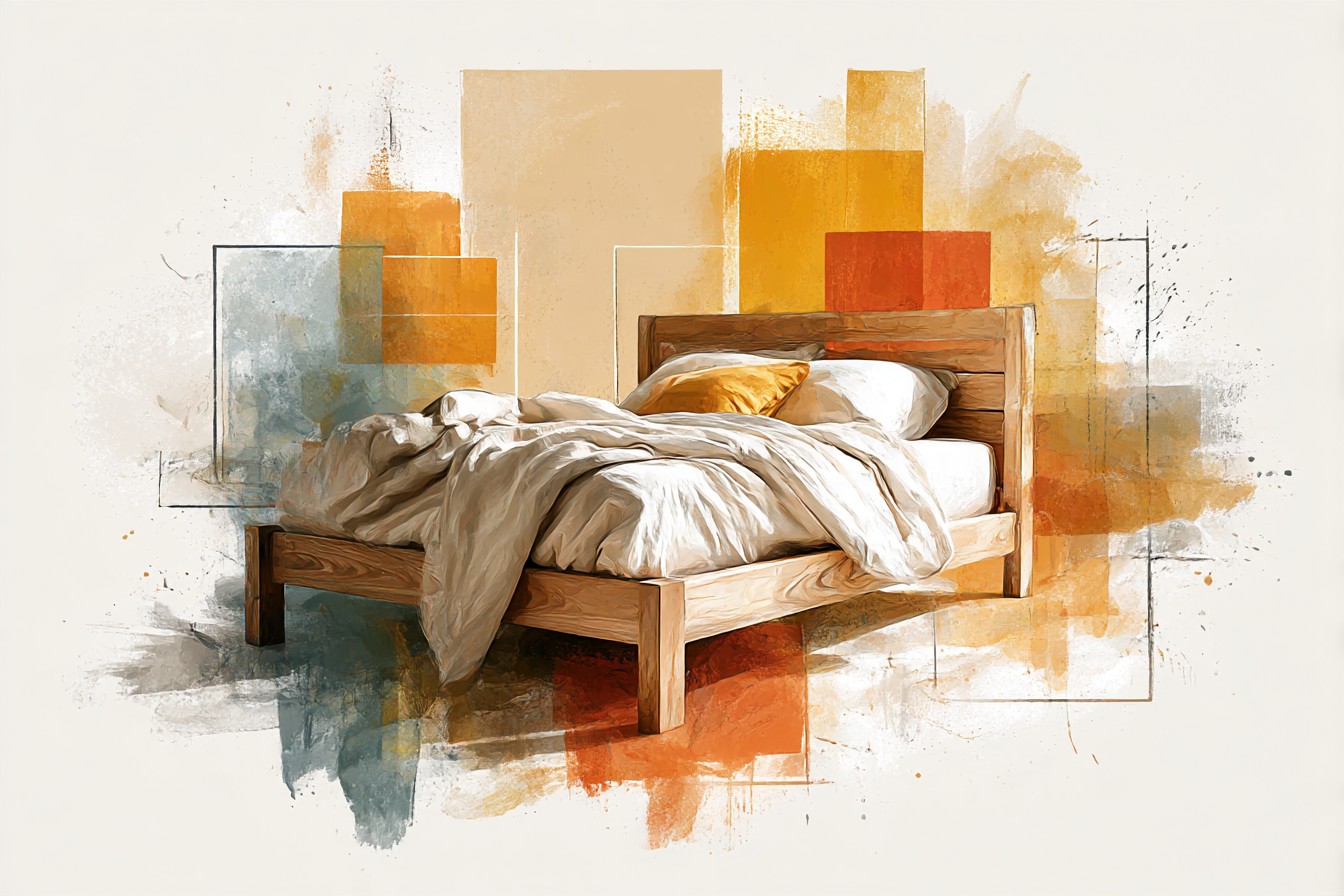
What fixed it, in that room and in most rooms since, was picking one textile element that goes properly saturated rather than everything staying pale. A rust or terracotta throw at the foot of the bed does it. So does a deep forest green quilt, which sounds like a strange pairing with a soft warm wood tone until you remember that cashmere has enough gray in it to handle a jewel tone without clashing, it’s not fighting for the same warm register the way a true beige would.

Charcoal pillowcases against white sheets, with the cashmere wardrobe sitting there being the warm anchor in the corner, is another one I keep coming back to, because it’s simple enough that you’re not managing five competing tones, you’re managing two, plus the wood.
Rugs get the same treatment in my head as bedding does. A busy pattern rug will fight with a cashmere piece because the wardrobe already has a lot of visual texture if it’s got any grain or age to it at all, and I’ve watched people layer a loud kilim under a beautifully worn cashmere dresser and lose both things at once. What holds up is something with two tones max, ideally one of them picking up that gray undertone directly, wool over jute if you can manage it, because jute on its own skews too yellow and starts arguing with the wood instead of supporting it. I’ll be honest, I nearly walked past a rug at an estate sale outside Pooler because it looked like nothing folded up in the corner of a garage, and when I finally unrolled it there was exactly that gray-blue two tone weave I’m describing, sitting there the whole time behind three identical rolls of that horrible looped carpet nobody wants. That’s the one that’s in my own bedroom now, next to a cashmere colored dresser I’ve had since before I knew what I was doing with any of this.
So if you’re standing where that Marketplace buyer was standing, staring at a wardrobe and a paint deck feeling like everything’s technically fine and nothing’s actually decided, that’s the real answer. Cool the walls down a shade, let the floor carry some gray if it can, and give your textiles one properly saturated moment instead of keeping everything pale and polite. Cashmere doesn’t need protecting from color. It needs something to actually talk to.