
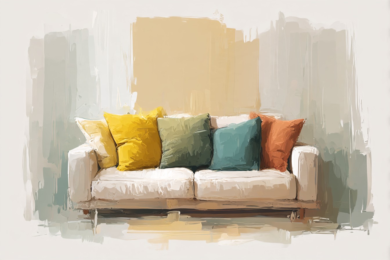
I count throw pillows the way some people count steps on a fitness tracker. Four on the sofa most of the year, six around the holidays because my mother gives me a set every December whether I ask for them or not, and at any given moment I have rearranged them at least twice since breakfast. My husband noticed this before I did. He said, “you moved the pillows again,” in the tone of a man reporting a minor structural issue with the house, and he wasn’t wrong to notice, because I genuinely do it without registering that I’m doing it. Straighten the corner one, swap the striped one to the other end, decide the whole thing looks wrong, start over. It’s a tic at this point.
I used to think this meant I had bad taste, that I couldn’t commit to a look because I didn’t actually know what a good look was.

Turns out it’s simpler than that. Most people who fuss with their pillows aren’t fussing because the room is wrong, they’re fussing because the color logic underneath it was never decided in the first place. You bought pillows the way you buy most soft furnishings, one at a time, whenever you saw something you liked, and now you own a small United Nations of colors that were each perfectly reasonable on their own and have never once agreed to be in the same room together.
I fixed this eventually, not through any great design insight but through a lot of trial and error and one particularly bad phase in 2019 that I still refer to, privately, as the jewel tone incident. A burgundy pillow, a teal pillow, and a mustard pillow, purchased separately, over about four months, each one a good decision in isolation and a genuine crime scene together. My sister came over, looked at the sofa, and said, “did you lose a bet,” which is the most honest review I’ve ever gotten on anything I’ve bought for this house.
What I’ve landed on since is less a rule and more a set of habits, the kind you build the same way you learn which floorboard creaks, through repeated contact with the problem. This is what actually works, sofa by sofa, mistake by mistake.
[Throw Pillow Colors]
The Neutral Base You Build Everything Else On
Every pillow arrangement that has ever worked on my sofa started with a boring decision made first and adjusted rarely. Two neutral pillows, always. Not matching exactly, that’s a different kind of boring, but from the same family. A linen colored one and an oatmeal one. A warm gray and a cooler stone gray. The point of these two is that they’re doing structural work, not decorative work, the same way you don’t notice the studs in a wall until something’s hanging wrong.
I run four pillows on the sofa most months, and I think four is the right number for a normal sized three seater, two large ones in the corners and two smaller ones inside them. Six starts to feel like you’re preparing for a photo shoot nobody booked, and two just looks like you forgot to finish. The neutral pair takes the two outside spots almost every time I set it up, because they’re the ones that get sat against and slept on and generally abused, and a busy pattern in that position wears out its welcome fast, visually and literally, mine have a permanent faint impression from where the cat sleeps against the arm.
Once the neutral base is down, everything you add reads as a decision rather than an accumulation. That’s the actual difference between a sofa that looks put together and one that looks like four separate trips to four separate stores, which, in my case, it was. I didn’t understand this for years. I thought the fix for a messy looking sofa was buying a fifth pillow to tie it together. It’s never a fifth pillow. It’s removing two and starting again with a neutral pair you actually chose on purpose.
[Neutral Base Pillows]
The Two Color Pairing That Does Ninety Percent of the Work
If I’m honest, almost every combination I’ve ever been happy with long term comes down to one deeper color and one that’s a few shades lighter or from the opposite side of warm and cool. Navy and a dusty rose. Forest green and a soft camel. Rust and a chalky blue. Not because there’s some formal rule I’m following, I couldn’t draw you a color wheel from memory if my life depended on it, but because one dark, saturated color next to one considerably softer one gives your eye somewhere to land and somewhere to rest, in that order.
The mistake I made for a long time was picking two colors of roughly equal weight and intensity. A bright teal and a bright coral, say. Both lovely. Both fighting for the exact same job in the room, which is being the thing you look at first. Nobody’s eye knows where to go, so it just sort of skids around the sofa looking for a place to stop, which is a strange thing to say about a piece of furniture but is genuinely how it feels when you sit across from one that’s done this.
What I do now, and what I’d tell anyone starting from scratch, is pick the deep color first, from something already in the room, a rug, curtains, the wood tone of the coffee table, and then choose the lighter color as the one that makes the deep one look intentional rather than accidental. My living room rug has a faded rust thread through it, so the rust pillow isn’t a color I invented, it’s a color I borrowed. That’s the whole trick. Borrow, don’t invent.
[Two Color Pillow Pairings]
Patterns Are Allowed, Just Not Three of Them Arguing
I avoided patterned pillows entirely for about six years because the one time I tried, I ended up with a striped pillow, a floral pillow, and a geometric pillow on the same three seat sofa, and it looked like the inside of a very confused fabric shop. My solution at the time was to remove all patterns and go entirely solid, which solved the chaos and introduced a new problem, which is that the sofa looked like a hospital waiting room. Safe. Nothing wrong with it. Also nothing you’d remember five minutes after leaving.
You Might Also Like

The actual fix, which took me an embarrassingly long time to arrive at, is one pattern maximum, two if the second one is so subtle it barely registers as a pattern at all, a herringbone weave in a single tone, for instance, which reads as texture more than pattern from across the room. The one real pattern you allow should pull its colors directly from the solids you’ve already picated, not introduce a third color story into the mix. If your solids are navy and dusty rose, your pattern pillow should have navy and rose in it somewhere, ideally with a bit of cream doing the connecting work, not a pattern that happens to also be very nice but is running on an entirely different color logic.
One of my students, completely unprompted, once told me my classroom rug looked “busy in a bad way,” which is the kind of blunt assessment twelve year olds specialize in and adults are usually too polite to offer. She was right about the rug. I think about that comment more than I probably should when I’m choosing pillows now, because it’s exactly the right question to ask. Busy in a good way, or busy in a bad way. There’s a real difference and your eye knows it even before your brain can explain it.
[Patterned Throw Pillows]
The One Pillow That’s Allowed to Be Loud
Every sofa I’ve ever liked has had exactly one pillow doing something a little unreasonable. A mustard yellow. A hot pink that has no business being anywhere near navy and rust but is somehow the reason the whole arrangement doesn’t look timid. This is the pillow that isn’t trying to match anything, it’s trying to be looked at, and once you accept that one pillow gets to have that job, the rest of the arrangement relaxes considerably, the way a room relaxes once one person finally says the thing everyone was thinking.
I resisted this for years because I assumed loud meant clashing, and clashing meant the jewel tone incident all over again. The difference, I’ve realized, is that a single loud pillow works because it’s outnumbered. Three loud colors compete. One loud color against three calm ones just looks confident. It’s the same reason one red lipstick can pull together an outfit that would look unhinged if every piece of clothing was that color.
Where you put this pillow matters more than which color you pick, honestly. Dead center of the arrangement and it reads as a mistake, something you’d apologize for. Off to one side, tucked slightly behind a larger neutral one, and it reads as a choice, something you did on purpose because you knew what you were doing. I learned this by accident, not design, I’d put the loud pillow in the middle for months and hated it, then bumped it aside one day while vacuuming and never moved it back. My husband asked what I’d changed. I hadn’t changed the pillow. I’d changed its address.
[Accent Pillow Colors]
Swapping Colors With the Seasons, or, What My Cold House Taught Me
I live in a building that is over a century old, and by November it makes its opinion of the season known whether I’ve asked for it or not, drafts along the baseboards, a chill that settles into the living room the second the sun drops behind the house next door. I started swapping pillow colors seasonally for entirely practical reasons that had nothing to do with fashion. A room that already feels cold does not need pale blue and icy gray pillows reinforcing the point. It needs rust, ochre, deep burgundy, colors that make a genuinely underheated room feel like someone made a decision about the temperature even when the radiator hasn’t caught up yet.
Summer gets my lighter combinations back, the dusty blues and soft sage greens, because by August this house holds heat about as well as it repels cold, which is to say not at all, and the last thing that room needs visually is more warmth suggested at it. I keep two sets in a bin in the closet and swap them over roughly with the clocks changing, and I will say, entirely without exaggeration, that the difference in how the room FEELS, temperature aside, actual perceived warmth, is bigger than any thermostat adjustment I’ve ever made.
It’s not scientific.
I know that. But I’ve spent enough winters in this house watching curtains marketed as thermal fail to do a single thermal thing to trust color to fix a draft. It doesn’t fix the draft. It just changes what your eye reports back to your brain while you’re sitting there in a sweater anyway, and honestly, in a house this old, I’ll take whatever psychological warmth I can get.
[Seasonal Pillow Colors]
Final Thoughts
None of this is complicated once you stop treating pillow buying as a series of unrelated purchases and start treating it as one ongoing decision you’re allowed to revise. Two neutrals to hold the structure, one deeper color borrowed from something already in the room, one pattern that plays by the same color rules instead of inventing its own, and one pillow that gets to be a little unreasonable, tucked slightly off center so it looks intentional rather than accidental. Four pillows, sometimes six around December, never the eight I briefly attempted in 2020 in a fit of ambition I do not care to discuss further.
I still rearrange them more than any reasonable adult should need to. That part hasn’t changed and I don’t think it will. But these days the rearranging is fine tuning, not damage control, which is the actual goal here, not perfection, just a sofa you stop needing to apologize for when someone unexpected sits down on it.

[…] by my sister who bought a burgundy sectional last spring and immediately started panicking, is what color pillows even go with that. The honest answer is more than she thinks, but not everything, and definitely […]