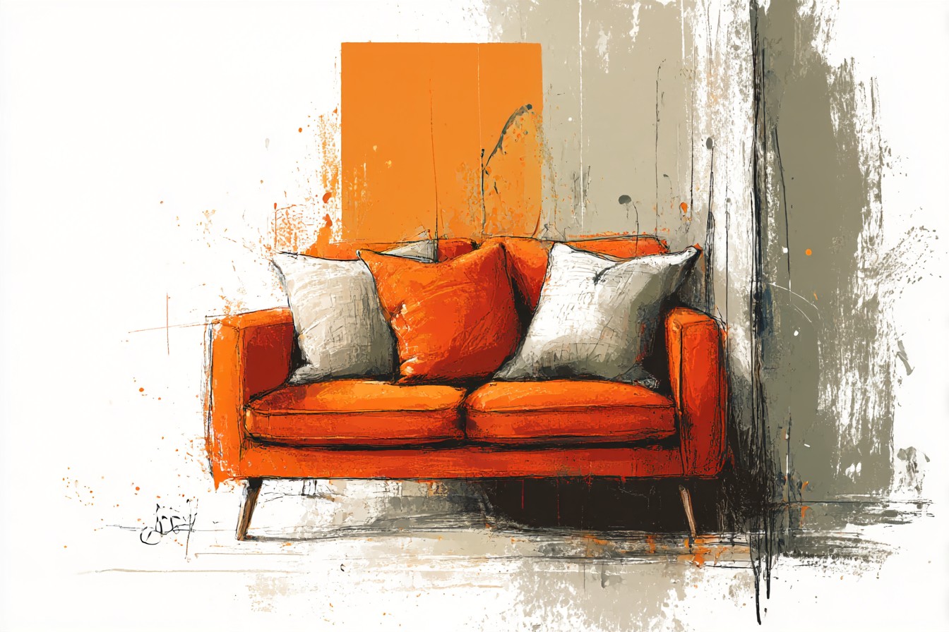
The sofa showed up on a Tuesday, and by Thursday I had genuinely convinced myself I’d made a terrible decision. Not about the sofa itself, the sofa was fine, a big squashy thing in a color the listing called “burnt clementine” which is a ridiculous name for a couch but an honest one. No, the disaster was what I did next, which was drive to a home goods store on my lunch break and buy four pillows in what I can only describe as “aggressive coral” and “hot pink with a tassel situation going on.” I got them home, threw them on, stood back, and my wife walked in from work, looked at the couch, looked at me, and said “did we lose a bet?”
That’s the thing nobody tells you about an orange sofa. It’s not actually the hard part. The hard part is everything you pile on top of it afterward, because orange is one of those colors that makes people panic and reach for more orange, or more of anything warm and loud, thinking they’re matching energy when really they’re just building a couch that hurts to look at directly, like it’s got its own light source. I lived with the clementine and coral situation for about six weeks before I couldn’t take it anymore, mostly because my youngest started calling it “the fire couch” and honestly, fair, kid wasn’t wrong.
What I’ve learned since, through a genuinely embarrassing amount of trial and error and at least one more failed pillow order I’m not proud of, is that orange doesn’t need loud friends.
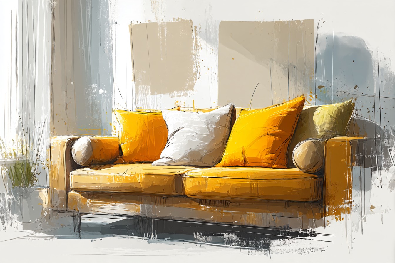
It needs calm, confident ones. The sofa’s already doing the talking. Everything else in the mix just needs to know when to shut up and complement, not compete. Once I figured that out, this stopped being a stressful color problem and turned into one of the more fun rooms in the house to actually put together, which is not a sentence I expected to write about a couch that once made my wife question our marriage.
So here’s what actually works, tested against real light, real mess, and one specific toddler who treats every soft surface as a landing pad.
[Orange Sofa Pillows]
Navy and Denim Blue Pillows
This is the one I should have started with instead of learning it the hard way. Blue and orange sit across from each other on the color wheel, which sounds like a fact from a textbook nobody asked for, but the practical version is that they make each other look more expensive than they are. I put two navy pillows on the clementine couch after the coral disaster and it was honestly a bit of a relief, like the room finally exhaled.
The specific shade matters more than I expected. A flat, chalky navy can look a little corporate, like a waiting room. A denim blue with some texture to it, a bit of a woven or slubby weave, softens the whole thing and makes it feel lived in rather than styled. I’ve got a couple in a heavier cotton twill that have been through two Christmases, one spilled mug of hot chocolate courtesy of my eldest, and a period where the dog decided that specific corner of the couch was his spot and no amount of moving him off it was going to change that. Wiped clean, dried fine, not a mark on them.
The other thing nobody mentions is how navy handles the orange in different light. Morning light through our front window turns the sofa almost peachy, and the navy pillows ground it, stop the whole thing floating off into pastel territory. By evening under lamp light the orange goes deeper, more amber, and the navy reads almost black against it, which honestly looks properly good, like it was planned instead of stumbled into over several months.
[Navy and Denim Blue Pillows]
Cream and Oatmeal Neutral Pillows
If blue is the confident choice, cream is the safe one, and I don’t mean that as an insult. Sometimes safe is exactly what a room needs, especially a room with two kids and a dog who between them have turned “safe” into a bit of a unicorn concept in my house.
Cream and oatmeal pillows do something specific next to an orange sofa that I didn’t appreciate until I tried it. They don’t fight the warmth, they just quiet it down a notch, like turning a song from full volume to a normal human listening level. The orange still reads as the main event, but it stops feeling like it’s shouting at you from across the room.
I’ve got a boucle style one in an oatmeal color that’s taken more abuse than anything else on that couch, including a full packet of crushed crackers ground into it by my youngest during what I can only describe as a snack related tantrum, and a marker incident that thankfully turned out to be washable despite what the packaging on the marker actually claimed. Brushed clean, ran it through a gentle wash, came out looking basically new, which given the circumstances felt like an actual miracle.
The texture matters here more than in almost any other pairing on this list, because a flat cream pillow next to a flat orange sofa can start looking a bit like a hospital waiting room again, all matched surfaces and no personality. Go textured. Boucle, chunky knit, a linen with some visible weave to it. It keeps the whole neutral thing from going bland, and it survives a genuinely surprising amount of daily wreckage.
[Cream and Oatmeal Neutral Pillows]
Olive and Forest Green Pillows
This is the pairing that surprised me most, mostly because I went into it expecting it to look like a pumpkin patch and instead it looked like autumn done properly, the good kind, not the seasonal aisle at the craft store kind.
Green and orange are actually neighbors on the color wheel in a roundabout way through the earth tone family, and what that means in practice is they both come from the same outdoorsy, natural palette. Olive especially. There’s a deep olive velvet pillow I picked up on a whim that I was fully prepared to return, and instead it’s become one of my favorite things on that couch, sitting next to a rust colored throw like they were always meant to be together.
You Might Also Like

Forest green is a bit bolder, a bit more of a statement, and I’d use it more sparingly, maybe one pillow rather than a pair, just so it doesn’t start competing with the sofa for attention. Olive is the workhorse of the two. It’s forgiving with pet hair, which matters enormously in a house with a dog who’s shed enough this year to reupholster a smaller couch entirely, and it doesn’t show the general grime of daily life the way a lighter color would.
I will say the velvet ones need a bit more care than the others on this list. Not delicate exactly, they’ve survived plenty, but I wouldn’t let a juice box anywhere near one without a coaster level of vigilance, because velvet holds onto a stain a bit longer while you’re scrubbing at it in a panic. Everything else about this combination, though, properly works.
[Olive and Forest Green Pillows]
Charcoal and Ink Gray Pillows
My sister came over a few months back, looked at the couch fully dressed with the navy and the olive going on, and said “it’s giving me hotel lobby, but like, a nice one,” which I’ve decided to take as a compliment even though I’m still not entirely sure it was meant as one. What she was actually reacting to, I think, was the charcoal pillow sitting in the middle of the arrangement, doing the quiet job of grounding everything else.
Charcoal and ink gray are the pairing I reach for when the room’s starting to feel a bit too soft, a bit too warm all over, like a room made entirely of blankets. One or two darker pillows against the orange stop the whole sofa from floating and give your eye somewhere to land. It’s the difference between a room that looks cozy and a room that looks like it was decorated by someone who owns a lot of throws and no actual opinions.
Practically, dark pillows are an easy choice for a family sofa because they hide an enormous amount of daily sin. Crayon marks, the occasional muddy paw print before I catch it, a smear of something I genuinely couldn’t identify last Tuesday. A charcoal linen cover just absorbs all of that visually in a way a lighter fabric never could. I’ve got one in a heavier weave that’s been sat on, slept on, used as a pillow fort wall, and dragged across the living room floor more times than I’d like to admit, and it still looks like a normal pillow rather than a crime scene.
Don’t go full black though. I tried it once. Against the orange it read a bit harsh, a bit like the couch was in mourning. Charcoal keeps enough warmth in it to stay friendly.
[Charcoal and Ink Gray Pillows]
Mustard and Gold Tonal Pillows
This is the one I’d tell you to be careful with, because it’s also the one I got wrong the second time, after I’d already learned my lesson from the coral disaster, which tells you something about how tempting it is.
Mustard and gold sit close to orange on the wheel, so this is a tonal pairing rather than a contrasting one, and tonal pairings are lovely right up until they tip over into looking like you own one color of anything and didn’t think about it further. The trick, and it took me an actual second failed pillow purchase to learn this, is that the mustard needs to read as clearly its own shade, not just a slightly paler version of the sofa. A proper deep, dijon style mustard rather than a pale butter yellow, which just looks washed out and a bit sickly next to the clementine.
Done right, it’s genuinely one of the richest looking combinations on this list, warm on warm, like a proper autumn evening.
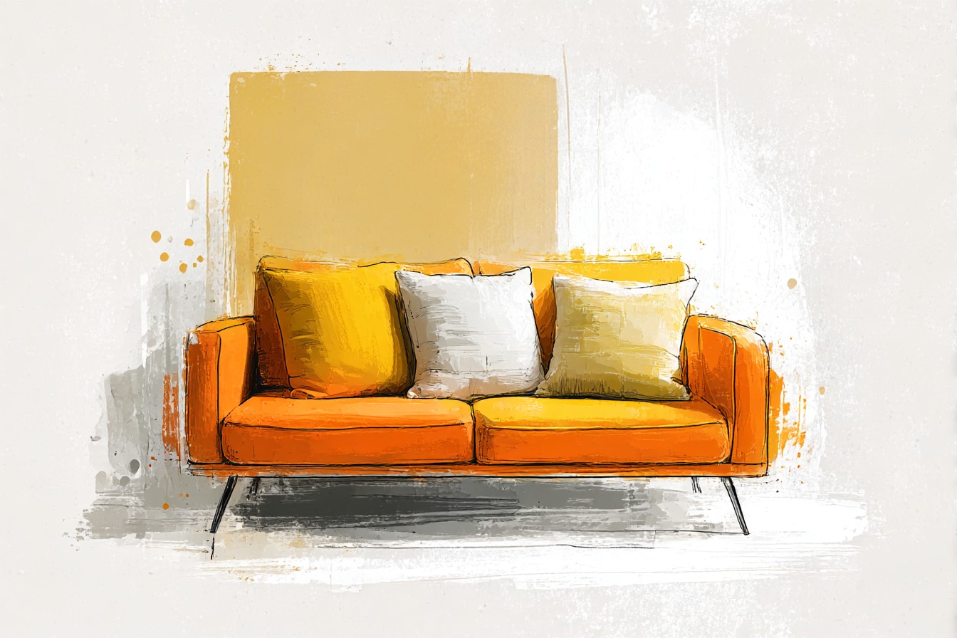
Done wrong, it looks like you ran out of orange pillows halfway through the order and grabbed whatever was left in the warehouse. I’d use it as an accent, one pillow among a mostly cooler crowd, rather than the whole arrangement, because too much warmth with no contrast at all starts to feel a bit stifling, like sitting too close to a space heater.
The mustard velvet one I kept has survived a full season of actual use, including a specific incident involving a hot chocolate spill that by some miracle missed the sofa entirely and landed square on the pillow instead, which I genuinely took as a win at the time.
[Mustard and Gold Tonal Pillows]
Final Thoughts
Looking back at the coral and clementine phase of my life, I think the real mistake wasn’t the color choice, it was the panic behind it. I saw a bold sofa and assumed everything around it had to match that energy, when actually the opposite was true. The sofa’s already loud. Everything else just needs a job, whether that’s calming it down, grounding it, or quietly agreeing with it in a slightly different shade.
If I’m being honest about what’s actually stayed on that couch longest, it’s the navy and the cream, because they’re the ones that survive both the daily wreckage and my own changing moods about what looks good, which shift more often than I’d like to admit. The olive and charcoal come out for the colder months. The mustard gets one careful pillow’s worth of appearance and no more, lesson properly learned.
None of this needed to be as complicated as I made it in that first panicked lunch break purchase. Orange just needed a bit of trust, a few reliable partners, and someone in the house willing to say “did we lose a bet” out loud so I’d actually listen.