
I bought four wicker baskets and a fake trailing plant for the top of my first proper wardrobe, in my first proper apartment in Somerville, because a magazine told me an empty gap above furniture was “wasted styling opportunity.” I stacked the baskets. I draped the plant so it spilled down one side like it was trying to escape. And then I stood back and looked at it and thought, this looks like a TJ Maxx display shelf that’s had some kind of breakdown. Because that’s exactly what it was. I’d spent three weekends thinking about what sat ON the wardrobe and precisely zero seconds thinking about the actual wall and ceiling behind and above it, the blank triangle of space that was doing all the visual damage in the first place.
That’s the bit nobody talks about. Everyone’s got an opinion on what goes on top of a wardrobe, baskets, boxes, suitcases, a sad rotating cast of things you don’t use enough to justify but not little enough to throw out.

Fine. Different article. What actually wrecks a room, what makes a perfectly decent wardrobe look like it’s apologizing for existing, is the dead zone above and around it that nobody addresses because it feels like it’s not really “a thing.” It’s not a shelf. It’s not storage. It’s just wall, and a bit of ceiling, usually badly lit, often the exact spot where a builder decided crown molding was too much effort and just stopped it dead six inches short like they ran out of enthusiasm halfway through the job.
I lived with mine unaddressed for two years. Two years of a rectangular shadow gap that collected dust I couldn’t reach without a step stool and a genuine safety risk. Then I actually looked at it as its own problem, separate from the baskets, separate from the plant, and the whole room changed. Not the wardrobe. The wall behind it. This is the part I got wrong for way too long, and it’s the part worth actually talking through properly.
[Space Above a Wardrobe]
The Gap Itself
Let’s start with the actual hole in the room, because that’s what it is, a hole, and most people just let it sit there being a hole. Builders leave a stretch of wall above a wardrobe unfinished because the assumption is you’ll put something on top and nobody will look up. Wrong. Everyone looks up. It’s the first thing your eye catches when the wardrobe is anywhere near a doorway, because the gap creates a shadow line your brain reads as “unfinished” even if you can’t articulate why.
The fix is boxing that space in properly, running a bulkhead or a stretch of crown detail across the top so the wardrobe reads as built in rather than shoved against a wall and abandoned. I did this eventually with a basic MDF trim kit that cost me forty dollars and about ninety minutes of swearing at a miter saw I do not know how to use. It transformed the wardrobe more than any amount of styling on top of it ever did.
What I will not shut up about is the “premium” pre-cut cornice kit I nearly bought instead, marketed as a simple weekend upgrade at ninety five dollars for eight feet of foam trim that is, structurally, a pool noodle with delusions. Ninety five dollars. For foam. You do not get to call foam premium just because you put a little illustration of a tape measure on the box. I returned it and bought the actual timber version for less, and it’s held up through one minor bookshelf collapse incident I’d rather not fully describe.
[The Gap Itself]
Wall Art Above a Wardrobe
Once the gap has an actual edge to it, a finished line where the wall stops being awkward, that panel of wall above the wardrobe becomes genuinely useful real estate for art, and this is where I made my second big mistake. I hung a single large print dead center, high up, at the sort of height you’d expect in a dentist’s waiting room, the kind of eye chart placement where you have to actually tilt your head back to see it properly.
Art above a wardrobe wants to sit lower and wider than instinct tells you, closer to the top edge of the wardrobe itself than to the ceiling, because the space between wardrobe and ceiling is usually shallower than it looks in your head. A cluster of three smaller framed pieces, slightly offset, does more for that wall than one big statement print stuck up near the cornice looking like it’s trying to escape the room entirely.
I’ve also learned, the hard way, that anything with glass up there catches every bit of overhead light and turns into a mirror for the ceiling fixture, which is its own small horror. Matte finish prints or canvas without glazing solve that instantly, and cost nothing extra to figure out, just a returned frame and a slightly annoyed conversation with myself about reading the product description properly next time.
[Wall Art Above a Wardrobe]
Paint and Wallpaper on That Panel
Here’s a genuinely cheap trick that did more work than anything else I tried, treating the wall panel above the wardrobe as its own small feature rather than an extension of the room’s main wall color. A single strip of wallpaper, cut to fit just that section, or even just a contrast paint color, breaks up what would otherwise be one long flat expanse from floor to ceiling with a wardrobe stuck awkwardly in front of it.
You Might Also Like

I did this with a deep, almost ink navy on a wall that was otherwise a boring, safe off white I’d chosen because I was too scared to commit to anything after a truly regrettable sage green situation in a previous apartment that I still think about with actual physical discomfort. The navy panel made the wardrobe look intentional, like it belonged exactly where it was, rather than like something that had been wheeled in and forgotten about.
One warning, and I mean this one properly. High gloss paint up there is a mistake if you’ve got any kind of overhead light or a window nearby, because it turns that panel into a glare box every evening, a shiny rectangle throwing light back at you while you’re trying to get dressed. Matte or eggshell, every time. I learned this by living with a glare box for four months before finally repainting it, which is a genuinely stupid amount of time to tolerate something bothering you daily.
[Paint and Wallpaper Above a Wardrobe]
Lighting the Gap
Nobody thinks about lighting that specific stretch of wall until they’re standing in front of the wardrobe at seven in the morning trying to find a matching sock in the dark, because the overhead light in most bedrooms sits dead center of the ceiling, nowhere near the wardrobe, and that whole upper wall stays in permanent shadow regardless of the time of day.
A slim LED strip run along the underside of a bulkhead, or a small picture light angled down onto the panel below it, fixes this properly and makes the whole wardrobe wall feel finished rather than just tolerated. I put a battery operated LED strip up mine, stuck on with adhesive tape, and it’s been running for a year and a half off two AA batteries, which honestly shocked me.
What did not shock me was the “smart” plug in version I looked at first, forty two dollars for a strip that needed an app, a hub, and apparently a small prayer to get it to sync with the rest of the house. Forty two dollars for a light strip that couldn’t just be a light strip. I want whoever wrote that product listing to explain to me, in person, why turning on a wardrobe light needed to become a software problem. I did not buy it. I bought the dumb one. The dumb one works every single time.
[Lighting Above a Wardrobe]
Mirrors Above a Wardrobe
I’ll admit this one’s divisive, because a mirror up there can genuinely bounce light around a dark bedroom in a way nothing else does, catching whatever’s coming through the window and throwing it back across the room, which sounds great until you realize it’s also catching the top of your wardrobe, which is rarely the room’s most photogenic feature.
A mirror above a wardrobe works best small and angled slightly, not a huge flat sheet centered like a second window, because a huge flat mirror up there just doubles the visual weight of the wardrobe rather than lifting it, and it becomes an absolute dust magnet you cannot reach without dragging a chair over, which I did once, wobbled, and had a genuinely unnecessary conversation with my own mortality over a two dollar dust rag.
The other issue, and this one’s practical rather than dramatic, is that a mirror that high reflects the ceiling far more than it reflects anything useful, so unless your ceiling is doing something interesting, which mine has never once done in any apartment I’ve lived in, you’re essentially paying to display more ceiling. I kept mine small, framed, slightly tilted down, and it does its one job without demanding attention. That’s really all I wanted from it in the end.
[Mirrors Above a Wardrobe]
Final Thoughts
None of this is complicated, and that’s honestly the most annoying part, because it took me two years and one deeply misguided basket situation to figure out that the wall and the gap above a wardrobe are their own problem entirely, separate from whatever you eventually decide to store or display on top of it.
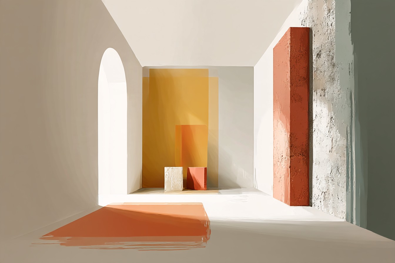
Box in the gap if you can. Think about the actual wall panel as its own small feature rather than an afterthought. Light it properly, with something dumb and reliable rather than something that needs an app. Hang art lower than instinct says. Skip the huge mirror unless your ceiling actually deserves the attention.
What changed my own bedroom wasn’t a single big purchase, it was forty dollars of timber trim and a can of navy paint I was too nervous to buy for a full year. The wardrobe didn’t move an inch. The wall around it just finally started pulling its weight. That’s the whole trick, really, stop looking at the wardrobe and start looking at everything around it that’s been quietly letting the room down for free.



