I saw a beige sofa once that made me want to apologize to it on behalf of whoever bought it. Flat, low pile, the exact same tone as the wall behind it, the exact same tone as the rug in front of it, paired with a glass coffee table that reflected absolutely nothing back except more beige. It sat in a rental living room like it was waiting for someone to notice it existed and then decided against it. That sofa wasn’t ugly because it was beige. It was ugly because every single decision made around it doubled down on the one color instead of doing anything to fight it.
That’s the whole argument, honestly. People blame beige for being boring when the actual problem is almost always one of two things: the sofa itself has zero texture, or nothing else in the room is doing any contrast work to make it interesting.

Fix either one and beige stops looking like a placeholder and starts looking like a decision you actually made on purpose.
The Sofa Itself Is Doing Less Work Than You Think
Here’s the thing nobody tells you when you’re comparing beige sofas online at midnight, half convinced you’re settling: the color barely matters compared to the weave. A smooth, flat, almost synthetic-feeling beige reads cheap and lifeless no matter how expensive it actually was. A chunky bouclé, a nubby linen blend, a corduroy with actual visible ridges, in the exact same color family, reads warm and layered and expensive even when it wasn’t. I learned this the hard way with our first “grown up” sofa, a smooth microfiber thing in a beige so flat it looked like it had been photocopied onto the frame. It wasn’t a bad color. It was a boring surface wearing a color that had nowhere to go.
Texture does something a flat color physically can’t, it catches light differently depending on the angle, the time of day, whether someone’s just gotten off it or is currently using it as a trampoline. That variation is what makes a neutral sofa look intentional instead of accidental. My kids have absolutely helped me appreciate this the hard way, because a textured weave hides the ordinary wear of daily life, the compressed cushion, the slight fading where the sun hits it every afternoon, in a way a smooth fabric just can’t. We’ve got a bouclé beige sectional now that’s survived juice, crayon, and one memorable incident involving a permanent marker that thankfully only got the throw pillow and not the actual cushion, and from six feet away you’d genuinely have no idea. Try that with a flat weave and you’ll see every single mark like it’s under a spotlight.
The other thing texture does, which almost nobody mentions, is it lets you go monochrome without the room looking like a hospital. A living room that’s beige sofa, beige wall, beige rug, all in smooth matching tones, is the closest thing to a beige overdose you can create. The same palette in mixed textures, a woven sofa against a smooth painted wall against a flat weave rug, looks deliberate, layered, kind of expensive actually, and it’s the exact same color story. So if your beige sofa feels flat, before you blame the color, run your hand over it and ask honestly whether it’s got any texture at all, because that’s usually the actual issue hiding behind the color complaint.
You Might Also Like

What You Put Around It Is Doing the Rest
Assuming the sofa itself has some texture going for it, the second half of this is entirely about contrast, and this is where most beige living rooms actually go wrong. People treat beige as a color that needs to be matched, so they pick a beige rug, a beige throw, beige curtains, and end up with a room that’s technically coordinated and completely lifeless. Beige isn’t a color that wants matching, it’s a color that wants something to react against. Pillows are the cheapest, fastest way to do that, and I mean genuinely cheap compared to reupholstering an entire sofa because you convinced yourself the color was the problem. Rust, deep green, a proper navy, mustard, terracotta, any of those against a beige sofa does more visual work than three throws in slightly different shades of beige ever will. If you want it calmer, go with charcoal or a warm chocolate brown instead of another neutral, because at least those give you actual depth instead of more sameness.
The coffee table is the next lever, and it’s the one people get most wrong by defaulting to glass because it feels “safe” with neutral furniture.

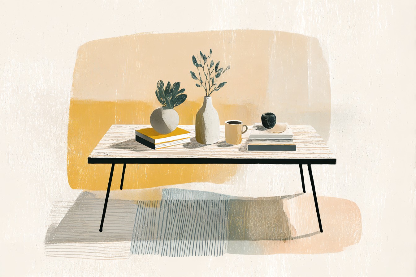
Glass with beige just gives you more emptiness, nothing for the eye to land on. A dark wood coffee table, walnut or a deep espresso stain, grounds the whole setup and gives the beige something solid to sit against instead of floating in a room full of light tones. We went through two coffee tables before landing on a dark wood one, and the difference in how “finished” the room looked was honestly bigger than I expected from swapping one piece of furniture.
The TV stand gets ignored constantly, probably because it’s the piece everyone treats as purely functional, but it’s usually the biggest block of color in the room after the sofa itself. A beige or light wood TV stand next to a beige sofa is just more of the same nothing. Black, dark wood, even a deep navy cabinet does the exact same job the coffee table does, gives the eye a stopping point, breaks up the wash of tan and cream that beige rooms fall into by default. Once I actually started thinking about the TV stand as a color decision instead of a storage decision, our whole setup stopped looking like it was auditioning for a rental listing photo.
So no, beige sofas aren’t boring. Under styled, sure, constantly. Give the fabric some actual texture and give the room around it something dark or colorful to bounce off, and it stops being the safe choice you settled for and starts being the one everyone asks about.