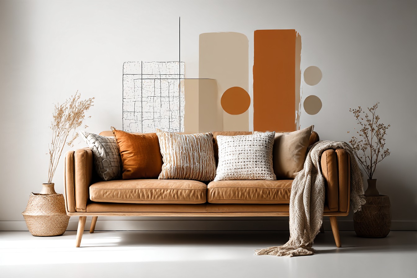
I reach for the throw pillows on my own brown leather sofa about fourteen times a year. I know that because I counted once, out of boredom, and then felt a little pathetic about it afterward. Fourteen times a season would be normal. Fourteen times a year for a guy who builds furniture for a living and supposedly has better things to think about is a lot. But that’s the thing about a brown sofa nobody tells you when you buy one: everyone treats brown like the safe, boring choice, the one you pick because you can’t decide, and then you live with it for a while and realize it’s actually the most workable color in the room. It’s oak.
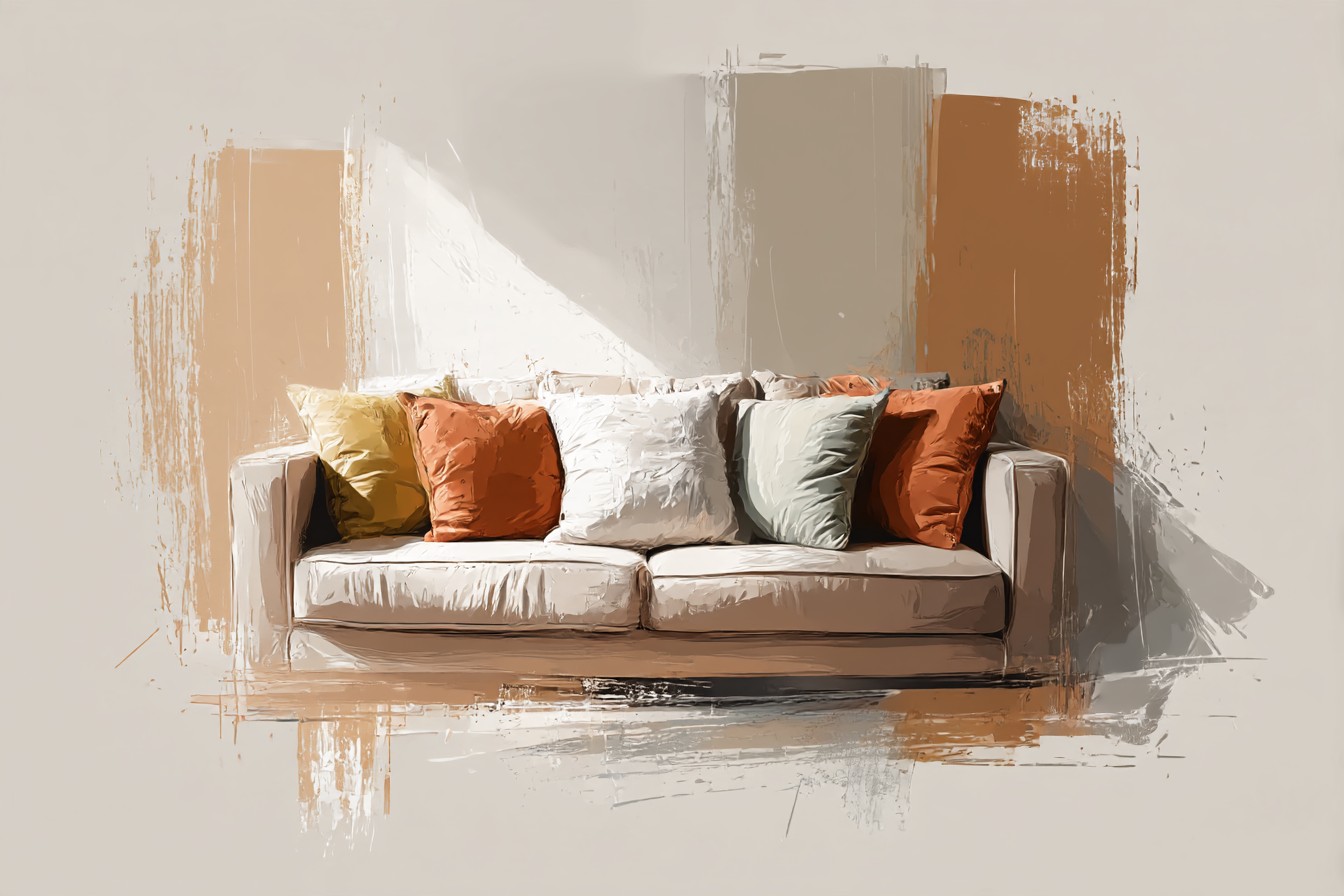
It’s walnut. It’s the wood tone every other finish gets measured against, and it takes color better than almost anything else you could put in that spot.
The problem is most people ask the wrong question about it. They ask what color pillows “match” a brown sofa, and match is doing a lot of quiet damage in that sentence, because matching and complementing are not the same job and they don’t produce the same room. Matching means you’re staying inside the same color family, tan on brown, cream on brown, quiet, cohesive, low risk. Complementing means you’re deliberately going across the color wheel to something that contrasts, blue against brown, green against brown, and that’s a different decision with a different result. I think about it the same way I think about staining two pieces of wood that are going to sit next to each other. Sometimes you want the stain to disappear into the grain so the whole piece reads as one material. Sometimes you want it to stand off, so the joint actually shows and the piece has some visual structure to it. Both are legitimate. They just do opposite things to a room, and if you don’t know which one you’re doing, you end up with pillows that fight the sofa without meaning to.
So this isn’t really a “here are some nice colors” piece. It’s more like walking through the actual decision, family by family, the way I’d walk a customer through finish options before they commit to anything.
[Brown Sofa Pillow Colors]
Cream, Oatmeal, and Warm White
This is the true “match” answer, and it’s the one everyone reaches for first because it’s the safest bet in the shop. Cream, oatmeal, a warm off white with a little gray or yellow in it, all of it sits close enough in the same family as brown that the eye reads the whole seating area as one calm block instead of a bunch of separate decisions. I did this on my own sofa for about two years because I genuinely couldn’t be bothered to think about it, and it worked fine. Fine is the right word. Not exciting, not wrong, just fine.
Here’s the part that actually matters though, the thing nobody explains: cream against brown is basically wood filler against wood grain. Done right, with the correct undertone matched to the sofa’s undertone, it disappears seamlessly and the whole thing looks intentional and calm. Done wrong, with a filler that’s too pink or too gray against a warm brown, it reads like a patch. I learned this the hard way staining a walnut bench for a client where I grabbed the wrong filler shade and it sat there looking like a scar for six months until I sanded it back and did it properly. Same exact trap with pillows. A cream that leans too cool or too pink against a warm chocolate brown leather doesn’t blend, it just looks slightly off, like a bulb that’s the wrong temperature. Check the undertone before you buy, not just the color name on the tag.
[Cream and Oatmeal Pillows]
Navy and Deep Teal
Now we’re properly complementing, not matching, and this is where a brown sofa actually gets interesting. Blue sits across enough of the color wheel from brown that it creates real contrast instead of blending in, and deep navy or teal against a chocolate or tobacco brown leather is one of the highest value, lowest risk combinations I’ve seen in a living room. It’s the color version of an inlay strip. My dad used to run a thin strip of contrasting wood, maple against walnut usually, along the edge of a tabletop, not because it needed to be there structurally, purely because it made the eye stop and register that there were two distinct materials doing two distinct jobs. Navy on a brown sofa does the same thing. It stops the eye. It says “this is a separate element,” in a way cream never will.
Teal’s the riskier cousin, more green in it, more saturation, and it can tip toward looking dated fast if the shade’s slightly off, so I’d test it in daylight before committing to more than one or two. Navy’s the one I’d put money on. It reads as almost neutral itself but it’s doing real contrast work against the brown, which is why it turns up on brown sofas in every decent living room photo you’ve ever half noticed and not questioned.
[Navy and Teal Pillows]
Rust, Terracotta, and Burnt Orange
This family sits in the middle ground between matching and complementing, same warm undertone as brown but a different value and a different position on the wheel, so you get harmony without flatness. It’s the closest thing to a compromise color, and it’s genuinely my favorite for a brown leather sofa specifically because leather already has warmth in it, and rust just leans into that instead of fighting it.
You Might Also Like

I got this wrong once, though, worth admitting. Bought a rust velvet pillow for my own sofa thinking it’d pop, and in evening light with the lamps on it basically vanished into the leather, same value, same warmth, no contrast at all, just a slightly fuzzier patch of brown. Turned out the color was fine, the problem was value, rust and my particular sofa’s tobacco brown were sitting at almost the exact same lightness, so there was nothing for the eye to catch on. Swapped it for a burnt orange with a bit more saturation and it fixed itself instantly. Lesson there: color families matter, but value, how light or dark something actually reads, matters just as much and gets ignored constantly.
[Rust and Terracotta Pillows]
Olive and Sage Green
Green against brown is the wood species pairing that always makes sense and nobody questions it, walnut and moss, oak and fern, brown furniture has been sitting next to green plants since forever, so olive or sage pillows read as almost inevitable rather than a bold choice. It’s a proper complement, genuinely across the wheel from brown, but it’s a gentle one, nothing about it shouts.
I did a set of olive velvet cushions for a client’s brown leather sectional two years back, mostly because she had a dog that sheds like it’s contractually obligated to and wanted something forgiving. Velvet hides pet hair better than you’d think, and the olive hasn’t shown a single coffee stain in two years of use, which either means she’s careful or that fabric’s doing serious work. Either way it held up, and it’s the section of this whole piece I’d point a nervous first timer toward if they wanted contrast without committing to anything loud.
[Olive and Sage Green Pillows]
Mustard and Gold
This one I’ll be straight about: it’s the riskiest pairing on this list and it works when it works and looks properly dated when it doesn’t. Mustard sits in roughly the same warm family as brown but at a much higher value and saturation, so instead of the gentle harmony you get with rust, you get a sharper jump, more of a spotlight than a blend. On the right brown, a deep espresso or a cool taupe brown, mustard looks intentional and a bit expensive. On a lighter, more orange leaning brown, it can tip into looking like a leftover from 2015 farmhouse decor, the kind of yellow that was everywhere for about three years and then vanished overnight.
I’d treat mustard the way I’d treat a bold wood stain choice, something you test on a scrap piece before you commit to the whole tabletop. Buy one pillow first. Live with it a week in actual daylight, not just the photo it looked good in. If it still earns its spot after that, get the second one.
[Mustard and Gold Pillows]
Final Thoughts
If you take one thing from all this, take the distinction between matching and complementing, because that’s the actual decision hiding underneath the question everyone asks. Cream matches. Navy, olive, rust, and mustard complement, each at a different level of contrast and risk.

Neither approach is the correct one in some absolute sense, they just build different rooms. Matching gives you calm. Complementing gives you a room that looks like someone actually decided something on purpose instead of defaulting to whatever came free with the sofa.
My own place has ended up somewhere in the middle, which I suspect is where most people land once they stop overthinking it. Two cream pillows doing the quiet matching work, one navy doing the contrast work, and a rust one that I’ve now checked against the leather in three different light settings because I’m apparently not over that mistake yet. That’s not indecision. That’s just how color actually behaves on a sofa that’s already got plenty of its own going on. Brown was never the boring choice. It was always the base color with the most options stacked on top of it, and most people just never bothered to test past the cream.




[…] pillows go with a cream sofa” isn’t a palette, it’s a permission slip. Go for the color you actually like and were talked out of by some vague memory of a magazine spread where every…. Two or three tones that already exist somewhere else in the room, whether that’s the rug or […]
[…] chemically impossible, I’ve tried. What surprised me is how much a textured neutral pillow actually helps the bolder colors around it look more expensive, more intentional, like there’s breathing room between the navy […]