Okay so light blue sofas have a reputation problem and I get why. People hear “light blue sofa” and picture one specific thing: a dentist’s waiting room, or your grandma’s formal living room that nobody was allowed to actually sit in, or that particular shade of blue that reads more “hospital corridor” than “cozy Tuesday night.” I said all of this, out loud, to my roommate Marcus when he first floated the idea of a chambray blue sectional for our place. I was firmly Team No. I told him light blue fades looking sad and washed out, that it’s a color that photographs cold, that it’s basically beige’s try hard cousin who thinks she’s more interesting.
Then he bought it anyway off a moving sale for way less than it should’ve cost, it showed up on a Thursday, and I hated it for exactly nine days. Nine. I counted because I was that committed to being right.
What changed my mind wasn’t the sofa.
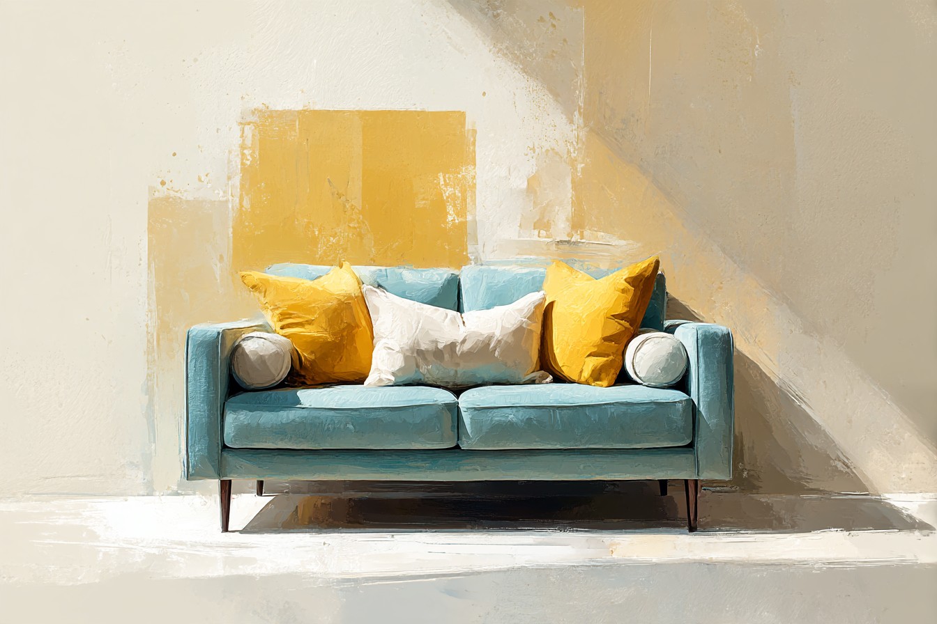
It was the pillows. I threw a mismatched pile of stuff on it that I already owned, just to see if I could make it feel less like a hospital waiting room, and within twenty minutes I was standing there going oh. OH. Because it turns out light blue isn’t the problem child of the sofa world, it’s actually one of the easiest bases to work with, more forgiving than the cream sofa I had before it that showed every red wine incident like a crime scene photo. The blue just needed help. It needed contrast, warmth, something to stop it reading as flat.
If you’ve ever typed “what color pillows go with light blue sofa” into a search bar at 11pm while sitting on the exact problem, this is basically that whole rabbit hole, lived through, filmed, second guessed, and eventually figured out. Some of these combos I got right the first try. One of them I got so wrong I had to admit it to the group chat and eat the consequences.
[Light Blue Sofa]
Navy and Deep Indigo, the Combo I Was Weirdly Scared Of
My first instinct was to avoid putting any other blue near the sofa, like two blues in a room was some kind of design crime I’d get arrested for. Completely backwards. Navy and deep indigo pillows against a lighter chambray sofa is one of those pairings that looks obvious in hindsight and terrifying beforehand, because your brain keeps yelling “that’s too matchy” when it’s actually the opposite of matchy, it’s depth.
I put two navy velvet pillows on the sofa, sent a photo to the group chat before I’d even fluffed them properly, and got back “wait that’s actually so much better” from one person and total silence from the other two, which in group chat language means they agreed but didn’t want to admit I was right. The trick is the lighter sofa needs the navy to be genuinely dark, not just “medium blue,” or the whole thing collapses into a blur of samey blue with no edges. I learned that the hard way with a set of dusty slate pillows that just made the sofa look like it was having a gray day. Returned those in eleven days flat.
Velvet does something specific here too, it catches light in a way that flat cotton doesn’t, so the navy actually looks different depending on where you’re sitting, which sounds fake until you’ve filmed it and watched the color shift on camera between two takes of the same clip. If your sofa’s leaning more toward a cooler powder blue rather than a warm chambray, indigo reads almost moody in the best way, like the room suddenly has more than one idea going on.
[Navy and Indigo Pillows]
Rust and Terracotta, for When Blue Needs a Temperature Check
This is the pairing that actually got me to stop being weird about the sofa entirely. Light blue on its own can run cold, especially in a room that doesn’t get a ton of afternoon sun, and mine faces north which means it’s basically auditioning for “coldest apartment in Chicago” every winter. Rust and terracotta pillows fix that instantly, it’s not subtle, it’s a genuinely obvious temperature shift the second you put them down.
I went with a burnt orange linen blend pillow first, cheap one, and honestly expected it to look like a mistake next to the blue. It did not. It looked intentional in a way I hadn’t planned for, like I was the kind of person who thinks in color theory instead of someone who bought it because it was on sale. Terracotta specifically works better than a straight up bright orange, it’s got enough brown in it to feel grounded rather than like a traffic cone crashed onto your sofa.
The one mistake I made was going too matchy on the actual terracotta shade, buying two pillows in almost identical rust and having them cancel each other out visually instead of adding anything. One rust, one deeper burnt orange, maybe a small mustard accent if you’re feeling brave, that’s the combo that actually reads as layered instead of like you just bought a two pack and called it done. It’s warm without turning the whole room into a fall Pinterest board, which, respectfully, is not the vibe I’m going for in July.
[Rust and Terracotta Pillows]
Textured Neutrals, Because Not Everything Needs a Color
Okay so there’s a version of this where every pillow on the sofa is a Color, capital C, and it starts to feel like the sofa’s shouting. Sometimes the actual move is texture, not color at all, and this is the section where I admit I underestimated boucle for way longer than I should have.
You Might Also Like

I bought one cream boucle pillow almost as an afterthought, filler while I waited for the terracotta ones to ship, and it ended up being the piece that made the whole arrangement look finished instead of thrown together. Against a light blue sofa, a chunky bouclé or a slubby heavy linen in off white or oatmeal doesn’t disappear the way a smooth cream pillow would, the texture gives it its own presence even without color doing the work. It’s the difference between a pillow that reads as “filler” and one that reads as a decision.
This is also the safest place to start if you’re nervous about committing to a bold pairing, because oatmeal and cream literally cannot clash with light blue, it’s chemically impossible, I’ve tried. What surprised me is how much a textured neutral pillow actually helps the bolder colors around it look more expensive, more intentional, like there’s breathing room between the navy and the rust instead of them competing for attention. My roommate’s exact words were “that one looks like it costs more than it did” and honestly, correct, it was twelve dollars.
[Textured Neutral Pillows]
Pattern, but Only the Kind That Knows Its Place
Pattern on a light blue sofa is where I’ve seen the most people, including past me, absolutely bite it. The instinct is to grab a busy floral or a loud geometric because the sofa feels like a blank canvas, and then suddenly your living room looks like it’s trying to sell you something. I did this exact thing with a striped pillow so aggressive it looked like it belonged on a beach umbrella, not a sofa, and it lasted about four days before I banished it to the closet.
What actually works is pattern that shares a color family with everything else already on the sofa. A block print pillow with rust and cream in it, or a subtle stripe in navy and white, does the job of pattern without introducing a fifth competing color into the mix. It ties the other pillows together instead of adding to the noise, which sounds like a design principle I made up to sound smart but is actually just something I stumbled into after the umbrella stripe disaster.
Small scale patterns film better too, for what it’s worth, since a big bold print tends to read as a blob on camera from a distance, whereas something like a fine check or a thin stripe holds its shape even in a wide shot. If you’re only adding one patterned pillow, put it in the middle or slightly forward of the arrangement, not tucked in the back corner where it does nothing. Learned that one from watching my own footage back and wondering why the pattern I paid extra for wasn’t even visible.
[Patterned Pillows]
Sage and Olive, the Pairing Nobody Warns You About
Nobody tells you that green, specifically the muddier, dustier greens like sage and olive, might be the most underrated partner for a light blue sofa, and I think that’s a genuine oversight on the internet’s part. I found this one completely by accident, grabbed an olive corduroy pillow because it was the only thing left on a clearance rack, brought it home expecting it to look wrong, and it didn’t.
Sage and olive sit next to blue the way they do in an actual landscape, sky and something green and a little dusty, which sounds overly poetic for a Target run but that’s genuinely the effect. It’s calming rather than cold, which solves the exact problem light blue gets criticized for in the first place, that “spa waiting room” thing people always bring up.

The greens warm it up just enough without tipping the whole look into the rust and terracotta territory, so if you want something soft rather than a big temperature swing, this is the quieter option.
Corduroy specifically earns its ALL CAPS moment here because the texture does something a flat cotton olive pillow just can’t, it catches light in ridges that make the color look different depending on the time of day, and on camera it’s genuinely the most interesting pillow I own. My one warning, don’t go full forest green, it’s too dark and heavy against a lighter blue and starts looking like a mistake rather than a choice. Sage or a lighter olive, that’s the sweet spot.
[Sage and Olive Pillows]
Final Thoughts
If you’d told me a year ago I’d be writing this many words defending a light blue sofa I originally hated, I would not have believed you, and yet here we are, nine days of resentment fully resolved. The whole thing taught me that a sofa’s color isn’t really the fixed, final decision everyone treats it as. It’s more like the first sentence of a paragraph you get to keep writing with whatever pillows you throw at it.
Navy for depth when the sofa’s feeling flat, rust when it’s feeling cold, texture when it’s feeling unfinished, a careful pattern when it needs one more idea, and sage when you just want it to feel calm instead of clinical. None of these are the “correct” answer on their own, they’re just the ones that actually worked, filmed well, and survived contact with my actual living room instead of just looking good in a photo I staged for twenty minutes and then never touched again. Light blue was never the boring choice everyone made it out to be. It just needed better company.