
Okay so here’s the thing everyone says about a yellow sofa. It’s a Pinterest fantasy that nobody actually lives with. Too loud, too much commitment, the kind of thing that looks incredible in a mood board and then absolutely unhinged in your actual living room six months later when the light changes and suddenly you’re sitting on what looks like a giant lemon. I believed this. I believed it hard enough that when my roommate Dani found a mustard velvet three seater on Facebook Marketplace for eighty bucks, I said absolutely not, that’s a returns pile item for a reason, someone regretted this before we could.
She bought it anyway. It sat in our living room for about three weeks looking exactly like the warning I’d given, this big confident yellow shape with nothing around it to explain itself.
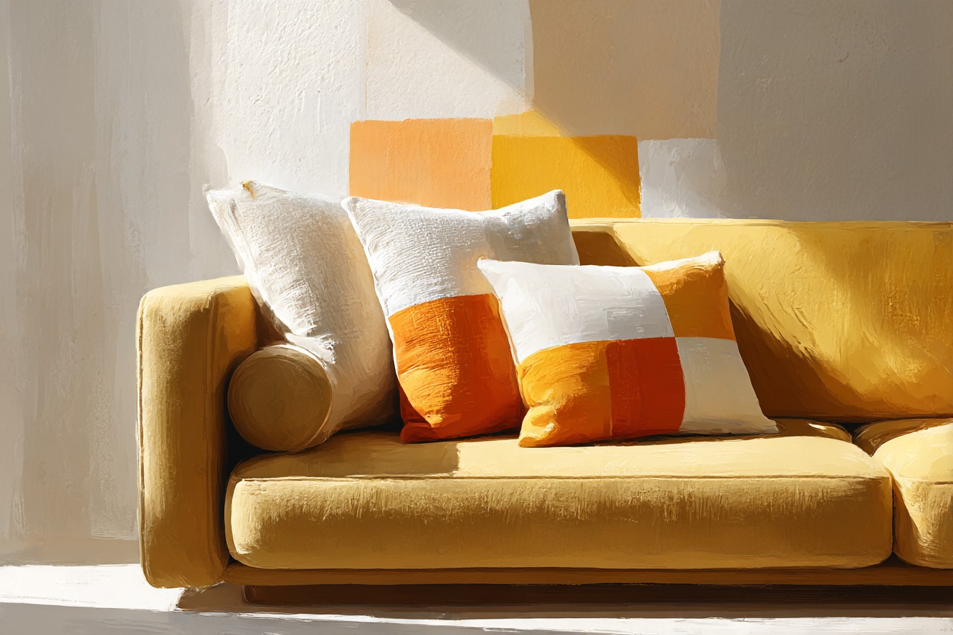
It looked like a decision nobody had actually finished making. And then I got obsessive about pillows, the way I get obsessive about literally everything the second it’s mine to fix, and it turned out the sofa was never the problem. The sofa was fine. The sofa was doing its job. What it needed was stuff around it that gave it a reason to be that color, because a bright couch with nothing to talk to just reads as loud, but a bright couch with the right pillows reads as intentional, and those are two completely different sentences even though they’re describing the same eighty dollar Marketplace sofa.
So this isn’t a “yellow sofas are secretly great” post, though they are, whatever. This is the pillow part. This is what actually calms a yellow sofa down when it needs calming and what actually leans into it when leaning in is the move, because those are different days and different moods and I think that’s the bit nobody tells you, you don’t pick one pillow strategy and marry it forever. Some weeks I want the sofa to whisper. Some weeks I filmed a whole reel because I wanted it to shout. Both are valid. Both are below.
[Yellow Sofa Pillows]
The Oatmeal and Cream Route, for When You Need It to Behave
This is the safe answer and I’m not going to pretend otherwise. Oatmeal, cream, that slightly grubby looking undyed linen that costs more than dyed linen for reasons nobody has ever explained to me properly. This is what I reach for when I want the sofa to look expensive instead of loud, because there’s a version of mustard that reads cheap fast if you don’t manage it, and cream pillows are basically damage control that also happens to look good.
What I actually own is two 20 inch linen covers in a color the listing called “flax” which is just cream with a marketing degree, and one slightly too small insert that bunches at the corners because I bought the covers before I bought the inserts, rookie mistake, don’t do what I did. The texture matters more than the shade here. A smooth cotton cream pillow next to a slubby linen one gives the whole arrangement some depth instead of just being two blobs of similar not color.
This is also the one my landlord adjacent brain trusts most for move out photos, if that’s a thing you’re thinking about, which if you rent, it always is somewhere in the back of your head. Neutral pillows photograph like you have your life together even on the days you very much do not. I sent a photo of this exact setup to the apartment group chat expecting nothing and got “okay this actually looks like a magazine” from one person and total silence from the other two, which in that chat is basically a five star review. Quiet doesn’t mean boring here, it means the yellow gets to be the whole point instead of fighting something for attention.
[Cream and Oatmeal Pillows]
Navy and Denim Blue, the Pairing Everyone Recommends and Is Annoyingly Right About
I want to be contrarian about this one, I really do, because “blue and yellow” is the answer every single color wheel diagram gives you and I resent being told what to do by a diagram. But I tried it specifically to disprove it and now I own three navy pillows and a denim colored bolster I didn’t even know I wanted until it was in the cart.
Navy does something specific to mustard that I wasn’t expecting, it makes the yellow look warmer and slightly more golden by comparison, almost like it’s doing the sofa’s color grading for it. The bolster is actual chambray, proper worn in denim texture, and it’s survived a red wine incident that should have ended it, my fault entirely, I was gesturing with the glass mid sentence like an idiot, and it came out with barely a shadow after a cold rinse. That’s the moment I stopped being smug about proving the color wheel wrong.
If you’re actually asking what color pillows go with a yellow sofa, and I know some of you typed basically that exact phrase into a search bar at midnight, navy is your answer nine times out of ten. It’s the one combination that reads as decorated on purpose rather than accidentally colorful. Just don’t go full nautical, no anchors, please, I’m begging, that’s a different decade’s problem entirely.
[Navy and Denim Blue Pillows]
Sage and Olive Green, the One I Didn’t See Coming
Nobody put me onto this one, I stumbled into it because I had a leftover olive corduroy cushion from a completely different room that I threw onto the yellow sofa mid reorganize, purely as a place to put it while I figured out where it actually lived. It never left. Three months later it’s still there and I’ve added a sage green knit one next to it that I bought specifically because of that first accident, which feels backwards but that’s honestly how most of my good decisions happen.
You Might Also Like

Green next to yellow shouldn’t work as calmly as it does, on paper it reads almost citrus, like you’re building a fruit bowl instead of a living room, but sage specifically pulls it back because it’s got so much gray mixed into it that it behaves more like a neutral than an actual color. Olive does something a little bolder, a little more autumn, which changes the whole mood of the sofa depending on which one you lean toward.
This is the pairing I’d tell someone to try if the cream route feels too quiet for them but full navy feels too obvious. It sits in the middle, calm but not boring, and it’s the one combination in this whole list that photographs completely differently depending on the time of day, morning light makes it look fresh, evening lamp light makes it look almost moody. I didn’t plan any of that. The corduroy cushion just never got moved.
[Sage and Olive Green Pillows]
Pattern Mixing, for the Days You Want the Sofa to Be Loud on Purpose
Okay this is the fun one and also the one that took me the most failed attempts to get right, so buckle up. My first go at this was three different patterns, a gingham, a stripe, and some kind of abstract blob print, all thrown on at once because I’d watched one too many bold pattern mixing videos that weekend and lost all sense of restraint. Sent the photo to the group chat before I’d even sat back down to look at it properly and got one skull emoji and no words, which, in hindsight, was completely fair, it looked like a fabric store had a small explosion on my couch.
What actually works is picking ONE loud pattern and letting everything else go quiet around it. A wide stripe in terracotta and cream, paired with one solid pillow in a similar terracotta tone and one plain cream, that’s it, that’s the whole trick. The stripe gets to be the personality, the solids just support it. I’ve since done a version with a small scale gingham in rust instead of the stripe and it reads almost preppy, in a good way, not in a way that makes me think of a uniform.
This is the direction for people who actually like their yellow sofa loud and are tired of being told to calm it down. Some rooms want quiet. Mine wants quiet on a Tuesday and completely unserious by Saturday, and pattern mixing done with one loud print and two backups is how you get both moods out of the same set of pillows depending on what you’re in the mood to film that day.
[Pattern Mixed Pillows]
Velvet and Chunky Texture, When You Want the Whole Thing to Photograph Like It Cost More
Texture is the cheat code nobody talks about enough, because color is only half the equation and the other half is how the light actually hits the fabric. A flat cotton pillow in the exact same shade as a velvet one will photograph completely differently, the velvet always wins, it catches light in a way that makes the whole arrangement look richer even when the color story is basically identical.
My rust colored velvet pillow is the single most photographed object in my apartment at this point, which is a genuinely unhinged sentence to type but it’s true, it ends up in the corner of every single video I film in that room whether it’s relevant or not.

Paired with a chunky knit throw pillow in a similar warm tone, the whole sofa suddenly looks like it belongs to someone with a much bigger budget than I actually have, which, again, eighty dollar Marketplace couch, we are not fooling anyone who looks too closely.
The one warning here, and I learned this the annoying way, is that cheap velvet crushes fast and looks tired within a month if you’re actually using the sofa like furniture and not like a prop. Spend the extra ten or fifteen dollars on a slightly better cover. Mine held up through an entire winter of actual daily use and still looks fine, the cheaper one I bought first got a flat matted patch on the corner where my elbow lives and it never really bounced back.
[Velvet and Textured Pillows]
Final Thoughts
If you take one thing from all of this, let it be that a yellow sofa isn’t a decision you make once and then live with forever exactly as it started, it’s more like a wardrobe, some days it wants to be quiet and some days it wants to show off, and the pillows are how you actually control which version of it you’re getting. I spent years assuming the color itself was the problem, when really I’d just never given it anything to work with.
Cream calms it down, navy makes it look intentional, green sneaks in somewhere unexpectedly gentle, pattern mixing gives it permission to be loud, and velvet makes the whole thing photograph like it cost double what it actually did. You don’t need all five. I own pillows from basically every one of these directions at this point, rotating them depending on the week, which is a lot for one eighty dollar couch to be carrying, but it’s carrying it fine. Better than fine, actually. It’s the first thing anyone notices when they walk in, and for once that’s a compliment and not a warning.


[…] it and I didn’t know enough to ask. A living room is not a dining room. It needs to go from bright enough to read a contract to low enough for a Tuesday night on the couch doing absolutely nothing productive, and a chandelier that can’t do that range is a beautiful […]