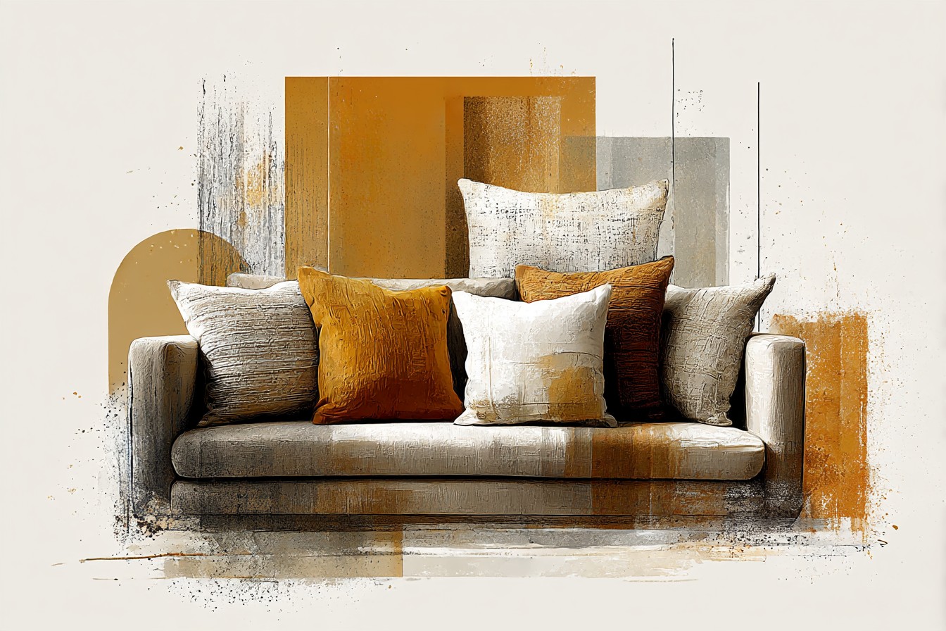
I bought a taupe sofa in 2019 because a magazine told me it was a “safe” choice, and I believed it, and then I spent an entire year hating that sofa with a specificity that surprised even me. It sat in my living room in Jamaica Plain looking like wet cardboard. Every pillow I threw at it, and I mean that literally, I was hurling throw pillows at this sofa like I was trying to punish it, made it look worse. I tried a set of gray pillows because I thought “matching” meant “safe,” and the whole setup went so flat and lifeless that my downstairs neighbor Denise came up to borrow a ladder, took one look at my living room, and said, completely unprompted, “did something die in here?” That’s the kind of feedback that stays with you.
Here’s what I didn’t understand yet: taupe is not one color. It’s an argument between gray and brown that never quite resolves, and depending on the light in your room, the fabric weave, the time of day, it leans one way or the other. My sofa, specifically, leans warm, has a sort of biscuit undertone in daylight and goes cooler and flatter under my ceiling fixture at night.

I spent months treating it like a neutral wall I was supposed to disappear into the background, when actually it needed pillows that would pick a fight with it, gently, and win.
Once I figured that out, everything changed. Not because I discovered some secret rule, there isn’t one, but because I stopped being scared of color near a “neutral” sofa. Taupe can hold a lot more personality than the magazines let on. It’s not beige’s boring cousin, it’s got warmth in it if you go looking, and once you find the undertone in your specific sofa, the pillow question stops being agonizing and starts being kind of fun.
This is the part where people usually ask me what color pillows go with a taupe sofa, like there’s a single correct answer sitting in a vault somewhere. There isn’t. There’s a handful of directions that actually work, depending on what mood you’re building, and I’ve gone down most of them, badly at first, then less badly. So here’s what I’ve actually lived with, cushion by cushion, mistake by mistake, on a sofa I once considered returning out of pure spite.
[Taupe Sofa Pillows]
Mustard and Ochre, the Warm Handshake
I resisted mustard pillows for years because I associated the color with a phase of 2016 interior blogging I found deeply embarrassing, all those “jewel tone” roundups that made every living room look like a Renaissance painting had a garage sale. But mustard against a warm leaning taupe does something I wasn’t ready for. It doesn’t clash, it completes a sentence the sofa was already halfway through saying.
I have two mustard velvet pillows now, eighteen inch, from a shop that no longer exists because apparently that’s the fate of every small textile company I ever fall for. They cost me forty two dollars each, which felt like a lot at the time, and I nearly sent them back the day they arrived because in the box, under fluorescent light, they looked orange, properly orange, like a traffic cone had opinions about my sofa. I almost repackaged them right there on the kitchen table. Then I actually put them on the sofa, in the living room, in real light, and the orange dropped away and this deep, almost honeyed gold showed up instead, sitting right in the warm undertone of the taupe like it had always belonged there.
The trick, and I learned this the hard way, is not going full mustard across the whole sofa. Two is plenty. Four starts to look like you’re auditioning for a cider commercial. I keep mine at opposite ends, not centered together, because taupe reads calmer when the warm pop isn’t doubled up in one spot. This combination works especially well in a room that gets a lot of afternoon light, which mine does, because the gold in the pillow catches it and throws a warmth back onto the sofa that the fabric alone doesn’t have. In a north facing room I’d probably go one shade darker, more of a true ochre, because the paler mustards can go a bit sickly without direct sun helping them out.
[Mustard and Ochre Pillows]
Blush and Dusty Rose, the One I Was Wrong About
I told a friend, confidently, wrongly, that pink pillows on a taupe sofa would look like a bridal shower nobody wanted. I said this with real conviction. I was completely off base, and I’m only admitting it because the alternative is pretending I’ve always known what I’m doing, and that would be a lie this entire site exists to avoid.
What actually happens with dusty rose against taupe, specifically the muddier, more brown leaning taupes, is something closer to sophisticated than sweet. The rose has to be dusty though, not bright, not anything that reads as Pepto or nursery pink. I have a twenty inch pillow in a cotton linen blend, a color the listing called “faded terracotta rose,” which is the kind of made up paint chip name that usually makes me roll my eyes, but in this case it’s actually accurate. It’s rose with enough gray and brown mixed in that it reads more like a dried flower than a fresh one.
This pairing is quieter than the mustard one. It doesn’t announce itself. It’s the pillow combination I reach for when I want the room to feel settled rather than energized, and it’s genuinely the one I get the most comments on, mostly because people expect to hate it and don’t. I made the mistake early on of pairing dusty rose with a bright white pillow in the mix, thinking I was adding freshness, and instead the white made the rose look chalky and cheap next to it, like it had been left out in the sun too long. Swap that white for a warm ivory or a soft oatmeal and the whole thing settles into something that feels considered instead of accidental.
[Blush and Dusty Rose Pillows]
Deep Ink Blue, for When Taupe Needs a Backbone
Sometimes a room doesn’t need warmth, it needs weight. Taupe can go soft and a little formless if every accent you add is also soft, and I learned this the slow way, over about two years of a living room that looked pleasant and said absolutely nothing. Deep ink or navy pillows are the fix, and I resisted them for a long time because I had it in my head that navy belonged on a boat themed guest bathroom and nowhere else.
You Might Also Like

I own three navy pillows now, one velvet and two in a heavier woven cotton, and they do something structural to the sofa that no warm tone ever managed. They give the taupe an edge, a boundary, make it read as intentional rather than default. The velvet one in particular, twenty two inches, has a slight sheen that catches light differently than the matte cotton ones, and putting them next to each other stops the whole navy grouping from going flat.
Here’s the part where I have to be honest about a genuine mistake, because it’s instructive. I bought a navy pillow described as “affordable luxury,” priced at ninety eight dollars, that arrived with a zipper so cheap it split on day four. NINETY EIGHT DOLLARS. For a zipper that couldn’t survive a week of normal use. I want whoever wrote that product description to explain “luxury” to my face, genuinely, I will wait by the phone. I returned it, loudly, in an email that was probably too long, and replaced it with a twenty four dollar pillow from a completely different retailer that has outlasted it by three years and counting. The color is doing the work here, not the price tag, and taupe rewards a deep navy whether it cost you a fortune or twenty four dollars and a bit of patience.
[Deep Ink Blue Pillows]
Cream and Bouclé, the Monochrome Move Nobody Warns You About
For a while I thought “neutral on neutral” was a cop out, the interior design equivalent of ordering plain toast because you’re too tired to decide on anything else. I was wrong about that too, which is becoming a running theme in my living room’s history. A taupe sofa with cream, ivory, and bouclé textured pillows in the mix doesn’t go boring, it goes tactile, and tactile is doing a lot of the work that color would otherwise have to do.
I have four pillows in this family now, which is at least two more than any reasonable person needs, but each one has a different texture, a chunky bouclé, a smooth cotton, a slightly ribbed ivory linen, and a small faux shearling one that my cat has claimed as her personal property. Lined up together on the taupe, none of them fighting for attention color wise, the texture differences do the visual heavy lifting instead. It reads calm without reading empty, which is the exact balance I failed to hit for that entire first miserable year with the gray pillows.
The mistake to avoid here is uniformity. If every pillow in this grouping is the same smooth cotton in slightly different shades of cream, it goes flat fast, same problem as my original gray disaster, just paler. You need at least one properly textured piece, the bouclé or a chunky knit, to give the eye something to catch on. This is also, practically speaking, the lowest maintenance combination on this list. None of these show cat hair the way the navy velvet does, and I say that as someone who has picked white fur off a navy cushion more times than I’d like to admit in front of Denise.
[Cream and Bouclé Pillows]
Rust and Terracotta, for the Months You Want the Room to Feel Lived In
I rotate a rust colored pillow onto the sofa every autumn like it’s a seasonal ritual, and I used to be a little embarrassed about that, like it made me predictable. I’ve stopped being embarrassed about it because it works too well to care about the optics. Rust and terracotta sit right in the middle of taupe’s warm undertone and pull it forward in a way that feels less like decorating and more like the sofa was always meant to look this way and I just hadn’t caught up yet.
The pillow I keep coming back to is a burnt orange cotton, twenty inches, with a subtle woven texture, not shiny, not flat, something in between that photographs terribly and looks fantastic in person, which is the opposite of most things I buy online. Paired with the mustard pillows from earlier in the piece, this combination can tip into “overwhelming” fast if you’re not careful, so I keep it to one rust pillow against one or two cooler or neutral pieces, never rust and mustard both at full strength on the same sofa at the same time. Learned that one by trial, and by a photo Denise took of my living room that I have since asked her to delete.
What I like about rust specifically, more than the softer terracotta shades, is that it doesn’t apologize for itself. It reads confident against taupe rather than cozy in the twee, blanket scarf sense of the word. If your room already has warm wood furniture, rust pillows tend to pull those tones together in a way that makes the whole space feel considered rather than assembled at random from four different online orders across three years, which, if I’m honest about my own living room, is closer to what actually happened here.
[Rust and Terracotta Pillows]
Final Thoughts
If you’d told me four years ago that I’d end up with an entire section of my closet dedicated to sofa pillows I rotate seasonally, I’d have laughed you out of the room, probably from the seat of that same taupe sofa I once tried to sell out of pure resentment. But that’s where I’ve landed, and the sofa I nearly returned is now the piece of furniture I’ve built the most opinions around in this entire apartment.
The thing nobody tells you about taupe is that it’s not asking you to play it safe.

It’s asking you to notice which direction it leans, warm or cool, and then commit to a pillow color that either agrees with it or gently pushes back. Mustard and rust lean into the warmth. Navy gives it a spine. Blush softens it without going saccharine, once you pick the right shade. Cream and bouclé prove that “neutral on neutral” isn’t a cop out, it’s just a different kind of decision, one about texture instead of color.
None of this required a bridal registry budget or a ninety eight dollar zipper that snaps on day four. It required actually looking at my own sofa, in my own light, and admitting that the safe gray pillows I started with were the real mistake, not the taupe itself. The sofa was fine all along. I just hadn’t figured out how to talk to it yet.