
My friend Dana stood in my hallway, still in her coat, staring at the wall I’d just painted a color called “Simply White” and said, “This looks exactly the same as before you painted it.” She wasn’t wrong, technically. It looked almost identical to the builder beige I’d been trying to erase for eight months. Except it wasn’t the same. It was warmer. It sat differently against my floors, which are a pale, honey toned white oak that the previous owner had clearly refinished without much of a plan, and the whole hallway had gone from looking tired to looking, finally, intentional. Dana just couldn’t see it because she was looking at a wall, not at the wall and the floor together, which is the entire problem with how most people pick paint.
Light wood floors get talked about like they’re a blank canvas, easy, forgiving, goes with everything.
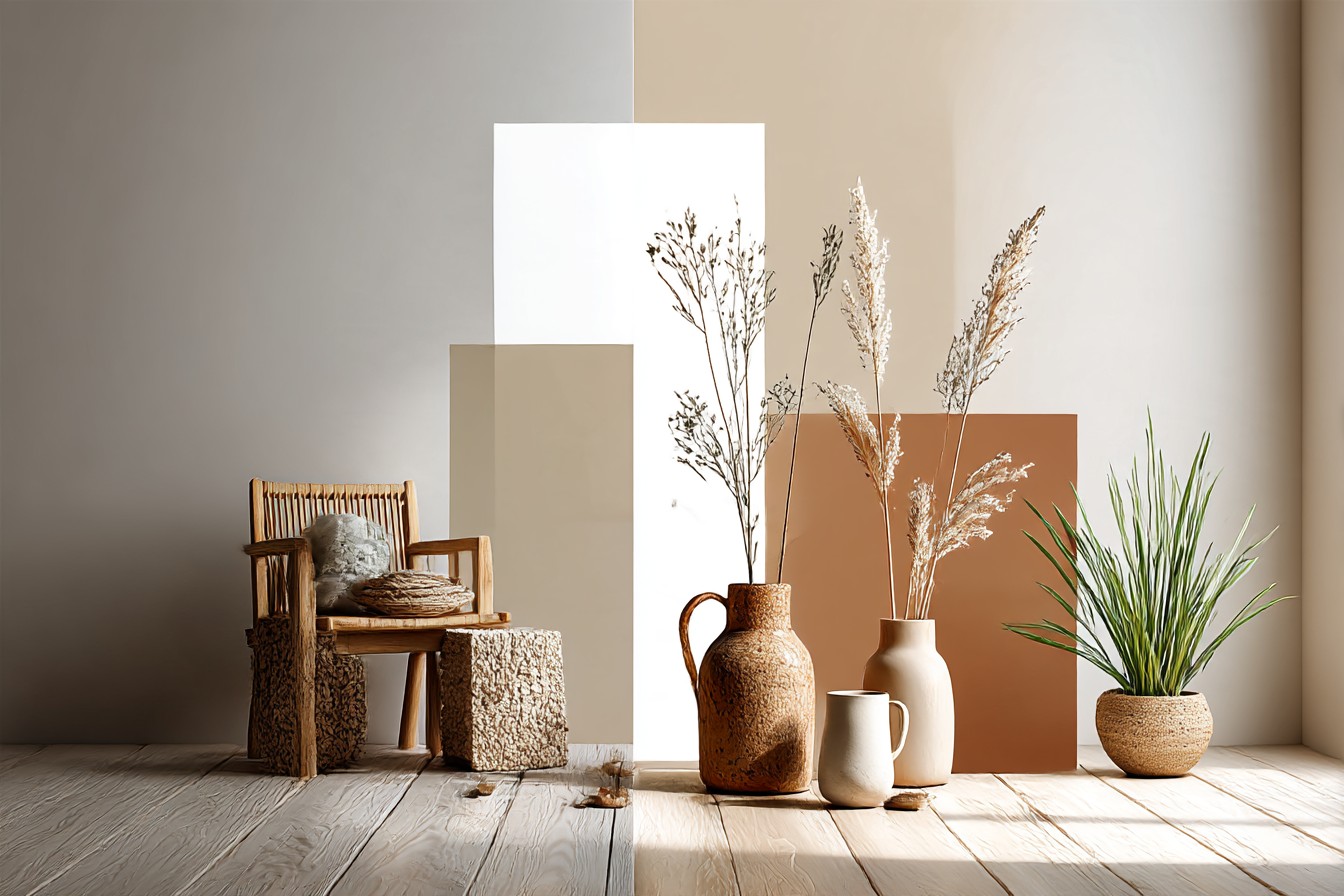
I believed that for years. Then I actually lived with them, in three different apartments, and worked with probably two dozen clients who had them too, and I can tell you it’s not true. Pale floors have undertones. Some lean pink, some lean yellow, some lean a sort of gray green that nobody warns you about until you’ve already bought five gallons of the wrong white. I had a client last spring whose engineered oak floors read warm honey in daylight and almost gray by lamplight, and she’d chosen her wall color, a cool dove gray, based on a swatch held up at 2pm on a Tuesday. By evening the whole room looked like it was arguing with itself.
So this isn’t a “these colors go with wood floors” list, because that sentence means nothing without knowing which wood floor. This is what actually happens when you put specific colors, warm and cool both, against pale floors, and where each one earns its place instead of just looking fine in a photo. I’m going to talk about the LRV numbers I actually check now, not just the paint chip name, because I got burned once trusting a name like “Oat Milk” to behave the way it sounded, and it did not.
[Light Wood Floors]
Warm Whites and Creams
Warm white is the one everyone reaches for first with light wood floors, and there’s a reason, but there’s also a very specific way to get it wrong that I did myself in my first apartment. I painted my living room a color with a name I won’t repeat because the brand doesn’t deserve the free mention, and it read fine on the chip. On the wall, next to floors that had a strong yellow undertone, it went custardy. Not warm. Custardy, like the whole room needed antacids.
What actually works is checking the undertone against your floor’s undertone, not against a neutral swatch card. If your floors lean gold or honey, like a lot of red oak or unfinished white oak does, you want a warm white with a slightly gray or greige base underneath it, something with an LRV in the low 80s rather than the 90s, because the higher you go the more it starts competing with the floor’s own warmth instead of settling next to it. I’ve used a soft cream, closer to LRV 82, in a client’s dining room with honey toned oak and it did exactly what it was supposed to, it made the floor look intentional rather than dated.
The mistake people make is assuming “warm white” is one thing. It’s not. There’s a warm white that leans peach, which is a disaster next to pink toned floors, and a warm white that leans a soft butter, which is what you actually want against gold or amber floors. Test both, in the actual room, at the actual time of day you use that room most, because the paint store’s lighting is doing you no favors and neither is your phone camera.
[Warm Whites and Creams]
Cool Grays and Greiges
Here’s the one that gets argued about constantly, whether a cool gray can sit next to a warm wood floor without the room looking like two people who weren’t invited to the same party. I used to say no, flatly, no exceptions. I’ve had to walk that back, slightly, and it annoys me a little to admit it.
The truth is a cool gray works if the floor itself isn’t screaming warm. A lot of newer pale engineered floors, the ones with a Scandinavian style whitewash or a light ash finish, actually have enough gray in them already that a cool wall color reads as a match rather than a clash. I had a client with a whitewashed oak floor, genuinely pale, almost driftwood colored, and we used a cool gray with a slight blue undertone in her bedroom. It looked properly considered. Calm, a little Nordic, nothing fighting for attention.
Where it goes wrong is when someone has a floor with obvious orange or red undertones, classic older red oak, and tries to force a cool gray onto the walls to “balance it out.” That’s not balance, that’s a standoff. I measured this literally once with a client, held a cool greige swatch against her honey red oak sample in her actual entryway light, and it looked jaundiced somehow, both colors made worse by proximity. We switched to a warmer greige, one with a touch of taupe rather than blue, and the whole thing resolved itself in about four minutes.
So cool grays absolutely can go with light wood floors. Just check the floor’s actual undertone first, in its own light, before you assume the “goes with everything” gray does what the paint store card promised.
[Cool Grays and Greiges]
Deep Contrast Colors
Everyone gets nervous about dark walls with pale floors, like the two things are natural enemies, and I genuinely don’t understand where that idea came from because some of the best rooms I’ve worked on use exactly this contrast. A deep navy, a forest green, even a near black charcoal, against a pale honey or ash floor, creates a kind of visual anchor that a room full of soft neutrals just doesn’t have.
I did this in my own bedroom, a color close to a very dark bottle green, against white oak floors that lean slightly pink, which I was initially worried about. It didn’t clash. If anything the depth of the wall made the pinkish undertone in the floor look deliberate, like it was chosen to be there, rather than something I was quietly trying to disguise with the right throw rug for three years.
You Might Also Like

The thing to actually watch here isn’t the color family, it’s the finish and the LRV, because a dark color with an LRV under 10 in a room with limited natural light will just read as a black hole, and your pale floor ends up looking like it’s floating in a void rather than grounding the space. I’d recommend staying in the LRV 12 to 18 range for a “dark” wall that’s meant to work with light floors rather than swallow them. A forest green at LRV 15 next to pale ash floors, in a room with decent window light, does something a beige wall never will, it makes the whole floor look intentional and expensive instead of just pale.
This isn’t a color for every room in a house, obviously, and I wouldn’t do it in a small windowless bathroom unless you enjoy caves. But one room, done properly, checked against your actual floor and your actual light, and it earns its place completely.
[Deep Contrast Colors]
Warm Greige, the Middle Ground
If I had to pick the single most useful category for people who don’t want to think about undertones every time the light changes, it’s warm greige, and I say that slightly reluctantly because it’s the “safe” answer and I don’t love being the person recommending the safe answer.
But it works because it does the thing cool grays and warm creams both struggle with individually, it flexes. A proper warm greige, something with a touch of taupe rather than a heavy lilac or blue base, sits next to almost any pale wood undertone without an argument. I’ve used the same warm greige, LRV around 58, in two completely different clients’ homes, one with golden oak floors and one with a much cooler, almost driftwood toned floor, and it read as correct in both. That basically never happens with a true cool gray or a true warm cream.
The failure mode with warm greige is going too dark and too flat at once, because then it stops being a flexible neutral and starts being just a beige with delusions, which was basically my parents’ entire house in 2004 and nobody needs to relive that. Keep the LRV somewhere in the mid 50s to low 60s and check the sheen, an eggshell rather than a flat matte will keep it from going dull next to a floor with any natural shine to it.
It’s not the exciting choice. I know that. But if you’ve got a rental, or floors you’re not sure about the undertone of yet, or you just want one thing in your life to stop requiring a decision, this is where I’d point you.
[Warm Greige Neutrals]
Muted, Dusty Color
The category nobody asks about and everyone should be using more, honestly. A dusty sage, a muted terracotta, a soft clay pink, these sit in a completely different lane from your standard neutral debate, and against pale wood floors they do something neither the whites nor the grays manage, they add actual personality without turning the whole room into a decision you have to defend at dinner parties.
I painted a small home office in a dusty sage, close to LRV 45, against pale white oak floors, and the effect surprised me. The green pulled just enough cool undertone to balance floors that lean warm, but it’s soft enough, muted enough, that it never reads as a “statement,” it just reads as a room someone thought about. A terracotta works similarly in the opposite direction, adding warmth to floors that lean cool or gray, without the commitment level of a full dark wall.
The mistake is choosing these colors too bright.
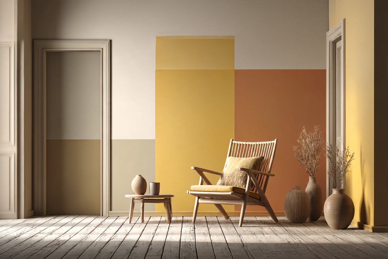
A saturated sage or a vivid terracotta stops being a backdrop and starts being the main event, competing with your floor instead of complementing it. Stay muted, stay dusty, check the LRV is doing more work than the hue itself, somewhere in the 40s tends to be the sweet spot for these to read as sophisticated rather than nursery adjacent.
[Muted Color Walls]
Final Thoughts
If there’s one thing I’d want someone to take from all this, it’s to stop trusting the paint chip and start trusting your own floor, in your own light, at the time of day you’re actually in the room. Every color above can work with light wood floors. Every single one can also go wrong, fast, if you skip the step of checking undertones against each other instead of assuming pale wood is neutral enough to forgive anything.
Dana was right, in a way, that first wall did look similar to what came before. But similar isn’t the same as correct, and the difference showed up over months, not in that first glance in a coat and boots on a Tuesday. Buy the sample pot. Paint the actual wall, not a poster board propped against the skirting. Look at it in the morning and at night, next to your actual floor, before you commit to five gallons of anything.




[…] and outdoing every prediction we made about it. The arm height did not matter even slightly. The color of the wood stain, argued over for what felt like a week, faded to more or less the same shade within one […]