My sister repainted her guest room in what the paint chip called “Blush Whisper” right before her father in law came to visit for two weeks, and by the time she was done it looked like she was expecting a baby she has never once mentioned wanting. Pale pink walls, white eyelet curtains, a cream rug so soft you sank into it, and a rocking chair she’d bought “for reading” that had never once been used for reading. Her father in law asked, very carefully, if there was something she wanted to tell the family. There was not. She called me that night asking how to fix it without repainting the whole room, because at that point she’d have rather admitted to a secret pregnancy than to a decorating mistake.
That’s the actual risk with light pink, and it’s got nothing to do with the pink itself. The color on its own is fine, it’s practically neutral once you get it light enough, somewhere between a blush and a whisper of coral.
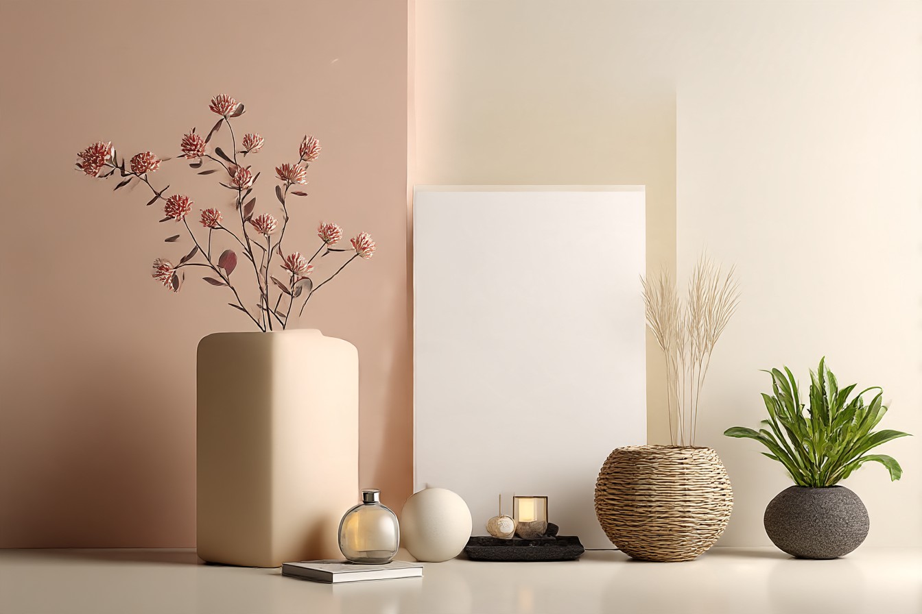
What tips a room into nursery territory is everything you put around it, and that’s really the whole answer to this question in two parts. Part one is what you dress the walls with, curtains and accent colors mostly. Part two is what’s under your feet, because carpet has an outsized vote in this that people don’t clock until it’s too late.
What you put with the pink matters more than the pink
Here’s the thing my sister got wrong, and it’s the thing almost everyone gets wrong first. She paired a soft, warm pink with other soft, warm, rounded things. White eyelet curtains with scalloped edges. A puffy cream rug. A rocking chair. Every single choice she made was gentle and cloud shaped, and gentle plus gentle plus pink reads as baby’s room every time, it’s basically a formula. If you want the same wall color to read like an adult chose it on purpose, you need at least one thing in the room that has some edge to it, literally or in tone.
Curtains are the easiest lever to pull here and I’d argue the most important one, because they’re right next to the wall and they set the temperature of the whole room. Skip anything white and gauzy, that’s the nursery uniform. A deep charcoal or true black curtain against light pink walls looks genuinely sharp, almost like a fashion choice rather than a paint chip that got out of hand. Olive green works too if you want it softer but still adult, and a rust or burnt orange curtain against blush pink is one of my actual favorite combinations in any house I’ve been in, it reads warm and considered instead of sweet.
Accent colors do similar work but you get more chances to use them, on cushions, on a lamp, on a single piece of furniture that isn’t afraid to be dark. Navy against light pink is close to foolproof, it’s the color equivalent of a firm handshake next to something soft. Black picture frames instead of gold or white do more for a pink room than almost any other single decision, and I say that as someone who spent an embarrassing amount of time debating frame colors in my own hallway. Even a mustard yellow throw thrown over the back of a gray sofa in a pink room reads as intentional in a way that a cream throw never will, because cream just agrees with everything and agreeing with everything is exactly the nursery problem.
You Might Also Like

The floor is doing more work than anyone gives it credit for
If the walls are pink, the floor is either going to back that up in a grown up direction or drag the whole room back toward the crib aisle at the baby store, and carpet in particular has a way of deciding this before you’ve even picked a curtain. A pale pink carpet under pale pink walls is the single fastest route to nursery I know of, it’s basically doubling down on the exact color story you’re trying to move away from. I’ve seen it done and it always ends up looking like the room is wearing matching pajamas, cute on a baby, not what you want in a living room you actually sit in as an adult.
What works instead is contrast in weight, not necessarily in color.
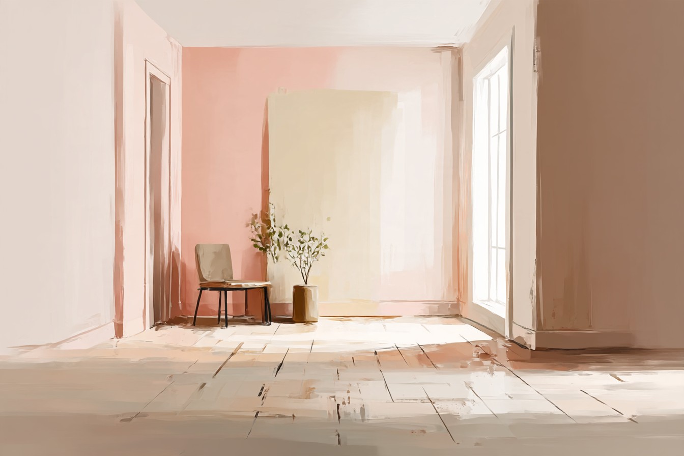
A charcoal gray carpet under light pink walls is the choice I’d make every time, it grounds the room instantly and makes the pink look like a deliberate warm note rather than the whole personality of the space. A deep navy carpet does something similar and honestly looks fantastic, moody in a good way. Even a plain oatmeal or taupe carpet, nothing fancy, works better than anything pink or cream because it stops the room from being one long apology in a single color family.
My youngest tested exactly this theory for me without meaning to, because we’ve got a charcoal rug in our own front room that sits under a wall I painted a soft dusty pink about a year ago, thinking it might read too soft once it was up. He tipped an entire bowl of spaghetti onto that rug during what I can only describe as an argument with himself, and once it was cleaned up the room looked exactly the same, dark rug still doing its job of making the pink look like a choice instead of an accident. If I’d gone with the pale blush carpet I nearly bought instead, that sauce would’ve told a very different story, and the room would’ve looked like a crime scene in a nursery.
Between the two, curtains and carpet are genuinely most of the battle, everything else is detail work. Get a dark, confident color on your windows and something with real weight underfoot, and light pink walls stop reading like a decision made for someone who can’t talk yet and start reading like a room a grown adult chose on purpose. My sister ended up going navy curtains and a charcoal rug in that guest room, kept the same pink walls, never repainted a thing. Her father in law hasn’t asked again.