
Okay so I own six bed frames. Six. Not six beds, six FRAMES, because two of them are just sitting disassembled behind my armchair like some kind of furniture graveyard, and I only noticed the actual number last week when my roommate Devon asked why there was a metal headboard leaning against the hallway wall like it was waiting for a bus. I didn’t have a good answer. The honest answer is that I moved into this apartment fourteen months ago, painted the bedroom a color the paint chip called “Anchor” and everyone else just calls gray, and then spent the better part of a year convinced every single frame I owned was suddenly wrong.
That’s the thing nobody warns you about with gray walls. They’re supposed to be the neutral option, the safe one, the “goes with everything” choice you pick specifically so you never have to think about it again.

Lies. Total lies. Gray reads differently depending on the light in your room, the time of day, whatever’s reflecting off your neighbor’s building, and a bed frame that looked perfect in the paint store lighting can look completely dead against your actual wall by six p.m. I learned this the hard way with a white frame that, under my bedroom’s specific weird north facing light, looked less “crisp Scandinavian minimalism” and more “hospital.” Sent a photo to the group chat, got back one person saying “very clean!!” and one person saying “did you move into a dentist’s office,” and honestly, the second person wasn’t wrong.
So I’ve spent over a year testing basically every color direction you can throw at a gray room, filming most of it, regretting some of it, and landing on a handful of directions that actually work depending on what kind of gray you’ve got and what mood you’re going for. Some of these match. Some of these fight the wall on purpose, in a good way. None of them are the boring answer, even when the boring answer turns out to be correct.
[Bed Frame Colors for Gray Walls]
Black Frames, for When Your Gray Has a Cool Undertone
The first frame I ever bought for this apartment was a black metal one, thin frame, kind of an industrial loft look, and I bought it purely because it was $140 and I was twenty two and broke. I did not buy it because I understood color theory. Turns out I accidentally got something right, because if your gray wall leans cool, the kind with a blue or even slightly lavender undertone rather than a warm greige, black is the frame that makes it look intentional instead of like you just ran out of paint budget halfway through the room.
The contrast is the whole point here. A cool gray wall with a black frame reads moody, a little editorial, like the kind of bedroom that photographs well in low light, which, fun fact, it does, I’ve filmed in this room more times than I can count and the black frame is the one piece of furniture that never disappears into the wall on camera. White furniture against gray can wash out under bad lighting. Black doesn’t have that problem. It just sits there looking like it meant to.
The trade off, and I will absolutely admit this because I lived it, is that black shows dust like it’s being paid to. My frame has thin metal rails and every single week there’s a very fine layer of it that makes the whole thing look gray itself if I skip cleaning for too long, which is a genuinely funny problem to have when the walls are already gray. And landlord wise this one’s an easy yes, it’s just a frame, nothing’s touching the walls, your deposit’s fine.
[Black Bed Frames]
Light Oak and Whitewashed Wood, for Warming a Cold Room Up
My second bedroom situation, back before this apartment, had a gray that I’d now describe as genuinely unkind. Cold, a little blue, the kind of gray that made the whole room feel like it was permanently five degrees colder than the rest of the apartment even with the heat on. A friend from the group chat suggested light oak, and I remember being skeptical because I associated light wood with very serious minimalist apartments that don’t allow throw pillows, which is not my personality at all.
But it worked, and it worked specifically because light oak does the opposite of what black does. Instead of contrasting the gray, it warms it. There’s something about a pale, honey toned wood frame that takes the temperature down a notch on a cold gray wall, softens the whole room, makes it feel lived in rather than staged. It’s the closest thing to a universal answer for “what color bed frame goes with gray walls” if your specific gray runs cool and you don’t want the moodiness of black.
Whitewashed frames do something slightly different, they brighten rather than warm, which is great if your room doesn’t get much natural light but can tip into that dentist office territory I mentioned earlier if your gray is already pale. I’d say light oak over whitewash nine times out of ten, purely because oak has enough grain and texture to keep the room from feeling flat, and texture is doing a lot of the work that color alone can’t.
[Light Oak Bed Frames]
Warm Walnut, the One I Actually Recommend to Everyone Now
This is the frame that’s currently in my actual bedroom, replacing the black metal one that got relegated to Devon’s room, and it’s the one I’d tell you to buy if you only wanted to own one bed frame ever, which, given my current count of six, is advice I clearly don’t follow myself.
Warm walnut sits in this weird sweet spot where it doesn’t fight the gray and it doesn’t disappear into it either. It’s got enough red and brown in the tone that it reads as a genuinely separate element in the room, not a match, not a clash, just a solid, grounded piece of furniture that makes the gray wall look considered instead of accidental. This is the frame equivalent of a good pair of jeans. Not exciting to talk about, works with everything, ages well.
You Might Also Like

The specific incident that sold me was moving day, actually, when the movers set it down against the wall before I’d put anything else in the room, no bedding, no rug, nothing, and it already looked finished. That basically never happens with furniture. Usually a bare frame against a bare wall looks sad and unfinished until you’ve dressed the whole bed. This one didn’t. I stood there for a solid minute just looking at an empty room feeling weirdly proud of a piece of wood.
If I’m being fully honest the only downside is walnut shows up everywhere right now, it’s not exactly a bold choice, and if you’re the type who wants your bedroom to look different from every apartment tour on your feed, this isn’t going to be it.
[Walnut Bed Frames]
Charcoal and Tonal Gray, the Matching Option Nobody Warns You Off Properly
Okay so here’s the one I actually messed up, properly, and I want to be honest about it because everyone tells you tonal is a safe bet and it is NOT automatically a safe bet. I bought a charcoal upholstered frame thinking a slightly darker gray than the walls would look intentional and layered, very “editorial gray on gray moment.” What actually happened is the frame and the wall blurred into each other at certain times of day, and the whole room looked like one flat gray blob with a mattress floating in the middle of it. Filmed a whole room tour, watched it back, and the bed frame genuinely just vanished into the wall behind it on camera. Deleted the footage. Did not post that one.
Tonal can absolutely work, but it needs help. You need contrast somewhere else doing the heavy lifting, a patterned rug, brass hardware, a headboard with visible texture like a channel tufted or ribbed fabric so the frame reads as its own shape even when the color’s nearly matching. My mistake was going matching AND flat, no texture anywhere, which is how you end up with a blob instead of a look.
Once I swapped in a ribbed boucle version of basically the same charcoal color, same shade family, completely different result. Texture saved it. If you’re going tonal, don’t skip that step, I promise you it’s not optional the way I thought it was.
[Charcoal Bed Frames]
Rust and Terracotta, for the Frame That Photographs Better Than It Lives
This is the trend one, and I’ll say upfront, this is exactly the kind of pick I get excited about before I’ve properly tested it, so take this with the appropriate grain of salt. Terracotta and rust toned upholstered frames have been everywhere the last few months, all over the same corner of the internet I spend way too much time on, and against a gray wall the color pops in a way that’s genuinely stunning on camera. Warm, saturated, makes the gray look almost blue by comparison. Sent a photo the second it arrived, got back three fire emojis and zero actual words, which felt like the correct reaction honestly.
In person, three weeks in, it’s a slightly different story. It’s a lot of color for a bedroom, more than I expected living with it daily rather than filming it for thirty seconds. It’s the kind of frame that needs the rest of the room to calm down around it, neutral bedding, nothing else competing, or the whole space starts to feel like it’s shouting. It also doesn’t hide dog hair or dust the way charcoal does, my own fault for not checking that before buying, and it’s a genuinely bold enough color that if you’re renting and thinking about resale of the piece itself down the line, it’s a narrower market than walnut or black would be.
Would I keep it? Yes, actually. But I’d tell you to sit with a fabric swatch against your actual wall for a few days before committing, because this one lives or dies on your specific gray and your specific light, more than any other color on this list.
[Terracotta Bed Frames]
Final Thoughts
Six frames later, here’s what I actually believe. There isn’t one correct answer to “what color goes with gray walls” because there isn’t one gray, not really, yours is warmer or cooler or lighter than mine and that changes everything downstream of it.
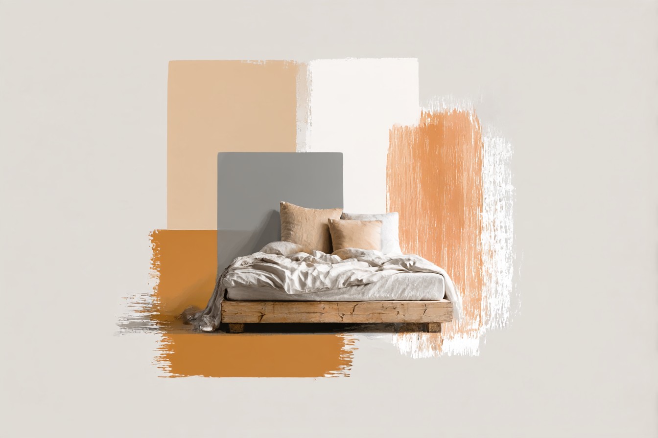
Black gives you contrast and drama and shows every speck of dust doing it. Light oak warms a cold room up without even trying. Walnut is the one that just works, quietly, every time, which is maybe the least exciting sentence I’ve written in this whole piece but also the most true one. Tonal gray needs texture or it collapses into a blob, ask me how I know. And terracotta will photograph better than it lives, at least at first, so give it a real week before you decide.
If you take one thing from all this, take the swatch test seriously. Hold the actual fabric or a paint chip of the frame color against your actual wall, at actual different times of day, before you buy anything. I skipped that step more than once and ended up with furniture in the hallway waiting for a bus that isn’t coming. Your gray deserves better research than mine got.




[…] wrong, but he’s wrong in a way that actually points at the real answer, which is that bed frame color isn’t a taste question first. It’s a room and bedding question that taste gets to weigh […]
[…] ask this a lot, honestly, once they’ve got the frame sorted, what to put on top of a bed frame that has a ledge or a shelf or a canopy rail. The honest answer is smaller and lighter than most […]
[…] yet these thirty cent discs have saved me more money than almost anything else on this list. Metal bed frame legs, especially the ones with a small flat foot rather than a rounded glide, will mark hardwood. […]