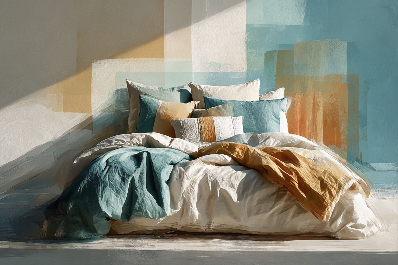
I was on my knees on a drop sheet in my bedroom at eleven on a Sunday morning, sanding the top rail of a headboard I’d bought off Facebook Marketplace for sixty dollars from a guy named Gary who described it as “solid oak, needs a little love.” It needed considerably more than a little love. It needed four hours of my life, two sanding blocks, and a primer coat that made my apartment smell like a hardware store had caught fire. Somewhere around hour two I decided I was painting it blue. Not navy, not that gray ish “coastal” blue every paint brand pretends is a personality. I went with a deep teal leaning blue, the kind with a bit of a grudge in it, and I loved it the second the second coat went on.
Then I stood back, admired my work, felt like a person with her life together, and looked at the bed itself. Still made up in the same white waffle comforter I’d had since a breakup three apartments ago.
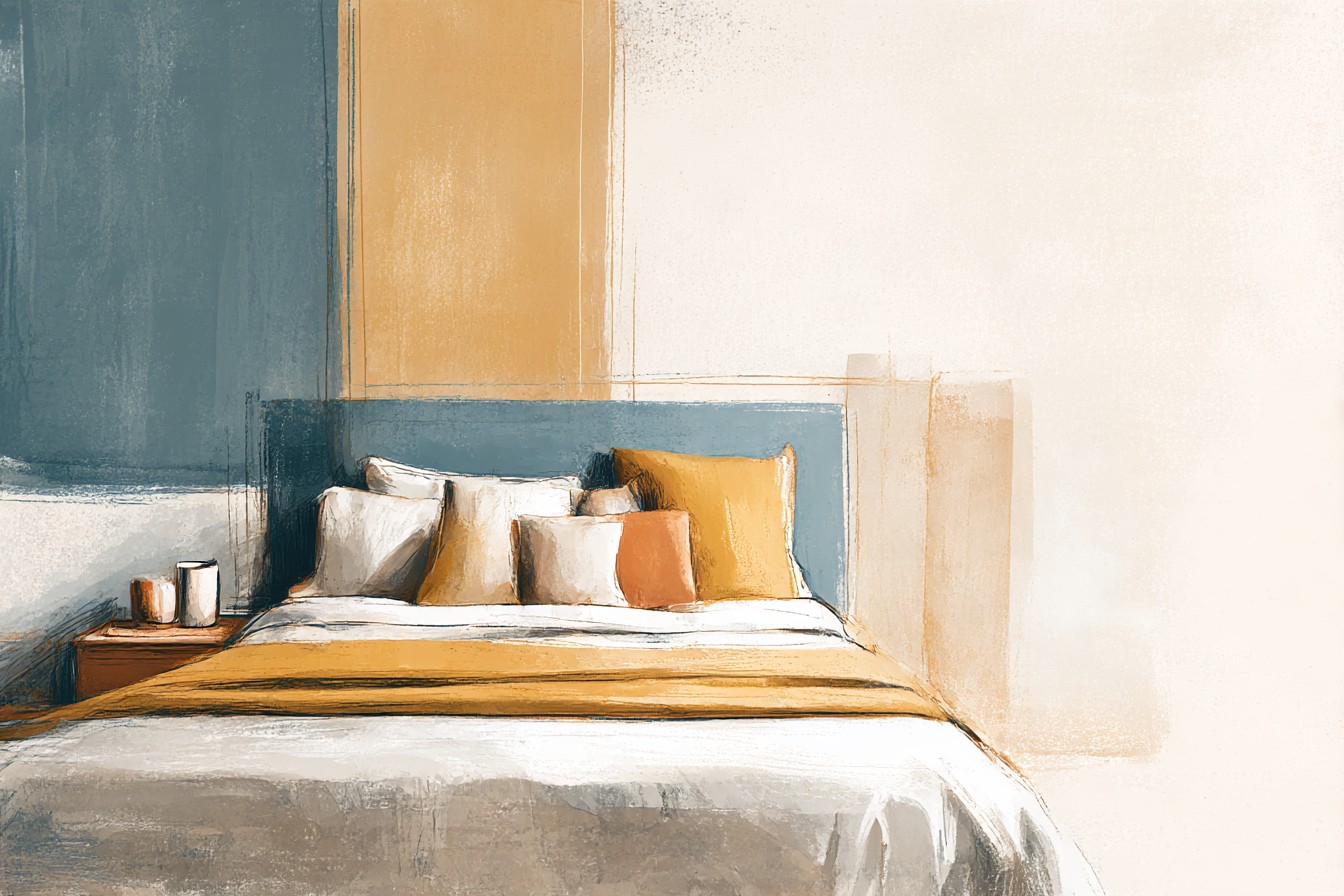
Fine on its own. Suddenly, next to that blue, it looked like an afterthought. Like I’d painted a feature wall and then never bought a single piece of art for it.
Here’s the bit nobody warns you about with a blue headboard. Everyone will compliment the color. Nobody tells you that the second you commit to it, your comforter stops being neutral background and starts being an actual decision. White wasn’t wrong, but it wasn’t right either, it was just what happened to already be in the closet, and there’s a real difference between a choice and a default.
My mom, visiting two weeks later, walked in, looked at the headboard, looked at the bed, and said, “did you run out of money halfway through?” Which, no. But also, emotionally, kind of yes.
So I went down the rabbit hole. I bought more comforters in six weeks than I’m comfortable admitting to in print, tested them against that exact blue in daylight, in lamp light, at 7am when the light comes in flat and unforgiving and shows you exactly what you’ve done wrong. Some worked. Some made the room look like a hospital waiting area with ambitions. Here’s what actually earned its place, color by color, and why the wrong white can do more damage than the right rust ever could.
[Blue Headboard]
The White and Cream Comforters That Actually Earn Their Place
Everyone tells you white goes with everything, and that advice is doing a lot of quiet damage, because “white” is not one thing. I learned this the hard way when I put a genuinely bright, optic white comforter against my headboard and it looked like a dentist’s office had opened a satellite location in my bedroom. Stark white against a deep, moody blue reads clinical. It flattens the color instead of framing it.
Ivory does the opposite job entirely. I switched to a warm, slightly off white matelasse comforter with a subtle honeycomb texture, and the difference was immediate, the blue looked deliberate instead of accidental, like the two colors had been introduced by a mutual friend rather than shoved into a room together by me at 11pm on a Tuesday.
I need to say something about a brand here, because I bought a “crisp white essential” comforter from a company that will remain unnamed for legal reasons, for two hundred and sixty dollars, and it pilled after two washes into something resembling a used dryer sheet. Two hundred and sixty dollars. For that. I do not know who signed off on calling that essential, but I would genuinely like them to explain the pricing to my face, in person, while I hold the pilled comforter up as evidence.
The texture matters more than the shade once you’ve got the temperature of white right. Waffle weave against a smooth painted headboard looks intentional. A slubby linen blend cream comforter against oak grain looks like two different decades agreed to share a room and mostly get along. Cream isn’t a compromise color here, it’s the one doing the actual work of making the blue look chosen rather than found.
[White and Cream Comforters]
Rust and Terracotta, the Pairing Nobody Warns You About
I bought a rust colored quilted comforter in October because it felt seasonal, and I fully expected to swap it out by February for something safer. I did not swap it out. It’s May and it’s still on the bed, and I have made peace with the fact that I was wrong about it being a temporary autumn thing.
Rust and terracotta sit almost opposite a deep blue on the color wheel, close enough to orange that it reads warm without tipping into anything Halloween adjacent, and against Hague Blue leaning paint it stops the whole room from feeling cold and a little institutional. Blue on its own, especially the deeper, teal leaning blues, can start to feel like a dentist’s waiting room’s moodier cousin. Rust fixes that instantly.
The specific shade matters enormously. A bright, tomato leaning rust looks cheap next to a sophisticated blue, like it wandered in from a different, louder apartment. What works is the dirtier end of the rust family, the ones closer to brick or dried clay, with a bit of brown mixed in rather than a bit of pink. I found one from a small home goods brand that described its own product as “brick, but make it cozy,” which is objectively a ridiculous sentence and also exactly correct.
My one complaint, and it’s a real one, is that rust shows lint like nothing else I own. I have a cat named nothing relevant to this story, but she is orange, and I genuinely cannot tell where the comforter ends and the cat hair begins some mornings. Worth it. Still worth it. But bring a lint roller into this relationship with open eyes.
[Rust and Terracotta Comforters]
Mustard as an Accent, Not a Commitment
I want to be honest about mustard, because I think it gets recommended constantly by people who have never actually lived with a full mustard comforter next to a blue headboard, and it can go wrong fast. A solid mustard comforter, all in, head to toe, against a deep blue starts to look like a university lecture hall from 1987. I know this because I tried it. My bedroom briefly resembled a place where you’d be assigned homework.
Where mustard actually works is as a supporting color rather than the main event. I found a comforter with a small scale geometric print, mostly cream, with mustard threaded through in narrow lines, and that was the version that made the blue headboard look considered instead of accidental. It’s the difference between wearing a mustard sweater and wearing a mustard tie. One is a decision. The other is a bit much before 9am.
You Might Also Like

There’s a specific kind of confidence this color needs and most comforters marketed as “mustard” don’t actually have it, they’ve gone too yellow, too flat, and against a moody blue that reads as clashing rather than complementary. What you actually want leans closer to ochre, with some brown mixed into the yellow, the color of turmeric rather than the color of a rubber duck. I learned that distinction by buying the wrong one first, obviously, because that’s apparently how I learn everything in this apartment.
If you’re nervous about commitment, which is fair, start with a single mustard toned throw folded at the foot of the bed over a cream comforter before you go all in on a full mustard duvet cover. It’s a smaller, much less expensive way to find out if you actually like it, or if you just liked the idea of it in a photo taken by someone with better lighting than you’ll ever have.
[Mustard Accent Comforters]
Blue on Blue, for People Who Trust Texture Over Contrast
There’s a specific kind of person who hears “blue headboard” and immediately reaches for a blue comforter in a slightly different shade, and for a while I thought that person was making a mistake. I don’t think that anymore. I think that person understood something about texture that took me an embarrassingly long time to catch up on.
Tonal blue on blue only works if the two blues are different enough in depth and the comforter itself has some texture doing the heavy lifting, because if you match two flat blues you end up with a bed that reads as one slightly confused blob rather than a room with layers. I put a lighter, dustier slate blue quilted comforter against my darker teal leaning headboard, with a proper channel stitched pattern that catches light differently depending on where you’re standing, and it stopped being one note. It became a room with depth instead of a room with a single, insistent color opinion.
The mistake I made first, and I’ll admit this outright, was buying a smooth sateen comforter in almost the exact same blue as the headboard, no texture, no tonal shift, and the whole bed disappeared into the wall behind it in low light. It looked less like a design choice and more like I’d run out of ideas and also possibly money, which, see my mother’s earlier comment about running out of money halfway through.
If you’re going tonal, spend the money on texture rather than on chasing an exact color match. Matelasse, quilted channels, a woven waffle. That’s what separates “sophisticated monochrome bedroom” from “I only own one throw pillow and it shows.”
[Tonal Blue Comforters]
Blush and Dusty Pink, the Pairing I Didn’t See Coming
I was skeptical about this one. Deeply skeptical. Blue and pink together felt like it belonged on a baby shower invitation, not a grown adult’s bedroom, and I said as much to more than one person before I actually tried it.
Then I found a dusty, almost clay adjacent pink comforter, closer to faded terracotta than to bubblegum, with a small floral print in muted tones, and against the darker blue headboard it looked soft in a way none of the other colors managed. Rust warms the room up. This softens it. Different job entirely, and I hadn’t realized how much I wanted that until I saw it done properly.
The trick, and it is a genuine trick rather than a suggestion, is staying away from anything that reads as pastel pink. Baby pink against a deep, serious blue looks like a nursery that got ambitious. Dusty, muted, almost grayed out pink reads as an actual color decision made by an adult with taste, rather than a color decision made by someone who wandered into the wrong aisle. The gray undertone is doing all the work here. Without it, you’re back to the baby shower.
I put this comforter on the bed for two weeks as a test, fully expecting to hate it and swap it straight back to the rust one, and instead I found myself telling people, unprompted, at a dinner I hosted for absolutely no reason related to bedding, that blush pink was the most underrated pairing for a blue headboard that nobody talks about. Nobody had asked. I brought it up anyway. That’s roughly the level of conviction I now hold on this particular color, and I did not expect to hold it at all.
[Blush and Dusty Pink Comforters]
Final Thoughts
If you take one thing from all of this, take the part where I say white isn’t automatically the safe choice people promise it is.
Shade and texture matter more than the color family you land on, and a wrong white can do more damage to a blue headboard than a right rust, a right mustard accent, or a slightly bold pink ever will.
What actually decides this isn’t a color wheel rule, it’s the mood you’re going for. Rust and terracotta warm the room up and make a deep blue feel less like a dentist’s waiting area. Tonal blue, done properly with real texture, makes the whole setup look intentional rather than matched by accident. Mustard wants to be an accent, not a full commitment, and blush pink, which I still can’t quite believe I’m defending in print, softens everything in a way I didn’t know the room needed until I saw it.
None of this needed to cost what some of these brands think it should cost, and I’ll keep saying that in every single one of these pieces until someone at one of these companies explains their pricing to me directly. It doesn’t need to. A good comforter in the right shade is not a luxury purchase, it’s just paying attention to the thing you already committed to when you picked up that paintbrush in the first place.
My bed currently has the blush pink one on it, which is not the outcome I expected when I started sanding a sixty dollar headboard from a stranger named Gary on a Sunday morning. But it’s the right one. And honestly, that’s the whole point of doing any of this properly instead of grabbing whatever was already sitting in the closet.