I used to think brown headboards were a design dead end. The kind of thing you inherit from a rental or buy in a hurry at a warehouse store and then spend the next three years apologizing for. My friend Marisol once described her own honey oak headboard as looking like “a filing cabinet that got ambitious,” and for years I nodded along, because every brown headboard I’d seen in real life came draped in whatever comforter was on sale, usually something beige and forgettable, and the whole bed just sort of disappeared into itself. Brown on brown on beige. A room with no pulse.
Then I found a headboard at an estate sale out past Wilmington Island, and it changed my whole opinion in about four minutes. It was walnut, properly aged, with a soft reddish cast to the grain that I hadn’t seen on furniture in years, the kind of color that only happens when wood’s had sixty or seventy years to settle into itself.
The dealer running the sale barely knew what he had. I nearly walked past the table it was leaning against entirely, tucked behind a folding screen like it was hiding from me on purpose, and if I’d kept moving I’d have missed the one thing that day actually worth the drive. I got it home, cleared off the woodworm scare that turned out to be nothing more than old varnish flaking (my heart did stop for a second there, bless it), and then stood in my bedroom for a solid twenty minutes trying to figure out what on earth to put on the bed in front of it.
That’s the thing nobody tells you about brown headboards. They’re not boring. They’re specific. Walnut wants something different than oak wants, and oak wants something different than the reddish mahogany veneer my aunt still has from her first apartment. Once I started treating the headboard like a piece with its own personality instead of a backdrop to ignore, the comforter question got a lot more interesting. What color comforter goes with brown headboard depends entirely on which brown you’re actually looking at, and how warm or cool you want the whole room to feel once the sun goes down.
[Comforters for a Brown Headboard]
Warm Neutrals: Cream, Oatmeal, and Buttermilk
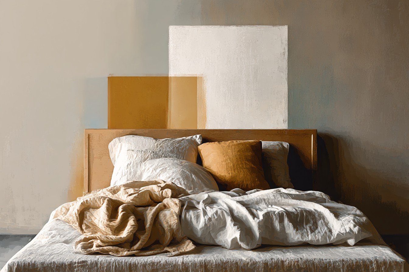
This is where most people start, and honestly, it’s where I started too, because it’s the safest possible answer and sometimes safe is exactly right. A cream or buttermilk comforter against a warm brown headboard doesn’t fight anything. It just sits there looking settled, the way a good pair of leather boots looks settled next to a wool coat. I found a linen blend comforter in a soft oatmeal color at a shop in the historic district that I almost didn’t buy because it looked plain folded on the shelf, no pattern, no texture you could see from six feet away. Got it home, put it against the walnut, and the whole bed suddenly looked like it had been planned rather than assembled.
The trick with this route is texture, because color alone will read flat fast. Waffle weave, a subtle herringbone, even a slightly slubby linen finish, something that catches light differently depending on where you’re standing in the room. Without it, cream on brown can start to look like a hotel that hasn’t been renovated since 2004, and nobody wants to sleep in that. I learned this the hard way with a flat matte cream set that looked fine in the store and completely lifeless once it hit the bed, no dimension, no life, just a beige rectangle. Sent it back within the week.
Buttermilk and oatmeal also do something practical that I didn’t appreciate until my mom pointed it out on a visit, standing in the doorway with her coffee going cold in her hand. She said the room felt calmer than my old apartment, and I realized it’s because warm neutrals don’t compete with warm wood, they just extend it. The whole space reads like one continuous decision instead of two separate ones bumping into each other.
[Warm Neutral Comforters]
Cool Contrast: Slate Blue, Dove Gray, and Sage
Here’s where the myth really falls apart, the idea that brown headboards demand brown bedding. Cool colors against warm wood do something genuinely striking, and I say that having avoided slate blue bedding for years after a bad experience with a navy comforter that looked black in low light and swallowed my old bedroom whole. Slate is different. It’s got enough gray mixed into it that it reads as calm rather than heavy, and against a reddish brown headboard it creates the kind of contrast that makes a room look considered rather than accidental.
I found a dove gray quilted comforter at a linen sale that I almost skipped because gray felt like a cop out, the fallback color for people who couldn’t commit to anything else. Got it home anyway, mostly out of curiosity, and it turned out to be the best decision I made that whole month. Against oak specifically, dove gray reads almost silvery, cool and soft, and it stops the room from tipping too far into cabin territory, which is a real risk with brown furniture if you’re not careful.
Sage does something slightly different again. It’s cooler than a warm neutral but it’s got enough green undertone that it doesn’t feel clinical the way a true gray or blue sometimes can. I put a sage comforter on a friend’s oak sleigh bed once, helping her move furniture on a Saturday that turned into an entire afternoon, and the effect was almost botanical, like the wood and the fabric were having a quiet conversation about the same forest. If your brown headboard leans more golden than red, sage is worth trying before you assume you need to match warmth with warmth. Sometimes the whole room needed was a little air in it.
[Cool Contrast Comforters]
Rust, Terracotta, and Burnt Orange
If cream is the safe answer and slate is the surprising one, rust is the answer for anyone who actually wants the brown headboard to feel like the main event rather than something to work around. I resisted this for a long time. Orange bedding sounded like a decision I’d regret within a season, the kind of bold choice that photographs well and lives badly. Then I found a rust colored quilted comforter, heavier cotton, at a Sunday market stall run by a woman selling off her late mother’s linen collection, and the dealer who runs that yard most weekends kept it back for me without me even asking, which after years of showing up there feels like the actual prize, better than the find itself some days.
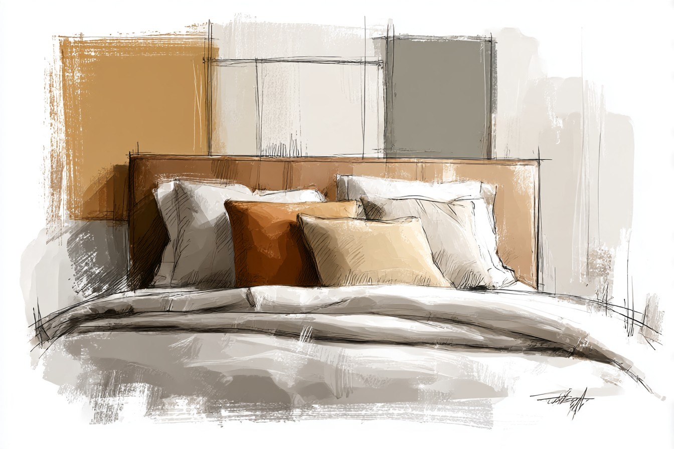
Rust against a deep walnut headboard doesn’t compete, it deepens. The two colors are close enough on the color wheel that instead of clashing they sort of layer into each other, and the room ends up feeling like autumn decided to move in permanently. Terracotta does something similar but lighter, less intense, good if you want the warmth without quite as much drama. Burnt orange is the boldest of the three and honestly the one I’d suggest testing with a throw first rather than committing the whole bed to it, because it’s a color that either makes a room or completely overwhelms it depending on how much natural light you’re working with.
You Might Also Like

What surprised me most was how well this range worked with mahogany specifically, that reddish brown that can otherwise feel a bit formal, almost stuffy. Rust loosens it up. Makes the whole bed feel less like a furniture showroom display and more like somewhere you’d actually want to read on a Sunday morning with coffee going cold on the nightstand.
[Rust and Terracotta Comforters]
The Vintage Quilt Route
This is the section I always end up writing longer than I mean to, because it’s genuinely my favorite way to dress a brown headboard, and it’s also the one that requires the most patience. Estate sales, flea markets, the occasional lucky find at a barn sale outside the city, that’s where the actual good quilts live, not in stores. I’ve got one now, a hand stitched piece in faded rust and cream, probably from the fifties based on the stitching pattern and the cotton batting, that I found folded at the bottom of a box marked “linens, $2 each” at a sale that looked like nothing from the gate. Nearly didn’t bother stopping the car.
The thing about a vintage quilt against a brown headboard is that both pieces have already lived a life, and somehow that shared history reads immediately, even if you can’t articulate why. New comforters, no matter how good, sit on a bed. A worn quilt with actual provenance settles into one. I always check the stitching before I buy anything labeled vintage, because plenty of sellers slap that word on things from the eighties that have no business calling themselves antique, and a proper look at the binding and the batting tells you more than any tag will.
The blind spot here, and I’ll admit it plainly, is that I’ve fallen for quilts at the table before checking them over properly and gotten them home to find stains I somehow missed entirely in the light of a parking lot, which happens more often than I’d like to admit. Always unfold the whole thing before you pay. Always. But when it works, and it usually does if you’re patient, nothing makes a brown headboard look more like it belongs exactly where it is.
[Vintage Quilt Comforters]
Deep Jewel Tones for Drama
Forest green, burgundy, ink navy, this is the register for anyone who wants the bedroom to feel a little bit like a den rather than a soft neutral retreat. I was skeptical of this pairing for a long time, mostly because a burgundy comforter I owned in my twenties made a small apartment feel like a funeral parlor, dark and airless and a little bit sad. But that was a small room with no natural light, and it turns out the color was never really the problem.
Against a substantial brown headboard, especially something with real presence like a sleigh frame or a carved detail, forest green does something almost architectural. It grounds the whole room. I put a deep green comforter on the walnut bed eventually, after months of cream and then slate and then finally admitting I wanted something with a bit more weight to it, and the effect was immediate. The wood looked richer. The room looked like it had been decorated by someone with an actual point of view rather than someone playing it safe on repeat.
Burgundy works similarly but runs warmer, closer to the rust family in feeling even though it photographs as a completely different color. Navy is the trickiest of the three, and it’s the one I’d only recommend if the room gets decent light, otherwise you risk the same funeral parlor problem I had years ago. These colors ask a lot of a room. They pay it back, but only if you’ve got the light and the space to let them breathe rather than close in.
[Jewel Tone Comforters]
Final Thoughts
If I’d kept believing the old reputation, that brown headboards are a design dead end best hidden under whatever’s cheapest, I’d never have bought that walnut piece at all, and I’d have missed out on the best bed I’ve owned in a decade of hunting for this stuff. The truth is a brown headboard is just a starting point, same as any other piece of furniture with actual character, and the color you put in front of it says more about the mood you’re chasing than any fixed rule ever could.
Warm neutrals settle a room down. Cool tones wake it up without fighting the wood.
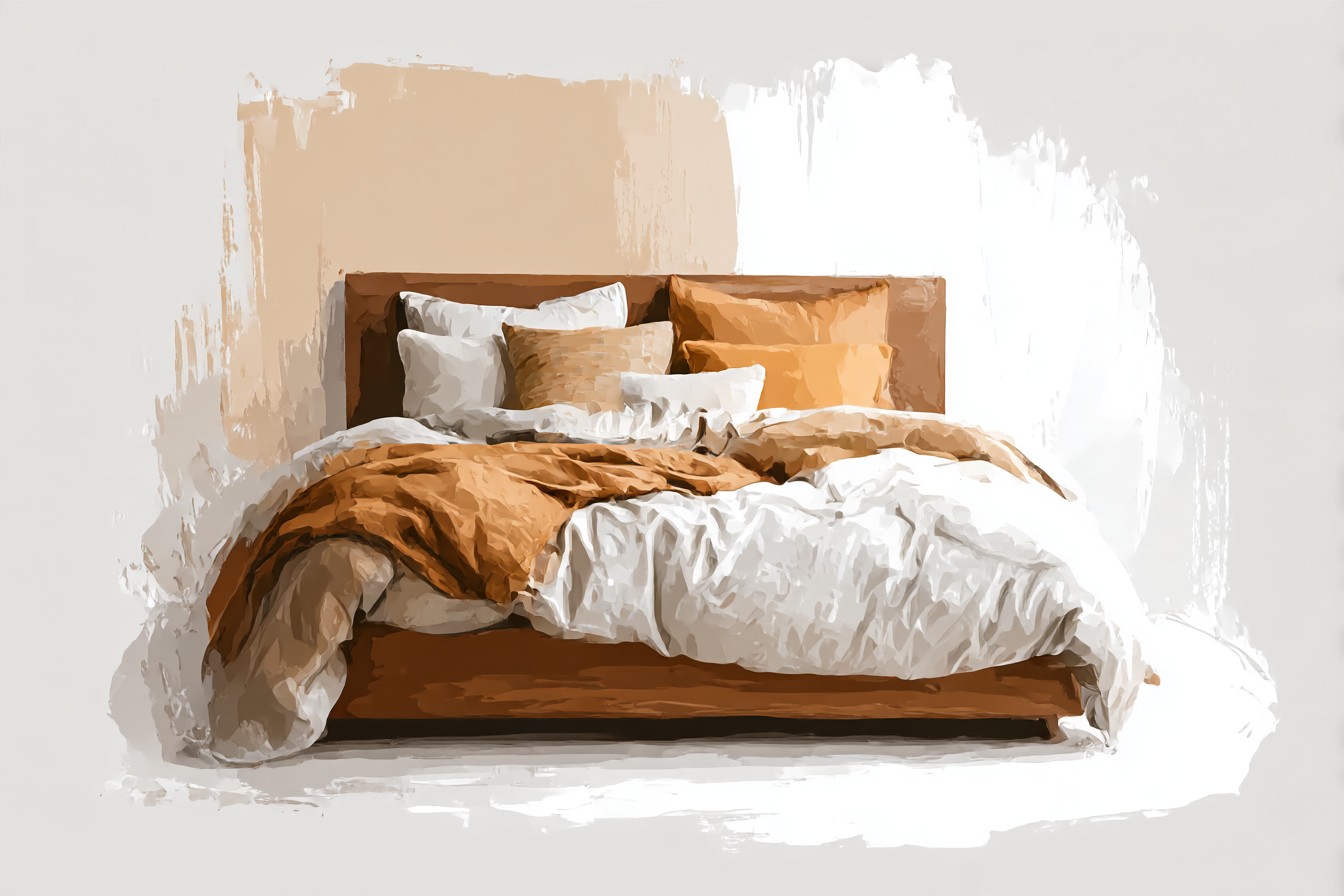
Rust and terracotta lean into the warmth on purpose, loudly, and mean it. A proper vintage quilt does something none of the new stuff quite manages, because it arrives with its own history already built in. Jewel tones ask for a bit of nerve and a decent window, but reward both.
What I’d tell anyone standing in front of their own brown headboard, stuck the way I was stuck for that first twenty minutes, is to stop trying to match the wood and start trying to talk to it instead. Some colors agree with it quietly. Some argue with it a little, in a good way. Both are worth trying before you settle on the safe cream option out of habit rather than actual preference. I still keep that first cream comforter, folded in a closet, for whenever the room wants a rest. But it’s not the only answer anymore, and knowing that took longer than it should have.