
I count laundry days now, not because I’m precious about it but because I’ve got a spreadsheet habit left over from quoting jobs, and the number that came out of it stopped me for a second. Fourteen times since January. That’s how many times I’ve swapped, washed, or rehung something on our bed since I built the headboard out of leftover oak veneer ply and upholstered it in a cream boucle that my wife picked because it “photographed well,” her words, not mine. Fourteen times in four months is basically once a week and a bit, which for a guy who used to think a bed was a mattress and whatever was on top of it, is a genuine shift in how much attention I’m paying to something I mostly just lie on unconscious.
Here’s the thing nobody tells you about a cream headboard. It’s not neutral in the way people mean when they say neutral. Cream’s got warmth sitting under it, some yellow, sometimes a bit of pink depending on the dye lot, and it reacts to whatever color you put next to it the same way a badly matched screw reacts to the wrong gauge hole.
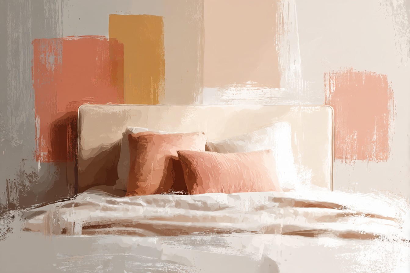
Looks fine for a second. Then it doesn’t. I found this out the hard way with a stark white duvet cover I bought without thinking, the really bright optical white kind, and it sat next to that cream boucle like two different projects that got pushed together at the last minute. My dad came round, took one look, and said “did that come with the bed or did you add it after,” which from him is basically a formal complaint.
So I started paying attention properly, the way I would with a job, working out what actually goes together instead of guessing. Bedding’s not furniture, I know that, there’s no load rating on a duvet cover, nothing’s going to fail structurally if you get the color wrong. But there’s still a right and wrong way to build a bed the same way there’s a right and wrong way to build anything, and once you start looking at fabric weight, weave, and tone the way you’d look at joints and screws, it stops being guesswork. I’ve landed on five ways of doing it that actually work against a cream base, and none of them are the stark white I started with.
[Bedding That Works With a Cream Headboard]
Tonal Whites and Off-Whites
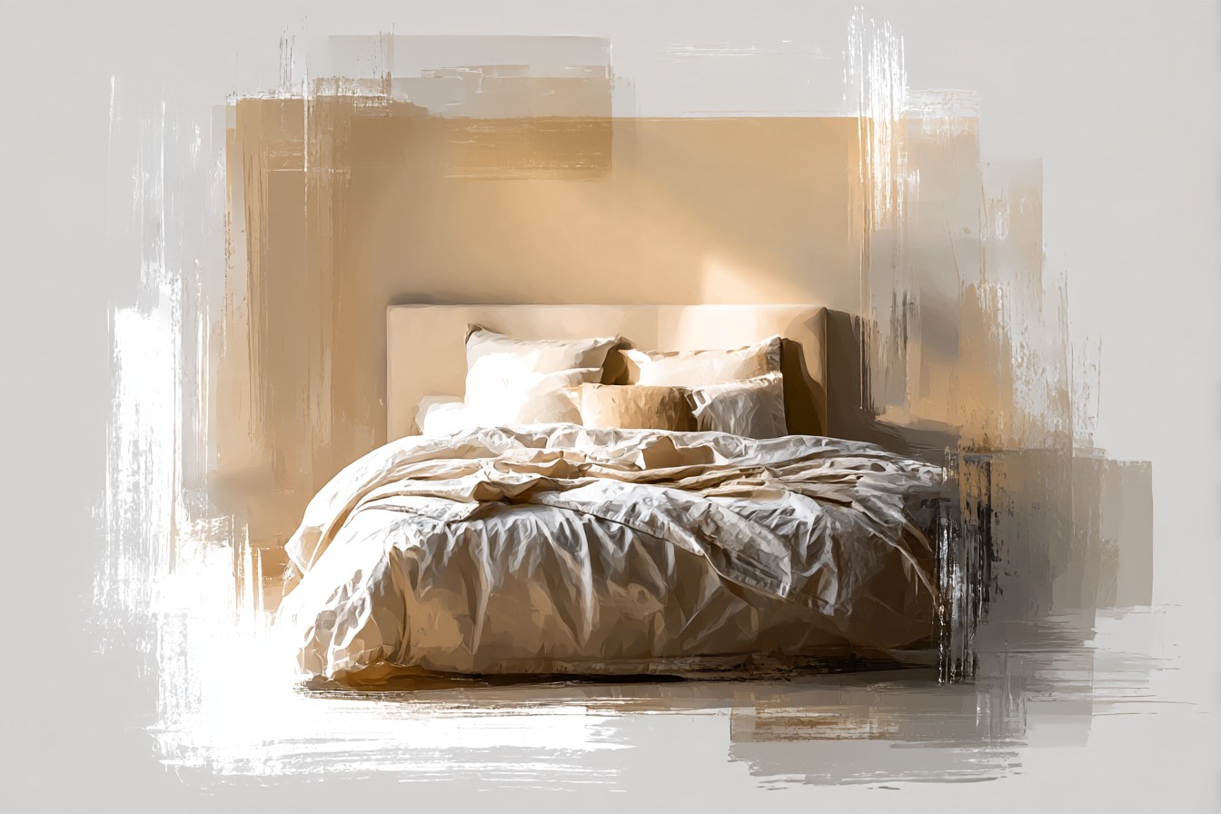
I know it sounds like a contradiction after what I just said about the stark white cover, but hear me out, because the fix wasn’t abandoning white, it was going warmer. There’s a difference between optical white, which is basically bleached to death and reads cold and a bit clinical, and something like ivory, bone, or a warm oatmeal white that’s got the same undertone as the cream itself. I swapped that first duvet cover for a 300 thread count cotton sateen in a shade the label called “parchment,” which is a fancy way of saying off white with a bit of yellow in it, and the whole headboard stopped looking like it was arguing with the bed.
The construction detail that actually matters here is the weave, not just the color. Sateen’s got a looser weave than percale, more thread floating on the surface, which is why it picks up light differently and looks slightly warmer even in the exact same dye. I checked the seams on both covers side by side, actually turned them inside out the way I’d check a drawer joint, and the sateen had a proper felled seam, folded and stitched twice, while the cheaper percale one had a single line of stitching that was already fraying at the corner after two washes. Cost about eleven dollars more. Worth every cent of it.
Layer two or three whites together, different weights, different weaves, and you get something that reads rich instead of matchy. A waffle weave throw over a sateen duvet over a linen sham, all roughly the same tone but different textures, and the cream headboard just sits there looking like it was always meant to go with all of it.
[Tonal Whites and Off-Whites]
Warm Neutrals: Taupe, Camel, Oatmeal
This is the safest bet on the list and I say that as someone who generally distrusts the word safe when it’s used to sell you something boring. Taupe and camel bedding against a cream headboard isn’t boring, it’s just correct, the same way a properly cut mortise and tenon joint isn’t exciting to look at but it’s correct.
What I like about this range is you can go a full shade or two darker than the headboard without any risk of clashing, because you’re staying in the same family, just moving down the scale. I’ve got a camel colored linen duvet cover now, heavier weight than the sateen, closer to 200 GSM, and it drapes differently, sits with more weight on the corners instead of floating. Linen wrinkles like nothing else, my mom took one look at ours unmade and said it looked like we’d slept in it standing up, which, fair, but that’s kind of the point with linen, it’s meant to look lived in rather than pressed.
Taupe works the same way but reads a bit cooler, more gray in it than camel does, so if your cream headboard leans slightly pink rather than yellow, taupe’s going to sit better than camel will. I learned this by actually holding fabric swatches up against the boucle in daylight rather than under the kitchen light, which is a trick I picked up from matching stain colors on site, artificial light lies to you constantly, daylight doesn’t.
Oatmeal sits right in the middle of the two and is probably the least risky option on this entire list if you want one thing to just work without overthinking it.
[Warm Neutrals]
Deep Contrast: Charcoal, Forest, Navy
Now for the bit where I stop being sensible. All that tonal matching is good advice, but a bed that’s entirely cream, oatmeal, and taupe for months on end starts to feel like it’s been sanded down to nothing, no edge left on it at all. So every so often I go the other way completely and bring in something dark.
Charcoal’s the one I reach for most, a heavier cotton, almost a twill weave, and against the cream headboard the contrast does something a full tonal setup can’t, it makes the cream actually look cream instead of just off white by comparison. Forest green does something similar but warmer, and navy’s the one I was most nervous about because navy and cream together can tip into a nautical thing fast if you’re not careful, stripes, anchors, all of it, not what I’m going for.
You Might Also Like

The trick that actually worked was keeping the dark color to one piece, a duvet cover or a folded blanket at the foot of the bed, not both, and definitely not the pillowcases as well, because three dark elements against one cream headboard stops being contrast and starts being a different color scheme altogether that the headboard’s now fighting.
I took the charcoal duvet cover apart at the seam once, just curious, cheap habit from the trade, and found double stitched flat felled seams the whole way round, proper construction, no fraying after a full year of washes. That’s the one I’d point anyone toward if they want the dark option without it falling apart in the machine after six months.
[Deep Contrast Colors]
Texture Over Pattern: Waffle, Linen, Boucle
If you take nothing else from this, take this bit, because it’s the part that actually changed how I think about bedding entirely. Texture does more work than color does, full stop. You can have a bed that’s five different shades of the exact same cream and off white, and if the textures are all flat cotton percale, it’ll look thin and a bit sad. Swap even two of those pieces for something with actual texture, a waffle weave blanket, a linen sham, a boucle cushion that matches the headboard fabric itself, and suddenly the whole thing has depth without adding a single new color.
I did this almost by accident because I had leftover boucle from the headboard upholstery job and figured I’d cover a couple of cushions with it rather than bin the offcuts. Turned out to be the best decision I made on the whole bed, because it ties the headboard into the bedding directly instead of just coordinating with it from a distance.
Waffle weave’s the other one worth knowing about, that raised grid texture you get on some throws and covers, and it works because it catches light unevenly, so even in a single color it reads as having more going on than a flat weave would. I checked the stitching on a cheap waffle throw once, the kind that’s about sixteen dollars, and the waffle texture was printed on, not actually woven in, which you can tell instantly because it goes flat after one wash and never bounces back. Actually woven waffle costs more and looks like it every single time you make the bed.
[Texture Over Pattern]
Quiet Pattern: Stripes and Checks, Nothing Loud
Last one, and I’ll admit this is the category I resisted longest, because I spent years thinking pattern on a bed meant busy, and busy against a cream headboard is a genuine mess, I’ve seen it done and it looks like the room can’t make a decision. But a quiet pattern, a narrow stripe in the same tonal family, a subtle windowpane check in taupe on oatmeal, that’s a different animal entirely.
The key detail, and this is the bit I’d actually flag if you’re buying rather than guessing, is scale.
A wide bold stripe reads as a statement, sure, I’ll use the word once, and it competes with the headboard rather than sitting alongside it. A narrow stripe, half an inch or less, especially in tone on tone rather than high contrast, reads almost like texture from a normal viewing distance rather than pattern. I’ve got a duvet cover with a stripe so subtle my wife didn’t notice it was patterned at all until she was folding it fresh out of the dryer.
Checks work the same way as long as they stay small and stay in the same color family as the headboard. What doesn’t work, and I found this out with a set my mother in law gave us as a gift that I still haven’t had the heart to get rid of, is a check in a totally unrelated color, hers was a blue and white gingham, lovely on its own, completely wrong against cream, sat on the bed for exactly one photo before it went in the cupboard.
[Quiet Pattern]
Final Thoughts
None of this is complicated once you actually look at it the way you’d look at a build rather than a purchase. Cream’s warm underneath, it reacts, and once you stop treating your bedding color as a random decision and start treating it like you’re matching materials on a job, checking undertone in daylight, checking the weave, checking how the stitching’s actually done, the whole thing gets a lot less stressful and a lot more obvious.
Fourteen swaps in four months taught me that the safest moves, the tonal whites and the warm neutrals, are the ones I reach for most, but the ones I’m actually proud of are the charcoal duvet and the boucle cushions, because they took a bit more nerve and they’re the ones that make the bed look like it was actually planned rather than just assembled from whatever was in the cupboard.
If you’re starting from scratch with a cream headboard, don’t buy five things at once. Buy one duvet cover in a tone you’re fairly confident about, live with it a week, then start layering texture and, eventually, a bit of contrast on top of that. Same rule I’d give anyone starting a build. Get the base right first, then work outward from there, and don’t rush the bit that actually holds the whole thing together.