
“Gray goes with everything, you can’t get it wrong.” That’s what the guy at the furniture store told me when I bought my sofa, standing there with his hands in his pockets like he’d just solved my whole living room for free. Complete garbage advice. I got it home, sat on it for a week staring at a coffee table that suddenly looked orange next to it, and realized “goes with everything” is the kind of thing people say when they want you to stop asking questions and sign the receipt. Gray isn’t a neutral. It’s about eight different colors wearing a trench coat, and depending on which one your sofa actually is, everything you put near it either works or looks like it wandered in from a different house.
The Soft Stuff Has to Actually Match the Undertone, Not Just the Word “Gray”
Here’s the thing nobody tells you before you buy: gray fabric almost always has a lean, warm or cool, and you can’t see it properly until it’s sitting in your actual room under your actual light. I took the cushions off mine, held them up against a window on a gray Milwaukee afternoon, which is most afternoons here, and realized my “neutral charcoal” sofa was pulling blue.
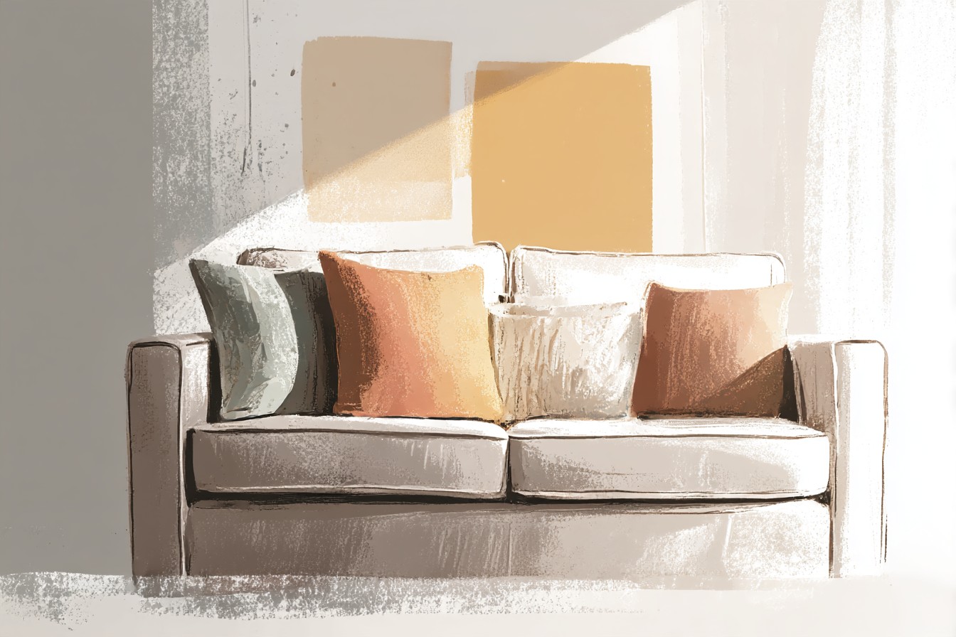
My dad, who’s spent forty years cutting wood and has approximately zero patience for decorating debates, took one look and said “that’s blue, Owen, just say it’s blue.” He wasn’t wrong. So the pillows I’d already ordered in a warm mustard sat on it looking like a mistake, not a choice.
For a cool gray sofa, the ones leaning blue or slate, you want pillows that either lean into that coolness or contrast it properly with something warm and confident, not timid. Navy and gray together is the safe move and it works because you’re matching the undertone instead of fighting it, but if you want actual personality, a rust or burnt orange pillow against a cool gray reads intentional in a way that mustard never managed on mine. Warm gray sofas, the ones with a beige or greige undertone, are more forgiving and take blush, warm cream, or even a soft olive without any of it looking accidental. What you want to avoid on either version is a pillow that’s almost the same gray as the sofa but not quite, because that’s the one combination that reads as a mistake instead of a decision, like you grabbed the wrong shade off a shelf in bad lighting.
Pattern is where I’d actually push you to take a swing, because a solid gray sofa with two solid pillows looks like a hotel lobby that gave up halfway through. Mixing one pattern, a stripe, a geometric, something with actual texture in the weave, against one or two solid colors gives the whole arrangement somewhere to land visually instead of just sitting there being gray on top of gray. I’ve got two textured cream pillows and one striped rust pillow on mine right now, three total, which is one more than I thought I needed and exactly the right number once they were actually on the couch.
You Might Also Like

Everything Else in the Room Is Just Solving for What the Sofa Already Decided
Once the pillows are sorted, the rest of the room stops being a series of separate decisions and starts being one long conversation the sofa’s already having without you. The coffee table is the next piece people get wrong because they either match it to the sofa exactly, which flattens the whole room into one gray blob, or they go so far in the other direction it looks like two different rooms got pushed together by accident. What actually works is wood, and specifically wood with some visible grain in it, walnut or a warm oak, because gray fabric next to real wood grain creates the kind of contrast that looks put together rather than accidental.
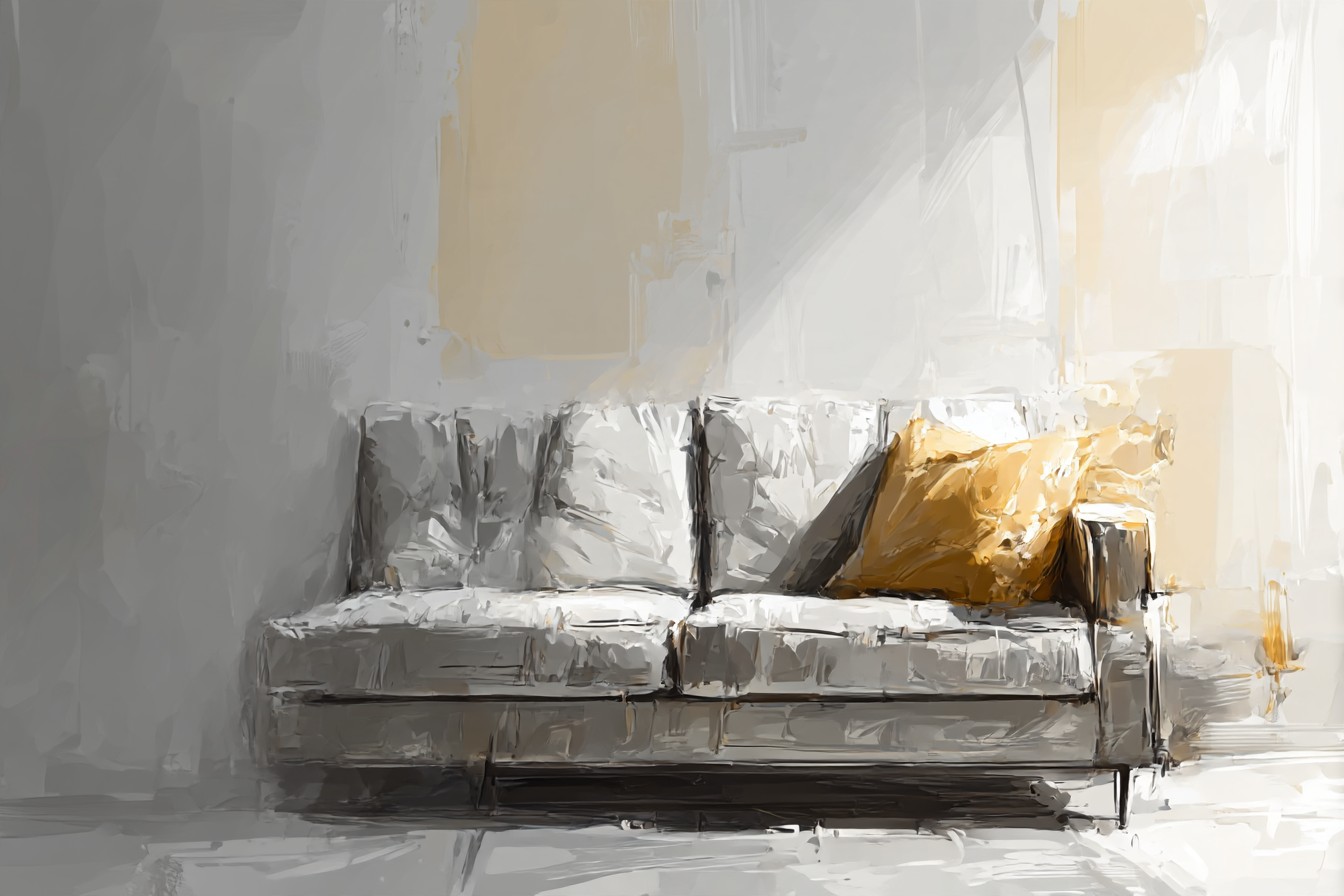
I built my own coffee table out of reclaimed oak a couple years back, checked the joints were actually mortise and tenon rather than just glued and pinned like half the flat pack stuff out there, and it’s the one piece in the room that gets asked about, which tells you contrast beats matching every time.
The TV stand gets treated like an afterthought and it shouldn’t be, because it’s usually the biggest flat piece of color in the room after the sofa itself. Black is the easy default and it works fine, especially with a darker charcoal sofa, but it’s also the choice everyone makes because it’s safe, not because anyone thought about it. A warm wood stand, same family as your coffee table if you can manage it, does more work in tying the room together than another black rectangle ever will, and if your sofa’s on the cooler side, a mid tone wood stand is the thing that actually warms the whole space up without anyone consciously clocking why. I’d steer away from white unless the rest of your room’s already gone bright and minimal, because a stark white stand against a gray sofa tends to look clinical rather than clean, like a waiting room that also happens to have a television in it.
Then there’s the armchair, which is the piece everyone treats like it’s supposed to be the star and honestly it’s better as the supporting act. A patterned or solid contrast chair, something in that same rust, mustard, or deep green range you might’ve already used in a pillow, ties the whole room together instead of introducing a fourth new color nobody asked for. I’d avoid a second gray, even a different shade of it, because two grays in the same room that aren’t identical just look like a mismatch you haven’t noticed yet, and someone will notice it for you eventually, usually while sitting in it. The chair’s job is to repeat something the room’s already said once, not introduce something new, and the rooms that feel most put together are the ones where every piece is quietly agreeing with something else in it rather than trying to win the argument on its own.
That’s really the whole answer once you strip the sales pitch out of it. Match your undertone, pick one warm anchor material and repeat it, and stop treating gray like it forgives every decision made around it, because it doesn’t, it just hides the bad ones for about a week before you notice.



[…] wall was never the hard part. It’s every decision after the wall that decides whether the room looks pulled together or […]
[…] I’d actually tell a friend starting from scratch: buy the thing that stays first, then let everything seasonal happen around it, because otherwise you’re starting over in March wondering why the bowl looks empty and […]
[…] had two separate temperatures fighting for control, warm pink tile underneath a navy that wanted everything around it to be gray and […]
[…] just there, a permanent little smudge that nobody can get worked up about anymore because everything around it looks […]