
Someone told me once that light brown furniture is the beige of the wood world, safe, forgettable, impossible to actually mess up because it goes with everything and therefore goes with nothing in particular. I believed this for years. My dining table is a honey oak thing I bought secondhand off a man in Pawtucket who was moving to Arizona and didn’t want to pay to ship it, and for a long time I treated it the way you’d treat a guest who’s easy to please, just put it in a room and don’t think too hard about the walls.
Then I painted my dining room a color the tin called “linen” and the actual result, under the particular gray light this house gets in February, was a room where the walls and the table were almost exactly the same temperature of beige. Not matching, which might have looked intentional. Just close enough that the table stopped reading as furniture and started reading as a slightly darker patch of wall that someone had, for reasons unclear, put plates on. My upstairs neighbor came down to borrow a extension cord and stood in the doorway for a second too long before saying, “did something happen in here,” which is not the reaction you want to the room where you eat dinner.
That was the moment I actually understood what light brown furniture needs, which isn’t safety, it’s contrast it can work with.

Oak, honey pine, that mid tone maple you see in a lot of Scandinavian leaning pieces, they’ve all got warmth and a bit of gold or red running through the grain depending on the light, and if you paint the walls something equally warm and equally muted, the wood just gets absorbed. It stops being a piece of furniture with any presence at all. What it actually wants is a wall color with enough of its own opinion to give the wood something to sit against, without fighting the warmth that’s already there. That’s a different job than “goes with everything,” and it took a genuinely depressing dinner party to teach me the difference.
[Wall Colors For Light Brown Furniture]
Warm White, Not Stark White
I want to defend warm white here because I think it gets unfairly lumped in with the beige problem, and it’s not the same thing at all if you get the undertone right. The mistake I made before the Pawtucket table, in a different room entirely, was going stark white, one of those bright blue based whites that looks crisp on a paint chip and then makes every piece of light brown wood in the room look slightly dirty by comparison, like the wood didn’t get the memo that everyone else was supposed to look clean. Stark white makes warm wood tones look muddy. It’s a genuinely strange effect and I didn’t believe it until I saw it happen to my own bookshelf.
What actually works is a white with some yellow or cream underneath it, something that reads as white in a photo but reads as slightly buttery in person, next to actual daylight. It gives you the brightness without the temperature clash. My bedroom, which has a light oak dresser and a matching headboard I regret slightly less than I regret most furniture decisions, is painted in something close to this, and it’s the one room in the house where I don’t feel like the wood and the wall are competing for the same job.
The test I use now, because I don’t trust a chip under store lighting anymore, is to actually tape a sample next to the piece of furniture itself and look at it in the morning and again at night with the lamps on, because warm whites can shift more than people expect once the sun’s gone and you’re working under a sixty watt bulb instead. It’s a small extra step. It’s saved me from at least one repeat of the dining room situation.
[Warm White Walls]
Sage and the Other Muted Greens
Sage is the color everyone recommends for this exact situation, to the point where I was skeptical of it purely on principle, the way you get skeptical of a restaurant that’s suspiciously popular. But I painted my back room, the one that gets north light and therefore gets almost none of the golden hour anything, a soft sage, mostly because I’d run out of better ideas, and it turned out to be the correct answer for reasons that actually make sense once you think about wood.
Light brown wood, especially oak, has warmth in it that leans slightly toward gold or even a soft pink depending on the finish, and green sits opposite that on the color wheel in a way that flatters it without shouting about it. Sage specifically works because it’s muted enough not to turn the room into a themed forest situation, it’s not the saturated green of a houseplant, it’s closer to the color of dried herbs, which sounds like a strange compliment but is exactly what makes it livable long term.
The room in question has a light brown bookshelf and a small side table in a similar tone, and against the sage they both look intentional in a way they didn’t against the previous color, a flat gray that made the whole room feel like a waiting area. My one warning here, and I learned it the slightly annoying way, is that north facing rooms can pull sage cooler and grayer than it looked in the store, so if your room doesn’t get much direct sun, go a shade warmer than you think you need, or you’ll end up with something closer to a hospital corridor green than the soft, herby tone you were promised on the swatch.
[Sage Green Walls]
Navy and Deep Blue as the Actual Contrast Move
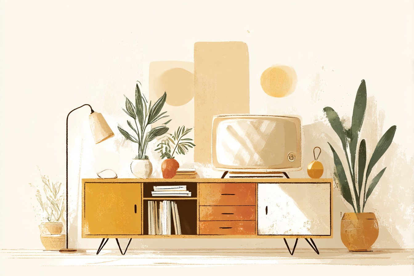
If sage is the polite, agreeable choice, navy is the one that actually makes light brown furniture look expensive, and I don’t say that lightly because most of what I own is secondhand or from a man in a parking lot. My living room has a mid century credenza in a lighter honey tone, and for two years it sat against a beige wall doing absolutely nothing for the room, just existing, the furniture equivalent of a student who’s technically present but has checked out mentally.
You Might Also Like

I repainted that wall a deep, almost ink adjacent blue, the kind of color that looks nearly black in low light and properly navy once the lamps are on, and the credenza suddenly looked like a piece someone had made a decision about, rather than a piece someone had inherited and not gotten around to dealing with. Dark, cool colors do something specific to warm, light wood tones, they push the warmth forward, make the gold and honey undertones in the grain more visible instead of less, which is the opposite of what I expected before I tried it.
The caveat, and it’s a real one, not a hedge, is that this only works if the rest of the room has enough light to balance it, because navy walls in a room that’s already dim will just read as dark, full stop, no drama, just gloom. Mine works because there’s a big window on the opposite wall and a floor lamp that runs most evenings from October onward, given how early it gets dark here. Without that light source doing its job, I’d have ended up with a moody room that just looks like it’s waiting for the power to come back on.
[Navy Blue Walls]
Terracotta and Clay, the Riskier Warm Option
I resisted warm on warm for a long time, on the theory that pairing light brown furniture with a terracotta or clay wall would just be too much of the same thing, an entirely brown room with extra steps. I was wrong about this, though not completely wrong, because there is a version of this that goes badly and I’ve seen it happen in a friend’s apartment, where the wall color and the furniture were similar enough in depth that the whole room flattened out into one undifferentiated warm blur, no edges anywhere, like the room had been shot through a sepia filter.
The version that works depends on there being enough difference in depth between the two warms, not the same warmth twice but two different warmths at two different intensities. My kitchen, which has a light oak table and open shelving in a similar tone, is painted a dusty, faded terracotta, closer to old brick than to anything you’d call orange, and because that color sits noticeably deeper than the pale wood, the two actually separate from each other instead of merging. The wood reads as light and bright by comparison, which is a neat trick for a warm color to pull off.
This is the section where I have to admit the paint chip lies to you the most, because clay and terracotta shift dramatically depending on the room’s light, more than almost any other color I’ve tried in this house. What looked appropriately dusty and vintage on the sample card looked, on one wall in direct afternoon sun, alarmingly close to a Pumpkin Spice display at a chain store I won’t name. Test it big, test it in the actual room, and don’t trust the version you saw in a showroom with better lighting than any room in a hundred year old house has ever had.
[Terracotta Walls]
Charcoal, for the One Wall That Can Handle It
I don’t think a whole room of charcoal makes sense with light brown furniture, it’s too much weight against too little contrast in the wood itself, but a single wall is a different proposition entirely, and it’s the one I’d actually recommend to someone nervous about doing anything bold at all.

My office has a light brown desk, the kind of piece that looked completely unremarkable against a plain white wall for about a year, present but not doing anything, furniture in the background of its own room.
I painted the wall behind it charcoal, not black, charcoal, there’s a real difference and I learned it by accident when I nearly bought actual black paint and the guy at the hardware store talked me down, and the desk went from background object to the actual focal point of the room without me changing a single thing about the desk itself. Dark, neutral, cool toned walls do for light wood what a dark mat does for a photograph, they give it an edge to end at, instead of letting it fade into whatever’s behind it.
The failure mode here, and I’ve seen it in exactly one other house so I know it’s a real risk and not a one off, is doing the dark wall in a room with genuinely bad light and low ceilings, where the effect isn’t dramatic, it’s just heavy, the room feels smaller and a bit oppressive rather than intentional. Mine works because the office has a decent window and I keep a lamp on most of the year regardless of the time of day, this house being what it is about actual daylight. Without that, I’d tell you to keep the drama to a piece of art instead and leave the wall alone.
[Charcoal Accent Wall]
Final Thoughts
If there’s one thing I’d want someone to take from all of this, it’s that light brown furniture isn’t the neutral, forgiving category everyone treats it as, it’s just forgiving of the wrong wall color in a specific, sneaky way, where the mistake doesn’t look like a disaster, it just looks like nothing happened. That’s worse in some ways than an obvious clash, because at least a clash tells you to fix it. A wall that quietly erases your furniture just sits there being fine, technically, for years, the way mine did before a neighbor’s face told me otherwise.
None of the five options above are the correct answer in some universal sense, and I’d be lying if I said any paint chip has ever told me the whole truth before I actually lived with it through a full run of seasons, different light, different lamps, different amount of dust on the window. What they all have in common is that they give the wood something to react against, warmth or contrast or depth, rather than asking it to disappear quietly into a wall that’s trying to match it. Test it big, test it at night with the lamps on, and don’t trust the version of the color you saw somewhere with better light than your actual house has ever had.

[…] is the biggest surface area in a bedroom after the walls and floor, and if it’s fighting the wall color on temperature the whole room feels off in a way you can’t quite name. Warm bedding against light blue walls stops looking […]