I counted eleven times last Tuesday. Eleven times I walked past my own display cabinet and adjusted something by maybe half an inch, then walked past it again ten minutes later and moved it back. That’s not styling, that’s a nervous tic with a piece of furniture attached. But it tells you something true about display cabinets that nobody says out loud: they’re the one piece of furniture in the house you’re never actually finished with. A sofa, you buy it, you sit on it, you’re done thinking about it until the cushions die. A display cabinet, you’re mid negotiation with it forever.
I’ve styled probably forty of these for clients now, mostly in San Francisco apartments where the “dining room” is a corner with delusions, and the single most common thing I see, in my own place and theirs, is a cabinet that’s been filled the way you’d fill a moving box.
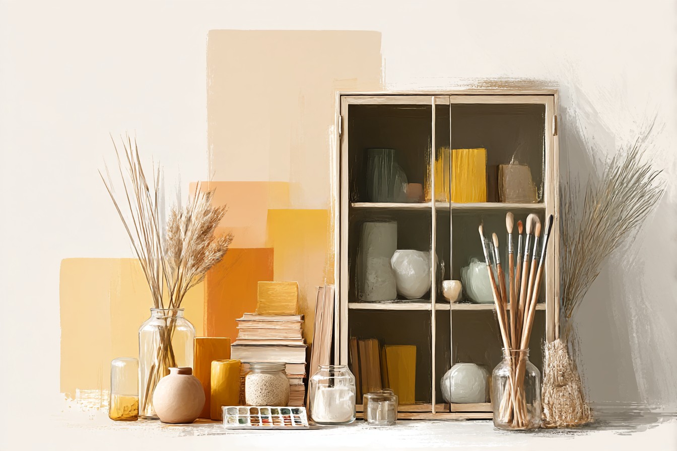
Get it all in. Nothing broken. Job done. Except a display cabinet with everything in it looks like a hoarder’s shelf that got expensive, and a display cabinet with almost nothing in it looks like you’re mid move and haven’t unpacked. There’s a narrow band in between where it actually works, and almost nobody hits it on the first attempt, myself included, my first one in my first apartment had nineteen objects in a cabinet with four shelves, I counted them recently out of morbid curiosity, and every single shelf looked like a jumble sale table.
What changed it wasn’t taste. It was measuring. I started treating the inside of the cabinet the way I treat a listing’s stated dimensions, with actual suspicion, actual inches, checking what the space really allows before I let myself buy one more ceramic thing. A shelf that’s 11 inches deep behaves completely differently to one that’s 14, and most of us are eyeballing it and guessing, which is how you end up with a cabinet that looks stuffed even though technically there’s “room.”
So this is the thing I keep coming back to with clients and with my own increasingly full cabinet: it’s not about what you own, it’s about how it’s grouped, how it’s lit, and, the part everyone skips, how much of it you deliberately leave empty. That’s the whole piece, really. Grouping, lighting, gaps, and the materials that make all three easier or harder depending what you’ve bought.
[Display Cabinets]
Glass Front Cabinets and the Problem of Seeing Everything at Once
Glass front cabinets get sold on the idea that they protect things while still letting you see them, which is true, but nobody mentions the actual consequence, which is that glass shows you the whole shelf in one glance, no forgiveness, no soft focus. A closed wood cabinet hides its own sins. Glass doesn’t.
I had a client last year with a glass front cabinet from a brand that advertised it as “gallery style,” which as far as I can tell just means the glass goes higher than the shelf line so you see more of the object and less of the frame. Fine idea. Except she’d filled all three shelves edge to edge with her grandmother’s china, and because it was glass, every single piece was visible at once, all competing, none of them getting to be the one you actually look at. We pulled two thirds of it out and put the rest in a cupboard for rotation. What was left looked like a collection. What she’d started with looked like inventory.
The upside of glass, and it’s a real one, is that it forces discipline you don’t get with open shelving, because you can’t hide behind “it’s tucked at the back, nobody will notice.” Everything’s on trial the second you close the door. That’s uncomfortable for about a week and then genuinely useful, because it stops you buying filler. If it’s not good enough to survive being seen from every angle in full light, it doesn’t earn a shelf.
Where glass goes wrong specifically, and I’ve measured this on three different pieces now, is depth. A lot of glass front cabinets are shallower than they look because the frame eats into the usable shelf, sometimes an inch, sometimes closer to an inch and a half once you account for the door swing clearance. Buy for the frame width printed in the listing and you’ll find your favorite oversized vase doesn’t actually clear the door. Measure the inside, not the outside, every time.
[Glass Front Cabinets]
Grouping in Threes, and Why Fours Always Look Like a Set
Everyone who’s ever handed me a styling brief has said some version of “I want it to look natural, not staged,” and then filled a shelf with four identical candles evenly spaced, which is the single most staged looking arrangement available to a human being. Even numbers read as sets. Sets read as furniture store display. That’s the opposite of what a display cabinet is supposed to say about you.
Threes work, and not because of some design mysticism, just because three lets you vary height without it looking accidental. Tall, medium, short, one of them slightly turned instead of facing dead forward. I do this now almost without thinking, tall ceramic vessel at the back, a stack of two or three books in front angled a bit, one small object sitting on top of the books so it’s not touching the shelf at all. That last part matters more than people think. An object sitting directly on a book instead of the shelf reads as chosen. An object sitting flat on the shelf next to everything else just reads as stored.
I got this wrong for actual years, arranging in pairs because pairs felt safe and symmetrical, and my cabinet looked like a hotel lobby credenza the whole time and I couldn’t work out why. It was the pairs. Every single time.
The other habit worth stealing, and I picked this up watching a friend’s mother do it without ever explaining the logic, is grouping by material rather than by type. Not “all the small bowls together,” but a wood object, a ceramic object, and something metal or glass, sitting as a trio, because the contrast between materials does more visual work than matching pieces ever will. Three matching mugs is a set. A wood bowl, a brass candlestick, and a single piece of glass is a moment. It takes longer to put together and it’s worth every extra minute.
[Grouping]
You Might Also Like

Lighting That Doesn’t Turn Your Shelves Into an Interrogation Room
I resisted lighting a display cabinet for years because every version I’d seen in a store was one long strip of cold white LED running along the top, and the effect wasn’t ambiance, it was clinical, like the objects were about to be questioned. If your only exposure to cabinet lighting is that, I understand the resistance completely.
What actually works, and I’ve now installed this in enough clients’ cabinets to trust it, is warm LED puck lights mounted individually rather than a single strip, because a strip lights the whole shelf evenly and evenly lit is flat and lifeless, while individual pucks let you light specific objects and leave others in soft shadow, which is closer to how a gallery actually does it and looks considerably less like a display cabinet trying too hard.
Temperature matters more than most people budgeting for this expect it to. Anything above about 3000K starts looking like a dentist’s office. I stay at 2700K, warm, close to candlelight, and it makes ceramic glazes and wood grain look like they have depth instead of just being visible. I learned this the expensive way, buying a set of “warm white” strip lights that turned out, once installed, to be closer to 4000K than anything a listing would ever admit to, and the whole cabinet looked like a hospital vending machine until I swapped them out.
Battery operated puck lights solve the wiring problem entirely, which matters if, like most of the apartments I work in, drilling into the back of a rented cabinet isn’t happening. They’re not permanent, they’re not elegant up close, but at night, from across the room, with the cabinet door mostly closed, nobody’s checking for wires. That’s the whole point of the exercise anyway.
[Cabinet Lighting]
The Gaps Nobody Wants to Leave
This is the section every client argues with me about, because leaving a shelf a third empty feels, to almost everyone, like admitting you don’t own enough stuff. It’s the opposite. An empty shelf, or a shelf with real breathing room around each object, is the single clearest signal that what’s on it was chosen deliberately rather than accumulated by accident.
I measure this now, genuinely with a tape measure, because eyeballing it I consistently want to add one more thing. My rule, which I did not invent, I stole it from a lighting designer I worked alongside on a shoot years back, is that no shelf should be more than about sixty percent full. Not sixty percent of the objects you own, sixty percent of the visible shelf surface. Everything else is negative space, and negative space is doing active work, it’s what lets your eye land on the one good object instead of scanning past twelve mediocre ones looking for somewhere to rest.
The hardest gap to leave, and the one I still fight myself on, is the top shelf, because it’s the one you see first walking into a room and it feels like the one that needs to “say something.” Leave it the emptiest. One object, maybe two, with real air around them, says considerably more than a top shelf crammed with everything you’re proudest of. I fixed my own cabinet’s top shelf about two years ago by removing everything except a single stone bowl I’d been shoving to the back for a decade, and it’s the first thing anyone comments on now, which tells you everything about how much the previous eight objects had been canceling each other out.
[Empty Shelf Space]
Tiered Cabinets and Getting the Eye Line Right
Multi tier cabinets, the kind with a taller upper section and a shorter lower section, get sold on flexibility, more surfaces, more storage, but the eye line is the part nobody mentions and it’s the part that actually determines whether the thing looks intentional or just tall.
Standing eye level in most rooms lands somewhere around 60 to 65 inches, so the shelf that sits closest to that height is doing the heaviest visual lifting whether you’ve planned for it or not. That’s the shelf that needs the most restraint, the fewest objects, the best individual piece you own. I’ve watched clients put their best object on the bottom shelf, low, half hidden, and their most forgettable clutter right at eye level, purely because that’s the shelf that was easiest to reach while unpacking. Swap it. Every time, swap it.
The lower shelves, below the knee roughly, are where I tell people to put anything with real bulk, larger vases, a stack of serving pieces, things that read as furniture rather than as objects, because at that height the eye’s already moving past on its way down to the floor and won’t linger to judge proportions harshly.
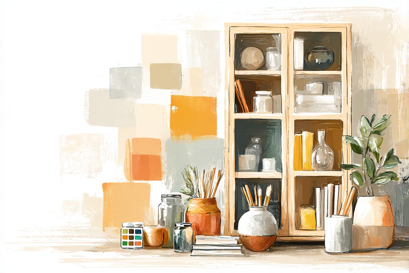
That’s exactly where “space saving” cabinet designs tend to fail me, incidentally, brands claiming a tiered unit is compact because the footprint’s small, without mentioning the lower shelf is 9 inches deep and useless for anything but flat storage. Measured one myself last spring, labeled compact, and it couldn’t fit a single vase over 7 inches wide without the door catching. Compact for what, is the question nobody asks before buying.
[Tiered Cabinets]
Final Thoughts
If there’s one thing I’d want someone to take from all of this, it’s that a display cabinet isn’t a storage problem, it’s a restraint problem, and restraint is the one thing none of us are naturally good at when we’ve just bought something we love and want everyone to see it immediately. Group in threes, not pairs. Light individual pieces instead of flooding the whole shelf. Leave that top shelf close to bare even when it feels wrong. And measure the inside of the thing before you trust what the listing told you, because “compact” and “gallery style” get used by brands to mean almost anything they want them to mean.
My own cabinet still isn’t finished, if I’m honest, I moved something on Tuesday. But it’s finished enough now that I don’t touch it every day, which for me counts as an ending.