I was standing in the cereal aisle at Star Market on a Tuesday night, genuinely deliberating between two brands of granola I already know taste identical, when my phone buzzed with a photo from my sister. New gray bed frame, installed, looking very pleased with itself in her Providence bedroom, and the caption just said “now what.” Not “does this look good,” not “what do you think,” just “now what,” like the bed itself was a problem she’d solved and the nightstands were the actual crisis. I put the granola down. This is apparently my life now, fielding furniture emergencies over oat clusters, and I texted her back before I’d even finished my shop, because she was right to panic a little. A gray bed is the easiest thing in the world to get catastrophically wrong at the next step, because everyone treats “gray” like it’s one color when it is, without exaggeration, about eleven different colors wearing the same coat.
The undertone in your gray bed decides everything else in the room, and most people never check it
Here’s the thing nobody tells you when you buy the bed: gray is never just gray. It’s got a temperature hiding inside it, warm or cool, and that temperature is going to fight or flatter every single thing you put next to it, starting with the nightstands.

A charcoal linen headboard with a warm, almost taupe undertone wants nightstands in a warm wood, something like walnut or a honey oak, because pairing it with a cold white lacquer stand makes the whole setup look like it’s having an argument nobody agreed to have. My sister’s frame, for the record, leans warm, properly warm, closer to a driftwood gray than a true neutral, and I told her flatly that if she put a pair of cool blue-gray nightstands next to it she’d spend two years wondering why the room felt slightly off without ever figuring out why. She didn’t believe me until she held a paint swatch up against the actual frame in daylight and went quiet on the phone for a second, which is the sound of someone realizing their bed has been lying to them under the showroom lights.
If your gray bed sits cool, the kind with a blue or slate cast to it, then warm wood tones can genuinely clash, not always, but often enough that I won’t pretend otherwise. What works there is either matching cool, a gray-washed or ashy wood nightstand, or going the total opposite direction with black metal or a true white lacquer, because those read as neutral enough to sidestep the temperature fight altogether. I made this exact mistake in my first apartment, paired a cool dove-gray upholstered bed with a pair of cheap orange-toned pine nightstands I’d had since college, and it looked like two rooms had been shoved together by someone in a hurry. It sat like that for FOURTEEN MONTHS before I admitted defeat, not because I couldn’t see it, I could see it every single day, but because replacing furniture felt like an admission that my student purchases had been wrong, which, obviously, they had been. The fix was a pair of matte black metal nightstands, twenty dollars each at a flea market in Somerville, and the room looked finished within a weekend, which still annoys me a little given how long I sat with the wrong ones.
You Might Also Like

Bedding is doing more balancing work than the nightstands ever will, and pillow color is where people panic unnecessarily
Once the nightstand question is sorted, people always ask me what color pillows go with gray bedding, and I understand the anxiety but it’s genuinely one of the lower stakes decisions in the whole room. Gray is one of maybe three colors that will not punish you for guessing wrong, so the real question isn’t which color is “correct,” it’s which color matches the mood you’re actually trying to create, because gray will hold hands with almost anything you hand it. Mustard or ochre pillows against gray bedding read warm and a little retro, which is exactly why every rental listing photo from 2019 used that combination until it started to feel like a uniform rather than a choice. Blush or dusty rose reads softer, more bedroom-as-retreat, and it’s the pairing I’d actually recommend if the rest of your room already has a lot of hard edges, wood floors, metal lamps, that kind of thing, because it gives the eye somewhere gentle to land.
Where I do have a firm opinion, and I mean a properly firm one, is on the layering itself, not the color.
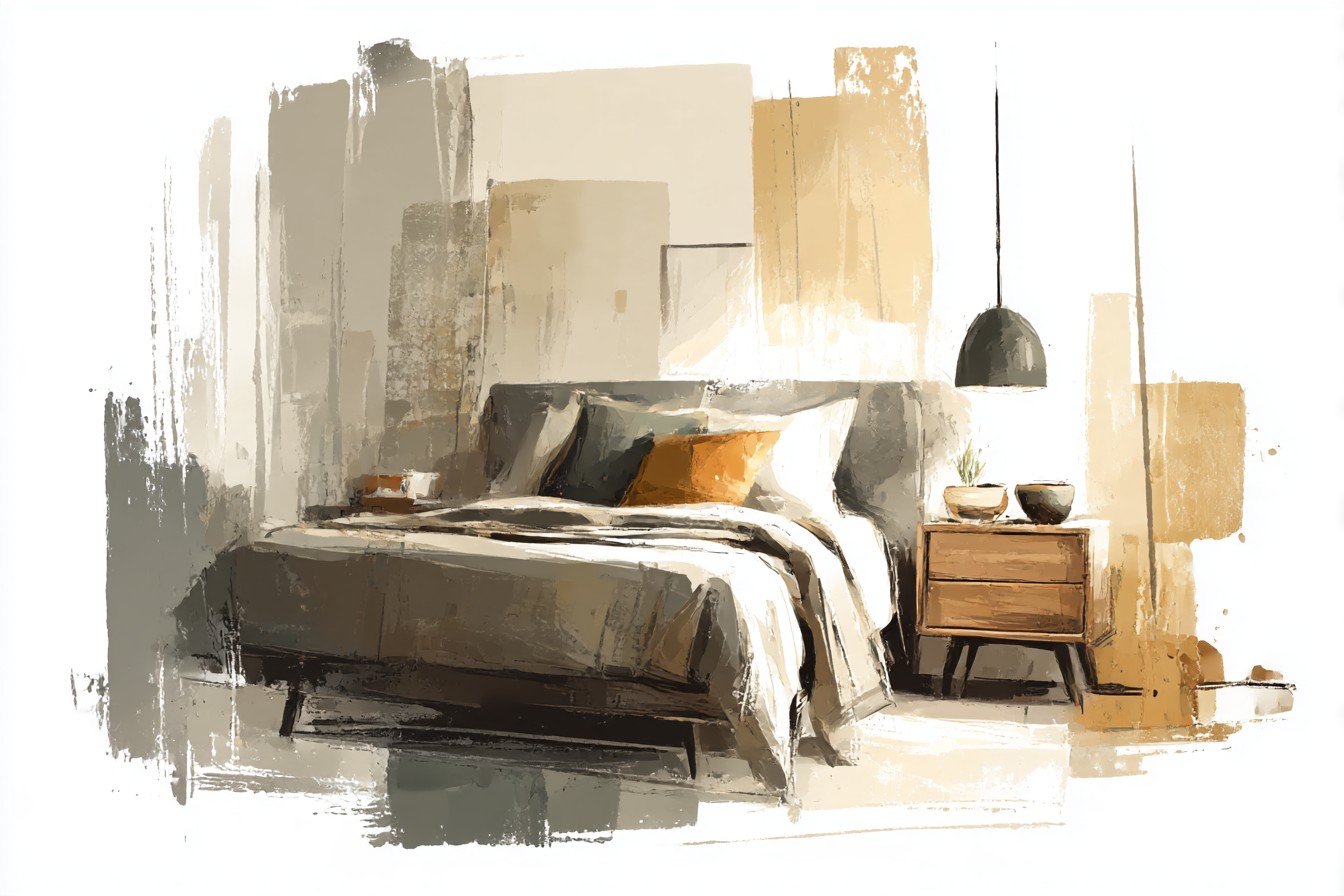
A gray duvet with a single flat gray pillow arrangement looks like a hotel room designed by someone who’s given up, and I don’t care how expensive the linen is, flat and monochrome reads cheap even when it wasn’t. You want at least one texture shift, a chunky knit throw, a linen sham with visible slub, something the light can catch differently than the duvet does, because gray bedding without texture variation just goes flat under any lighting that isn’t a professional photo shoot. I’ll also say, and this is where I’ll admit the temperature rule from before bends a little, that bedding is more forgiving of undertone mismatches than furniture is, because fabric is soft and close to the body and nobody’s standing across the room squinting at whether your pillowcase runs three degrees warmer than your duvet cover. Furniture sits still and gets scrutinized. Bedding gets slept in and washed and rumpled, and it earns a bit more grace because of it.
So no, I don’t think there’s a single correct nightstand finish or a single correct pillow shade for a gray bed, that would be a lie dressed up as advice, and I’m not in the business of pretending certainty I don’t have. What I do think is that undertone is the decision that actually matters and gets skipped constantly, while pillow color is the decision people stress over that barely matters at all. Check the bed in daylight before you buy anything else for the room. Everything downstream of that gets easier, including whatever text you send your sister at 8pm from a grocery store aisle.