I painted my bedroom wall the exact color of wet cardboard once. Not on purpose, obviously. I stood in the paint aisle at the hardware store on the west side of Indianapolis holding two swatches that looked identical under fluorescent lighting, “Anew Gray” and something called “Agreeable Gray,” and I thought, sure, either one, they’re basically the same, how different can two grays be. I went with Anew Gray because the little paint chip felt slightly warmer between my fingers, which is not a real way to choose a paint color but it’s the logic I used at eleven at night with a toddler asleep down the hall and a strict two hour window to make a decision before I lost the nerve entirely.
I had a chocolate brown wardrobe, one of those big double door ones with actual weight to it, the kind you regret buying secondhand the second you have to move it up a staircase. And against that Anew Gray wall it looked like a filing cabinet in a doctor’s waiting room. Flat.
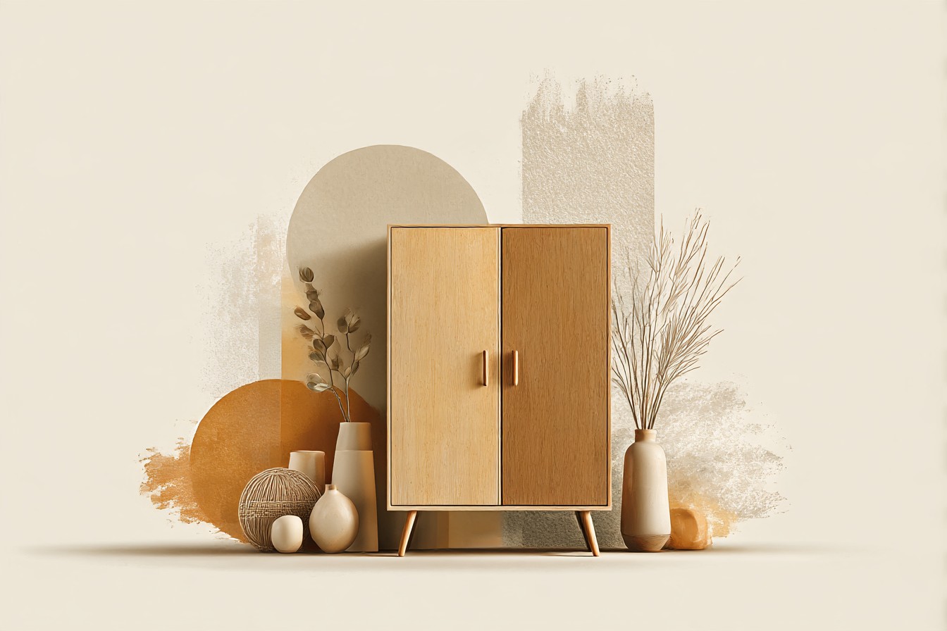
Cold. Sad, honestly. The brown, which I loved, which had all this warmth in the grain when the morning light hit it right, just went dead next to that gray. It took me embarrassingly long to work out why. Cool grays and warm wood are not friends. They just aren’t. I lived with it for the better part of a year telling myself I’d get used to it, and I never did, I just got used to being irritated by my own bedroom every single morning.
That whole saga is basically the reason this piece exists. Brown wardrobes get treated like the safe, boring choice, the thing you buy because you can’t decide on anything else, and then people surround them with whatever’s already on the wall and wonder why the room feels flat. It’s not the wardrobe’s fault. It’s almost always what’s sitting next to it. So this is me working through what actually earns its place beside a warm wood wardrobe, wall by wall, layer by layer, mistake by mistake, because I made most of these mistakes myself before I made anything look right.
[Brown Wardrobes]
The Wall Color That Actually Works
After the Anew Gray disaster I overcorrected hard and went full cream, which fixed the coldness problem but somehow made the whole room look like a hotel breakfast room, all beige on beige with nothing to hold your eye. The fix, when I finally found it, was a warm putty color, one of those in between shades that reads as gray in some light and almost taupe in others. I ended up with something close to Sherwin Williams’ Perfect Greige, and the difference against that same brown wardrobe was honestly kind of stupid how big it was. Same furniture. Same room. Completely different feeling.
Here’s the actual rule I wish someone had told me at eleven at night in that paint aisle: figure out whether your wardrobe leans warm or cool before you pick anything. Chocolate and walnut tones, the ones with reddish or orange undertones, want a wall with some warmth in it too, a soft clay, a warm greige, even a muted terracotta if you’re feeling brave. Cooler brown, the ashier oak and gray brown finishes, can actually handle a true cool gray without going dead the way mine did, because they’re already playing in that temperature.
Dark charcoal walls are the other one people underestimate. I was skeptical, thought it’d swallow the room, but a friend’s place I visited had a near black wall behind a medium brown wardrobe and it worked like a frame around a painting, made the wood look almost lit from within. Not something I’d do in a small room with one window, but worth knowing it’s an option, not just a beige or bust situation.
[Wall Colors]
Bedding That Doesn’t Fight the Wood
I went through a genuine phase of buying navy bedding because I’d read somewhere that navy and brown was a classic combination, and it is, in theory, except the specific navy duvet I bought had a cool blue undertone that clashed with my wardrobe’s warmer red brown finish in a way that made both colors look slightly wrong, like they were trying to talk over each other.
What ended up working was almost embarrassingly simple. Off white linen, the kind with visible texture and a slightly rumpled look even when it’s freshly washed, because crisp bright white next to warm wood can look a little clinical, a little too matched to the wardrobe’s finish in an accidental way that reads as trying too hard. Cream and oatmeal tones do the same job with even less risk. They let the wardrobe stay the warmest thing in the room, which honestly it should be, it’s usually the biggest piece of furniture and the one with the most character.
Where I’d push you to actually take a risk is a rust or burnt orange throw folded at the foot of the bed. I resisted this for ages assuming it’d be too much color repeated too close to the wood, and it’s the opposite, it deepens the whole warm palette instead of fighting it. Sage green pillows do something similar from the cooler end, calm the warmth down without canceling it out. The one thing I’d genuinely avoid is anything with a cool gray base running through the pattern, learned that one the hard way with a duvet cover I returned within a week because it made the wardrobe look tired every single morning.
[Bedding]
Flooring and Rugs Underneath
Nobody thinks about the floor until the wardrobe is already in the room and something feels slightly off, and then it’s always the floor. My place has that mid toned oak engineered flooring that’s in about half the houses built in this city in the last fifteen years, and for a while I had a gray jute rug under the wardrobe that did nothing at all, just sort of sat there being neutral in the least interesting way possible.
A rug with actual color in it changes the whole equation. I put down a rust and cream patterned wool rug, cheap one honestly, and suddenly the wardrobe, the floor, and the rug all read as one warm family of tones instead of three separate decisions made in three separate stores. Terracotta does the same trick. So does a faded vintage style rug in muted red and gold, the kind that looks like it’s already lived a life somewhere else.
You Might Also Like

If your floor itself is very dark, close in tone to the wardrobe, you actually want to go lighter and cooler underfoot to stop the whole lower half of the room turning into one brown block. A soft blue gray rug works there in a way it never would against a lighter oak floor. And if you’ve got pale flooring, lean into the contrast instead of fighting it, a deep rust or chocolate toned rug ties the wardrobe down to the ground properly instead of leaving it looking like it’s floating on a raft of beige.
[Flooring and Rugs]
Blues as the Accent That Surprised Me
I was properly wrong about blue for years. Convinced it’d always read as cold next to brown wood, based on nothing but that one bad navy duvet experience I mentioned earlier, which honestly wasn’t even blue’s fault, it was the wrong specific blue.
Dusty blue, the grayed off, slightly faded version you’d see on old denim, is the one that actually earns its place next to a brown wardrobe. I’ve got a single dusty blue armchair in the corner of my bedroom now and it does more work in that room than almost anything else I own, pulls the whole space together without demanding attention the way a bright color would. Petrol blue, that deep almost teal shade, works even harder in a room with darker wood, chocolate or espresso tones specifically, because it’s got enough depth to hold its own instead of getting swallowed.
What I’d steer you away from is bright, clear, primary blue, the kind you’d paint a kid’s bedroom, because that one genuinely does clash, reads as two different design decades having an argument in the same room. Keep the blue muted, whether it’s a wall, a chair, curtains, whatever, and it sits beside brown wood like it was always meant to be there. Took me an embarrassingly long time and one returned duvet cover to figure that distinction out.
[Blues]
Greens That Ground the Whole Room
Sage got popular a few years back and I resisted it purely out of contrariness, assumed it was a trend that’d age badly the way certain paint colors from a decade ago now look immediately dateable. I was wrong about that too, turns out, at least next to warm brown wood. There’s something about a muted, grayed off green that reads as almost neutral while still adding actual color, which is a strange trick most colors can’t pull off.
I added a sage green throw pillow and a small olive toned lamp shade to my bedroom, nothing dramatic, and the room stopped feeling like it was built entirely around one wood tone and started feeling like it had layers. Olive and deep forest green go further in the same direction, especially in a room with more natural light, where a darker green won’t read as murky the way it might in a north facing room with one small window, which mine happens to have, so I learned to keep my greens on the lighter, dustier side of the spectrum out of necessity more than taste.
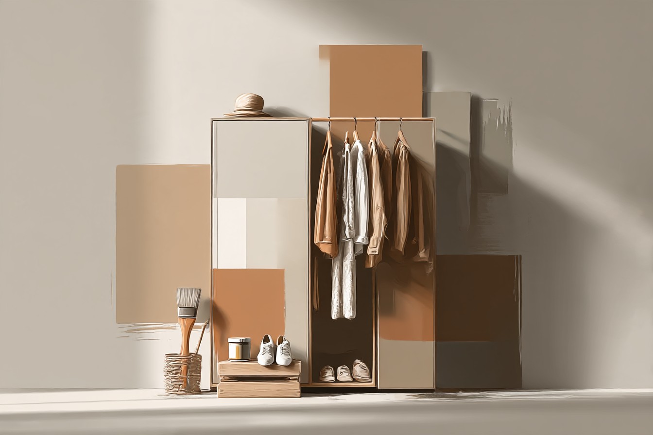
The other thing green does that I didn’t expect is make the wardrobe’s actual wood grain more visible, more interesting, in a way that neutral tones around it don’t.
It’s a genuinely underrated pairing, and one I’d have found years earlier if I hadn’t been so stubborn about writing it off as a passing trend before I’d even tried it.
[Greens]
Final Thoughts
If I’m honest, the whole point of this piece is the same lesson I learned standing in that paint aisle wasting an evening comparing two nearly identical gray swatches. A brown wardrobe isn’t the boring, safe choice everyone treats it as. It’s actually one of the more flexible pieces you can own, warm wood plays well with a genuinely wide range of colors, it just needs the temperature matched properly, warm wood wants warm or muted neighbors, not cool ones fighting it for attention.
I spent a full year living with a wall color that made a piece of furniture I actually liked look flat and sad, purely because I rushed a decision late at night without understanding why warm and cool tones behave the way they do next to each other. Once I got that one thing right, everything else, the bedding, the rug, the accent colors, got easier to choose almost by instinct.
So if you’ve got a brown wardrobe sitting in a room that feels slightly off and you can’t work out why, start with the wall. Check whether it’s fighting the wood’s temperature instead of matching it. Then build outward from there, rust, dusty blue, sage, warm cream, whatever suits the specific brown you’re working with. It’s a much more forgiving piece of furniture than its reputation suggests. Mine just took me an unreasonably long time, and one truly regrettable gray wall, to actually believe that.