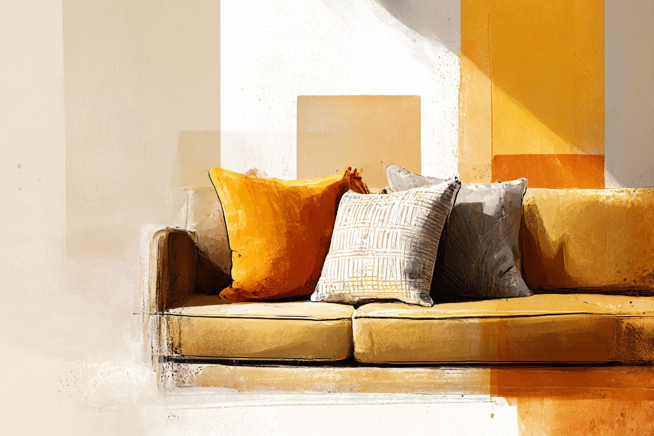
I currently own fourteen pillow covers for one sofa. Fourteen. I counted them properly last week, laid out on the guest bed like some sort of forensic display, and my first reaction was the specific horror of realizing I’d become someone who owns more pillow covers than plates. My second reaction, slower, more honest, was that every single one of them earns its place, because the sofa underneath them is a genuine gold velvet three seater I bought in 2015 and have never once regretted, and gold sofas, real proper gold ones, not the beige that furniture stores call gold when they’re trying to make it sound less committal, are stupidly hard to find. You cannot walk into a showroom and expect three of them lined up for comparison. You get one, if you’re lucky, usually a floor model, usually with someone else eyeing it at the same time, and you buy it there and then because you understand you might not see its equal for another decade.
That rarity is exactly why I’ve never once considered replacing mine, and why the fourteen pillow covers exist in the first place.
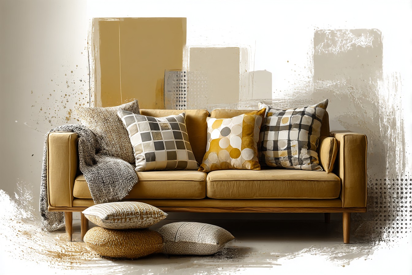
When you can’t easily swap the sofa, you learn to treat the cushions on it as the actual design decision, the lever you pull when the room feels off or dated or, worst of all, like something out of 1974 that never got the memo. Gold has a reputation problem. Say the word to most people and they picture a shiny wingback in a room that smells faintly of cigarettes and ambition, and I understand why, because gold done wrong looks less like a color choice and more like a decade you’re trying to relive. Done right, with the correct pillows doing the correct work around it, it’s one of the richest, most flattering colors a living room can hold. The whole difference sits in what you put in front of it.
So this is really a piece about what goes on top of a gold sofa, not the sofa itself, because I’m assuming if you’re reading this you already have one, or you’ve found one and you’re standing in the showroom with your phone out googling exactly this question. What color pillows go with gold. Here’s everything I’ve actually tried, on my actual sofa, over roughly ten years of getting it wrong before I got it right.
[Gold Sofa Pillows]
Jewel Tone Pillows
The first pillows I ever put on that sofa were emerald green, a mistake I’d like to take partial credit for and partial blame for, because emerald against gold velvet is such an obvious, gorgeous pairing that I genuinely thought I’d invented it. I hadn’t. It’s been the go to combination since roughly the Georgian era, which I only learned later and which took some of the shine off my supposed genius, but it still works, and it works because jewel tones and gold share the same emotional register. They’re both a little formal, a little rich, and neither one is trying to be understated. Sapphire does the same job, so does a proper deep ruby, the kind of red that reads more like wine than fire engine.
What I’d say to the version of me who bought that first emerald velvet pillow in 2015, thrilled with herself, is that one jewel tone is a decision and three is a theme park. I went through a phase, briefly, of stacking emerald, sapphire, and a garnet colored pillow together on the same three cushions, and it looked like the sofa was auditioning for a production of something. My sister came round, looked at it for exactly as long as it takes to remove a coat, and said nothing, which from her is a review in itself. I took two of the three jewel tones off within the week. One strong jewel tone, maybe two if they’re from the same family, sapphire and a slightly dustier navy, say, reads as considered. Three separate jewel tones reads as a sale rack. The gold needs one confident partner in that register, not a committee.
[Jewel Tone Pillows]
Neutral and Ivory Pillows
There’s a specific kind of gold sofa disaster that happens when every single pillow on it is also warm, also rich, also trying to be the main event, and the whole arrangement ends up looking like the inside of a jewelry box rather than a room you’d sit in with your shoes off. Ivory and bone colored pillows exist to stop that. They’re the pause button. A bouclé cushion in undyed cream, or a heavier linen in a color closer to raw canvas than white, gives the eye somewhere to rest before it goes back to the gold, and it’s the single fastest way I know to keep a gold sofa from tipping into what I privately call casino lounge territory.
I learned this properly, rather than by instinct, the year I redid the whole living room and got a little carried away with warmth everywhere, gold sofa, rust curtains, a terracotta rug, the works, and it looked completely fine in photographs and completely airless in person, like the room had been sealed in amber. Two ivory pillows, nothing fancier than a heavy cotton weave with a bit of texture to it, fixed it in an afternoon. Not because ivory is exciting. It isn’t. But its whole job is to be quiet next to something that isn’t, and gold velvet is never quiet. I still keep a pair of these permanently in rotation now, the way you’d keep a good white shirt, not thrilling on its own, essential next to everything else.
[Neutral and Ivory Pillows]
Black and Charcoal Pillows
If ivory is the pause button, black is the full stop, and it’s the pairing I was slowest to trust because I spent years assuming black pillows on a gold sofa would look heavy, or worse, like I was trying too hard to make the whole thing feel expensive. I was wrong, and I’ll say that plainly because I don’t say it often about my own decorating instincts. A single charcoal or true black pillow, especially in a slightly matte fabric rather than anything shiny, sharpens gold up in a way almost nothing else does. It stops the sofa reading as soft and nostalgic and makes it read as current, almost architectural, which matters enormously if you’re nervous, as I was, about the whole thing tipping into a look that belongs to your grandmother’s front room rather than your own.
You Might Also Like

I bought one online a few years back that arrived with a swing tag actually printed with the phrase TIMELESS ELEGANCE FOR EVERY HOME, in capitals, on a pillow that shed dye onto my hands the first time I touched it, and I remember standing in the hallway laughing properly at the sheer nerve of it. That particular pillow didn’t survive the year. But the idea behind it, dark, sharp, unfussy, was right even though the execution was junk, and I’ve since replaced it with a proper cotton velvet in near black that’s held its color for three years now without a single complaint. One dark pillow against gold does more work than people expect. Two starts to look like mourning. I’d stop at one, maybe a matching pair if your sofa’s a genuinely large three seater, and let it do its job quietly.
[Black and Charcoal Pillows]
Blush and Terracotta Pillows
I need to address the elephant in this particular room, which is that I owned an avocado green sofa in the late 1980s, paired at the time with pillows in a shade of orange I can only describe as deeply, unforgivably confident, and the whole combination is exactly the kind of thing people picture when they hear that a color pairing is having a moment again. Blush and terracotta against gold is having exactly that moment right now, and I understand the hesitation, because it looks, on the surface, like a rerun of a decade most of us survived rather than enjoyed.
Here’s the difference, and it took me a while to see it. The seventies version was saturated, everything turned up to full volume, orange next to gold next to a burnt red rug that all fought for the same attention. Done properly now, blush is dusty rather than bright, closer to the inside of a shell than a highlighter, and terracotta reads as clay rather than traffic cone. Against gold velvet, one blush linen pillow and one terracotta in a nubbly, slightly rustic weave gives you warmth without the shouting match. I tried this combination two winters ago, cautiously, half expecting to hate it, and instead found it was the softest, most livable the sofa has ever looked, particularly with a lamp on rather than the overhead light. It photographs less dramatically than the jewel tones. It lives with you better day to day, which is the test I actually care about.
[Blush and Terracotta Pillows]
Pattern and Texture Pillows
Every pairing so far has been about color, and color is only half the conversation, because a gold sofa dressed entirely in solid colored pillows, however well chosen, can still end up looking a little static, a little too matched, like it was assembled from a single catalog page rather than lived into over time.
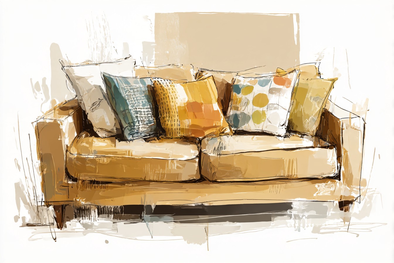
This is where pattern earns its place, and specifically pattern that brings texture with it rather than just print, because a flat printed pillow on velvet tends to look cheap by comparison, the two fabrics arguing rather than agreeing.
A ticking stripe in ivory and charcoal does an enormous amount of work here, because it’s quietly pulling both of the neutral and dark pairings into the same cushion rather than making you choose. An ikat in muted rust and navy does something similar for the warmer and jewel toned combinations. What I’d steer you away from, having tried it and regretted it, is anything with metallic thread running through the pattern itself, gold on gold, so to speak, which I assumed would look rich and instead looked like I was trying to convince a guest the sofa was worth more than it was. Texture, boucle, a slightly nubby linen weave, a corduroy in a narrow wale, does the pattern job without the shine, and it’s the difference between a sofa that looks decorated and one that looks collected, which is the far better compliment.
[Pattern and Texture Pillows]
Final Thoughts
Ten years and fourteen pillow covers into owning this sofa, the thing I keep coming back to is that gold rewards patience in a way most sofa colors don’t. It doesn’t want to be finished off with whatever’s in the sale bin, and it certainly doesn’t want six colors arguing on top of it at once. It wants one strong idea at a time, jewel tone or ivory or black or that softer blush and terracotta pairing, worn in and swapped out as the room shifts around it, the way you’d change a scarf rather than reupholster the whole coat.
If you’ve found a proper gold sofa, hold onto it. They don’t turn up often, and the ones that do rarely turn up twice. The pillows are how you keep proving to yourself, and to everyone who walks in and briefly pictures 1974, that the color was the right call all along.