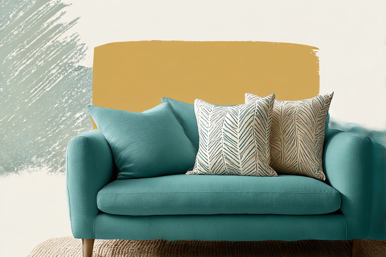
I bought my teal sofa four years ago, in a fit of confidence I still can’t fully explain, and for three of those years I dressed it with whatever pillows were on sale at the time. Mustard one Christmas. A blush pink someone gave me as a joke gift. A truly regrettable orange thing I bought at 11pm that I will not be discussing further. It looked like the sofa had been dressed by a committee that had never met each other, because it had, the committee was just me on different nights with different levels of judgment. Then a friend came over, looked at it for a solid four seconds, and said “did the pillows just happen, or did you mean this?” And I had no answer.

That’s the moment I realized I’d been treating pillow color like an afterthought instead of the thing that decides whether teal reads as a choice or an accident.
Because that’s really the whole question here. Teal is not neutral. It’s not gray, it’s not oatmeal, it doesn’t sit quietly in the background while you throw whatever at it. It has an opinion already, and if your pillows don’t have a relationship to that opinion, on purpose, the whole sofa just looks like it happened to you rather than something you decided. So the answer to “what color pillows go with a teal sofa” isn’t really a color chart. It’s two separate arguments you need to win: the temperature argument and the contrast argument. Get those two right and everything else is just taste.
Temperature Is the Whole Game, and Most People Ignore It
Teal sits right on the fence between warm and cool, which is exactly why it’s such a trap. It’s got blue in it, so people instinctively reach for other cool tones, more blues, more grays, maybe a cool white, and the result is a sofa that looks like it’s been left out in the rain. Technically coordinated. Completely lifeless. I did this myself for about eight months with a set of gray linen pillows that matched perfectly and made my living room feel like a dentist’s waiting area with better lighting.
What actually works is fighting the coolness on purpose. Teal has enough green in it to pull warm colors toward it without a fight, so a mustard or ochre pillow doesn’t clash the way you’d expect, it just makes the teal look richer, like it was always meant to sit next to something warm. Terracotta does the same job with more attitude. Even a warm, slightly dusty pink, not the blush pink from my joke gift era, something closer to clay, can sit against teal and look like it was mixed by someone who thought about undertones, because it was.
The trick is not going full warm either, because then you’ve just swapped one flat look for another. One warm pillow against a couple of cooler or neutral ones does more work than four warm pillows all fighting for attention. I run a mustard, a cream, and one deep navy on my sofa now, and the mustard is doing about eighty percent of the labor. It’s the pillow that makes someone glance at the room twice. Everything else is just there to let it do that.
Brands selling “teal-friendly” pillow sets are, most of the time, just sending you gray and white and calling it a curated palette, which is the laziest possible interpretation of coordination and I will die on this hill. Coordinated is not the same as safe. A pillow set that matches your sofa’s undertone without adding any warmth at all isn’t a pairing, it’s a paint swatch with a zipper, and I’ve watched more than one “matching set” quietly get shoved in a closet within a year because the room it was styled for ended up looking cold and showroomy instead of lived in.
You Might Also Like

Contrast Is What Makes It Look Intentional, Not Just Correct
Here’s the part that took me the longest to actually learn, because I spent a long time thinking “matching” and “coordinated” were the same instruction. They’re not. A pillow that’s a slightly lighter or darker version of the sofa’s own teal will always look correct and will almost never look intentional, because there’s nothing for the eye to land on. It just reads as more sofa. If every pillow on a teal couch is some shade of teal, congratulations, you’ve built a very expensive monochrome blob.
What actually reads as deliberate is one pillow that’s doing something different in value, not just color. A deep charcoal or near black pillow against teal does something a matching teal-on-teal pillow never will, it gives the eye an anchor point, a place to stop, and suddenly the rest of the arrangement looks like it was built around that anchor rather than assembled at random. I learned this by accident when I threw a black and white striped pillow onto the sofa mostly to hide a coffee stain on the cushion under it, and it ended up being the single best pillow decision I’ve made in four years of owning this couch.
Pattern does a version of the same job that solid contrast does, but it’s riskier and I’ll say that plainly. A geometric print with teal, cream, and one warm accent color pulled into it can genuinely tie a whole arrangement together, because it’s basically doing your color matching homework for you in one pillow.

But two patterned pillows on a teal sofa, especially two busy ones, starts looking like you found them in different decades and never checked whether they’d get along. One pattern, max, and let your solids hold the rest of the composition steady.
The number of pillows matters here too, though not in the way pillow brands want you to think. Four pillows arranged with intention beats six pillows arranged with hope, every single time. I know because I once had six on that sofa, purchased across roughly two years of impulse decisions, and it looked less like a styled room and more like the sofa was quietly being buried. Three or four, with one clear contrast piece and one warm piece doing the actual work, is enough. Anything more than that and you’re not styling a sofa anymore, you’re hoarding cushions and calling it design, which, again, I say with the full authority of someone who has personally done it.
So no, it was never really about which exact color goes with teal. It’s about whether your pillows are fighting teal’s temperature or working with it, and whether at least one of them is giving your eye somewhere to land instead of just more of the same tone. Solve those two things and the sofa stops looking like something that happened to you on a series of late nights, and starts looking like something you actually meant.