I used to think bathrooms with colored vanities were a trap. You inherit the thing (a rental, a house you bought with the previous owner’s choices baked in, whatever) and everyone tells you the safe move is a wall of stark white, because at least then nothing’s fighting for attention. I believed that for years. I painted a client’s powder room Sherwin Williams Extra White around a navy vanity in 2019 because I panicked and defaulted to “can’t go wrong,” and it looked like a dentist’s waiting room had a baby with a boat shoe catalog. Flat. Cold.
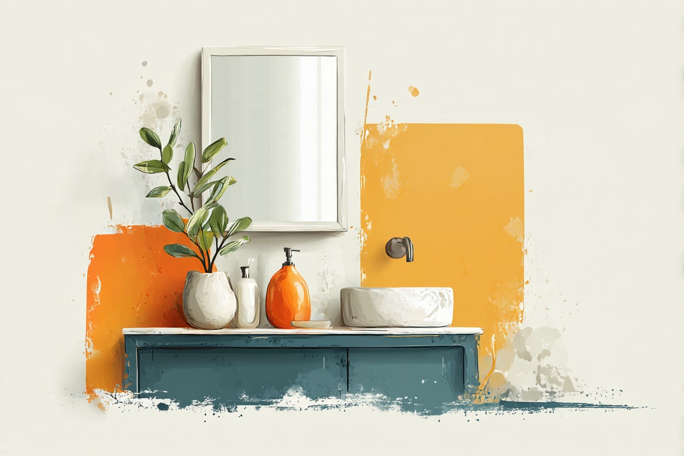
The vanity looked like it had been dropped in from a different, better designed house.
What changed my mind was doing the opposite on my own bathroom two years later. I’ve got a slate blue vanity, somewhere between BM Hale Navy and a proper gray, and instead of running from the color I decided to actually build the wall paint around it, checking light reflectance values instead of guessing off a paint chip held under my kitchen light at 9pm like an idiot (I did that too, for years, and it’s why I once ended up with a “warm white” that read distinctly lavender by 3pm). A blue vanity isn’t a problem to neutralize. It’s a color decision someone already made for you, which if you think about it is the hard part done. White vanities are the ones that actually leave you guessing, because they tell you nothing.
So this isn’t a “just paint it white and hope” piece. Blue vanities come in wildly different temperatures, from ink navy to a washed out dusty gray-blue to a proper cobalt someone chose because they were feeling brave, and each one wants something different on the walls around it. I’ve painted around all of these, gotten at least two of them wrong the first time, and I’ve got actual color names and actual reasons this time, not vibes.
[Blue Vanity Wall Colors]
Navy and Ink Blue Vanities
Navy is the vanity color people are most scared of, and also the one that’s easiest to get right, which is a stupid contradiction but here we are. The mistake is assuming navy needs another cool color to “match” it. It doesn’t. Navy is already doing the heavy lifting in the room, deep and saturated, so the walls need contrast in warmth, not more of the same temperature.
I had a client last spring whose builder grade vanity was a factory navy, and her instinct was a pale gray, something like Benjamin Moore Gray Owl, because gray “goes with everything.” It went with nothing. Two cool tones next to each other in a room with no natural light (her bathroom had a single frosted window, barely counts) just made the whole space read flat and slightly damp, like a hotel bathroom you’re trying to leave. We repainted in Benjamon Moore Simply White, which sits around an LRV of 91, and the difference was immediate. The white gave the navy somewhere to land instead of competing with it.
If straight white feels too stark for your taste, and I get that, a warm off white with an LRV in the mid to high 80s does the same job with slightly less glare, something like Sherwin Williams Shell White. What I wouldn’t do is go blush or pink next to navy unless you’re deliberately chasing a nautical, almost preppy look, because it can tip into “coastal grandmother gift shop” fast if the pink leans too warm. A muted warm white is the safer bet nine times out of ten, and it’s the one I’d tell you to try first before getting fancier.
[Navy Vanities]
Dusty, Slate Blue Vanities
This is my own vanity’s category and it’s the trickiest one to shop for online because photos lie about it constantly. Dusty blue, the kind that reads gray in one light and properly blue in another, is basically a chameleon, and it punishes any wall color that’s trying too hard.
I learned this the annoying way, by living with three different testers on my bathroom wall for about six weeks because I couldn’t commit. Bright white made my vanity look muddy, like it needed a wash. A cool gray made it look flat, almost lifeless, the exact problem from the navy section above but in a smaller room where you notice it more because there’s nowhere for your eye to go. What actually worked was a warm greige, Benjamin Moore Revere Pewter, LRV around 55, which sounds like it shouldn’t work next to a blue vanity because greige and blue can clash, but the warmth in it is what pulled the gray undertone out of my vanity and let the blue show up properly instead of looking apologetic.
If your vanity leans more gray than mine, closer to a true slate, Sherwin Williams Alabaster is the safer starting point, an LRV in the low 80s that reads warm without tipping yellow. The rule I’d give anyone with this shade specifically: don’t test it in isolation, test it next to the actual vanity, in the actual bathroom, at two different times of day, because this color changes its mind more than any other blue I’ve worked with and the wall paint needs to be chosen in response to that, not to a swatch on your phone screen.
[Dusty Blue Vanities]
Bright Cobalt and Bold Blue Vanities
Somebody, somewhere, is currently standing in a paint aisle having chosen a genuinely bold cobalt vanity and is now panicking about what goes above it, and I want to say up front: good for you, that took nerve, don’t undo it now by whiting it out into nothing.
The instinct with a saturated color like this is to go as neutral as humanly possible on the walls, which isn’t wrong exactly, it’s just often executed too coldly. A crisp, blue leaning white next to a cobalt vanity tends to make the whole room feel like it’s trying to be a spa brochure. What I’d reach for instead is a white with a whisper of warmth in it, something like Behr Swiss Coffee, LRV in the high 70s, which keeps the room bright without turning the whole thing into one long cold blue statement.
You Might Also Like

The other option, and this is the one I actually prefer when the client’s willing to be a bit braver, is a very pale, almost imperceptible warm neutral with a hint of ochre or clay in it, Farrow & Ball Skimming Stone is close to this, LRV around 63. It sounds like it shouldn’t sit next to cobalt at all. It does, because the warmth acts like a buffer, giving your eye a rest between doses of that intense blue instead of surrounding it with more visual noise. What doesn’t work, and I’ve seen this go wrong twice now, is a second bold color on the walls trying to “coordinate,” a teal or a green that thinks it’s being bold in the same language. Two loud colors in a small room don’t have a conversation, they just talk over each other.
[Cobalt Blue Vanities]
Teal and Blue-Green Vanities
Teal vanities are the ones nobody warns you about, because they’re not quite blue and not quite green, and every paint chip that claims to “complement” one is guessing just as hard as you are. I avoided recommending anything definitive here for actual years because I got burned once pairing a teal vanity with a mint green wall that I was assured was “complementary,” and the finished bathroom looked like a science fair display about algae. Not my finest hour.
What I’ve settled on since is that teal wants warmth pulled from the opposite end entirely, not more green, not more blue, but something that acknowledges the color has a foot in both camps and doesn’t try to pick a side for it. A warm white with a faint pink or peach undertone does this well, Clare’s Coconut Milk sits around LRV 84 and has just enough warmth to stop the teal from reading murky. If you want more contrast and you’re not precious about resale value, a soft, dusty terracotta on an accent wall behind the vanity does something genuinely nice here, it’s warm enough to counter the coolness in the teal without clashing the way a straight red or orange would.
The other thing worth saying plainly, because I spend most of this article being annoyed at bad matches: teal and a very pale blush pink is one combination that’s actually earned its reputation. I was skeptical, tried it in a small guest bath last year, and it worked better than I expected it to. Sometimes the trendy answer is trendy because it’s right.
[Teal Vanities]
Small, Windowless Bathrooms With a Blue Vanity
This one isn’t about the shade of blue so much as the room itself, because a small bathroom with no natural light changes every rule above. I’ve got a client’s powder room in mind, four feet by six feet, one bulb over the mirror, a navy vanity that looked fantastic on the showroom floor and considerably less fantastic once it landed in a room with zero daylight.
In a windowless space, LRV stops being a nice to know and becomes the whole decision. Anything under about 60 starts to feel like the walls are absorbing the single light source instead of bouncing it back, and in a room this size you feel that within about four seconds of walking in. I’d stay in the 75 to 90 range regardless of which blue vanity you’re working with, and I’d go eggshell rather than flat matte, because matte in a dim room without a window reads chalky and a bit sad, while eggshell picks up whatever light you’ve got and actually does something with it.
The other adjustment is warmth.
A windowless bathroom under a standard warm white bulb (2700K, check yours, most builder grade fixtures are this) will pull any cool toned paint further cool than the chip suggested, which is exactly the mistake I made with that Extra White job I mentioned earlier. Lean warm on your white or neutral choice here even if you wouldn’t in a bathroom with a window, because the room’s already fighting you on light, no need to fight it on temperature too.
[Small Windowless Bathrooms]
Final Thoughts
If there’s one thing I’d want someone to take from all this, it’s that a blue vanity isn’t the obstacle. It’s the starting point, and it’s already told you more about what to do next than a blank white vanity ever would. The mistakes I’ve made and watched other people make all trace back to the same instinct, panicking at the color and trying to cancel it out with the most neutral, least offensive white available, instead of actually looking at what temperature and depth you’re working with and choosing something that responds to it.
Buy the sample pot. Paint an actual square, not a stripe, an actual two foot square, next to the actual vanity, and look at it in the morning and again at night under whatever bulb you’ve actually got, not the daylight bulb in the hardware store. It costs eight dollars and forty minutes and it will save you from ending up with a bathroom that looks like it was decorated by two different people who never met.
I got it wrong more than once writing this piece back through my own head, algae colored teal bathrooms and dentist’s office navy included, and every single time the fix was the same: stop trying to neutralize the vanity and start actually working with what it’s already telling you. Blue’s not the hard part. Guessing is.