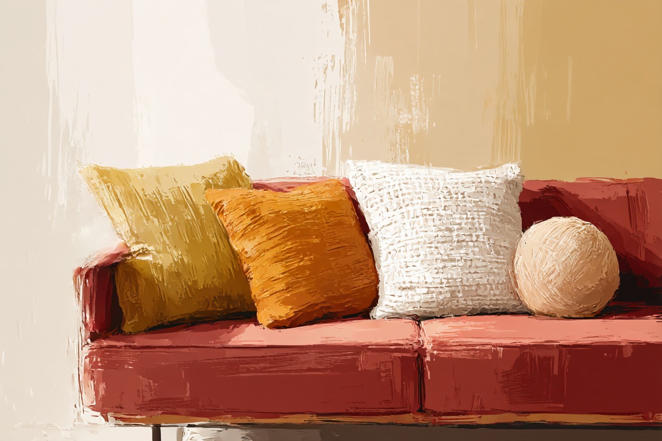
My dad walked into my living room last month, took one look at the maroon sofa I’d just reupholstered myself, then clocked the pile of pillows I’d dumped on it straight from the delivery box, mismatched, colors fighting each other, one of them still in its plastic wrap because I hadn’t gotten around to it. He didn’t say anything for a second. Then he just went “that’s a lot going on for a couch that color.” Which from my dad is basically a formal complaint filed with the union.
He wasn’t wrong. I’d built the sofa frame myself, kiln dried oak, mortise and tenon joints I’m still proud of eighteen months later, upholstered it in a maroon that I picked because it reminded me of a chair my grandmother had that nobody was allowed to sit in. Then I did what I always do with soft furnishings, which is treat them as an afterthought because I’m a joinery guy first and a decorator a distant second. I grabbed whatever pillows were on sale.
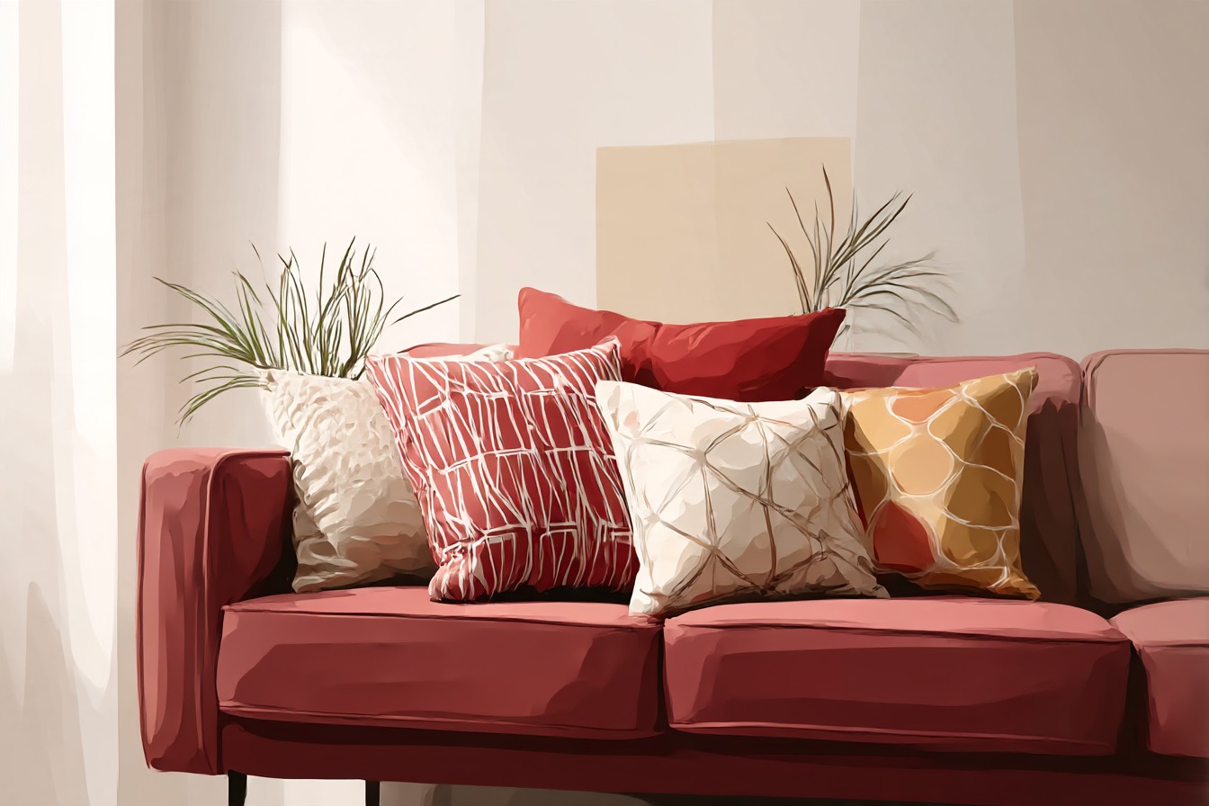
Wrong move. A maroon sofa is not a neutral. It’s got weight to it, it reads warm and a little serious, and it’s basically begging for a retro streak if you let it, because that deep wine red has been sitting in living rooms since the seventies without ever really leaving. But you can’t just throw color at it and hope. You have to actually think about what’s sitting on top of it the same way I think about what’s holding a joint together, because a pillow that’s the wrong color does the same damage as a screw in the wrong spot. It undermines the whole thing quietly, and you don’t notice why the room feels off until someone points it out to you standing in your own living room holding a coffee.
So I spent a weekend actually working through it properly instead of guessing, the way I’d assess a job before quoting on it. Not by matching swatches like a paint chart, but by testing combinations on the actual sofa in actual daylight and then again under the lamp at night, because color reads different both times and cheap advice never accounts for that. What follows is what actually earned a spot on the couch and what got returned, plus the stuff nobody tells you about how these things are put together, because a pillow’s just another piece of furniture as far as I’m concerned, it’s got a cover, a fill, seams doing the load bearing work, and most of them are built about as well as flat pack shelving from a gas station.
[Maroon Sofa Pillows]
Mustard and Gold, the Ones That Actually Earned Their Spot
I was skeptical about mustard for longer than I probably needed to be, because the last time I bought a mustard anything it was a throw blanket in 2019 that looked less “retro warmth” and more “traffic cone had a baby.” Wrong shade, too bright, too saturated, sat on the maroon sofa like it was arguing with it. Turns out the difference between a mustard that works and one that doesn’t is about ten percent less yellow than you think you want. A dustier gold, something closer to turmeric than to a highlighter, sits right next to maroon because they’re both coming from the same warm, slightly muted family, like they grew up in the same house.
I took the cover off one I bought to actually check the fill, because that’s just what I do, and found a polyester insert stuffed to about seventy percent of what the cover needed, which is why it looked flat on the shelf photo and fine in my living room, the cover had room to loft. Good sign, actually, tells you the company sized the insert to the cover instead of cramming whatever was cheapest into it. Two of these on either end of the sofa, gold against maroon, and the room finally looked like it meant to do that instead of looking like leftovers.
[Mustard and Gold Pillows]
Olive and Forest Green, for the Full Seventies Den Effect
If mustard is the safe retro move, olive is the one that actually commits to it. Deep forest green next to maroon reads like a hunting lodge that got a good decorator involved, and I mean that as a compliment, my dad’s old den had this exact combination and I used to think it looked dated, now I’ve rebuilt it on purpose in my own house, which tells you something about how these cycles work.
Where I got burned was on welting, the little corded edge some pillow covers have running the seam. Bought one with a contrast welt in a mustard thread against the olive cover, looked sharp in the photo, fell apart at the seam within about three weeks because whoever sewed it used a single pass instead of doubling back at the stress points. I know this because I took the seam apart to see why it was fraying, found a straight single line of stitching doing a job that needed reinforcement, and honestly respected the shortcut even while I was annoyed by it. Now I check the seams before I buy, run a thumb along them, look for that slight ridge that tells you it’s been stitched twice. Sounds fussy. Saves you a pillow.
[Olive and Forest Green Pillows]
You Might Also Like

Cream, Oatmeal, and the Boucle Ones That Calm Everything Down
Every room needs something that isn’t trying to make a point, and next to a maroon sofa that’s cream or oatmeal, ideally in a texture with a bit of nap to it, boucle or a heavy slubbed cotton, something your hand notices when you sit down. This is the color that keeps the room from looking like it’s dressed for a costume party, it grounds the whole thing the way a good baseboard grounds a wall.
I own four of these now, in three slightly different shades of “not quite white,” which I didn’t plan and can’t fully explain, except that every time I saw one in a slightly different oatmeal I convinced myself it was the missing piece. It wasn’t, they all work, that’s the problem with a good neutral. Construction wise, this is where I check the zipper first, because a lot of cream covers use a fine gauge zipper that’s fine for looks and then jams the third time you actually wash it. Look for a proper metal pull, not the tiny plastic ones that snap off in your hand, because a light colored cover is going in the wash a lot more than a maroon one ever will.
[Cream and Oatmeal Pillows]
Dusty Blue and Teal, the Contrast Nobody Warns You About
Here’s the one that surprised me. Maroon is a warm color through and through, so the instinct is to stay warm with everything you pair it with. Wrong, or at least incomplete. A dusty blue or a muted teal, not navy, not anything bright, cuts across that warmth and stops the whole sofa from reading as one heavy block of color. It’s the same principle as mixing species of wood in a build, you want something that contrasts on purpose instead of everything blending into the same tone and going muddy.
I overstuffed my first attempt at this one on purpose, went up an insert size deliberately because I wanted a firmer, plumper look on the corners, and it actually worked, gave the pillow a boxier shape that reads more structured against the softer drape of the maroon fabric. If you’re going to oversize an insert, do it here, on the cooler tone, it reads intentional instead of like you just grabbed whatever was in the closet.
[Dusty Blue and Teal Pillows]
Geometric and Checkerboard Prints for Actually Committing to Retro
Last category, and the one that scares people off because pattern feels risky. It’s not, if you keep it to one busy pillow and let everything else stay solid. A checkerboard print in cream and rust, or a geometric zigzag pulling in that same mustard and olive family, does the same job on a sofa that a good accent wall does in a room, it gives your eye somewhere to land.
Pattern is also where cheap construction hides best, because a busy print disguises a bad seam in the photos. I found this out the hard way with a geometric one that had an overlocked zigzag seam instead of a proper straight stitch, the kind of finish that’s fine for a t-shirt hem and not great for something getting sat on and thrown around daily.
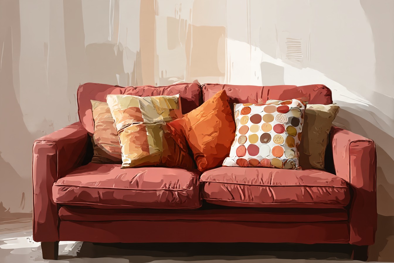
Pulled apart within two months. Now I flip every printed pillow inside out before I decide, check the seam type, and if I see that loose zigzag stitching doing all the work I put it back regardless of how good the print looks from the front.
[Geometric and Checkerboard Pillows]
Final Thoughts
None of this is complicated once you stop treating pillows like an afterthought, which is exactly what I did for the first eighteen months I owned this sofa. Maroon’s got a retro backbone whether you lean into it or not, so you might as well lean in, mustard and olive for the warmth, cream for the ground floor, blue or teal for the one deliberate contrast, pattern if you’re feeling brave enough to commit to it. I’ve spent more words in this piece on zippers and seam construction than I have on how any of this actually looks together, which probably tells you where my head goes first, but the truth is the two things aren’t separate. A pillow that’s falling apart at the seam in four months was never going to make the room look finished anyway, no matter what color it came in. Get the construction right and the color choices actually get to matter, instead of getting undermined by an insert that’s the wrong size or a stitch line that gives up the first time someone actually uses the sofa the way sofas are meant to be used. That’s the whole job, really, whether it’s a mortise and tenon joint or a zippered cover. Build the part nobody sees properly, and the part everybody sees gets to do its job.

[…] years, on principle, a principle I could not have articulated if pressed, and then a blush velvet pillow arrived as a birthday gift from a friend who clearly understood my living room better than I did and I have not been able to argue with it since. It is on the sofa right now, in […]