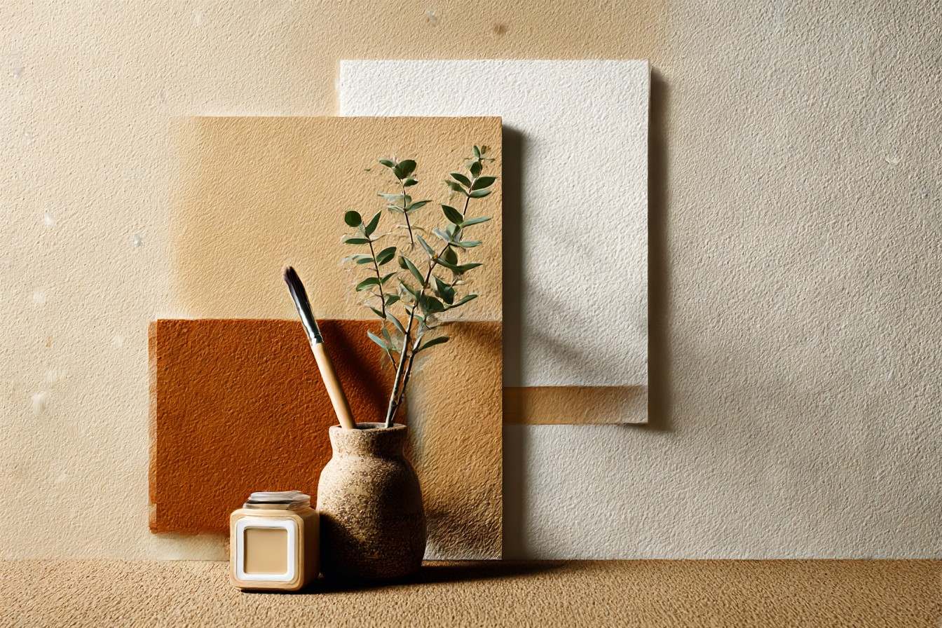
I painted my own living room the wrong color first, which is embarrassing to admit given I make furniture for a living and you’d think that means I know how a room should look before I touch it. I didn’t. I picked a gray called something like “Stonewash” off a fan deck at the hardware store, liked the swatch under the fluorescent lights, brought it home, rolled two coats onto a wall that sat about four feet from wall to wall carpet the color of weak tea. Beige. Light brown. Whatever you want to call it, builder grade, came with the house, still in decent shape so I never had a reason to rip it out.
The gray looked fine on the swatch.
In the room it looked sick. Not stylish, not moody, sick, like the wall had a cold. The carpet, which had looked perfectly normal for years, suddenly looked pink in places and muddy in others, fighting the gray instead of sitting next to it. I stood there with a roller in my hand at ten at night wondering if I’d bought the wrong sheen, checked the can, no, sheen was right, eggshell like I wanted. The problem wasn’t the finish. It was the undertone, which is a word I now use constantly and used to think was decorator nonsense invented to sell more paint.
Here’s the thing nobody tells you when you’re standing in the paint aisle. Every gray, every white, every “neutral” has a hidden color living inside it, blue, green, purple, and that hidden color either shakes hands with a warm carpet or picks a fight with it. My gray had a cool blue undertone. My carpet had a warm brown, almost orange undertone underneath the beige. Put them next to each other and the wall pulls all the pink and gray out of the carpet fibers that were never really visible before, and the carpet drags the wall toward looking flat and lifeless instead of calm. Nobody wins. I ended up repainting that wall within about six weeks, which if you’ve ever mixed and rolled paint for a living, or even just done it once on a Saturday, you know is not a small tax to pay for one bad swatch decision.
So this is me writing the piece I wish I’d read before I opened that can. What actually goes with light brown carpet, what fights it, and what makes it look like you did it on purpose instead of just inheriting it from whoever lived there before you.
[Light Brown Carpet]
Warm Whites and Warm Neutrals
If you want the safe option that’s actually safe for a reason and not just boring, this is it. Warm white, the kind with a hint of yellow or a hint of that same brown undertone your carpet’s already got, works because you’re not asking two different temperatures of color to sit in the same room together. I think of it like matching grain when you’re joining two pieces of wood, you’re not trying to make them identical, you’re trying to make sure they’re moving in the same direction so the seam doesn’t scream at you every time you walk past it.
The mistake people make here is grabbing “white” off the shelf assuming white is neutral by default. It isn’t. Cool white, the stuff with a blue or gray base, does almost the exact same damage my gray did, just quieter about it. You end up with a wall that looks slightly gray and a carpet that looks slightly dirty, and you won’t know why, you’ll just feel like the room’s a bit off.
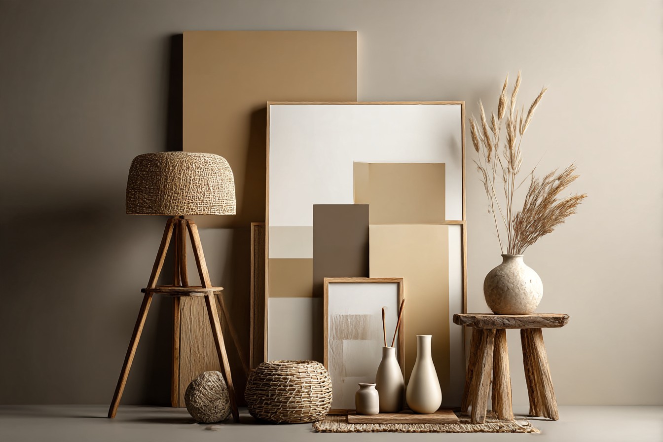
What actually works is anything sold as warm white, oat, alabaster, that whole family, and honestly most cream colored neutrals too, the ones that lean toward butter rather than toward chalk. I tested four sample pots on the same wall in my own place before landing on the fix, taped a piece of the old beige carpet remnant right up against each swatch to see how they actually sat together, not how they looked floating alone on white primer, which tells you nothing. That’s the only way to actually check it, side by side with the real material, the same way I’d never trust a stain color off a tiny chip without seeing it on the actual wood I’m using.
Warm neutrals don’t fight for attention. They let the carpet be the quiet, unremarkable base it’s supposed to be, and they make the room feel lit even on a gray Milwaukee afternoon in February when the sun’s basically theoretical.
[Warm Whites and Warm Neutrals]
Sage and Soft Greens
Green surprised me. I wouldn’t have put it on a wall near a brown carpet on instinct, green and brown together sounds like it belongs outside, not in a living room, but there’s a reason it keeps showing up in every search for what goes with light brown carpet, and it’s because brown is basically a shade of green’s family that got dried out. Think about it, brown is what green looks like once the chlorophyll’s gone. They’re related. Put them back together in the right proportions and it reads as natural instead of muddy.
Sage specifically, the grayed down, almost dusty green rather than anything bright or minty, does the job best. It’s got enough gray in it to feel calm and enough yellow in it to stay warm, which again comes back to that undertone matching I keep hammering on. A true, cool, blue based green will do exactly what my original gray did, sit there looking sickly next to a warm carpet. Sage doesn’t, because it’s already halfway toward brown itself.
I used a sage close to this in a spare room with the same beige carpet everyone in this piece is dealing with, and the honest reaction from anyone who walked in was that it looked like an actual decision, not an accident. Green also does something practical, it makes a beige carpet look intentional instead of like a placeholder, the same trick you’d use pairing a warm oak floor with the right cabinet color, you’re not hiding the material, you’re giving it a partner that makes sense of it.
If you’re nervous about green, start on one wall, the same way you’d test fit a joint before committing glue to it. It’s a lot cheaper to repaint one wall than four, a lesson I learned the expensive way already so you don’t have to.
[Sage and Soft Greens]
Cool Grays
I already told you the story, so I’ll keep this short and just explain why it went wrong, because “gray is neutral” is repeated so often people stop questioning it, and it’s simply not always true. Gray only behaves neutrally when its undertone matches what’s already in the room. A warm gray, one with a hint of brown or beige mixed in, can actually work fine next to light brown carpet, it’s basically a cousin of the warm neutral family from earlier, just a shade or two darker and moodier.
Cool gray, though, the blue leaning or purple leaning stuff that gets marketed as “sophisticated” or “modern farmhouse,” is the one to be careful with. That’s my Stonewash mistake exactly. It’s not that cool gray is a bad color, it’s a badly matched color for this specific carpet. Same way I wouldn’t grab just any stain and slap it on oak without checking how it pulls, some stains go orange on oak no matter what the can promises, you have to test it on the actual wood, not the sample block they hand you in the store.
You Might Also Like

If you want gray in a room with light brown carpet, the way to actually check is the same trick from the first section, tape a scrap of carpet or take a photo of your carpet and hold real paint swatches against it in daylight, not store lighting, not your phone screen. Look specifically for whether the gray goes blue or goes brown when it sits next to that beige. If it goes blue, and you can usually tell within about ten seconds of holding it there, walk away. If it goes brown or even slightly green, you’re probably fine.
I’m not saying never use gray. I’m saying gray is the color most likely to make you repaint a wall twice in six weeks if you don’t check first, because I’ve got the receipt for that mistake sitting in my own living room’s paint history.
[Cool Grays]
Blues, From Navy to Dusty Denim
Blue’s trickier than green because there’s more room for it to go wrong, but done right it’s the one that gets me the most compliments in my own house, mostly because people don’t expect it to work with a beige carpet and then it does.
The trick with blue is the same undertone logic running through this whole piece, but blue’s got more range in how it can lean. A crisp, cool navy, almost black in low light, actually works surprisingly well against light brown carpet because the contrast is doing the work rather than the undertone matching, it’s dark enough that it reads as a deliberate anchor color rather than something trying to blend. I used a navy close to this on one wall in a den with beige carpet and it made the whole room feel more finished, more like a real choice, less like whatever came with the house.
Where blue goes wrong is in the middle range, the medium sky blues and cooler denim shades that are neither dark enough to anchor the room nor warm enough to sit easily with brown. Those tend to make a beige carpet look grayish and tired, the same washed out effect as the cool gray mistake, just with a different name on the paint can.
If you want blue but you’re nervous, go one of two directions and skip the middle. Either go properly dark, navy, ink, near black blue, used as an accent wall or in a room with good natural light so it doesn’t feel like a cave, or go warmer and dustier, the kind of blue that’s got a gray, almost driftwood quality to it. Test both against your actual carpet before buying a full gallon. I learned that lesson once already this piece, I’m not doing it twice.
[Blues]
Terracotta, Rust, and Warm Accent Walls
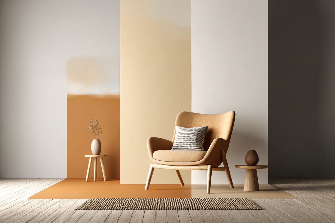
This is the one I’d tell you to be bold about, because a light brown carpet gives you more room here than people assume. Terracotta, rust, burnt orange, these all sit in the same warm family as the brown already on your floor, so instead of matching quietly like the warm whites do, they lean into the relationship and turn it into a feature.
I did a single accent wall in a rust close to a burnt clay pot color in a hallway with beige carpet, and it stopped looking like a hallway that was just there to connect two rooms and started looking like a room someone actually thought about. The carpet, instead of reading as the default option, started reading as a deliberate warm base holding up a warm, confident wall color above it. That’s the whole difference between a beige carpet looking cheap and a beige carpet looking grounded, it comes down to whether the walls are working with it or ignoring it.
The warning here isn’t about undertone the way it was with gray or blue, it’s about proportion. Rust and terracotta are strong colors. Four walls of it in a small room can feel like standing inside a clay pot, which is a lot even for someone who likes warm colors as much as I do. One wall, or a room with actual square footage to spread it across, is the better call.
Think of it the way you’d think about using a bold wood like walnut, gorgeous as a feature, exhausting as the only material in the room.
Test a decent sized swatch, not the tiny paint chip, an actual quart on cardboard if you can, and prop it against the carpet in the room at different times of day before committing. Rust shifts more than most colors depending on the light hitting it.
[Terracotta and Rust]
Final Thoughts
If there’s one thing I’d want you to take out of all this, it’s that “neutral” isn’t a real category, it’s a marketing word. Every white, gray, and beige has an undertone hiding in it, and that undertone is either going to shake hands with your carpet or start a fight with it. I found that out the expensive way, twice actually if you count the primer I wasted repainting my own mistake.
Warm whites and warm neutrals are the safe, dependable choice, sage and soft greens are the one that surprised me most, cool grays are the trap dressed up as sophistication, blue rewards you if you commit to either end and skip the middle, and rust or terracotta is where you go if you actually want the carpet to feel like part of the plan instead of something you’re covering up for.
None of this requires expensive paint or a color consultant charging by the hour. It requires taping a real swatch against your real carpet, in your real light, before you commit a whole gallon to a wall you’re going to be looking at every day for the next few years. I’d have saved myself a Saturday and a half a gallon of gray paint if I’d done that the first time around.
Pick based on what’s actually on your floor, not what looked good under hardware store lighting. Your carpet’s not going anywhere for a while. Might as well make friends with it.