
I was on my knees in the bedroom on a Sunday night, phone flashlight in my teeth, trying to figure out why I could not find my glasses on the nightstand in the dark like I do every single night of my life. Turned out I wasn’t failing at finding them. The nightstand itself had basically disappeared. I’d painted the bed frame black three weekends before, one of those impulsive Saturday projects that started with “it’s just a can of spray paint” and ended with me googling if you can spray paint metal bed slats without them sticking to the carpet forever (you can, mostly, if you’re patient, which I was not). The frame looked incredible. Moody, a little hotel-ish, exactly the vibe I was after after two years of a beige particleboard situation I will not be defending.
What I did not plan for was that the black frame ate everything around it.

My old nightstand, a dark walnut veneer thing from the thrift store on Harford Road that I’d been proud of for eighteen months, just melted into the whole scene like it had never existed. In daylight it looked fine, moody even. At eleven at night with one lamp on, it was a void. I was patting around a void for my glasses.
So I did what I do, which is get slightly obsessive about a problem that cost me nothing to have and will now cost me money to fix. I spent about four nights properly looking into this, reading way too many forum threads from people with the exact same black metal frame as mine, and running my own informal experiment where I dragged five different nightstand candidates into the bedroom over two weeks and just lived with each one for a few days before deciding it was wrong. That’s the real answer to “what color nightstand goes with a black bed,” by the way. It’s not one answer. It depends what job you actually need the nightstand to do, visually, because a black bed is basically a big dark anchor and everything near it either has to fight it, complement it, or lean all the way into it on purpose. I found five ways to do that properly, and one way I tried that went straight into the bad column of the ledger.
[Nightstands for a Black Bed]
Warm Wood Tones That Actually Warm the Room Up
The walnut veneer piece I mentioned, the one that vanished, taught me something specific. It wasn’t the wood that failed, it was the tone. Dark walnut sits too close to black on the color wheel to register as its own object at night, it just reads as “more dark.” What actually worked, and this took me embarrassingly long to figure out, was going lighter and warmer, not darker and matchier. I ended up with a honey oak piece, properly orange-toned, almost the color of a well used cutting board, picked up for eighteen dollars at an estate sale two towns over where the family clearly wanted the furniture gone more than they wanted money for it.
Against the black frame it does exactly what I needed, it reads as a separate, warm object instead of getting absorbed. In the morning it looks almost Scandinavian next to the black metal, in the evening lamp light it goes properly golden. I’ve had it eleven months, cost me the eighteen dollars plus about four dollars in sandpaper and oil to bring the finish back, so call it twenty two dollars total, which works out to roughly two dollars a month so far and dropping the longer I keep it. That’s a genuinely good number.
The lesson that came out of this, cheaply, is that wood tone matters more than “is it wood” as a category. Oak, ash, light pine, anything that leans yellow or orange rather than red or espresso brown, is going to hold its own next to black in a way that a dark walnut or mahogany piece just won’t, no matter how nice the joinery is. I checked the joints on that oak piece before I bought it, obviously, dovetailed drawer, no wobble, worth the eighteen dollars on construction alone. The color was the bonus I didn’t know I needed until the black bed forced the issue.
[Warm Wood Nightstands]
White and Cream, the Boring Answer That Isn’t Boring in Practice
I resisted white nightstands for years on the grounds that white furniture in a house with radiators and hot Baltimore summers is basically begging for scuff marks and a slow yellowing you can’t reverse. I still think that’s a fair concern for a coffee table. For a nightstand next to a black bed, though, white or a warm off white is doing something the wood tones can’t, it’s giving you full, clean contrast rather than a warm counterpoint, and with a black frame that contrast reads expensive in a way that costs nothing extra to achieve.
The piece I tried for this was a plain painted pine cube, single door, from the same corner thrift store I check every week, four dollars, already painted a slightly chipped cream that I sanded back and repainted properly with leftover trim paint I had from the bathroom, so call it maybe six dollars all in once you count the sandpaper. Against the black frame at night it practically glows under lamp light, and during the day it’s the brightest thing in the room without being clinical about it, because it’s cream, not stark white, so it doesn’t read like a hospital cart, which given where I work is a comparison I’m allowed to make.
The one thing I’ll flag honestly, because I said I’d get things wrong in this piece and I did, is that a true bright white next to black can look a little showroom, a little “nobody actually lives here.” Cream, ivory, anything with a hint of warmth in the white, avoids that. Chip the corner of it moving furniture around, which I did within the first month, and it barely shows against cream the way it would scream against true white. Small mercy, but a real one.
[White and Cream Nightstands]
Brass and Warm Metal, for When You Want the Room to Feel a Little Expensive
I did not think I was a brass person. Brass, to me, was always something my aunt had too much of in the nineties, and I carried that bias around for longer than I should have. Then I found a small brass and glass nightstand, the kind with thin round legs and a single glass shelf, at an estate sale for twelve dollars, tarnished enough that the seller practically apologized for it, and I brought it home mostly out of curiosity about whether it would clean up.
It cleaned up completely. Simple green polish, twenty minutes, and it went from dull to properly gleaming. Next to the black bed frame it does something the wood and the cream can’t, it catches actual light and throws it back, so even in a dim room there’s a glint where the nightstand is, which solves my original glasses problem better than either of the other two options honestly did. There’s something about a warm metal against a matte black frame that reads a little glamorous without costing glamorous money. Twelve dollars, one evening of polishing, and it’s the piece guests actually comment on, which given what I paid feels borderline unfair to whoever priced that sale.
You Might Also Like

The caution here is that not all metal does this. I also tried a chrome side table, cool toned silver, in the same spot for about a week, and it did the opposite of what I wanted, it made the whole corner of the room feel cold and a little clinical, echoing the black instead of warming against it. Chrome and black together can work in a very specific, very intentional industrial bedroom. Mine is not that bedroom. Warm metals, brass, gold, aged bronze, are doing the actual work here, not metal as a category.
[Brass and Metal Nightstands]
Going Black on Black on Purpose, Not by Accident
Here’s the one I got properly wrong before I got it right. I assumed matching the nightstand to the bed frame, full black on black, was an automatic mistake, the exact vanishing act that started this whole thing. Turns out that’s only true if the two black pieces are the same kind of black, doing the same kind of nothing.
I tried again with a black nightstand, but this time picked one with texture the bed frame doesn’t have, a rattan cane front over a black painted frame, six dollars at the corner store on a Friday, the day the volunteer restocks, which I now treat as basically a personal shopping appointment. The cane catches shadow and light in a way flat metal never will, so even though the color technically matches the bed, the object still reads as its own thing because your eye catches the texture before it registers the color. Add one lamp with actual presence, mine’s a cheap ceramic base I picked up for nine dollars, and the black on black stops being invisible and starts being intentional, which is the whole difference.
Six dollars, nine months in, no chips, cane’s held up fine even though I was nervous about it around a water glass. Works out to well under a dollar a month, and it’s quietly my favorite pairing of the five I tried, which I did not expect walking in.
[Black on Black Nightstands]
One Loud Color, Because the Black Bed Can Actually Take It
Last one, and this is the wild card. I had a small terracotta orange side table sitting in my hallway doing nothing, bought on a whim for four dollars because I liked the color and had no plan for it, which is a very on brand mistake for me. On a dare to myself I dragged it into the bedroom to sit next to the black frame for a few nights.
It should have looked ridiculous. It did not. Against black, a genuinely saturated color, terracotta, rust, a deep sage green, stops competing with the room and starts acting like the room’s one accent, because black is neutral enough to let a bold color actually sing instead of clashing with it. This is the pairing I’d have been too nervous to try if the vanishing nightstand problem hadn’t forced me into experimenting in the first place.
Four dollars, and it’s stayed. I will say this is the one where I have to actively remind myself I like it, some mornings it looks a little much, but it’s never once disappeared into the bed frame, not for a single night, which given how this whole thing started counts as a genuine win in my book.
[Color Pop Nightstands]
Final Thoughts
Total spend across all five nightstands I actually tried living with: about seventy two dollars, which sounds like a lot until you realize that’s five separate solutions to one problem, tested properly, in my actual bedroom, over about three weeks.
If I’d bought one matching set from a catalog it would have cost more than that for a single nightstand and I’d have had zero idea if it would actually work with the frame until it was already sitting there.
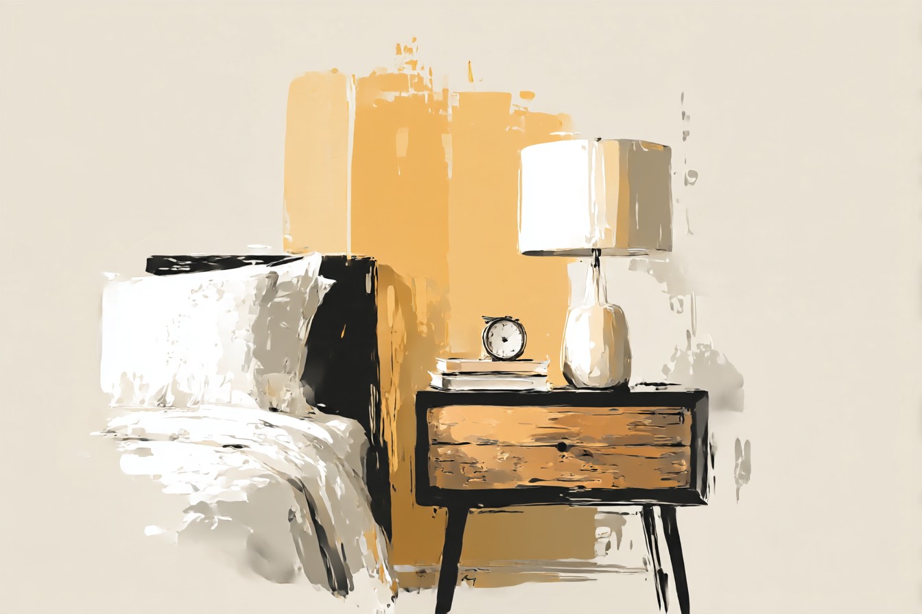
The honest answer to what color goes with a black bed is that warmth beats matching, and texture or shine beats flatness, every time. Wood tones need to lean orange, not brown. White needs a little cream in it to avoid looking staged. Metal needs to be warm, not chrome. Black can work on black if one of the two pieces has texture doing the heavy lifting. And one bold color, used once, gets to be the whole point instead of a mistake.
The rattan cane piece is staying long term, that’s the real winner, under a dollar a month and it still looks deliberate eight months in. The terracotta table is on notice, we’ll see. Either way, my glasses have a fighting chance in the dark again, which honestly was the entire point of this exercise before it turned into five nightstands and a small research project I didn’t plan on running.