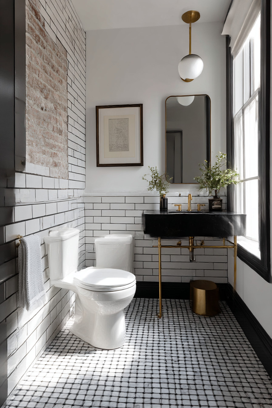
I was visiting my friend James’ apartment earlier in the year, and I used his bathroom. And something suddenly ‘clicked’. The area did not seem to exhibit the odd performance of masculinity (the leather accessories and industrial pipes that suggest “I am a man”) but the space seemed to be properly elegant.
Understated. As if someone with real taste lived there. This led me to think about how many guys mess up designing bathrooms, and I am guilty of this myself for years.
Either sterile white hotel bathroom style or totally crazy man-cave style with exposed brick and vintage beer posters. Neither feel right when you are living with it. My old flat’s bathroom was awful.
Just your typical new build developer bathroom – white tiles, white grout, white everything. Looked nice for about 6 months until that grout began to go grey and the whole area just felt… depressing. Then there was my cousin’s bathroom renovation disaster, all black marble and chrome that probably cost him $5K but felt like bathing in a funeral home.
Great photos however. For months I had been putting off redoing my guest bathroom because I literally had no idea what I wanted. I spent months surfing design web sites seeing the same tired “male” cliches repeatedly.
Dark woods EVERYWHERE. Black grouted subway tile. Edison bulb lights.
All of it felt like another guy’s opinion of what men should like vs. what will actually work. It wasn’t until I quit thinking about male design as a statement and started thinking about it simply as… good design. High quality materials.
Clean lines. Nothing trying too hard. Functionality without boredom.
This is what James had accomplished with his space. So I tore everything out and redid it. First major decision I made was the tiles — chose large porcelain concrete effect tiles instead of actual concrete since I’m not a total nutcase and do not wish to spend hours every other month sealing floors.
The tiles came in 24 x 24 inches, resulting in far less grout line areas and a much cleaner appearance. They ran approximately £40 per m2 from Topps Tiles which was not inexpensive but also not expensive enough to be considered designer priced. Grout was a lesson learned from past disasters.
Once a grout job goes white, it becomes dirty looking instantly. Chose charcoal gray instead and now two years into it, it still looks brand spanking new. So simple yet huge impact on upkeep.
Vanity took me weeks to select because everything appeared either to be too country farmhouse or too modern white box. Found this floating walnut vanity on-line – true wood veneer NOT printed — with an integrated sink. Ran roughly £800 which seemed like a fortune at the time; however, it does clearly demonstrate quality.
My old IKEA vanity looked great until it didn’t, then it looked cheap. I still get a smile from this one each time I use it. Lighting almost drove me nuts.
You Might Also Like
Downlight overheads make everyone look bad; but I did not want Hollywood mirror bulbs either. Ultimately settled upon linear LED strips hung vertically to the sides of the mirror. Very architectural; proper lighting for shaving; doesn’t feel cold or sterile.
Purchased them locally from a lighting specialist rather than at a DIY store — occasionally spending a bit extra is worthwhile for things you will look at daily. All fixtures and fittings went matte black — taps, towel bars, shower parts etc.. Sounds pretentious but it is actually much more low-key than chrome and conceals water stains amazingly well.
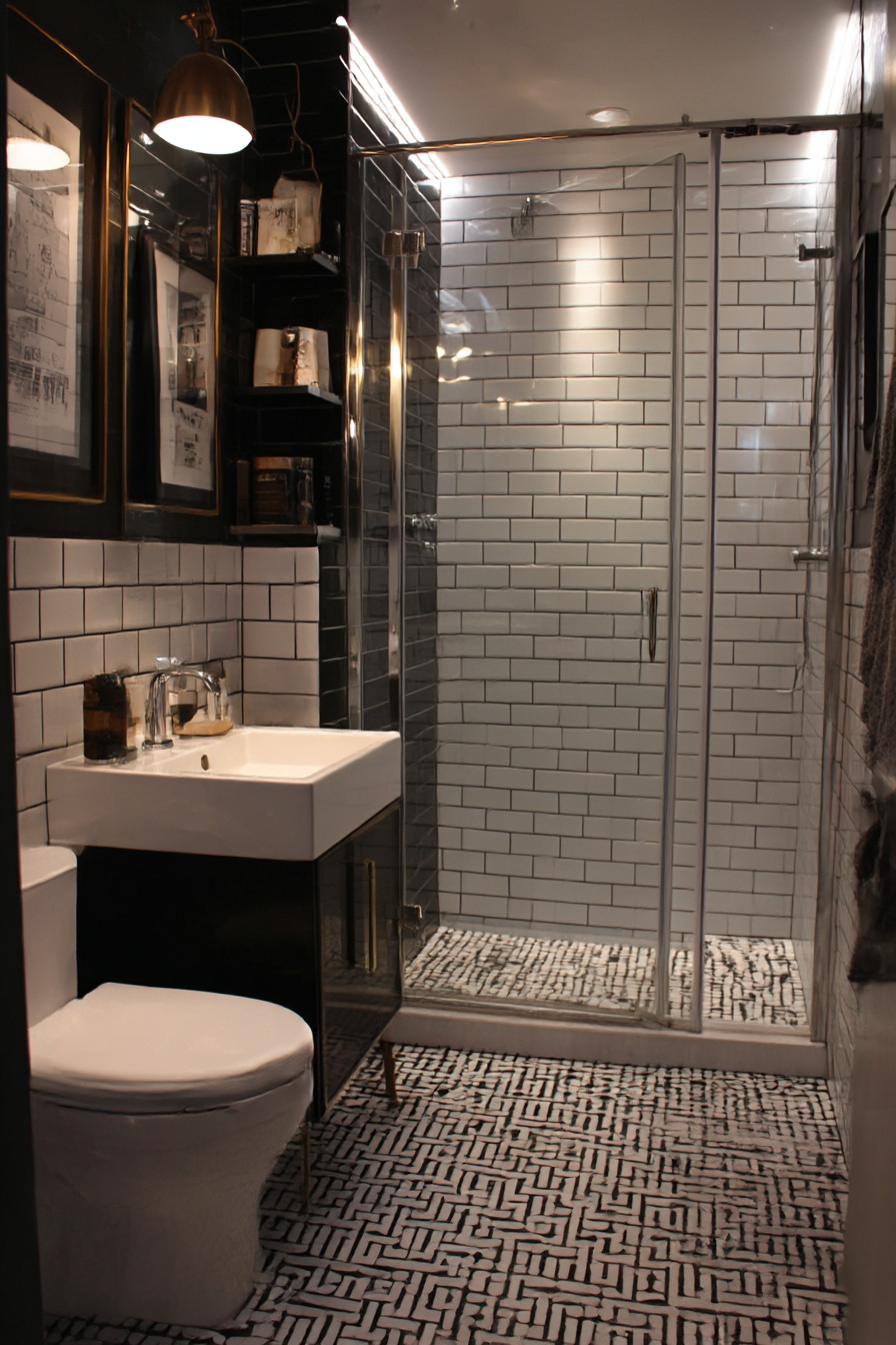
After finishing the bathroom, my dad came by for a visit within a week and immediately commented on the fixtures saying they looked “high end” – I think he was attempting to say “approved”. Shower was where I spent the most money. Rain shower head + separate hand held on sliding arm all connected via thermostatic valve which maintains consistent temp.
Installed one built-in corner shelf at shoulder height — learned from my old flat where I utilized those hideous wire caddies hanging everywhere. Much neater with built-in storage. Painted walls in that warmer grey that has varying characteristics depending on the time of day — appears near charcoal in late afternoon/early evening but doesn’t feel heavy during daytime.
Took an eternity to locate the perfect color — may have sampled 8+ different shades on sample patch test prior to settling on final selection. Tip: Paint large swaths (not tiny strokes) and inspect for multiple days prior to selecting final color — that £5 sample pot can potentially prevent you having to repaint an entire room. I certainly made some serious errors along the way.
Bought towel rails initially that looked great in the showroom but were ridiculously short once installed. Had to replace them with longer ones which resulted in additional holes to drill & touch-up. Additionally, I found that matte-black fixtures require unique cleaning — ordinary bathroom cleaners leave streaks but a micro-fiber cloth with just water cleans them perfectly.
Storage was difficult due to lack of desire for wall cabinets that would create claustrophobic environment. Replaced with recessed medicine cabinet behind the mirror instead – provides storage without any visual clutter. Underneath the walnut floating vanity, installed a basic shelf made of matching walnut for extra towels.
Not fancy – simply a wooden ledge; however, it helps maintain order. Walnut window blind. Could have selected something completely contrasting; however, I liked how the space worked together with similar tones – created harmony rather than making individual statements.
Details matter significantly more than I thought they would. Thick, dark gray towels instead of skimpy white ones that reveal every stain. Basic ceramic soap dispenser – NO plastic pumps whatsoever.
Even replaced conventional toilet paper holder with a simple horizontal bar. Sounds silly, but these smaller details add up. Surprised me most is how calm the space feels compared to previously.
Most visitors tell me it “feels like a mature adult” or “like a hotel”, but in a positive manner. Exactly what I was searching for – that sensation of peaceful sophistication. Approximately £3500 total cost – including labor costs for tiler & plumber for the tiling/plumbing work (approximately 2 months).
While pricey, spread over two months was manageable; and truthfully, it has greatly improved how the flat feels overall. Invested in high-end pieces – tiles, vanity, fixtures – and left everything else minimalist. Major takeaway from this project is that effective masculine design is not about symbolism or stereotypes; it is about expressing self-confidence through simplicity.
Quality materials. Thoughtful details. NOTHING UNNECESSARY!
Best compliment I received was from my girlfriend stating “it looks like a proper grown-up bathroom” – EXACTLY what I had hoped for without realizing it. Still love using the space daily now two years post-completion, and have zero remorse regarding any decisions – extremely unusual for renovation projects! Shows that masculine doesn’t have to mean moody/aggressive – sometimes it simply means thoughtful & long-lasting