I was drinking coffee at around six months pregnant with BabyO when I first properly looked at our downstairs toilet in ages, and blushed a little with shame. We moved into this house three years ago and I’d painted exactly…nothing. We still had magnolia walls.
Everyone paints their bathrooms magnolia, don’t they? You just GET magnolia in your bathroom and move on with your life. Except when I looked at my toilet that morning whilst drinking coffee out of my KEEP CALM mug I realised that toilet wasn’t just boring, beige.
It was depressing me a little bit every time I went to visit. Enough was enough!
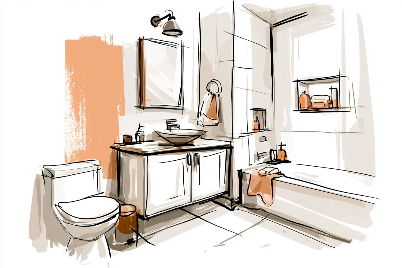
I might spend all of my time feeling rubbish at stuff I didn’t want my toilet walls adding to that unnecessarily.
The problem is, picking a bathroom paint colour when you’ve never done it before is actually quite stressful. You can’t just go for whatever colour you like the look of in the tin, sadly. Case in point: Our old flat.
We bought it when we were about 22/23 and I decided to go for a really trendy dark grey colour in the bathroom. Looked great in the pot. Looked like a dingy tunnel on the walls.
And do you know what else? It showed up EVERYTHING. Marks, stains, splashes.
That weird grimy dust you get in bathrooms even when you clean them all the time. WTF is that dust?! Took me a whole weekend to scrape it off and start again with something lighter.
Phil laughed at me for ages about that one. Every now and then he’ll still throw it in my face if I start bragging about how good I am at decorating… BUT! The upside of that horrendous paint choice was that it taught me that some colours are BETTER than others for bathrooms.
Not just ‘better looking’ but actually better. More forgiving. They don’t make you feel like death warmed up when you’re hauling your butt out of bed to take a 4 am weeing, they don’t cling to every smudge and watermark and they don’t transform from a warm, cosy shade to a sterile clinical colour when you switch on the main light instead of the overhead light of the mirror.
Ok so over the years I’ve tried lots of colours and done a LOT of googling and frankly researching paint colours is kind of addictive. But there are definitely some colours that are really JOBSITE and will go with pretty much everything. Obviously I’m talking about your fixtures here too.
Chrome fittings vs Brass towel rails. White tiles vs Wooden furniture/vanities. That weird mish mash of materials that most of us have as a result of trying to update a room without spending a fortune on everything at once.
Whites are obviously great BUT be careful which white you go for. And by careful I don’t mean plain white. Nope.
Nothing screams ‘I couldn’t be bothered’ like bright white walls that make your bathroom look like a hospital ward. Or white that’s actually too cool and makes your skin look grey in selfies. No thank you.
I mean whites that have maybe a hint of yellow or cream to them. We painted our ensuite walls this lovely warm white (*three trips to B&Q later*) and it’s been up for nearly two years now and I have NEVER thought ‘urgh I hate this paint colour’. Everything else in the room just seems to look better.
The shower fittings look more high-end, that wooden shelf Phil installed looks designed rather than purely practical and even my sad tumble dryer towels somehow look like part of a coordinated bathroom set. The thing with whites is that you need to TEST them properly. And I don’t mean tiny paint samples that you stick on the corner of your wall.
Like actual BIG squares of colour. And do it on different walls if you can. Natural light changes throughout the day but bathroom light especially can be pretty grim.
You Might Also Like
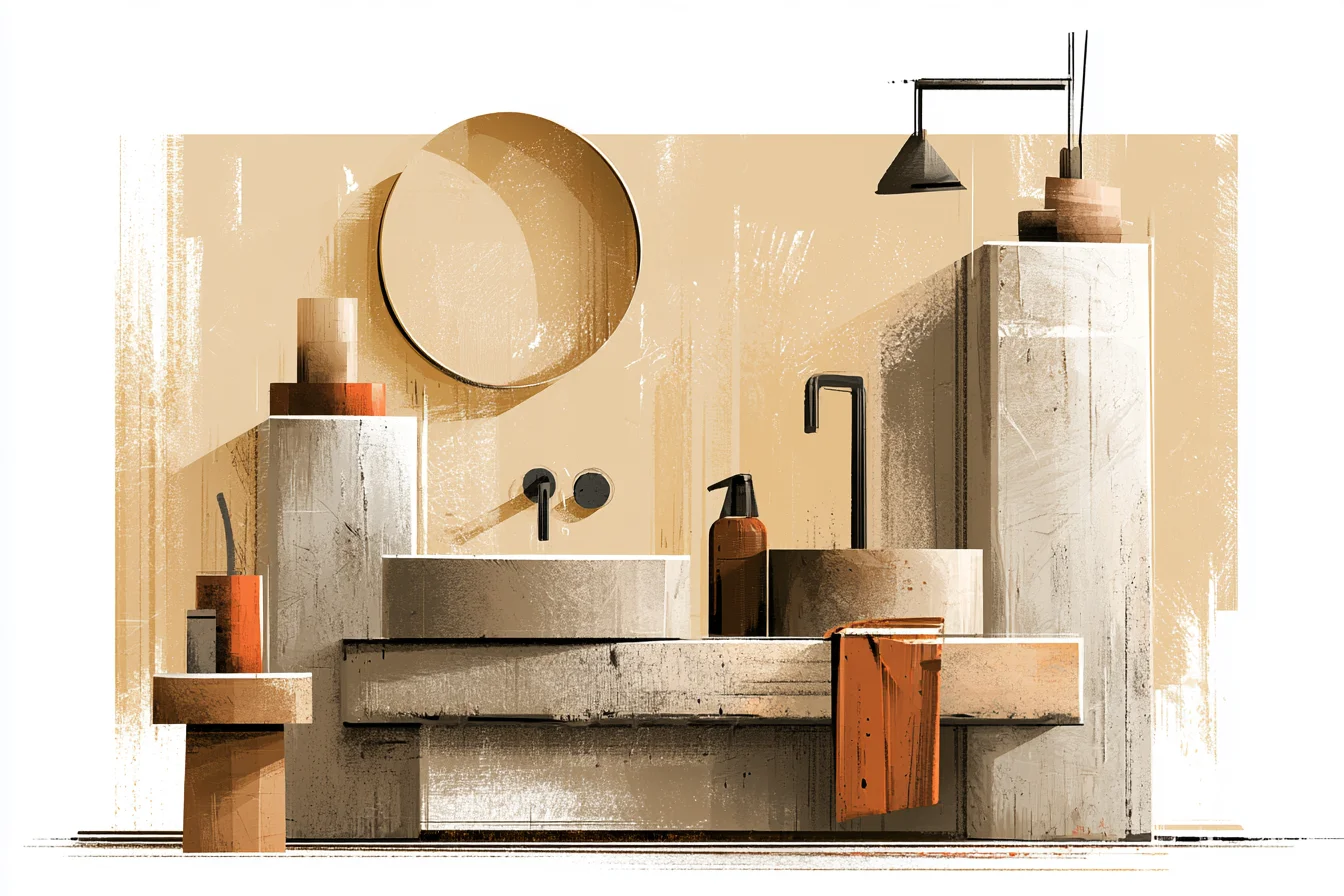
You want to make sure it looks good when the main light is on aswell as the mirror light. Don’t feel like you have to stick with white though. Warm greys are my go-to if I’m unsure about white.
And by warm greys I DON’T MEAN cool greys. I mean like warm greys with undertones of brown/beige. They look smart without being too ‘overpowering’ and go with pretty much everything.
I’ve seen bathrooms with warm grey that looked amazing with super modern black fittings AND super cute with traditional brass fittings. Trust me, it works. THIS COLOUR SHOCKED ME when I finally built up the courage to try it.
I was against it for the longest time. Bathroom greens can go so wrong, right? Too bright and your bathroom looks like a citrus farm exploded.
Too dark and it’s seventy-something and your granny is sat drying her hair in it. Sage however… Sage that’s been mixed with just a teensy bit of grey is actually great. Relaxing when you wake up (let’s be honest we all need that) but it also makes any white fittings look oh-so crisp and clean.
Plus people assume it costs loads of money when it really doesn’t… I painted my sister’s downstairs toilet this colour nearly two years ago now – she thought I’d lost it with the suggestion at first but she let me do it as I’d recently ‘proved’ myself painting her living room. Literally every.single.person.who.uses.her toilet comments on the colour. It looks amazing with her Next brass mirror AND the white subway tiles she did too but I’ve seen lots of bathrooms online that have done the same colour with chrome fittings AND marble…and it worked just as well.
Ok so this might sound obvious BUT bathrooms have tile EVERYWHERE. Showers, baths, sinks. They’re splashed with water every single day.
Plus toothpaste splodges, grubby fingerprints etc. Choosing a colour that can work with real-life (read:grim) bathroom conditions is essential. Some colours make everything stand out like a patch work quilt.
Lighter colours are usually better for hiding said imperfections but that isn’t always true… Light blues are great BUT you have to be careful you DON’T go TOO blue. In fact go for colours so taupe they could almost be considered grey depending on the light shining on them. They work really well with white fittings too as it just enhances that clean feeling without making your bathroom look like it’s themed.
Another trick I always swear by is painting the majority of the walls white/warm white but then painting underneath the sink or on one wall only a deeper colour. Soft mushroom grey, sage green.. you get my drift. Adds a bit of interest without having pops of colour everywhere which can feel too busy in a smaller room.
NOPE. As much as I hate to say it – trends come and go. Like that stripey horrible duck egg blue that EVERYONE was banging on about a couple of years ago.
Yep that one. DON’T DO IT. Or if the colour you love only looks good when your bathroom is spotlessly clean.
Life’s hard enough without your choice of paint colour adding to the stress. So to finish up; Paint finish is almost as important as the colour you choose. Go for a semi-gloss or satin finish as they’re best at coping with moisture (hello shower every morning) and are easiest to wipe down if –NOT WHEN- you get toothpaste on the wall.
Yes they will show up wall flaws more than a flat paint.
But being able to wipe down your walls whenever needed is worth it! The endgame with choosing paint colours (for me anyway) is that they don’t shout.
Like opaque tights; doing their job without you really noticing them. They make whatever you bring into the room better; towels brighter, artwork Standout-y etc. Without taking the attention away from your beautiful basin set.
Like I said. There are LOTS of colours that I love for bathrooms. Over the years I’ve tried bold colours, repainted disasters and lived with colours I love.
If I had to choose again I always go back to colours that feel like you didn’t even try too hard. That leave people wondering ‘ooh what colour paint is THAT?’ not because it’s stand out bright but because the entire room looks…. Effortless.