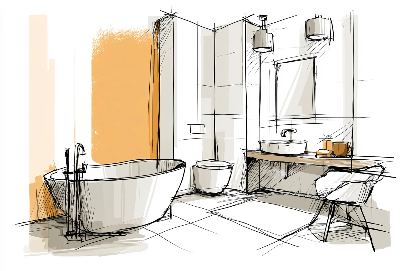
You’ve stood in your tiny bathroom at seven in the morning, squinting at yourself in the medicine cabinet mirror while the ceiling light throws pools of shadow on your skin, and thought to yourself, “this place feels like a cave.” At least, that’s how I felt whenever I first woke up in my bathroom. For years I blamed its size. It turns out I was mostly wrong.
It was the paint. When I moved into my first flat, the bathroom was tiny. Like airplane bathroom tiny.
Honestly, not much of an exaggeration. The former tenant had painted the walls and ceiling “medical beige” — every ounce of natural light tried to escape through that frosted window, and this colour sucked it all in.
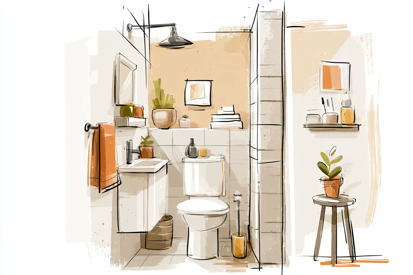
I resigned myself to the fact that there was nothing I could do to make it feel any larger — short of demolishing walls (not an option when you’re renting) — and lived with that shade of despair for six months.
Then, one day when I was feeling particularly bold (and let’s be honest, bored of beige), I rummaged through the testers at my local DIY shop. What I discovered has changed the way I decorate small spaces ever since. Spoiler alert: a lot of design blogs will disagree with my findings.
White, white, white. Everyone says you should paint small bathrooms white. Hear me out before you click back to Instagram, because yes, white is good.
But white is kind of a bland, overused option if that’s all you’ve heard. Allow me to explain. White comes in approximately forty-seven different hues.
Many of these will make your bathroom feel clinical and cave-like. I discovered this the hard way by trying three “trust-me-it’s-a-classic-white” paint pots before my lightbulb moment. One was too gray and made me look sickly each morning.
Another was too yellow and clashed horribly with my chrome shower curtain rails. The third wasn’t bad, per se, but it was so stark it made the whole room feel cold even in the summer. What happened when I stood back and took a step away from searching for a white that would “make the space look bigger”?
I actually started thinking about how I wanted the space to make me feel. Getting ready for work in the morning isn’t the happiest of times, and neither is de-stressing in the bath with a clinically white ceiling staring back at you. I settled on a warm, pale white that the paint chart rather unimaginatively labelled “Moonbeam.” It wasn’t groundbreaking; it just had a hint of cream and reflected light beautifully.
Artificial light didn’t bounce around and blind me like a prison cell; natural light gleamed off the surfaces and made the space feel welcoming. But choosing that pale blue-white was only half the battle. Oh no, there’s more.
The coolest colour trick I learnt along the way was about colour temperature. I’m sure you’ve heard about using “cool whites” in small spaces to make them look larger — and yes, that is correct. But what most sources fail to mention is how the undertones of your wall colour can affect other finishes in the room.
Cool whites have blue or gray undertones, which can make your bathroom feel larger and more modern. Sounds great, but what happens when you’ve got warm- toned fixtures and fittings? You’ll end up with a mismatch that drags your space down and may even accentuate that institutional vibe you’re trying to avoid.
Cool whites play best with other chrome, nickel, or modern-style fittings. Because they have colder color temperature themselves, they bounce off these finishes and create a crisp, clean feel that really does open up a tight bathroom. I used a cool gray-blue called Glacier in a rental bathroom last year that looked incredible with my client’s shower fixtures (they have silver-blue undertones too, so it worked).
Warm whites are going to pair beautifully with gold, brass, or wooden finishes. It softens the space enough to avoid institutional feelings but still brightens the surfaces in the same way. My current bathroom is gold and brass aplenty, and a warm-toned white is what I used to tie everything together. (Psst.
Feathery blonde hairs don’t show up in off-whites, FYI.) Pale gray. Gray. It was a color I never would’ve considered for a small bathroom.
But boy, oh boy does it work if you’ve got the right shade. I’m writing this from home at the moment, and we painted our bathroom a pale gray last year that I absolutely love. It’s got the lightest blue undertones, similar to a foggy sky.
You Might Also Like
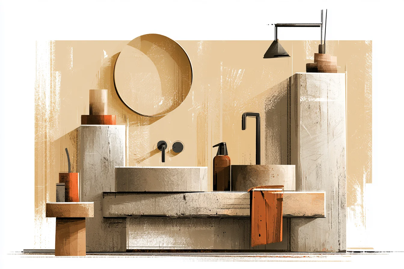
Gray is a deep color that can still feel sophisticated without being too dark. The walls and ceiling seem to recede into the background somehow, making the space feel bigger than it really is. Even better?
It made our bathroom feel taller. The hardest part about using gray is finding one pale enough to still reflect enough light around the room without being purely white. I made this mistake myself a few years ago and ended up with a wall color that looked… muddy?
Damp? God, I lived with that depressing gray for about two months before I could smile enough to replace it. Moral of the story: test your paint.
If you can afford to buy a tester pot of every.single.gray., do it. Inspect those colors at every time of day before you make your final decision. That £3 could save you £50 on a paint color you despise.
Another shout out to soft blues. This isn’t a color I would normally recommend; bathrooms tend to have cooler light which can make some blue tones look sickly. That said, if you’re lucky enough to have lots of natural light flowing into your bathroom, a barely-there blue can work wonders.
I painted an entire powder room — walls and ceiling — a pale blue called Morning Sky a few years ago, and I still get comments on how nice it is and how peaceful it makes the room feel. It has this magical ability to make your walls recede just slightly, opening up the space a teeny bit more. But as I said before, be wary of artificial light when it comes to blue.
Oh, and yellow. Yellow looks absolutely terrible under standard bathroom lighting. Black?
Maybe. Deep, saturated colors can work spectacularly in small bathrooms, but only when done right. And by “done right,” I mean you have plenty of natural light flooding in, and your ceilings are higher than average.
I painted an ensuite black (don’t judge me, I was young and foolish) and thought I had nailed the whole looking-like-a-master-bedroom-feeling-like-a-cave thing. It looked amazing in photos, but trust me when I say that waking up in that little black hole every morning did not give me joy. Dark colors can work, but be smart about it.
And please don’t paint your bathroom red. Paint your ceilings. Okay, maybe not paint your ceilings white, but hear me out on this one.
Ceilings are often an overlooked aspect of a bathroom decoration. Most people leave them the original color of the drywall or paint them a darker shade to “accent.” When designing or decorating on a budget, paint your ceiling the same color as your walls! Or, if you’re feeling funky, one shade lighter.
Taking away that boundary between where the wall stops and the ceiling starts really makes a bathroom feel larger and more open. Glossier finishes.
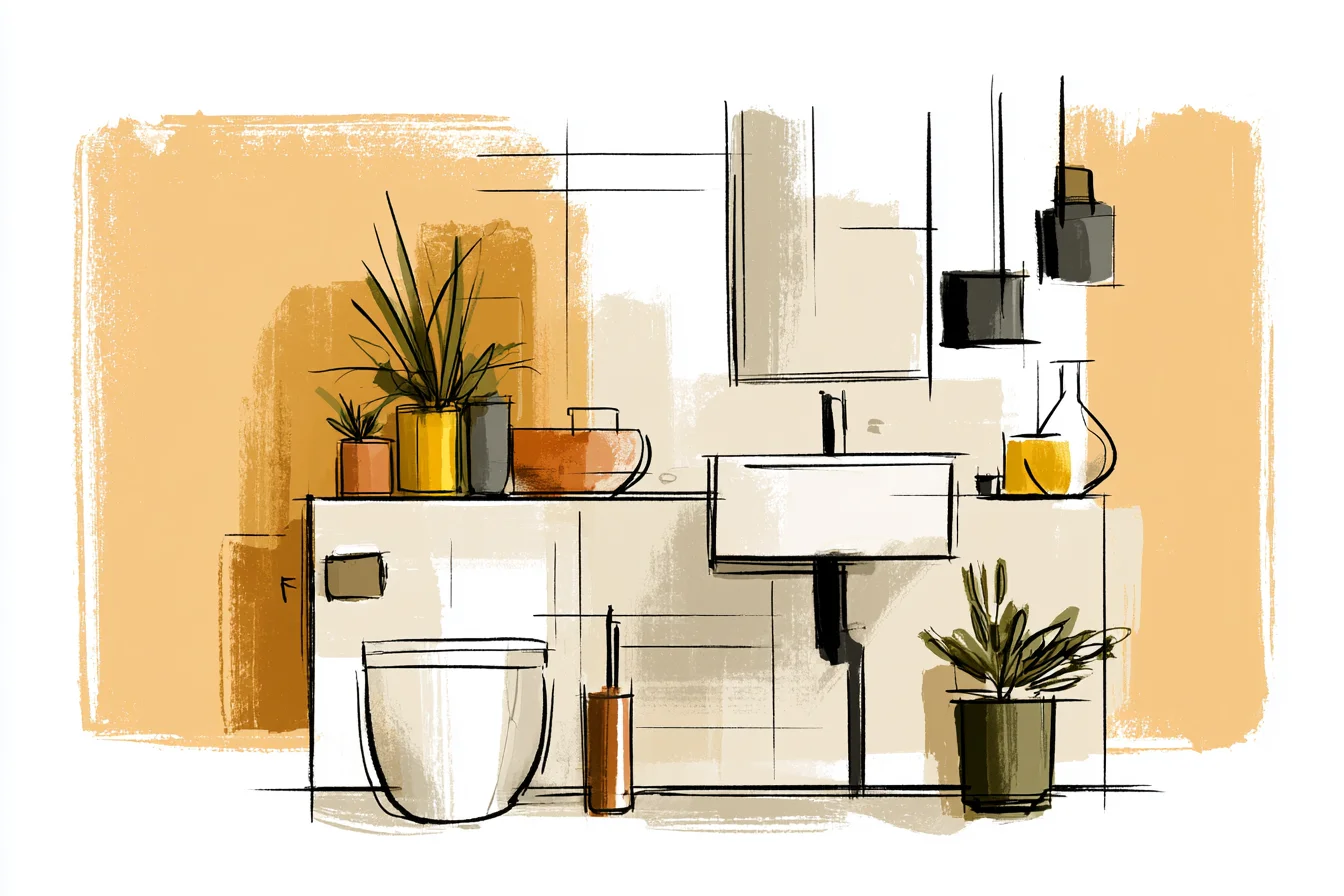
White walls aren’t the only trick to making your small bathroom feel larger and brighter.
The finish you choose for your walls can play a massive role, too. Glossier finishes like semi-gloss or satin reflect more light around the room than flat finishes. Yes, they’ll highlight every bump and crack in your pre-2000 bathroom walls.
But they also make cleaning easier (hello, steamy shower walls), and they bounce light around like it’s nobody’s business. Choose wisely. The moral of the story?
There is no one-size-fits-all answer for what color your small bathroom should be painted. Take into account your light fixtures, your wall colors, and honestly, how you want the space to make you feel. A beautifully crisp, cool white might do the trick.
Or perhaps you’ll find magic in a soft blue or warm gray. Your bathroom isn’t a formula; it’s as unique as the person peeing in it every day.