It’s been three years since I stared into my friend Sarah’s bathroom and had my entire opinion of beige turned upside down. Disclaimer: I hated her bathroom at first. Not because it wasn’t beautiful –it was—I hated it because it was beige and disproved every dumb stereotype I had about that colour.
Stereotypes like beige is boring and blah and totally soul-crushingly blah blah blah. Wait, that was MY stereotype talking. But hear me out: There is nothing boring about a beautifully done beige bathroom.
Sarah’s walls were not merely beige. They were a honey-toned beige that actually appeared to be glowing from within.
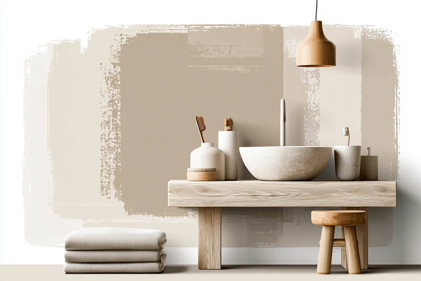
The beautiful travertine tiles she’d had installed on one wall had pores like no other tile Sara hath seen, catching shadows and creating interest.
The thick wood trim around her heavy mirror added texture while the brass faucet and cabinet pulls added warmth without being too shiny. It was calm + serene + not an ounce of boring. Before Sarah’s bathroom, I’d bashed beige plenty of times myself.
When I tackled my very first renovation project (read: tiny rental bathroom that smelled like wet dog year-round), I painted everything pure white because I wanted the space to feel “fresh and modern.” Problem was, it didn’t feel fresh and modern. It felt like a dentist’s office. Chilly.
Clinical. Unwelcoming. Every time I showered in the morning I felt like I was being scraped open for a check-up.
So, lesson learned. But like with most rookie-designer mistakes, it took me YEARS to learn from that beige lesson. Once I finally did figure it out?
Yeah. I overdosed on beige bathrooms for a solid year and learned pretty much everything there is to know about designing in neutral. First things first: When you swear off beige?
You’re kinda missing the point. Sure, slap a few gallons of pure white paint on any old bathroom and you’ll get… well, you guessed it. But beautiful beiges aren’t afraid to get funky with textures, materials, and contrasting cool vs warm undertones.
Here’s what I learned about making beige really pop. It’s time we got something straight. Beige is NOT boring and it’s certainly not the colour that stops at white.
Beige is an entire colour family full of beautiful warm neutrals. There’s chocolatey brown-beiges. Creamy mushroom-beiges.
Sandy taupe-beiges. Light orange-beiges. Ashy greige-beiges.
Like all colours, some shades of beige work better in smaller spaces while others look amazing blown wide open. Once you pick the perfect shade for your space, play around with different textures (more on that below! ), materials, and cool vs warm-toned balancing acts to build your beautiful bathroom. Sound easy?
It isn’t. At least, not at first. I remember pulling the paint sample that became my favourite bathroom paint colour of all-time (SW’s Classic Linen, if you’re curious) and hanging it on my bathroom wall next to all the other contenders.
It was perfect. Warm without being orange. Light without being sterile.
Fast forward two weeks when I actually painted a swatch on the wall. Instantly it looked sad and flat. Had I made the wrong choice?
Instead of pulling the trigger on beige Bingo, I decided to play around with some texture. I ended up keeping the same paint colour but brought in textured wallpaper for one accent wall. Nothing wild, but a nice grasscloth with tiny variations in tone that added instant depth to the room.
Next came the brass towel bars instead of boring ol’ chrome. A jute rug instead of a rubber tile floor mat. Linen curtains instead of dowdy blinds.
You Might Also Like
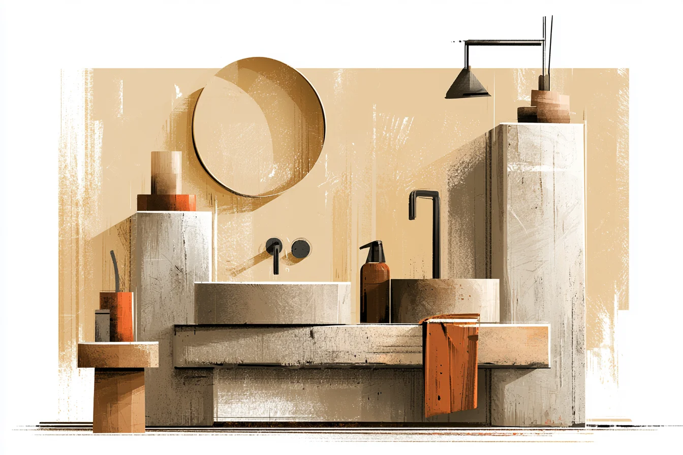
Paint colour was the same, but suddenly it went from blah to badass. Ever since that bathroom, I’ve noticed how designers always manage to layer beautifully within the same colour family. It’s not about painting one wall a completely different colour.
It’s about mixing textures, finishes, and cool/ warm tones to create an instant sense of depth. Easy for them to say, right? WRONG.
Artificial light has the ability to make or break any colour. I learned that the hard way when I moved into my first-ever north-facing flat. Every morning as I opened the curtains and trickled into the bathroom, I was greeted with… well, grey.
The beige paint I loved in my last sunnier apartment turned mud-coloured and depressing thanks to near zero natural light. Then I discovered LED strip lighting. Slapped some behind my mirror for warm-overhead lighting and set myself a tiny table lamp on the windowsill.
Bam! Instant sunshine. (PS: yes you can put lamps in bathrooms. Get ones that are rated for damp areas.) Moral of the story?
Pick light temperatures that will accentuate the warm or cool undertones of your chosen beige paint colour. And try to view paint samples at different times of day. You might love a shade at noon only to hate it by nighttime.
Colour temperature is everything. Ever notice how cool grey-blue bathrooms can feel soooo icy?? That’s because cool-toned colours (even beige!) have blue or green undertones that can make a room feel unfinished.
On the flip side, warm beige tones with red/yellow undertones will feel richer and more inviting. The key is to always stick with the same cool or warm family when layering different beige tones. If you mix cool and warm undertones together it will always look off.
Got it? Cool. But back to the whole temperature thing.
Whenever possible, I always try to bring in handmade items (especially tiles) that have natural texture and tonal variations. Same goes for natural materials like stone, wood, rattan, and even linen. I slapped a reclaimed wood shelf up in that beige bathroom of mine and suddenly natural imperfections and wood grain took that blank slate from man-made to Mother Nature-made.
Bonus? Bought that baby from a salvage yard for £45 instead of £200 at a retail home store. Smooth subway tiles are boring in pure white.
But holy crap, are they sexy in a slightly imperfect, warm-toned beige?! I threw down some handmade ceramic tiles in pale tan last summer and suddenly those tiny imperfections (some darker, some lighter) made them look like I spent thousands on custom stone. Same goes for layered beige tones.
I used to panic at the thought of mixing two beige shades in one space. But my favourite all-beige bathrooms always layer different neutral hues. Think cream walls, mushroom coloured tiles, and sandy grout.
The only rule? Stick to same-temperature beiges. All warm or all cool.
You’ll never get that perfect mix if you start pairing purple-blue greige with sand-beige just because they look similar side-by-side. Say it with me now: BASKETS.
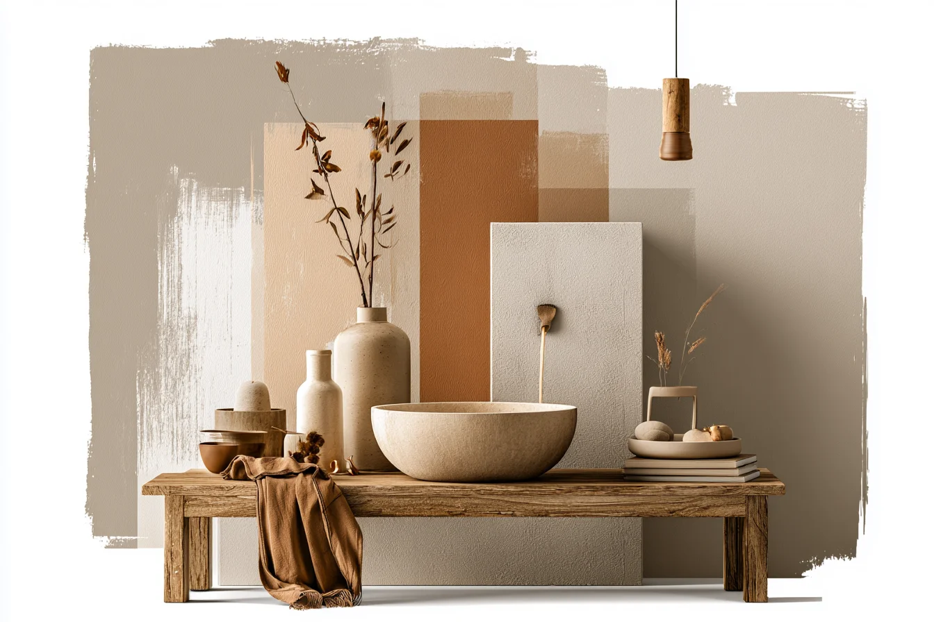
AND LINEN.
Woven textures always add organic interest and hide clutter in plain sight. I snagged these seagrass baskets at a car boot sale years ago for £3 apiece and they’re still hanging in there. Pro tip: woven storage looks amazing paired with wooden lids.
Who knew throwing some plants in your bathroom could make such a difference?! Since I live in London and have nearly zero outdoor space, my bathroom is where my green thumb lives (yes it thrives in bathrooms, just make sure it’s rated for damp areas like this one!). I have a pair of snake plants that look stunning next to my warm honey walls.
Bonus points if your plant has dark green leaves – it creates the perfect pop of colour against beige! Warm-beige+fancy chrome=bad news bears. Once I swapped out my bathroom’s chrome cabinet pulls and towel bars for warm toned brass fixtures, it was like they’d arrived ready to party.
Same goes for shiny gold or even satin black fixtures. Just say no to chrome in your warmest of beige baths.